NFTs & Art

CyberPunkMetalHead
2 years ago
Why Bitcoin NFTs Are Incomprehensible yet Likely Here to Stay
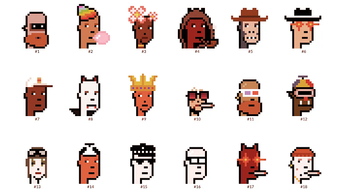
I'm trying to understand why Bitcoin NFTs aren't ready.
Ordinals, a new Bitcoin protocol, has been controversial. NFTs can be added to Bitcoin transactions using the protocol. They are not tokens or fungible. Bitcoin NFTs are transaction metadata. Yes. They're not owned.
In January, the Ordinals protocol allowed data like photos to be directly encoded onto sats, the smallest units of Bitcoin worth 0.00000001 BTC, on the Bitcoin blockchain. Ordinals does not need a sidechain or token like other techniques. The Ordinals protocol has encoded JPEG photos, digital art, new profile picture (PFP) projects, and even 1993 DOOM onto the Bitcoin network.
Ordinals inscriptions are permanent digital artifacts preserved on the Bitcoin blockchain. It differs from Ethereum, Solana, and Stacks NFT technologies that allow smart contract creators to change information. Ordinals store the whole image or content on the blockchain, not just a link to an external server, unlike centralized databases, which can change the linked image, description, category, or contract identifier.
So far, more than 50,000 ordinals have been produced on the Bitcoin blockchain, and some of them have already been sold for astronomical amounts. The Ethereum-based CryptoPunks NFT collection spawned Ordinal Punk. Inscription 620 sold for 9.5 BTC, or $218,000, the most.

Segwit and Taproot, two important Bitcoin blockchain updates, enabled this. These protocols store transaction metadata, unlike Ethereum, where the NFT is the token. Bitcoin's NFT is a sat's transaction details.
What effects do ordinary values and NFTs have on the Bitcoin blockchain?
Ordinals will likely have long-term effects on the Bitcoin Ecosystem since they store, transact, and compute more data.
Charges Ordinals introduce scalability challenges. The Bitcoin network has limited transaction throughput and increased fees during peak demand. NFTs could make network transactions harder and more expensive. Ordinals currently occupy over 50% of block space, according to Glassnode.
One of the protocols that supported Ordinals Taproot has also seen a huge uptick:
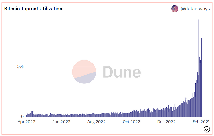
Taproot use increases block size and transaction costs.

This could cause network congestion but also support more L2s with Ordinals-specific use cases. Dune info here.
Storage Needs The Bitcoin blockchain would need to store more data to store NFT data directly. Since ordinals were introduced, blocksize has tripled from 0.7mb to over 2.2mb, which could increase storage costs and make it harder for nodes to join the network.
Use Case Diversity On the other hand, NFTs on the Bitcoin blockchain could broaden Bitcoin's use cases beyond storage and payment. This could expand Bitcoin's user base. This is two-sided. Bitcoin was designed to be trustless, decentralized, peer-to-peer money.
Chain to permanently store NFTs as ordinals will change everything.
Popularity rise This new use case will boost Bitcoin appeal, according to some. This argument fails since Bitcoin is the most popular cryptocurrency. Popularity doesn't require a new use case. Cryptocurrency adoption boosts Bitcoin. It need not compete with Ethereum or provide extra benefits to crypto investors. If there was a need for another chain that supports NFTs (there isn't), why would anyone choose the slowest and most expensive network? It appears contradictory and unproductive.
Nonetheless, holding an NFT on the Bitcoin blockchain is more secure than any other blockchain, but this has little utility.
Bitcoin NFTs are undoubtedly controversial. NFTs are strange and perhaps harmful to Bitcoin's mission. If Bitcoin NFTs are here to stay, I hope a sidechain or rollup solution will take over and leave the base chain alone.

Boris Müller
2 years ago
Why Do Websites Have the Same Design?
My kids redesigned the internet because it lacks inventiveness.

Internet today is bland. Everything is generic: fonts, layouts, pages, and visual language. Microtypography is messy.
Web design today seems dictated by technical and ideological constraints rather than creativity and ideas. Text and graphics are in containers on every page. All design is assumed.
Ironically, web technologies can design a lot. We can execute most designs. We make shocking, evocative websites. Experimental typography, generating graphics, and interactive experiences are possible.
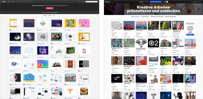
Even designer websites use containers in containers. Dribbble and Behance, the two most popular creative websites, are boring. Lead image.
How did this happen?
Several reasons. WordPress and other blogging platforms use templates. These frameworks build web pages by combining graphics, headlines, body content, and videos. Not designs, templates. These rules combine related data types. These platforms don't let users customize pages beyond the template. You filled the template.
Templates are content-neutral. Thus, the issue.
Form should reflect and shape content, which is a design principle. Separating them produces content containers. Templates have no design value.
One of the fundamental principles of design is a deep and meaningful connection between form and content.
Web design lacks imagination for many reasons. Most are pragmatic and economic. Page design takes time. Large websites lack the resources to create a page from scratch due to the speed of internet news and the frequency of new items. HTML, JavaScript, and CSS continue to challenge web designers. Web design can't match desktop publishing's straightforward operations.
Designers may also be lazy. Mobile-first, generic, framework-driven development tends to ignore web page visual and contextual integrity.
How can we overcome this? How might expressive and avant-garde websites look today?
Rediscovering the past helps design the future.
'90s-era web design
At the University of the Arts Bremen's research and development group, I created my first website 23 years ago. Web design was trendy. Young web. Pages inspired me.
We struggled with HTML in the mid-1990s. Arial, Times, and Verdana were the only web-safe fonts. Anything exciting required table layouts, monospaced fonts, or GIFs. HTML was originally content-driven, thus we had to work against it to create a page.
Experimental typography was booming. Designers challenged the established quo from Jan Tschichold's Die Neue Typographie in the twenties to April Greiman's computer-driven layouts in the eighties. By the mid-1990s, an uncommon confluence of technological and cultural breakthroughs enabled radical graphic design. Irma Boom, David Carson, Paula Scher, Neville Brody, and others showed it.
Early web pages were dull compared to graphic design's aesthetic explosion. The Web Design Museum shows this.
Nobody knew how to conduct browser-based graphic design. Web page design was undefined. No standards. No CMS (nearly), CSS, JS, video, animation.
Now is as good a time as any to challenge the internet’s visual conformity.
In 2018, everything is browser-based. Massive layouts to micro-typography, animation, and video. How do we use these great possibilities? Containerized containers. JavaScript-contaminated mobile-first pages. Visually uniform templates. Web design 23 years later would disappoint my younger self.
Our imagination, not technology, restricts web design. We're too conformist to aesthetics, economics, and expectations.
Crisis generates opportunity. Challenge online visual conformity now. I'm too old and bourgeois to develop a radical, experimental, and cutting-edge website. I can ask my students.
I taught web design at the Potsdam Interface Design Programme in 2017. Each team has to redesign a website. Create expressive, inventive visual experiences on the browser. Create with contemporary web technologies. Avoid usability, readability, and flexibility concerns. Act. Ignore Erwartungskonformität.
The class outcome pleased me. This overview page shows all results. Four diverse projects address the challenge.
1. ZKM by Frederic Haase and Jonas Köpfer
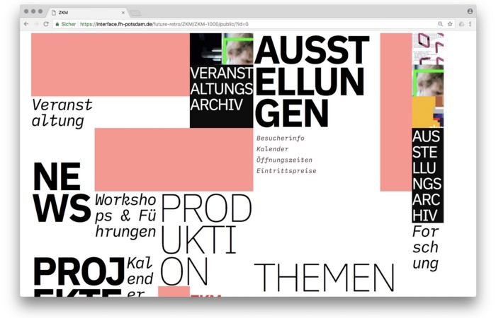
Frederic and Jonas began their experiments on the ZKM website. The ZKM is Germany's leading media art exhibition location, but its website remains conventional. It's useful but not avant-garde like the shows' art.
Frederic and Jonas designed the ZKM site's concept, aesthetic language, and technical configuration to reflect the museum's progressive approach. A generative design engine generates new layouts for each page load.
ZKM redesign.
2. Streem by Daria Thies, Bela Kurek, and Lucas Vogel
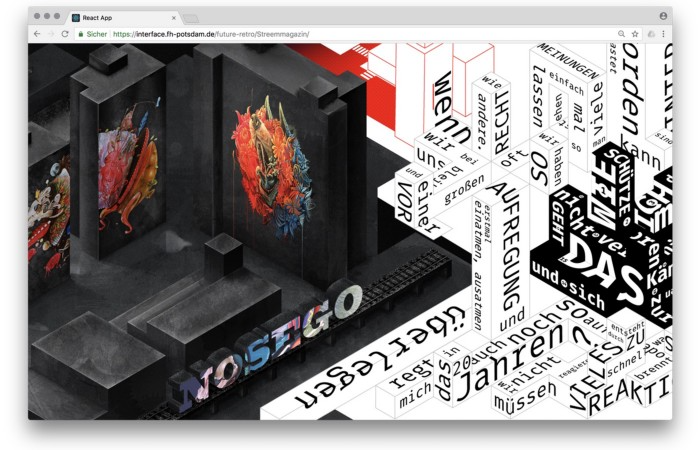
Street art magazine Streem. It promotes new artists and societal topics. Streem includes artwork, painting, photography, design, writing, and journalism. Daria, Bela, and Lucas used these influences to develop a conceptual metropolis. They designed four neighborhoods to reflect magazine sections for their prototype. For a legible city, they use powerful illustrative styles and spatial typography.
Streem makeover.
3. Medium by Amelie Kirchmeyer and Fabian Schultz
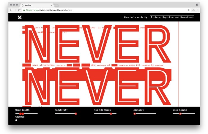
Amelie and Fabian structured. Instead of developing a form for a tale, they dissolved a web page into semantic, syntactical, and statistical aspects. HTML's flexibility was their goal. They broke Medium posts into experimental typographic space.
Medium revamp.
4. Hacker News by Fabian Dinklage and Florian Zia
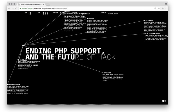
Florian and Fabian made Hacker News interactive. The social networking site aggregates computer science and IT news. Its voting and debate features are extensive despite its simple style. Fabian and Florian transformed the structure into a typographic timeline and network area. News and comments sequence and connect the visuals. To read Hacker News, they connected their design to the API. Hacker News makeover.
Communication is not legibility, said Carson. Apply this to web design today. Modern websites must be legible, usable, responsive, and accessible. They shouldn't limit its visual palette. Visual and human-centered design are not stereotypes.
I want radical, generative, evocative, insightful, adequate, content-specific, and intelligent site design. I want to rediscover web design experimentation. More surprises please. I hope the web will appear different in 23 years.
Update: this essay has sparked a lively discussion! I wrote a brief response to the debate's most common points: Creativity vs. Usability

Steffan Morris Hernandez
2 years ago
10 types of cognitive bias to watch out for in UX research & design
10 biases in 10 visuals

Cognitive biases are crucial for UX research, design, and daily life. Our biases distort reality.
After learning about biases at my UX Research bootcamp, I studied Erika Hall's Just Enough Research and used the Nielsen Norman Group's wealth of information. 10 images show my findings.
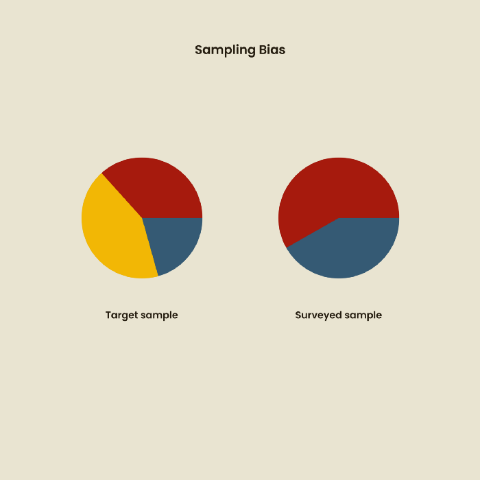
1. Bias in sampling
Misselection of target population members causes sampling bias. For example, you are building an app to help people with food intolerances log their meals and are targeting adult males (years 20-30), adult females (ages 20-30), and teenage males and females (ages 15-19) with food intolerances. However, a sample of only adult males and teenage females is biased and unrepresentative.
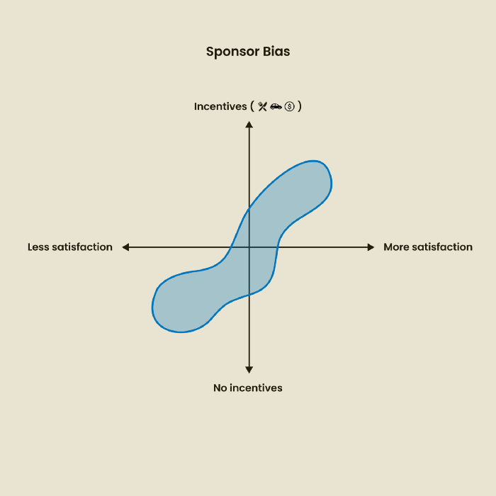
2. Sponsor Disparity
Sponsor bias occurs when a study's findings favor an organization's goals. Beware if X organization promises to drive you to their HQ, compensate you for your time, provide food, beverages, discounts, and warmth. Participants may endeavor to be neutral, but incentives and prizes may bias their evaluations and responses in favor of X organization.
In Just Enough Research, Erika Hall suggests describing the company's aims without naming it.
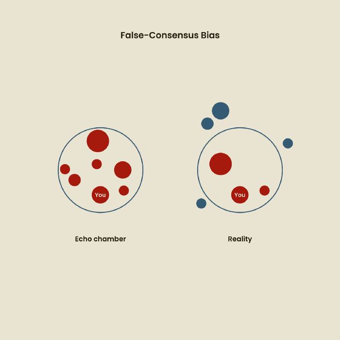
Third, False-Consensus Bias
False-consensus bias is when a person thinks others think and act the same way. For instance, if a start-up designs an app without researching end users' needs, it could fail since end users may have different wants. https://www.nngroup.com/videos/false-consensus-effect/
Working directly with the end user and employing many research methodologies to improve validity helps lessen this prejudice. When analyzing data, triangulation can boost believability.
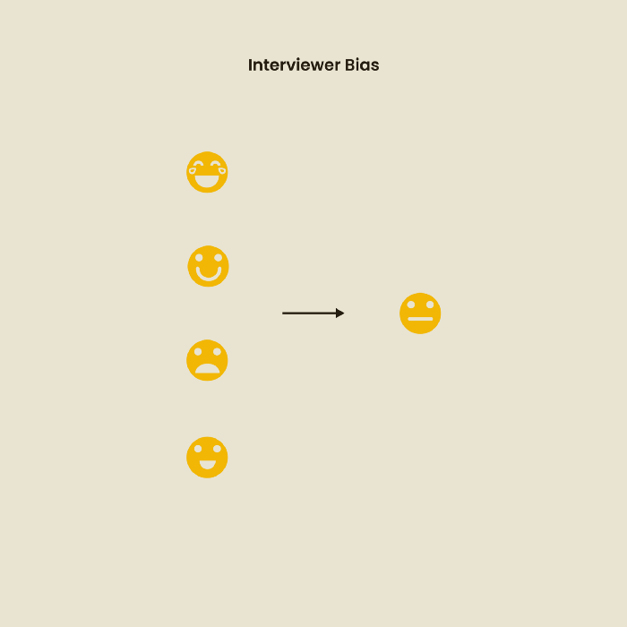
Bias of the interviewer
I struggled with this bias during my UX research bootcamp interviews. Interviewing neutrally takes practice and patience. Avoid leading questions that structure the story since the interviewee must interpret them. Nodding or smiling throughout the interview may subconsciously influence the interviewee's responses.
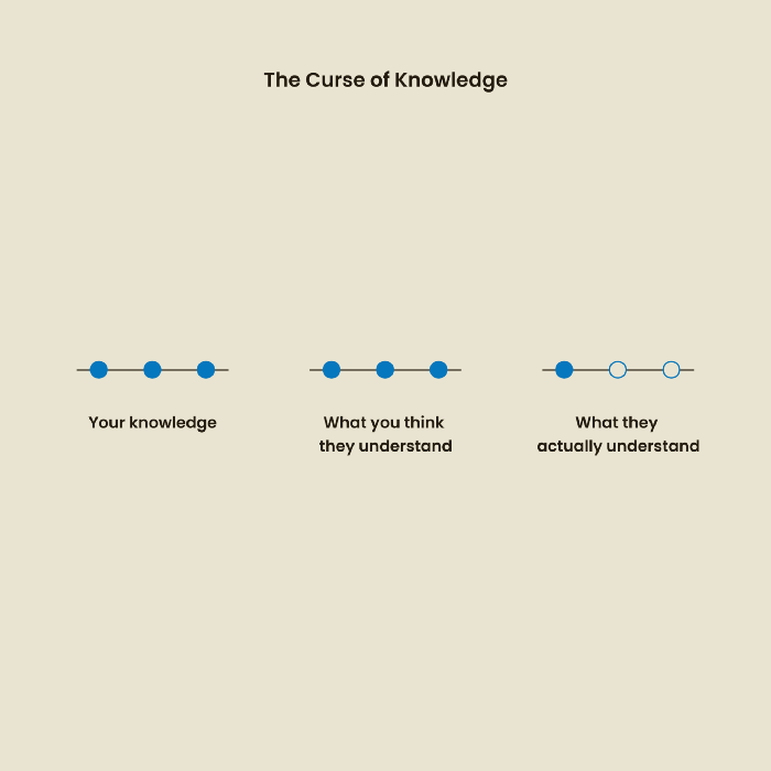
The Curse of Knowledge
The curse of knowledge occurs when someone expects others understand a subject as well as they do. UX research interviews and surveys should reduce this bias because technical language might confuse participants and harm the research. Interviewing participants as though you are new to the topic may help them expand on their replies without being influenced by the researcher's knowledge.
Confirmation Bias
Most prevalent bias. People highlight evidence that supports their ideas and ignore data that doesn't. The echo chamber of social media creates polarization by promoting similar perspectives.
A researcher with confirmation bias may dismiss data that contradicts their research goals. Thus, the research or product may not serve end users.
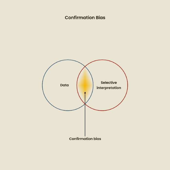
Design biases
UX Research design bias pertains to study construction and execution. Design bias occurs when data is excluded or magnified based on human aims, assumptions, and preferences.

The Hawthorne Impact
Remember when you behaved differently while the teacher wasn't looking? When you behaved differently without your parents watching? A UX research study's Hawthorne Effect occurs when people modify their behavior because you're watching. To escape judgment, participants may act and speak differently.
To avoid this, researchers should blend into the background and urge subjects to act alone.
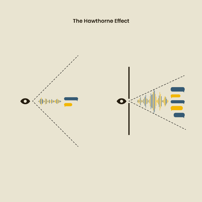
The bias against social desire
People want to belong to escape rejection and hatred. Research interviewees may mislead or slant their answers to avoid embarrassment. Researchers should encourage honesty and confidentiality in studies to address this. Observational research may reduce bias better than interviews because participants behave more organically.
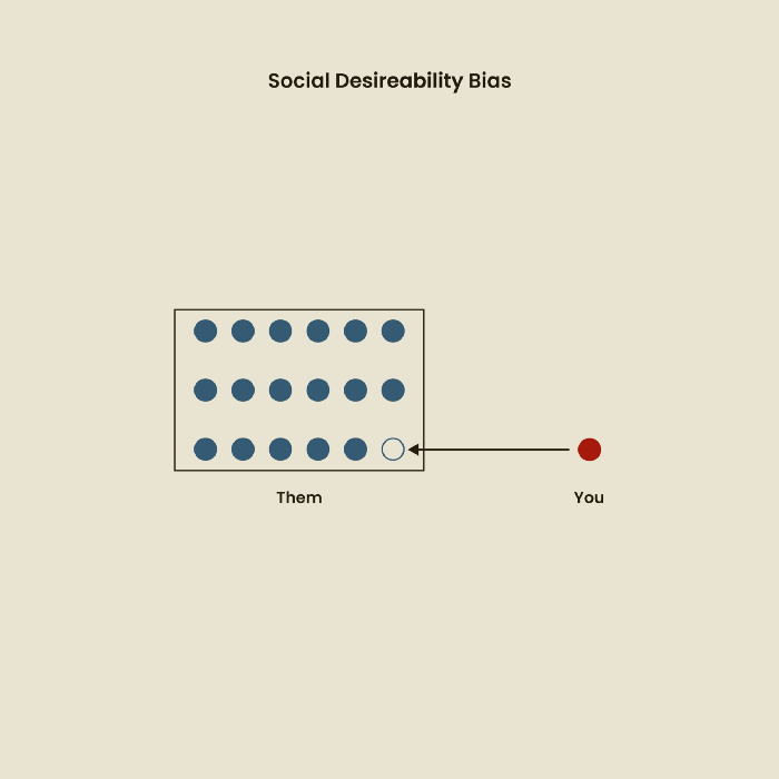
Relative Time Bias
Humans tend to appreciate recent experiences more. Consider school. Say you failed a recent exam but did well in the previous 7 exams. Instead, you may vividly recall the last terrible exam outcome.
If a UX researcher relies their conclusions on the most recent findings instead of all the data and results, recency bias might occur.
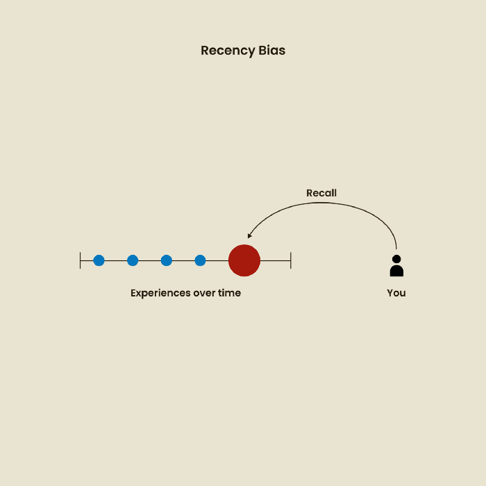
I hope you liked learning about UX design, research, and real-world biases.

xuanling11
2 years ago
Reddit NFT Achievement

Reddit's NFT market is alive and well.
NFT owners outnumber OpenSea on Reddit.
Reddit NFTs flip in OpenSea in days:
Fast-selling.
NFT sales will make Reddit's current communities more engaged.
I don't think NFTs will affect existing groups, but they will build hype for people to acquire them.
The first season of Collectibles is unique, but many missed the first season.
Second-season NFTs are less likely to be sold for a higher price than first-season ones.
If you use Reddit, it's fun to own NFTs.
Dmytro Spilka
2 years ago
Why NFTs Have a Bright Future Away from Collectible Art After Punks and Apes

After a crazy second half of 2021 and significant trade volumes into 2022, the market for NFT artworks like Bored Ape Yacht Club, CryptoPunks, and Pudgy Penguins has begun a sharp collapse as market downturns hit token values.
DappRadar data shows NFT monthly sales have fallen below $1 billion since June 2021. OpenSea, the world's largest NFT exchange, has seen sales volume decline 75% since May and is trading like July 2021.
Prices of popular non-fungible tokens have also decreased. Bored Ape Yacht Club (BAYC) has witnessed volume and sales drop 63% and 15%, respectively, in the past month.
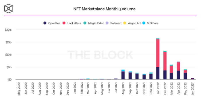
BeInCrypto analysis shows market decline. May 2022 cryptocurrency marketplace volume was $4 billion, according to a news platform. This is a sharp drop from April's $7.18 billion.
OpenSea, a big marketplace, contributed $2.6 billion, while LooksRare, Magic Eden, and Solanart also contributed.
NFT markets are digital platforms for buying and selling tokens, similar stock trading platforms. Although some of the world's largest exchanges offer NFT wallets, most users store their NFTs on their favorite marketplaces.
In January 2022, overall NFT sales volume was $16.57 billion, with LooksRare contributing $11.1 billion. May 2022's volume was $12.57 less than January, a 75% drop, and June's is expected to be considerably smaller.
A World Based on Utility
Despite declines in NFT trading volumes, not all investors are negative on NFTs. Although there are uncertainties about the sustainability of NFT-based art collections, there are fewer reservations about utility-based tokens and their significance in technology's future.
In June, business CEO Christof Straub said NFTs may help artists monetize unreleased content, resuscitate catalogs, establish deeper fan connections, and make processes more efficient through technology.
We all know NFTs can't be JPEGs. Straub noted that NFT music rights can offer more equitable rewards to musicians.
Music NFTs are here to stay if they have real value, solve real problems, are trusted and lawful, and have fair and sustainable business models.
NFTs can transform numerous industries, including music. Market opinion is shifting towards tokens with more utility than the social media artworks we're used to seeing.
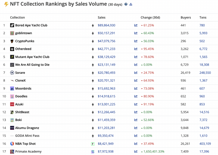
While the major NFT names remain dominant in terms of volume, new utility-based initiatives are emerging as top 20 collections.
Otherdeed, Sorare, and NBA Top Shot are NFT-based games that rank above Bored Ape Yacht Club and Cryptopunks.
Users can switch video NFTs of basketball players in NBA Top Shot. Similar efforts are emerging in the non-fungible landscape.
Sorare shows how NFTs can support a new way of playing fantasy football, where participants buy and swap trading cards to create a 5-player team that wins rewards based on real-life performances.
Sorare raised 579.7 million in one of Europe's largest Series B financing deals in September 2021. Recently, the platform revealed plans to expand into Major League Baseball.
Strong growth indications suggest a promising future for NFTs. The value of art-based collections like BAYC and CryptoPunks may be questioned as markets become diluted by new limited collections, but the potential for NFTs to become intrinsically linked to tangible utility like online gaming, music and art, and even corporate reward schemes shows the industry has a bright future.