


More on Marketing

Saskia Ketz
2 years ago
I hate marketing for my business, but here's how I push myself to keep going
Start now.

When it comes to building my business, I’m passionate about a lot of things. I love creating user experiences that simplify branding essentials. I love creating new typefaces and color combinations to inspire logo designers. I love fixing problems to improve my product.
Business marketing isn't my thing.
This is shared by many. Many solopreneurs, like me, struggle to advertise their business and drive themselves to work on it.
Without a lot of promotion, no company will succeed. Marketing is 80% of developing a firm, and when you're starting out, it's even more. Some believe that you shouldn't build anything until you've begun marketing your idea and found enough buyers.
Marketing your business without marketing experience is difficult. There are various outlets and techniques to learn. Instead of figuring out where to start, it's easier to return to your area of expertise, whether that's writing, designing product features, or improving your site's back end. Right?
First, realize that your role as a founder is to market your firm. Being a founder focused on product, I rarely work on it.
Secondly, use these basic methods that have helped me dedicate adequate time and focus to marketing. They're all simple to apply, and they've increased my business's visibility and success.
1. Establish buckets for every task.
You've probably heard to schedule tasks you don't like. As simple as it sounds, blocking a substantial piece of my workday for marketing duties like LinkedIn or Twitter outreach, AppSumo customer support, or SEO has forced me to spend time on them.
Giving me lots of room to focus on product development has helped even more. Sure, this means scheduling time to work on product enhancements after my four-hour marketing sprint.
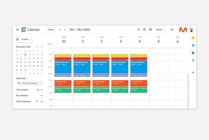
It also involves making space to store product inspiration and ideas throughout the day so I don't get distracted. This is like the advice to keep a notebook beside your bed to write down your insomniac ideas. I keep fonts, color palettes, and product ideas in folders on my desktop. Knowing these concepts won't be lost lets me focus on marketing in the moment. When I have limited time to work on something, I don't have to conduct the research I've been collecting, so I can get more done faster.
2. Look for various accountability systems
Accountability is essential for self-discipline. To keep focused on my marketing tasks, I've needed various streams of accountability, big and little.
Accountability groups are great for bigger things. SaaS Camp, a sales outreach coaching program, is mine. We discuss marketing duties and results every week. This motivates me to do enough each week to be proud of my accomplishments. Yet hearing what works (or doesn't) for others gives me benchmarks for my own marketing outcomes and plenty of fresh techniques to attempt.
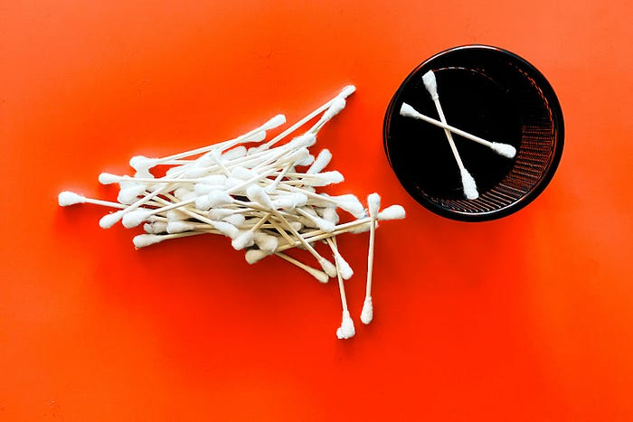
… say, I want to DM 50 people on Twitter about my product — I get that many Q-tips and place them in one pen holder on my desk.
The best accountability group can't watch you 24/7. I use a friend's simple method that shouldn't work (but it does). When I have a lot of marketing chores, like DMing 50 Twitter users about my product, That many Q-tips go in my desk pen holder. After each task, I relocate one Q-tip to an empty pen holder. When you have a lot of minor jobs to perform, it helps to see your progress. You might use toothpicks, M&Ms, or anything else you have a lot of.
3. Continue to monitor your feedback loops
Knowing which marketing methods work best requires monitoring results. As an entrepreneur with little go-to-market expertise, every tactic I pursue is an experiment. I need to know how each trial is doing to maximize my time.
I placed Google and Facebook advertisements on hold since they took too much time and money to obtain Return. LinkedIn outreach has been invaluable to me. I feel that talking to potential consumers one-on-one is the fastest method to grasp their problem areas, figure out my messaging, and find product market fit.
Data proximity offers another benefit. Seeing positive results makes it simpler to maintain doing a work you don't like. Why every fitness program tracks progress.
Marketing's goal is to increase customers and revenues, therefore I've found it helpful to track those metrics and celebrate monthly advances. I provide these updates for extra accountability.
Finding faster feedback loops is also motivating. Marketing brings more clients and feedback, in my opinion. Product-focused founders love that feedback. Positive reviews make me proud that my product is benefitting others, while negative ones provide me with suggestions for product changes that can improve my business.
The best advice I can give a lone creator who's afraid of marketing is to just start. Start early to learn by doing and reduce marketing stress. Start early to develop habits and successes that will keep you going. The sooner you start, the sooner you'll have enough consumers to return to your favorite work.

Guillaume Dumortier
2 years ago
Mastering the Art of Rhetoric: A Guide to Rhetorical Devices in Successful Headlines and Titles
Unleash the power of persuasion and captivate your audience with compelling headlines.
As the old adage goes, "You never get a second chance to make a first impression."
In the world of content creation and social ads, headlines and titles play a critical role in making that first impression.
A well-crafted headline can make the difference between an article being read or ignored, a video being clicked on or bypassed, or a product being purchased or passed over.
To make an impact with your headlines, mastering the art of rhetoric is essential. In this post, we'll explore various rhetorical devices and techniques that can help you create headlines that captivate your audience and drive engagement.
tl;dr : Headline Magician will help you craft the ultimate headline titles powered by rhetoric devices
Example with a high-end luxury organic zero-waste skincare brand
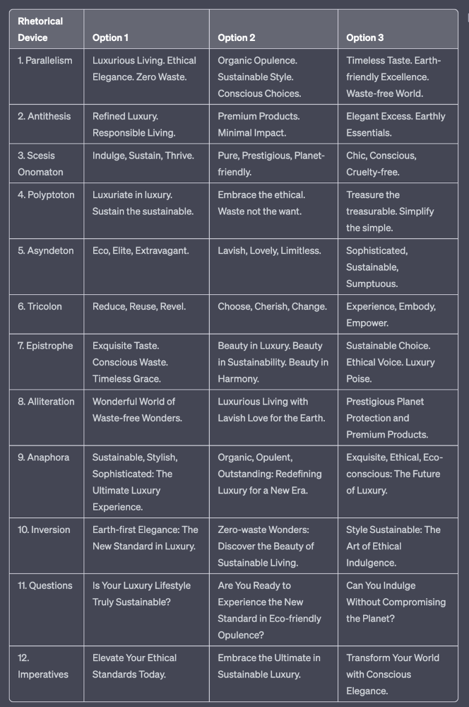
✍️ The Power of Alliteration
Alliteration is the repetition of the same consonant sound at the beginning of words in close proximity. This rhetorical device lends itself well to headlines, as it creates a memorable, rhythmic quality that can catch a reader's attention.
By using alliteration, you can make your headlines more engaging and easier to remember.
Examples:
"Crafting Compelling Content: A Comprehensive Course"
"Mastering the Art of Memorable Marketing"
🔁 The Appeal of Anaphora
Anaphora is the repetition of a word or phrase at the beginning of successive clauses. This rhetorical device emphasizes a particular idea or theme, making it more memorable and persuasive.
In headlines, anaphora can be used to create a sense of unity and coherence, which can draw readers in and pique their interest.
Examples:
"Create, Curate, Captivate: Your Guide to Social Media Success"
"Innovation, Inspiration, and Insight: The Future of AI"
🔄 The Intrigue of Inversion
Inversion is a rhetorical device where the normal order of words is reversed, often to create an emphasis or achieve a specific effect.
In headlines, inversion can generate curiosity and surprise, compelling readers to explore further.
Examples:
"Beneath the Surface: A Deep Dive into Ocean Conservation"
"Beyond the Stars: The Quest for Extraterrestrial Life"
⚖️ The Persuasive Power of Parallelism
Parallelism is a rhetorical device that involves using similar grammatical structures or patterns to create a sense of balance and symmetry.
In headlines, parallelism can make your message more memorable and impactful, as it creates a pleasing rhythm and flow that can resonate with readers.
Examples:
"Eat Well, Live Well, Be Well: The Ultimate Guide to Wellness"
"Learn, Lead, and Launch: A Blueprint for Entrepreneurial Success"
⏭️ The Emphasis of Ellipsis
Ellipsis is the omission of words, typically indicated by three periods (...), which suggests that there is more to the story.
In headlines, ellipses can create a sense of mystery and intrigue, enticing readers to click and discover what lies behind the headline.
Examples:
"The Secret to Success... Revealed"
"Unlocking the Power of Your Mind... A Step-by-Step Guide"
🎭 The Drama of Hyperbole
Hyperbole is a rhetorical device that involves exaggeration for emphasis or effect.
In headlines, hyperbole can grab the reader's attention by making bold, provocative claims that stand out from the competition. Be cautious with hyperbole, however, as overuse or excessive exaggeration can damage your credibility.
Examples:
"The Ultimate Guide to Mastering Any Skill in Record Time"
"Discover the Revolutionary Technique That Will Transform Your Life"
❓The Curiosity of Questions
Posing questions in your headlines can be an effective way to pique the reader's curiosity and encourage engagement.
Questions compel the reader to seek answers, making them more likely to click on your content. Additionally, questions can create a sense of connection between the content creator and the audience, fostering a sense of dialogue and discussion.
Examples:
"Are You Making These Common Mistakes in Your Marketing Strategy?"
"What's the Secret to Unlocking Your Creative Potential?"
💥 The Impact of Imperatives
Imperatives are commands or instructions that urge the reader to take action. By using imperatives in your headlines, you can create a sense of urgency and importance, making your content more compelling and actionable.
Examples:
"Master Your Time Management Skills Today"
"Transform Your Business with These Innovative Strategies"
💢 The Emotion of Exclamations
Exclamations are powerful rhetorical devices that can evoke strong emotions and convey a sense of excitement or urgency.
Including exclamations in your headlines can make them more attention-grabbing and shareable, increasing the chances of your content being read and circulated.
Examples:
"Unlock Your True Potential: Find Your Passion and Thrive!"
"Experience the Adventure of a Lifetime: Travel the World on a Budget!"
🎀 The Effectiveness of Euphemisms
Euphemisms are polite or indirect expressions used in place of harsher, more direct language.
In headlines, euphemisms can make your message more appealing and relatable, helping to soften potentially controversial or sensitive topics.
Examples:
"Navigating the Challenges of Modern Parenting"
"Redefining Success in a Fast-Paced World"
⚡Antithesis: The Power of Opposites
Antithesis involves placing two opposite words side-by-side, emphasizing their contrasts. This device can create a sense of tension and intrigue in headlines.
Examples:
"Once a day. Every day"
"Soft on skin. Kill germs"
"Mega power. Mini size."
To utilize antithesis, identify two opposing concepts related to your content and present them in a balanced manner.
🎨 Scesis Onomaton: The Art of Verbless Copy
Scesis onomaton is a rhetorical device that involves writing verbless copy, which quickens the pace and adds emphasis.
Example:
"7 days. 7 dollars. Full access."
To use scesis onomaton, remove verbs and focus on the essential elements of your headline.
🌟 Polyptoton: The Charm of Shared Roots
Polyptoton is the repeated use of words that share the same root, bewitching words into memorable phrases.
Examples:
"Real bread isn't made in factories. It's baked in bakeries"
"Lose your knack for losing things."
To employ polyptoton, identify words with shared roots that are relevant to your content.
✨ Asyndeton: The Elegance of Omission
Asyndeton involves the intentional omission of conjunctions, adding crispness, conviction, and elegance to your headlines.
Examples:
"You, Me, Sushi?"
"All the latte art, none of the environmental impact."
To use asyndeton, eliminate conjunctions and focus on the core message of your headline.
🔮 Tricolon: The Magic of Threes
Tricolon is a rhetorical device that uses the power of three, creating memorable and impactful headlines.
Examples:
"Show it, say it, send it"
"Eat Well, Live Well, Be Well."
To use tricolon, craft a headline with three key elements that emphasize your content's main message.
🔔 Epistrophe: The Chime of Repetition
Epistrophe involves the repetition of words or phrases at the end of successive clauses, adding a chime to your headlines.
Examples:
"Catch it. Bin it. Kill it."
"Joint friendly. Climate friendly. Family friendly."
To employ epistrophe, repeat a key phrase or word at the end of each clause.

obimy.app
3 years ago
How TikTok helped us grow to 6 million users
This resulted to obimy's new audience.
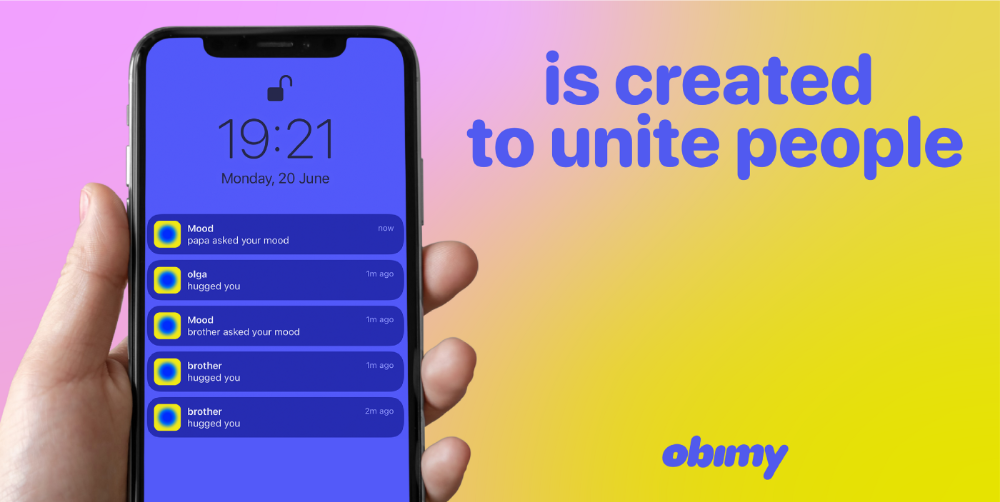
Hi! obimy's official account. Here, we'll teach app developers and marketers. In 2022, our downloads increased dramatically, so we'll share what we learned.
obimy is what we call a ‘senseger’. It's a new method to communicate digitally. Instead of text, obimy users connect through senses and moods. Feeling playful? Flirt with your partner, pat a pal, or dump water on a classmate. Each feeling is an interactive animation with vibration. It's a wordless app. App Store and Google Play have obimy.
We had 20,000 users in 2022. Two to five thousand of them opened the app monthly. Our DAU metric was 500.
We have 6 million users after 6 months. 500,000 individuals use obimy daily. obimy was the top lifestyle app this week in the U.S.
And TikTok helped.
TikTok fuels obimys' growth. It's why our app exploded. How and what did we learn? Our Head of Marketing, Anastasia Avramenko, knows.
our actions prior to TikTok
We wanted to achieve product-market fit through organic expansion. Quora, Reddit, Facebook Groups, Facebook Ads, Google Ads, Apple Search Ads, and social media activity were tested. Nothing worked. Our CPI was sometimes $4, so unit economics didn't work.
We studied our markets and made audience hypotheses. We promoted our goods and studied our audience through social media quizzes. Our target demographic was Americans in long-distance relationships. I designed quizzes like Test the Strength of Your Relationship to better understand the user base. After each quiz, we encouraged users to download the app to enhance their connection and bridge the distance.
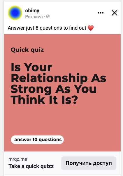
We got 1,000 responses for $50. This helped us comprehend the audience's grief and coping strategies (aka our rivals). I based action items on answers given. If you can't embrace a loved one, use obimy.
We also tried Facebook and Google ads. From the start, we knew it wouldn't work.
We were desperate to discover a free way to get more users.
Our journey to TikTok
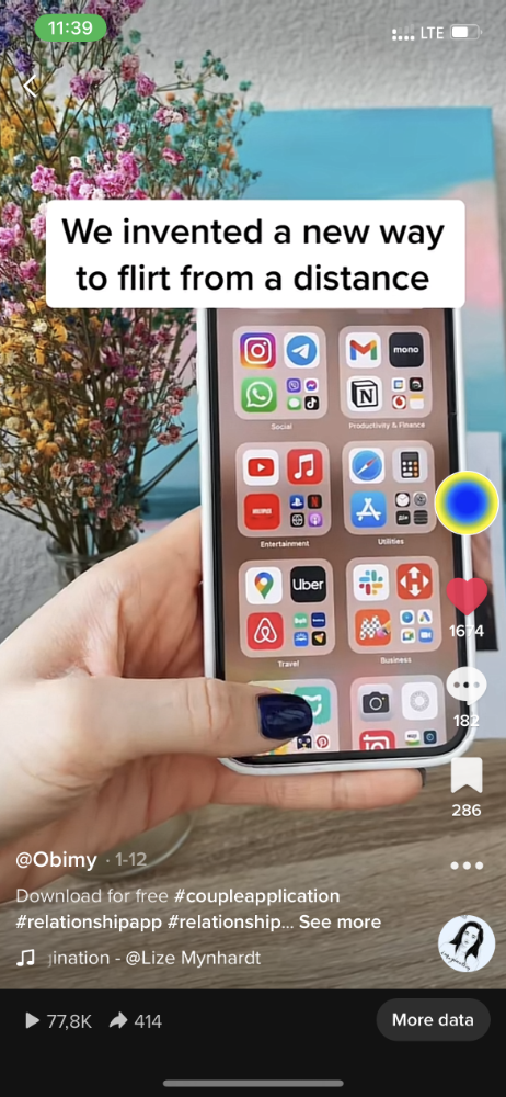
TikTok is a great venue for emerging creators. It also helped reach people. Before obimy, my TikTok videos garnered 12 million views without sponsored promotion.
We had to act. TikTok was required.
I wasn't a TikTok user before obimy. Initially, I uploaded promotional content. Call-to-actions appear strange next to dancing challenges and my money don't jiggle jiggle. I learned TikTok. Watch TikTok for an hour was on my to-do list. What a dream job!
Our most popular movies presented the app alongside text outlining what it does. We started promoting them in Europe and the U.S. and got a 16% CTR and $1 CPI, an improvement over our previous efforts.
Somehow, we were expanding. So we came up with new hypotheses, calls to action, and content.
Four months passed, yet we saw no organic growth.
Russia attacked Ukraine.
Our app aimed to be helpful. For now, we're focusing on our Ukrainian audience. I posted sloppy TikToks illustrating how obimy can help during shelling or air raids.
In two hours, Kostia sent me our visitor count. Our servers crashed.
Initially, we had several thousand daily users. Over 200,000 users joined obimy in a week. They posted obimy videos on TikTok, drawing additional users. We've also resumed U.S. video promotion.
We gained 2,000,000 new members with less than $100 in ads, primarily in the U.S. and U.K.
TikTok helped.
The figures
We were confident we'd chosen the ideal tool for organic growth.
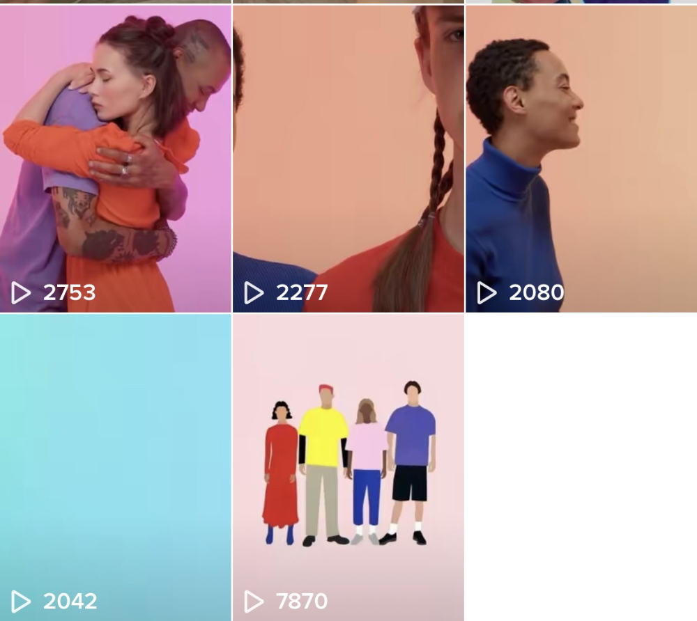
Over 45 million people have viewed our own videos plus a ton of user-generated content with the hashtag #obimy.
About 375 thousand people have liked all of our individual videos.
The number of downloads and the virality of videos are directly correlated.
Where are we now?
TikTok fuels our organic growth. We post 56 videos every week and pay to promote viral content.
We use UGC and influencers. We worked with Universal Music Italy on Eurovision. They offered to promote us through their million-follower TikTok influencers. We thought their followers would improve our audience, but it didn't matter. Integration didn't help us. Users that share obimy videos with their followers can reach several million views, which affects our download rate.
After the dust settled, we determined our key audience was 13-18-year-olds. They want to express themselves, but it's sometimes difficult. We're searching for methods to better engage with our users. We opened a Discord server to discuss anime and video games and gather app and content feedback.
TikTok helps us test product updates and hypotheses. Example: I once thought we might raise MAU by prompting users to add strangers as friends. Instead of asking our team to construct it, I made a TikTok urging users to share invite URLs. Users share links under every video we upload, embracing people worldwide.
Key lessons
Don't direct-sell. TikTok isn't for Instagram, Facebook, or YouTube promo videos. Conventional advertisements don't fit. Most users will swipe up and watch humorous doggos.
More product videos are better. Finally. So what?
Encourage interaction. Tagging friends in comments or making videos with the app promotes it more than any marketing spend.
Be odd and risqué. A user mistakenly sent a French kiss to their mom in one of our most popular videos.
TikTok helps test hypotheses and build your user base. It also helps develop apps. In our upcoming blog, we'll guide you through obimy's design revisions based on TikTok. Follow us on Twitter, Instagram, and TikTok.
You might also like

Greg Lim
3 years ago
How I made $160,000 from non-fiction books
I've sold over 40,000 non-fiction books on Amazon and made over $160,000 in six years while writing on the side.
I have a full-time job and three young sons; I can't spend 40 hours a week writing. This article describes my journey.
I write mainly tech books:
Thanks to my readers, many wrote positive evaluations. Several are bestsellers.
A few have been adopted by universities as textbooks:
My books' passive income allows me more time with my family.
Knowing I could quit my job and write full time gave me more confidence. And I find purpose in my work (i am in christian ministry).
I'm always eager to write. When work is a dread or something bad happens, writing gives me energy. Writing isn't scary. In fact, I can’t stop myself from writing!
Writing has also established my tech authority. Universities use my books, as I've said. Traditional publishers have asked me to write books.
These mindsets helped me become a successful nonfiction author:
1. You don’t have to be an Authority
Yes, I have computer science experience. But I'm no expert on my topics. Before authoring "Beginning Node.js, Express & MongoDB," my most profitable book, I had no experience with those topics. Node was a new server-side technology for me. Would that stop me from writing a book? It can. I liked learning a new technology. So I read the top three Node books, took the top online courses, and put them into my own book (which makes me know more than 90 percent of people already).
I didn't have to worry about using too much jargon because I was learning as I wrote. An expert forgets a beginner's hardship.
"The fellow learner can aid more than the master since he knows less," says C.S. Lewis. The problem he must explain is recent. The expert has forgotten.”
2. Solve a micro-problem (Niching down)
I didn't set out to write a definitive handbook. I found a market with several challenges and wrote one book. Ex:
- Instead of web development, what about web development using Angular?
- Instead of Blockchain, what about Blockchain using Solidity and React?
- Instead of cooking recipes, how about a recipe for a specific kind of diet?
- Instead of Learning math, what about Learning Singapore Math?
3. Piggy Backing Trends
The above topics may still be a competitive market. E.g. Angular, React. To stand out, include the latest technologies or trends in your book. Learn iOS 15 instead of iOS programming. Instead of personal finance, what about personal finance with NFTs.
Even though you're a newbie author, your topic is well-known.
4. Publish short books
My books are known for being direct. Many people like this:
Your reader will appreciate you cutting out the fluff and getting to the good stuff. A reader can finish and review your book.
Second, short books are easier to write. Instead of creating a 500-page book for $50 (which few will buy), write a 100-page book that answers a subset of the problem and sell it for less. (You make less, but that's another subject). At least it got published instead of languishing. Less time spent creating a book means less time wasted if it fails. Write a small-bets book portfolio like Daniel Vassallo!
Third, it's $2.99-$9.99 on Amazon (gets 70 percent royalties for ebooks). Anything less receives 35% royalties. $9.99 books have 20,000–30,000 words. If you write more and charge more over $9.99, you get 35% royalties. Why not make it a $9.99 book?
(This is the ebook version.) Paperbacks cost more. Higher royalties allow for higher prices.
5. Validate book idea
Amazon will tell you if your book concept, title, and related phrases are popular. See? Check its best-sellers list.
150,000 is preferable. It sells 2–3 copies daily. Consider your rivals. Profitable niches have high demand and low competition.
Don't be afraid of competitive niches. First, it shows high demand. Secondly, what are the ways you can undercut the completion? Better book? Or cheaper option? There was lots of competition in my NodeJS book's area. None received 4.5 stars or more. I wrote a NodeJS book. Today, it's a best-selling Node book.
What’s Next
So long. Part II follows. Meanwhile, I will continue to write more books!
Follow my journey on Twitter.
This post is a summary. Read full article here

Victoria Kurichenko
3 years ago
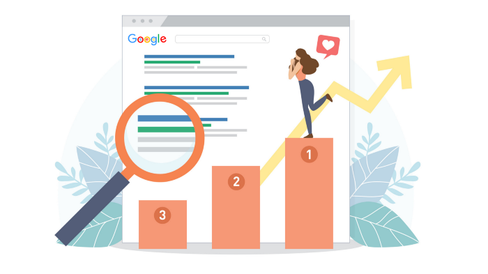
Updates From Google For Content Producers What You Should Know Is This
People-first update.
Every Google upgrade causes website owners to panic.
Some have just recovered from previous algorithm tweaks and resumed content development.
If you follow Google's Webmaster rules, you shouldn't fear its adjustments.
Everyone has a view of them. Miscommunication and confusion result.
Now, for some (hopefully) exciting news.
Google tweeted on August 18, 2022 about a fresh content update.
This change is another Google effort to remove low-quality, repetitive, and AI-generated content.
The algorithm generates and analyzes search results, not humans.
Google spends a lot to teach its algorithm what searchers want. Intent isn't always clear.
Google's content update aims to:
“… ensure people see more original, helpful content written by people, for people, in search results.”
Isn't it a noble goal?
However, what does it mean for content creators and website owners?
How can you ensure you’re creating content that will be successful after the updates roll out?
Let's first define people-first content.
What does "people-first-content" mean?
If asked, I'd say information written to answer queries and solve problems.
Like others, I read it from the term.
Content creators and marketers disagree. They need more information to follow recommendations.
Google gives explicit instructions for creating people-first content.
According to Google, if you answer yes to the following questions, you have a people-first attitude.
Do you have customers who might find your content useful if they contacted you directly?
Does your content show the breadth of your knowledge?
Do you have a niche or a focus for your website?
After reading your content, will readers learn something new to aid them in achieving their goals?
Are readers happy after reading your content?
Have you been adhering to Google's fundamental updates and product reviews?
As an SEO writer, I'm not scared.
I’ve been following these rules consciously while creating content for my website. That’s why it’s been steadily growing despite me publishing just one or two stories a month.
If you avoid AI-generated text and redundant, shallow material, your website won't suffer.
If you use unscrupulous methods to boost your website's traffic, including link buying or keyword stuffing, stop. Google is getting smarter and will find and punish your site eventually.
For those who say, “SEO is no longer working,” I dedicated the whole paragraph below.
This does not imply that SEO is obsolete.
Google:
“People-first content creators focus on creating satisfying content, while also utilizing SEO best practices to bring searchers additional value.”
The official helpful content update page lists two people-first content components:
meeting user needs
best practices for SEO
Always read official guidelines, not unsolicited suggestions.
SEO will work till search engines die.
How to use the update
Google said the changes will arrive in August 2022.
They pledged to post updates on Google's search ranking updates page.
Google also tweets this info. If you haven't followed it already, I recommend it.
Ranking adjustments could take two weeks and will affect English searches internationally initially.
Google affirmed plans to extend to other languages.
If you own a website, monitor your rankings and traffic to see if it's affected.

The woman
3 years ago
Why Google's Hiring Process is Brilliant for Top Tech Talent
Without a degree and experience, you can get a high-paying tech job.

Most organizations follow this hiring rule: you chat with HR, interview with your future boss and other senior managers, and they make the final hiring choice.
If you've ever applied for a job, you know how arduous it can be. A newly snapped photo and a glossy resume template can wear you out. Applying to Google can change this experience.
According to an Universum report, Google is one of the world's most coveted employers. It's not simply the search giant's name and reputation that attract candidates, but its role requirements or lack thereof.
Candidates no longer need a beautiful resume, cover letter, Ivy League laurels, or years of direct experience. The company requires no degree or experience.
Elon Musk started it. He employed the two-hands test to uncover talented non-graduates. The billionaire eliminated the requirement for experience.
Google is deconstructing traditional employment with programs like the Google Project Management Degree, a free online and self-paced professional credential course.
Google's hiring is interesting. After its certification course, applicants can work in project management. Instead of academic degrees and experience, the company analyzes coursework.
Google finds the best project managers and technical staff in exchange. Google uses three strategies to find top talent.
Chase down the innovators
Google eliminates restrictions like education, experience, and others to find the polar bear amid the snowfall. Google's free project management education makes project manager responsibilities accessible to everyone.
Many jobs don't require a degree. Overlooking individuals without a degree can make it difficult to locate a candidate who can provide value to a firm.
Firsthand knowledge follows the same rule. A lack of past information might be an employer's benefit. This is true for creative teams or businesses that prefer to innovate.
Or when corporations conduct differently from the competition. No-experience candidates can offer fresh perspectives. Fast Company reports that people with no sales experience beat those with 10 to 15 years of experience.
Give the aptitude test first priority.
Google wants the best candidates. Google wouldn't be able to receive more applications if it couldn't screen them for fit. Its well-organized online training program can be utilized as a portfolio.
Google learns a lot about an applicant through completed assignments. It reveals their ability, leadership style, communication capability, etc. The course mimics the job to assess candidates' suitability.
Basic screening questions might provide information to compare candidates. Any size small business can use screening questions and test projects to evaluate prospective employees.
Effective training for employees
Businesses must train employees regardless of their hiring purpose. Formal education and prior experience don't guarantee success. Maintaining your employees' professional knowledge gaps is key to their productivity and happiness. Top-notch training can do that. Learning and development are key to employee engagement, says Bob Nelson, author of 1,001 Ways to Engage Employees.
Google's online certification program isn't available everywhere. Improving the recruiting process means emphasizing aptitude over experience and a degree. Instead of employing new personnel and having them work the way their former firm trained them, train them how you want them to function.
If you want to know more about Google’s recruiting process, we recommend you watch the movie “Internship.”