

What An Inverted Yield Curve Means For Investors
The yield spread between 10-year and 2-year US Treasury bonds has fallen below 0.2 percent, its lowest level since March 2020. A flattening or negative yield curve can be a bad sign for the economy.
What Is An Inverted Yield Curve?
In the yield curve, bonds of equal credit quality but different maturities are plotted. The most commonly used yield curve for US investors is a plot of 2-year and 10-year Treasury yields, which have yet to invert.
A typical yield curve has higher interest rates for future maturities. In a flat yield curve, short-term and long-term yields are similar. Inverted yield curves occur when short-term yields exceed long-term yields. Inversions of yield curves have historically occurred during recessions.
Inverted yield curves have preceded each of the past eight US recessions. The good news is they're far leading indicators, meaning a recession is likely not imminent.
Every US recession since 1955 has occurred between six and 24 months after an inversion of the two-year and 10-year Treasury yield curves, according to the San Francisco Fed. So, six months before COVID-19, the yield curve inverted in August 2019.
Looking Ahead
The spread between two-year and 10-year Treasury yields was 0.18 percent on Tuesday, the smallest since before the last US recession. If the graph above continues, a two-year/10-year yield curve inversion could occur within the next few months.
According to Bank of America analyst Stephen Suttmeier, the S&P 500 typically peaks six to seven months after the 2s-10s yield curve inverts, and the US economy enters recession six to seven months later.
Investors appear unconcerned about the flattening yield curve. This is in contrast to the iShares 20+ Year Treasury Bond ETF TLT +2.19% which was down 1% on Tuesday.
Inversion of the yield curve and rising interest rates have historically harmed stocks. Recessions in the US have historically coincided with or followed the end of a Federal Reserve rate hike cycle, not the start.
More on Economics & Investing

Trevor Stark
3 years ago
Economics is complete nonsense.
Mainstream economics haven't noticed.

What come to mind when I say the word "economics"?
Probably GDP, unemployment, and inflation.
If you've ever watched the news or listened to an economist, they'll use data like these to defend a political goal.
The issue is that these statistics are total bunk.
I'm being provocative, but I mean it:
The economy is not measured by GDP.
How many people are unemployed is not counted in the unemployment rate.
Inflation is not measured by the CPI.
All orthodox economists' major economic statistics are either wrong or falsified.
Government institutions create all these stats. The administration wants to reassure citizens the economy is doing well.
GDP does not reflect economic expansion.
GDP measures a country's economic size and growth. It’s calculated by the BEA, a government agency.
The US has the world's largest (self-reported) GDP, growing 2-3% annually.
If GDP rises, the economy is healthy, say economists.
Why is the GDP flawed?
GDP measures a country's yearly spending.
The government may adjust this to make the economy look good.
GDP = C + G + I + NX
C = Consumer Spending
G = Government Spending
I = Investments (Equipment, inventories, housing, etc.)
NX = Exports minus Imports
GDP is a country's annual spending.
The government can print money to boost GDP. The government has a motive to increase and manage GDP.
Because government expenditure is part of GDP, printing money and spending it on anything will raise GDP.
They've done this. Since 1950, US government spending has grown 8% annually, faster than GDP.
In 2022, government spending accounted for 44% of GDP. It's the highest since WWII. In 1790-1910, it was 3% of GDP.
Who cares?
The economy isn't only spending. Focus on citizens' purchasing power or quality of life.
Since GDP just measures spending, the government can print money to boost GDP.
Even if Americans are poorer than last year, economists can say GDP is up and everything is fine.
How many people are unemployed is not counted in the unemployment rate.
The unemployment rate measures a country's labor market. If unemployment is high, people aren't doing well economically.
The BLS estimates the (self-reported) unemployment rate as 3-4%.
Why is the unemployment rate so high?
The US government surveys 100k persons to measure unemployment. They extrapolate this data for the country.
They come into 3 categories:
Employed
People with jobs are employed … duh.
Unemployed
People who are “jobless, looking for a job, and available for work” are unemployed
Not in the labor force
The “labor force” is the employed + the unemployed.
The unemployment rate is the percentage of unemployed workers.
Problem is unemployed definition. You must actively seek work to be considered unemployed.
You're no longer unemployed if you haven't interviewed in 4 weeks.
This shit makes no goddamn sense.
Why does this matter?
You can't interview if there are no positions available. You're no longer unemployed after 4 weeks.
In 1994, the BLS redefined "unemployed" to exclude discouraged workers.
If you haven't interviewed in 4 weeks, you're no longer counted in the unemployment rate.
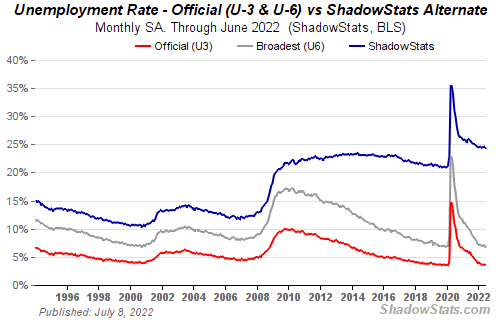
If unemployment were measured by total unemployed, it would be 25%.
Because the government wants to keep the unemployment rate low, they modify the definition.
If every US resident was unemployed and had no job interviews, economists would declare 0% unemployment. Excellent!
Inflation is not measured by the CPI.
The BLS measures CPI. This month was the highest since 1981.
CPI measures the cost of a basket of products across time. Food, energy, shelter, and clothes are included.
A 9.1% CPI means the basket of items is 9.1% more expensive.
What is the CPI problem?
Here's a more detailed explanation of CPI's flaws.
In summary, CPI is manipulated to be understated.
Housing costs are understated to manipulate CPI. Housing accounts for 33% of the CPI because it's the biggest expense for most people.
This signifies it's the biggest CPI weight.
Rather than using actual house prices, the Bureau of Labor Statistics essentially makes shit up. You can read more about the process here.
Surprise! It’s bullshit
The BLS stated Shelter's price rose 5.5% this month.
House prices are up 11-21%. (Source 1, Source 2, Source 3)
Rents are up 14-26%. (Source 1, Source 2)
Why is this important?
If CPI included housing prices, it would be 12-15 percent this month, not 9.1 percent.
9% inflation is nuts. Your money's value halves every 7 years at 9% inflation.
Worse is 15% inflation. Your money halves every 4 years at 15% inflation.
If everyone realized they needed to double their wage every 4-5 years to stay wealthy, there would be riots.
Inflation drains our money's value so the government can keep printing it.
The Solution
Most individuals know the existing system doesn't work, but can't explain why.
People work hard yet lag behind. The government lies about the economy's data.
In reality:
GDP has been down since 2008
25% of Americans are unemployed
Inflation is actually 15%
People might join together to vote out kleptocratic politicians if they knew the reality.
Having reliable economic data is the first step.
People can't understand the situation without sufficient information. Instead of immigrants or billionaires, people would blame liar politicians.
Here’s the vision:
A decentralized, transparent, and global dashboard that tracks economic data like GDP, unemployment, and inflation for every country on Earth.
Government incentives influence economic statistics.
ShadowStats has already started this effort, but the calculations must be transparent, decentralized, and global to be effective.
If interested, email me at trevorstark02@gmail.com.
Here are some links to further your research:

Sam Hickmann
3 years ago
What is this Fed interest rate everybody is talking about that makes or breaks the stock market?
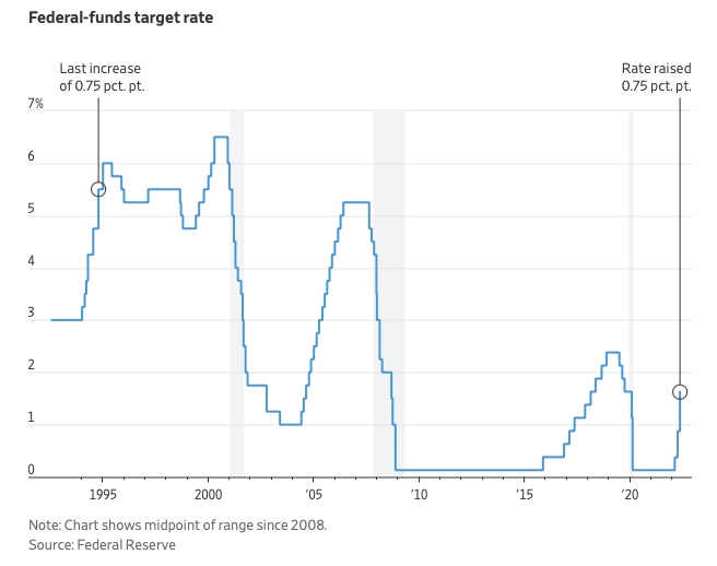
The Federal Funds Rate (FFR) is the target interest rate set by the Federal Reserve System (Fed)'s policy-making body (FOMC). This target is the rate at which the Fed suggests commercial banks borrow and lend their excess reserves overnight to each other.
The FOMC meets 8 times a year to set the target FFR. This is supposed to promote economic growth. The overnight lending market sets the actual rate based on commercial banks' short-term reserves. If the market strays too far, the Fed intervenes.
Banks must keep a certain percentage of their deposits in a Federal Reserve account. A bank's reserve requirement is a percentage of its total deposits. End-of-day bank account balances averaged over two-week reserve maintenance periods are used to determine reserve requirements.
If a bank expects to have end-of-day balances above what's needed, it can lend the excess to another institution.
The FOMC adjusts interest rates based on economic indicators that show inflation, recession, or other issues that affect economic growth. Core inflation and durable goods orders are indicators.
In response to economic conditions, the FFR target has changed over time. In the early 1980s, inflation pushed it to 20%. During the Great Recession of 2007-2009, the rate was slashed to 0.15 percent to encourage growth.
Inflation picked up in May 2022 despite earlier rate hikes, prompting today's 0.75 percent point increase. The largest increase since 1994. It might rise to around 3.375% this year and 3.1% by the end of 2024.

Theresa W. Carey
3 years ago
How Payment for Order Flow (PFOF) Works
What is PFOF?
PFOF is a brokerage firm's compensation for directing orders to different parties for trade execution. The brokerage firm receives fractions of a penny per share for directing the order to a market maker.
Each optionable stock could have thousands of contracts, so market makers dominate options trades. Order flow payments average less than $0.50 per option contract.
Order Flow Payments (PFOF) Explained
The proliferation of exchanges and electronic communication networks has complicated equity and options trading (ECNs) Ironically, Bernard Madoff, the Ponzi schemer, pioneered pay-for-order-flow.
In a December 2000 study on PFOF, the SEC said, "Payment for order flow is a method of transferring trading profits from market making to brokers who route customer orders to specialists for execution."
Given the complexity of trading thousands of stocks on multiple exchanges, market making has grown. Market makers are large firms that specialize in a set of stocks and options, maintaining an inventory of shares and contracts for buyers and sellers. Market makers are paid the bid-ask spread. Spreads have narrowed since 2001, when exchanges switched to decimals. A market maker's ability to play both sides of trades is key to profitability.
Benefits, requirements
A broker receives fees from a third party for order flow, sometimes without a client's knowledge. This invites conflicts of interest and criticism. Regulation NMS from 2005 requires brokers to disclose their policies and financial relationships with market makers.
Your broker must tell you if it's paid to send your orders to specific parties. This must be done at account opening and annually. The firm must disclose whether it participates in payment-for-order-flow and, upon request, every paid order. Brokerage clients can request payment data on specific transactions, but the response takes weeks.
Order flow payments save money. Smaller brokerage firms can benefit from routing orders through market makers and getting paid. This allows brokerage firms to send their orders to another firm to be executed with other orders, reducing costs. The market maker or exchange benefits from additional share volume, so it pays brokerage firms to direct traffic.
Retail investors, who lack bargaining power, may benefit from order-filling competition. Arrangements to steer the business in one direction invite wrongdoing, which can erode investor confidence in financial markets and their players.
Pay-for-order-flow criticism
It has always been controversial. Several firms offering zero-commission trades in the late 1990s routed orders to untrustworthy market makers. During the end of fractional pricing, the smallest stock spread was $0.125. Options spreads widened. Traders found that some of their "free" trades cost them a lot because they weren't getting the best price.
The SEC then studied the issue, focusing on options trades, and nearly decided to ban PFOF. The proliferation of options exchanges narrowed spreads because there was more competition for executing orders. Options market makers said their services provided liquidity. In its conclusion, the report said, "While increased multiple-listing produced immediate economic benefits to investors in the form of narrower quotes and effective spreads, these improvements have been muted with the spread of payment for order flow and internalization."
The SEC allowed payment for order flow to continue to prevent exchanges from gaining monopoly power. What would happen to trades if the practice was outlawed was also unclear. SEC requires brokers to disclose financial arrangements with market makers. Since then, the SEC has watched closely.
2020 Order Flow Payment
Rule 605 and Rule 606 show execution quality and order flow payment statistics on a broker's website. Despite being required by the SEC, these reports can be hard to find. The SEC mandated these reports in 2005, but the format and reporting requirements have changed over the years, most recently in 2018.
Brokers and market makers formed a working group with the Financial Information Forum (FIF) to standardize order execution quality reporting. Only one retail brokerage (Fidelity) and one market maker remain (Two Sigma Securities). FIF notes that the 605/606 reports "do not provide the level of information that allows a retail investor to gauge how well a broker-dealer fills a retail order compared to the NBBO (national best bid or offer’) at the time the order was received by the executing broker-dealer."
In the first quarter of 2020, Rule 606 reporting changed to require brokers to report net payments from market makers for S&P 500 and non-S&P 500 equity trades and options trades. Brokers must disclose payment rates per 100 shares by order type (market orders, marketable limit orders, non-marketable limit orders, and other orders).
Richard Repetto, Managing Director of New York-based Piper Sandler & Co., publishes a report on Rule 606 broker reports. Repetto focused on Charles Schwab, TD Ameritrade, E-TRADE, and Robinhood in Q2 2020. Repetto reported that payment for order flow was higher in the second quarter than the first due to increased trading activity, and that options paid more than equities.
Repetto says PFOF contributions rose overall. Schwab has the lowest options rates, while TD Ameritrade and Robinhood have the highest. Robinhood had the highest equity rating. Repetto assumes Robinhood's ability to charge higher PFOF reflects their order flow profitability and that they receive a fixed rate per spread (vs. a fixed rate per share by the other brokers).
Robinhood's PFOF in equities and options grew the most quarter-over-quarter of the four brokers Piper Sandler analyzed, as did their implied volumes. All four brokers saw higher PFOF rates.
TD Ameritrade took the biggest income hit when cutting trading commissions in fall 2019, and this report shows they're trying to make up the shortfall by routing orders for additional PFOF. Robinhood refuses to disclose trading statistics using the same metrics as the rest of the industry, offering only a vague explanation on their website.
Summary
Payment for order flow has become a major source of revenue as brokers offer no-commission equity (stock and ETF) orders. For retail investors, payment for order flow poses a problem because the brokerage may route orders to a market maker for its own benefit, not the investor's.
Infrequent or small-volume traders may not notice their broker's PFOF practices. Frequent traders and those who trade larger quantities should learn about their broker's order routing system to ensure they're not losing out on price improvement due to a broker prioritizing payment for order flow.
This post is a summary. Read full article here
You might also like

Amelie Carver
3 years ago
Web3 Needs More Writers to Educate Us About It
WRITE FOR THE WEB3
Why web3’s messaging is lost and how crypto winter is growing growth seeds
People interested in crypto, blockchain, and web3 typically read Bitcoin and Ethereum's white papers. It's a good idea. Documents produced for developers and academia aren't always the ideal resource for beginners.
Given the surge of extremely technical material and the number of fly-by-nights, rug pulls, and other scams, it's little wonder mainstream audiences regard the blockchain sector as an expensive sideshow act.
What's the solution?
Web3 needs more than just builders.
After joining TikTok, I followed Amy Suto of SutoScience. Amy switched from TV scriptwriting to IT copywriting years ago. She concentrates on web3 now. Decentralized autonomous organizations (DAOs) are seeking skilled copywriters for web3.
Amy has found that web3's basics are easy to grasp; you don't need technical knowledge. There's a paradigm shift in knowing the basics; be persistent and patient.
Apple is positioning itself as a data privacy advocate, leveraging web3's zero-trust ethos on data ownership.
Finn Lobsien, who writes about web3 copywriting for the Mirror and Twitter, agrees: acronyms and abstractions won't do.
Web3 preached to the choir. Curious newcomers have only found whitepapers and scams when trying to learn why the community loves it. No wonder people resist education and buy-in.
Due to the gender gap in crypto (Crypto Bro is not just a stereotype), it attracts people singing to the choir or trying to cash in on the next big thing.
Last year, the industry was booming, so writing wasn't necessary. Now that the bear market has returned (for everyone, but especially web3), holding readers' attention is a valuable skill.
White papers and the Web3
Why does web3 rely so much on non-growth content?
Businesses must polish and improve their messaging moving into the 2022 recession. The 2021 tech boom provided such a sense of affluence and (unsustainable) growth that no one needed great marketing material. The market found them.
This was especially true for web3 and the first-time crypto believers. Obviously. If they knew which was good.
White papers help. White papers are highly technical texts that walk a reader through a product's details. How Does a White Paper Help Your Business and That White Paper Guy discuss them.
They're meant for knowledgeable readers. Investors and the technical (academic/developer) community read web3 white papers. White papers are used when a product is extremely technical or difficult to assist an informed reader to a conclusion. Web3 uses them most often for ICOs (initial coin offerings).

White papers for web3 education help newcomers learn about the web3 industry's components. It's like sending a first-grader to the Annotated Oxford English Dictionary to learn to read. It's a reference, not a learning tool, for words.
Newcomers can use platforms that teach the basics. These included Coinbase's Crypto Basics tutorials or Cryptochicks Academy, founded by the mother of Ethereum's inventor to get more women utilizing and working in crypto.
Discord and Web3 communities
Discord communities are web3's opposite. Discord communities involve personal communications and group involvement.
Online audience growth begins with community building. User personas prefer 1000 dedicated admirers over 1 million lukewarm followers, and the language is much more easygoing. Discord groups are renowned for phishing scams, compromised wallets, and incorrect information, especially since the crypto crisis.
White papers and Discord increase industry insularity. White papers are complicated, and Discord has a high risk threshold.
Web3 and writing ads
Copywriting is emotional, but white papers are logical. It uses the brain's quick-decision centers. It's meant to make the reader invest immediately.
Not bad. People think sales are sleazy, but they can spot the poor things.
Ethical copywriting helps you reach the correct audience. People who gain a following on Medium are likely to have copywriting training and a readership (or three) in mind when they publish. Tim Denning and Sinem Günel know how to identify a target audience and make them want to learn more.
In a fast-moving market, copywriting is less about long-form content like sales pages or blogs, but many organizations do. Instead, the copy is concise, individualized, and high-value. Tweets, email marketing, and IM apps (Discord, Telegram, Slack to a lesser extent) keep engagement high.
What does web3's messaging lack? As DAOs add stricter copyrighting, narrative and connecting tales seem to be missing.
Web3 is passionate about constructing the next internet. Now, they can connect their passion to a specific audience so newcomers understand why.

nft now
3 years ago
A Guide to VeeFriends and Series 2
VeeFriends is one of the most popular and unique NFT collections. VeeFriends launched around the same time as other PFP NFTs like Bored Ape Yacht Club.
Vaynerchuk (GaryVee) took a unique approach to his large-scale project, which has influenced the NFT ecosystem. GaryVee's VeeFriends is one of the most successful NFT membership use-cases, allowing him to build a community around his creative and business passions.
What is VeeFriends?
GaryVee's NFT collection, VeeFriends, was released on May 11, 2021. VeeFriends [Mini Drops], Book Games, and a forthcoming large-scale "Series 2" collection all stem from the initial drop of 10,255 tokens.
In "Series 1," there are G.O.O. tokens (Gary Originally Owned). GaryVee reserved 1,242 NFTs (over 12% of the supply) for his own collection, so only 9,013 were available at the Series 1 launch.
Each Series 1 token represents one of 268 human traits hand-drawn by Vaynerchuk. Gary Vee's NFTs offer owners incentives.
Who made VeeFriends?
Gary Vaynerchuk, AKA GaryVee, is influential in NFT. Vaynerchuk is the chairman of New York-based communications company VaynerX. Gary Vee, CEO of VaynerMedia, VaynerSports, and bestselling author, is worth $200 million.
GaryVee went from NFT collector to creator, launching VaynerNFT to help celebrities and brands.
Vaynerchuk's influence spans the NFT ecosystem as one of its most prolific voices. He's one of the most influential NFT figures, and his VeeFriends ecosystem keeps growing.
Vaynerchuk, a trend expert, thinks NFTs will be around for the rest of his life and VeeFriends will be a landmark project.
Why use VeeFriends NFTs?
The first VeeFriends collection has sold nearly $160 million via OpenSea. GaryVee insisted that the first 10,255 VeeFriends were just the beginning.
Book Games were announced to the VeeFriends community in August 2021. Mini Drops joined VeeFriends two months later.
Book Games
GaryVee's book "Twelve and a Half: Leveraging the Emotional Ingredients for Business Success" inspired Book Games. Even prior to the announcement Vaynerchuk had mapped out the utility of the book on an NFT scale. Book Games tied his book to the VeeFriends ecosystem and solidified its place in the collection.
GaryVee says Book Games is a layer 2 NFT project with 125,000 burnable tokens. Vaynerchuk's NFT fans were incentivized to buy as many copies of his new book as possible to receive NFT rewards later.
First, a bit about “layer 2.”
Layer 2 blockchain solutions help scale applications by routing transactions away from Ethereum Mainnet (layer 1). These solutions benefit from Mainnet's decentralized security model but increase transaction speed and reduce gas fees.
Polygon (integrated into OpenSea) and Immutable X are popular Ethereum layer 2 solutions. GaryVee chose Immutable X to reduce gas costs (transaction fees). Given the large supply of Book Games tokens, this decision will likely benefit the VeeFriends community, especially if the games run forever.
What's the strategy?
The VeeFriends patriarch announced on Aug. 27, 2021, that for every 12 books ordered during the Book Games promotion, customers would receive one NFT via airdrop. After nearly 100 days, GV sold over a million copies and announced that Book Games would go gamified on Jan. 10, 2022.
Immutable X's trading options make Book Games a "game." Book Games players can trade NFTs for other NFTs, sports cards, VeeCon tickets, and other prizes. Book Games can also whitelist other VeeFirends projects, which we'll cover in Series 2.
VeeFriends Mini Drops
GaryVee launched VeeFriends Mini Drops two months after Book Games, focusing on collaboration, scarcity, and the characters' "cultural longevity."
Spooky Vees, a collection of 31 1/1 Halloween-themed VeeFriends, was released on Halloween. First-come, first-served VeeFriend owners could claim these NFTs.
Mini Drops includes Gift Goat NFTs. By holding the Gift Goat VeeFriends character, collectors will receive 18 exclusive gifts curated by GaryVee and the team. Each gifting experience includes one physical gift and one NFT out of 555, to match the 555 Gift Goat tokens.
Gift Goat holders have gotten NFTs from Danny Cole (Creature World), Isaac "Drift" Wright (Where My Vans Go), Pop Wonder, and more.
GaryVee is poised to release the largest expansion of the VeeFriends and VaynerNFT ecosystem to date with VeeFriends Series 2.
VeeCon 101
By owning VeeFriends NFTs, collectors can join the VeeFriends community and attend VeeCon in 2022. The conference is only open to VeeCon NFT ticket holders (VeeFreinds + possibly more TBA) and will feature Beeple, Steve Aoki, and even Snoop Dogg.
The VeeFreinds floor in 2022 Q1 has remained at 16 ETH ($52,000), making VeeCon unattainable for most NFT enthusiasts. Why would someone spend that much crypto on a Minneapolis "superconference" ticket? Because of Gary Vaynerchuk.
Everything to know about VeeFriends Series 2
Vaynerchuk revealed in April 2022 that the VeeFriends ecosystem will grow by 55,555 NFTs after months of teasing.
With VeeFriends Series 2, each token will cost $995 USD in ETH, allowing NFT enthusiasts to join at a lower cost. The new series will be released on multiple dates in April.
Book Games NFT holders on the Friends List (whitelist) can mint Series 2 NFTs on April 12. Book Games holders have 32,000 NFTs.
VeeFriends Series 1 NFT holders can claim Series 2 NFTs on April 12. This allotment's supply is 10,255, like Series 1's.
On April 25, the public can buy 10,000 Series 2 NFTs. Unminted Friends List NFTs will be sold on this date, so this number may change.
The VeeFriends ecosystem will add 15 new characters (220 tokens each) on April 27. One character will be released per day for 15 days, and the only way to get one is to enter a daily raffle with Book Games tokens.
Series 2 NFTs won't give owners VeeCon access, but they will offer other benefits within the VaynerNFT ecosystem. Book Games and Series 2 will get new token burn mechanics in the upcoming drop.
Visit the VeeFriends blog for the latest collection info.
Where can you buy Gary Vee’s NFTs?
Need a VeeFriend NFT? Gary Vee recommends doing "50 hours of homework" before buying. OpenSea sells VeeFriends NFTs.

Josef Cruz
3 years ago
My friend worked in a startup scam that preys on slothful individuals.
He explained everything.
A drinking buddy confessed. Alexander. He says he works at a startup based on a scam, which appears too clever to be a lie.
Alexander (assuming he developed the story) or the startup's creator must have been a genius.
This is the story of an Internet scam that targets older individuals and generates tens of millions of dollars annually.
The business sells authentic things at 10% of their market value. This firm cannot be lucrative, but the entrepreneur has a plan: monthly subscriptions to a worthless service.
The firm can then charge the customer's credit card to settle the gap. The buyer must subscribe without knowing it. What's their strategy?
How does the con operate?
Imagine a website with a split homepage. On one page, the site offers an attractive goods at a ridiculous price (from 1 euro to 10% of the product's market worth).
Same product, but with a stupid monthly subscription. Business is unsustainable. They buy overpriced products and resell them too cheaply, hoping customers will subscribe to a useless service.
No customer will want this service. So they create another illegal homepage that hides the monthly subscription offer. After an endless scroll, a box says Yes, I want to subscribe to a service that costs x dollars per month.
Unchecking the checkbox bugs. When a customer buys a product on this page, he's enrolled in a monthly subscription. Not everyone should see it because it's illegal. So what does the startup do?
A page that varies based on the sort of website visitor, a possible consumer or someone who might be watching the startup's business
Startup technicians make sure the legal page is displayed when the site is accessed normally. Typing the web address in the browser, using Google, etc. The page crashes when buying a goods, preventing the purchase.
This avoids the startup from selling a product at a loss because the buyer won't subscribe to the worthless service and charge their credit card each month.
The illegal page only appears if a customer clicks on a Google ad, indicating interest in the offer.
Alexander says that a banker, police officer, or anyone else who visits the site (maybe for control) will only see a valid and buggy site as purchases won't be possible.
The latter will go to the site in the regular method (by typing the address in the browser, using Google, etc.) and not via an online ad.
Those who visit from ads are likely already lured by the site's price. They'll be sent to an illegal page that requires a subscription.
Laziness is humanity's secret weapon. The ordinary person ignores tiny monthly credit card charges. The subscription lasts around a year before the customer sees an unexpected deduction.
After-sales service (ASS) is useful in this situation.
After-sales assistance begins when a customer notices slight changes on his credit card, usually a year later.
The customer will search Google for the direct debit reference. How he'll complain to after-sales service.
It's crucial that ASS appears in the top 4/5 Google search results. This site must be clear, and offer chat, phone, etc., he argues.
The pigeon must be comforted after waking up. The customer learns via after-sales service that he subscribed to a service while buying the product, which justifies the debits on his card.
The customer will then clarify that he didn't intend to make the direct debits. The after-sales care professional will pretend to listen to the customer's arguments and complaints, then offer to unsubscribe him for free because his predicament has affected him.
In 99% of cases, the consumer is satisfied since the after-sales support unsubscribed him for free, and he forgets the debited amounts.
The remaining 1% is split between 0.99% who are delighted to be reimbursed and 0.01%. We'll pay until they're done. The customer should be delighted, not object or complain, and keep us beneath the radar (their situation is resolved, the rest, they don’t care).
It works, so we expand our thinking.
Startup has considered industrialization. Since this fraud is working, try another. Automate! So they used a site generator (only for product modifications), underpaid phone operators for after-sales service, and interns for fresh product ideas.
The company employed a data scientist. This has allowed the startup to recognize that specific customer profiles can be re-registered in the database and that it will take X months before they realize they're subscribing to a worthless service. Customers are re-subscribed to another service, then unsubscribed before realizing it.
Alexander took months to realize the deception and leave. Lawyers and others apparently threatened him and former colleagues who tried to talk about it.
The startup would have earned prizes and competed in contests. He adds they can provide evidence to any consumer group, media, police/gendarmerie, or relevant body. When I submitted my information to the FBI, I was told, "We know, we can't do much.", he says.