


More on Entrepreneurship/Creators

Rachel Greenberg
3 years ago
The Unsettling Fact VC-Backed Entrepreneurs Don't Want You to Know
What they'll do is scarier.

My acquaintance recently joined a VC-funded startup. Money, equity, and upside possibilities were nice, but he had a nagging dread.
They just secured a $40M round and are hiring like crazy to prepare for their IPO in two years. All signals pointed to this startup's (a B2B IT business in a stable industry) success, and its equity-holding workers wouldn't pass that up.
Five months after starting the work, my friend struggled with leaving. We might overlook the awful culture and long hours at the proper price. This price plus the company's fate and survival abilities sent my friend departing in an unpleasant unplanned resignation before jumping on yet another sinking ship.
This affects founders. This affects VC-backed companies (and all businesses). This affects anyone starting, buying, or running a business.
Here's the under-the-table approach that's draining VC capital, leaving staff terrified (or jobless), founders rattled, and investors upset. How to recognize, solve, and avoid it
The unsettling reality behind door #1
You can't raise money off just your looks, right? If "looks" means your founding team's expertise, then maybe. In my friend's case, the founding team's strong qualifications and track records won over investors before talking figures.
They're hardly the only startup to raise money without a profitable customer acquisition strategy. Another firm raised money for an expensive sleep product because it's eco-friendly. They were off to the races with a few keywords and key players.
Both companies, along with numerous others, elected to invest on product development first. Company A employed all the tech, then courted half their market (they’re a tech marketplace that connects two parties). Company B spent millions on R&D to create a palatable product, then flooded the world with marketing.
My friend is on Company B's financial team, and he's seen where they've gone wrong. It's terrible.
Company A (tech market): Growing? Not quite. To achieve the ambitious expansion they (and their investors) demand, they've poured much of their little capital into salespeople: Cold-calling commission and salary salesmen. Is it working? Considering attrition and companies' dwindling capital, I don't think so.
Company B (green sleep) has been hiring, digital marketing, and opening new stores like crazy. Growing expenses should result in growing revenues and a favorable return on investment; if you grow too rapidly, you may neglect to check that ROI.
Once Company A cut headcount and Company B declared “going concerned”, my friend realized both startups had the same ailment and didn't recognize it.
I shouldn't have to ask a friend to verify a company's cash reserves and profitability to spot a financial problem. It happened anyhow.
The frightening part isn't that investors were willing to invest millions without product-market fit, CAC, or LTV estimates. That's alarming, but not as scary as the fact that startups aren't understanding the problem until VC rounds have dried up.
When they question consultants if their company will be around in 6 months. It’s a red flag. How will they stretch $20M through a 2-year recession with a $3M/month burn rate and no profitability? Alarms go off.
Who's in danger?
In a word, everyone who raised money without a profitable client acquisition strategy or enough resources to ride out dry spells.
Money mismanagement and poor priorities affect every industry (like sinking all your capital into your product, team, or tech, at the expense of probing what customer acquisition really takes and looks like).
This isn't about tech, real estate, or recession-proof luxury products. Fast, cheap, easy money flows into flashy-looking teams with buzzwords, trending industries, and attractive credentials.
If these companies can't show progress or get a profitable CAC, they can't raise more money. They die if they can't raise more money (or slash headcount and find shoestring budget solutions until they solve the real problem).
The kiss of death (and how to avoid it)
If you're running a startup and think raising VC is the answer, pause and evaluate. Do you need the money now?
I'm not saying VC is terrible or has no role. Founders have used it as a Band-Aid for larger, pervasive problems. Venture cash isn't a crutch for recruiting consumers profitably; it's rocket fuel to get you what and who you need.
Pay-to-play isn't a way to throw money at the wall and hope for a return. Pay-to-play works until you run out of money, and if you haven't mastered client acquisition, your cash will diminish quickly.
How can you avoid this bottomless pit? Tips:
Understand your burn rate
Keep an eye on your growth or profitability.
Analyze each and every marketing channel and initiative.
Make lucrative customer acquisition strategies and satisfied customers your top two priorities. not brand-new products. not stellar hires. avoid the fundraising rollercoaster to save time. If you succeed in these two tasks, investors will approach you with their thirsty offers rather than the other way around, and your cash reserves won't diminish as a result.
Not as much as your grandfather
My family friend always justified expensive, impractical expenditures by saying it was only monopoly money. In business, startups, and especially with money from investors expecting a return, that's not true.
More founders could understand that there isn't always another round if they viewed VC money as their own limited pool. When the well runs dry, you must refill it or save the day.
Venture financing isn't your grandpa's money. A discerning investor has entrusted you with dry powder in the hope that you'll use it wisely, strategically, and thoughtfully. Use it well.

Aaron Dinin, PhD
3 years ago
I'll Never Forget the Day a Venture Capitalist Made Me Feel Like a Dunce
Are you an idiot at fundraising?

Humans undervalue what they don't grasp. Consider NASCAR. How is that a sport? ask uneducated observers. Circular traffic. Driving near a car's physical limits is different from daily driving. When driving at 200 mph, seemingly simple things like changing gas weight or asphalt temperature might be life-or-death.
Venture investors do something similar in entrepreneurship. Most entrepreneurs don't realize how complex venture finance is.
In my early startup days, I didn't comprehend venture capital's intricacy. I thought VCs were rich folks looking for the next Mark Zuckerberg. I was meant to be a sleek, enthusiastic young entrepreneur who could razzle-dazzle investors.
Finally, one of the VCs I was trying to woo set me straight. He insulted me.
How I learned that I was approaching the wrong investor
I was constructing a consumer-facing, pre-revenue marketplace firm. I looked for investors in my old university's alumni database. My city had one. After some research, I learned he was a partner at a growth-stage, energy-focused VC company with billions under management.
Billions? I thought. Surely he can write a million-dollar cheque. He'd hardly notice.
I emailed the VC about our shared alumni status, explaining that I was building a startup in the area and wanted advice. When he agreed to meet the next week, I prepared my pitch deck.
First error.
The meeting seemed like a funding request. Imagine the awkwardness.
His assistant walked me to the firm's conference room and told me her boss was running late. While waiting, I prepared my pitch. I connected my computer to the projector, queued up my PowerPoint slides, and waited for the VC.
He didn't say hello or apologize when he entered a few minutes later. What are you doing?
Hi! I said, Confused but confident. Dinin Aaron. My startup's pitch.
Who? Suspicious, he replied. Your email says otherwise. You wanted help.
I said, "Isn't that a euphemism for contacting investors?" Fundraising I figured I should pitch you.
As he sat down, he smiled and said, "Put away your computer." You need to study venture capital.
Recognizing the business aspects of venture capital
The VC taught me venture capital in an hour. Young entrepreneur me needed this lesson. I assume you need it, so I'm sharing it.
Most people view venture money from an entrepreneur's perspective, he said. They envision a world where venture capital serves entrepreneurs and startups.
As my VC indicated, VCs perceive their work differently. Venture investors don't serve entrepreneurs. Instead, they run businesses. Their product doesn't look like most products. Instead, the VCs you're proposing have recognized an undervalued market segment. By investing in undervalued companies, they hope to profit. It's their investment thesis.
Your company doesn't fit my investment thesis, the venture capitalist told me. Your pitch won't beat my investing theory. I invest in multimillion-dollar clean energy companies. Asking me to invest in you is like ordering a breakfast burrito at a fancy steakhouse. They could, but why? They don't do that.
Yeah, I’m not a fine steak yet, I laughed, feeling like a fool for pitching a growth-stage VC used to looking at energy businesses with millions in revenues on my pre-revenue, consumer startup.
He stressed that it's not necessary. There are investors targeting your company. Not me. Find investors and pitch them.
Remember this when fundraising. Your investors aren't philanthropists who want to help entrepreneurs realize their company goals. Venture capital is a sophisticated investment strategy, and VC firm managers are industry experts. They're looking for companies that meet their investment criteria. As a young entrepreneur, I didn't grasp this, which is why I struggled to raise money. In retrospect, I probably seemed like an idiot. Hopefully, you won't after reading this.

Tim Denning
3 years ago
One of the biggest publishers in the world offered me a book deal, but I don't feel deserving of it.

My ego is so huge it won't fit through the door.
I don't know how I feel about it. I should be excited. Many of you have this exact dream to publish a book with a well-known book publisher and get a juicy advance.
Let me dissect how I'm thinking about it to help you.
How it happened
An email comes in. A generic "can we put a backlink on your website and get a freebie" email.
Almost deleted it.
Then I noticed the logo. It seemed shady. I found the URL. Check. I searched the employee's LinkedIn. Legit. I avoided middlemen. Check.
Mixed feelings. LinkedIn hasn't valued my writing for years. I'm just a guy in an unironed t-shirt whose content they sell advertising against.
They get big dollars. I get $0 and a few likes, plus some email subscribers.
Still, I felt adrenaline for hours.
I texted a few friends to see how they felt. I wrapped them.
Messages like "No shocker. You're entertaining online." I didn't like praises, so I blushed.
The thrill faded after hours. Who knows?
Most authors desire this chance.
"You entitled piece of crap, Denning!"
You may think so. Okay. My job is to stand on the internet and get bananas thrown at me.
I approached writing backwards. More important than a book deal was a social media audience converted to an email list.
Romantic authors think backward. They hope a fantastic book will land them a deal and an audience.
Rarely occurs. So I never pursued it. It's like permission-seeking or the lottery.
Not being a professional writer, I've never written a good book. I post online for fun and to express my opinions.
Writing is therapeutic. I overcome mental illness and rebuilt my life this way. Without blogging, I'd be dead.
I've always dreamed of staying alive and doing something I love, not getting a book contract. Writing is my passion. I'm a winner without a book deal.
Why I was given a book deal
You may assume I received a book contract because of my views or follows. Nope.
They gave me a deal because they like my writing style. I've heard this for eight years.
Several authors agree. One asked me to improve their writer's voice.
Takeaway: highlight your writer's voice.
What if they discover I'm writing incompetently?
An edited book is published. It's edited.
I need to master writing mechanics, thus this concerns me. I need help with commas and sentence construction.
I must learn verb, noun, and adjective. Seriously.
Writing a book may reveal my imposter status to a famous publisher. Imagine the email
"It happened again. He doesn't even know how to spell. He thinks 'less' is the correct word, not 'fewer.' Are you sure we should publish his book?"
Fears stink.

I'm capable of blogging. Even listicles. So what?
Writing for a major publisher feels advanced.
I only blog. I'm good at listicles. Digital media executives have criticized me for this.
It is allegedly clickbait.
Or it is following trends.
Alternately, growth hacking.
Never. I learned copywriting to improve my writing.
Apple, Amazon, and Tesla utilize copywriting to woo customers. Whoever thinks otherwise is the wisest person in the room.
Old-schoolers loathe copywriters.
Their novels sell nothing.
They assume their elitist version of writing is better and that the TikTok generation will invest time in random writing with no subheadings and massive walls of text they can't read on their phones.
I'm terrified of book proposals.
My friend's book proposal suggestion was contradictory and made no sense.
They told him to compose another genre. This book got three Amazon reviews. Is that a good model?
The process disappointed him. I've heard other book proposal horror stories. Tim Ferriss' book "The 4-Hour Workweek" was criticized.
Because he has thick skin, his book came out. He wouldn't be known without that.
I hate book proposals.
An ongoing commitment
Writing a book is time-consuming.
I appreciate time most. I want to focus on my daughter for the next few years. I can't recreate her childhood because of a book.
No idea how parents balance kids' goals.
My silly face in a bookstore. Really?
Genuine thought.
I don't want my face in bookstores. I fear fame. I prefer anonymity.
I want to purchase a property in a bad Australian area, then piss off and play drums. Is bookselling worth it?
Are there even bookstores anymore?
(Except for Ryan Holiday's legendary Painted Porch Bookshop in Texas.)
What's most important about books
Many were duped.
Tweets and TikTok hopscotch vids are their future. Short-form content creates devoted audiences that buy newsletter subscriptions.
Books=depth.
Depth wins (if you can get people to buy your book). Creating a book will strengthen my reader relationships.
It's cheaper than my classes, so more people can benefit from my life lessons.
A deeper justification for writing a book
Mind wandered.
If I write this book, my daughter will follow it. "Look what you can do, love, when you ignore critics."
That's my favorite.
I'll be her best leader and teacher. If her dad can accomplish this, she can too.
My kid can read my book when I'm gone to remember her loving father.
Last paragraph made me cry.
The positive
This book thing might make me sound like Karen.
The upside is... Building in public, like I have with online writing, attracts the right people.
Proof-of-work over proposals, beautiful words, or huge aspirations. If you want a book deal, try writing online instead of the old manner.
Next steps
No idea.
I'm a rural Aussie. Writing a book in the big city is intimidating. Will I do it? Lots to think about. Right now, some level of reflection and gratitude feels most appropriate.
Sometimes when you don't feel worthy, it gives you the greatest lessons. That's how I feel about getting offered this book deal.
Perhaps you can relate.
You might also like

Sofien Kaabar, CFA
2 years ago
Innovative Trading Methods: The Catapult Indicator
Python Volatility-Based Catapult Indicator

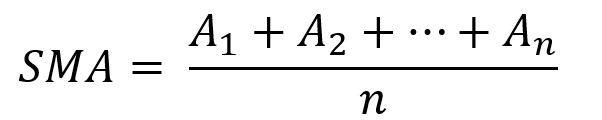
As a catapult, this technical indicator uses three systems: Volatility (the fulcrum), Momentum (the propeller), and a Directional Filter (Acting as the support). The goal is to get a signal that predicts volatility acceleration and direction based on historical patterns. We want to know when the market will move. and where. This indicator outperforms standard indicators.
Knowledge must be accessible to everyone. This is why my new publications Contrarian Trading Strategies in Python and Trend Following Strategies in Python now include free PDF copies of my first three books (Therefore, purchasing one of the new books gets you 4 books in total). GitHub-hosted advanced indications and techniques are in the two new books above.
The Foundation: Volatility
The Catapult predicts significant changes with the 21-period Relative Volatility Index.
The Average True Range, Mean Absolute Deviation, and Standard Deviation all assess volatility. Standard Deviation will construct the Relative Volatility Index.
Standard Deviation is the most basic volatility. It underpins descriptive statistics and technical indicators like Bollinger Bands. Before calculating Standard Deviation, let's define Variance.
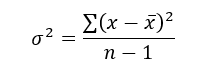
Variance is the squared deviations from the mean (a dispersion measure). We take the square deviations to compel the distance from the mean to be non-negative, then we take the square root to make the measure have the same units as the mean, comparing apples to apples (mean to standard deviation standard deviation). Variance formula:
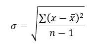
As stated, standard deviation is:
# The function to add a number of columns inside an array
def adder(Data, times):

    for i in range(1, times + 1):

        new_col = np.zeros((len(Data), 1), dtype = float)
        Data = np.append(Data, new_col, axis = 1)

    return Data

# The function to delete a number of columns starting from an index
def deleter(Data, index, times):

    for i in range(1, times + 1):

        Data = np.delete(Data, index, axis = 1)

    return Data

# The function to delete a number of rows from the beginning
def jump(Data, jump):

    Data = Data[jump:, ]

    return Data

# Example of adding 3 empty columns to an array
my_ohlc_array = adder(my_ohlc_array, 3)

# Example of deleting the 2 columns after the column indexed at 3
my_ohlc_array = deleter(my_ohlc_array, 3, 2)

# Example of deleting the first 20 rows
my_ohlc_array = jump(my_ohlc_array, 20)

# Remember, OHLC is an abbreviation of Open, High, Low, and Close and it refers to the standard historical data file

def volatility(Data, lookback, what, where):

  for i in range(len(Data)):

     try:

        Data[i, where] = (Data[i - lookback + 1:i + 1, what].std())
     except IndexError:
        pass

  return Data
The RSI is the most popular momentum indicator, and for good reason—it excels in range markets. Its 0–100 range simplifies interpretation. Fame boosts its potential.
The more traders and portfolio managers look at the RSI, the more people will react to its signals, pushing market prices. Technical Analysis is self-fulfilling, therefore this theory is obvious yet unproven.
RSI is determined simply. Start with one-period pricing discrepancies. We must remove each closing price from the previous one. We then divide the smoothed average of positive differences by the smoothed average of negative differences. The RSI algorithm converts the Relative Strength from the last calculation into a value between 0 and 100.
def ma(Data, lookback, close, where):

    Data = adder(Data, 1)

    for i in range(len(Data)):

            try:
                Data[i, where] = (Data[i - lookback + 1:i + 1, close].mean())

            except IndexError:
                pass

    # Cleaning
    Data = jump(Data, lookback)

    return Data
def ema(Data, alpha, lookback, what, where):

    alpha = alpha / (lookback + 1.0)
    beta  = 1 - alpha

    # First value is a simple SMA
    Data = ma(Data, lookback, what, where)

    # Calculating first EMA
    Data[lookback + 1, where] = (Data[lookback + 1, what] * alpha) + (Data[lookback, where] * beta)

    # Calculating the rest of EMA
    for i in range(lookback + 2, len(Data)):
            try:
                Data[i, where] = (Data[i, what] * alpha) + (Data[i - 1, where] * beta)

            except IndexError:
                pass

    return Datadef rsi(Data, lookback, close, where, width = 1, genre = 'Smoothed'):

    # Adding a few columns
    Data = adder(Data, 7)

    # Calculating Differences
    for i in range(len(Data)):

        Data[i, where] = Data[i, close] - Data[i - width, close]

    # Calculating the Up and Down absolute values
    for i in range(len(Data)):

        if Data[i, where] > 0:

            Data[i, where + 1] = Data[i, where]

        elif Data[i, where] < 0:

            Data[i, where + 2] = abs(Data[i, where])

    # Calculating the Smoothed Moving Average on Up and Down
    absolute values

    lookback = (lookback * 2) - 1 # From exponential to smoothed
    Data = ema(Data, 2, lookback, where + 1, where + 3)
    Data = ema(Data, 2, lookback, where + 2, where + 4)

    # Calculating the Relative Strength
    Data[:, where + 5] = Data[:, where + 3] / Data[:, where + 4]

    # Calculate the Relative Strength Index
    Data[:, where + 6] = (100 - (100 / (1 + Data[:, where + 5])))

    # Cleaning
    Data = deleter(Data, where, 6)
    Data = jump(Data, lookback)

    return Data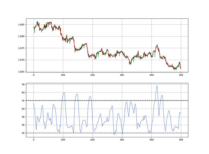
def relative_volatility_index(Data, lookback, close, where):

    # Calculating Volatility
    Data = volatility(Data, lookback, close, where)

    # Calculating the RSI on Volatility
    Data = rsi(Data, lookback, where, where + 1)

    # Cleaning
    Data = deleter(Data, where, 1)

    return Data
The Arm Section: Speed
The Catapult predicts momentum direction using the 14-period Relative Strength Index.
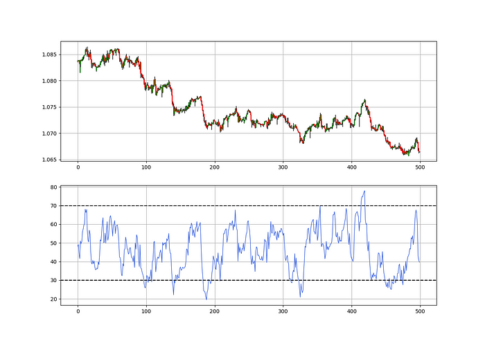
As a reminder, the RSI ranges from 0 to 100. Two levels give contrarian signals:
A positive response is anticipated when the market is deemed to have gone too far down at the oversold level 30, which is 30.
When the market is deemed to have gone up too much, at overbought level 70, a bearish reaction is to be expected.
Comparing the RSI to 50 is another intriguing use. RSI above 50 indicates bullish momentum, while below 50 indicates negative momentum.
The direction-finding filter in the frame
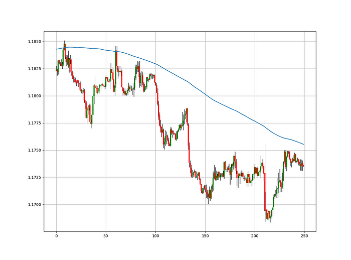
The Catapult's directional filter uses the 200-period simple moving average to keep us trending. This keeps us sane and increases our odds.
Moving averages confirm and ride trends. Its simplicity and track record of delivering value to analysis make them the most popular technical indicator. They help us locate support and resistance, stops and targets, and the trend. Its versatility makes them essential trading tools.
This is the plain mean, employed in statistics and everywhere else in life. Simply divide the number of observations by their total values. Mathematically, it's:
We defined the moving average function above. Create the Catapult indication now.
Indicator of the Catapult
The indicator is a healthy mix of the three indicators:
The first trigger will be provided by the 21-period Relative Volatility Index, which indicates that there will now be above average volatility and, as a result, it is possible for a directional shift.
If the reading is above 50, the move is likely bullish, and if it is below 50, the move is likely bearish, according to the 14-period Relative Strength Index, which indicates the likelihood of the direction of the move.
The likelihood of the move's direction will be strengthened by the 200-period simple moving average. When the market is above the 200-period moving average, we can infer that bullish pressure is there and that the upward trend will likely continue. Similar to this, if the market falls below the 200-period moving average, we recognize that there is negative pressure and that the downside is quite likely to continue.
lookback_rvi = 21
lookback_rsi = 14
lookback_ma  = 200
my_data = ma(my_data, lookback_ma, 3, 4)
my_data = rsi(my_data, lookback_rsi, 3, 5)
my_data = relative_volatility_index(my_data, lookback_rvi, 3, 6)
Two-handled overlay indicator Catapult. The first exhibits blue and green arrows for a buy signal, and the second shows blue and red for a sell signal.
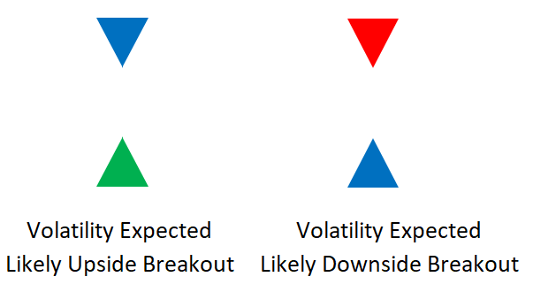
The chart below shows recent EURUSD hourly values.
def signal(Data, rvi_col, signal):

    Data = adder(Data, 10)

    for i in range(len(Data)):

        if Data[i,     rvi_col] < 30 and \
           Data[i - 1, rvi_col] > 30 and \
           Data[i - 2, rvi_col] > 30 and \
           Data[i - 3, rvi_col] > 30 and \
           Data[i - 4, rvi_col] > 30 and \
           Data[i - 5, rvi_col] > 30:

               Data[i, signal] = 1

    return Data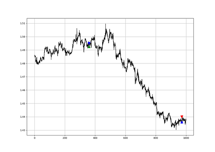
Signals are straightforward. The indicator can be utilized with other methods.
my_data = signal(my_data, 6, 7)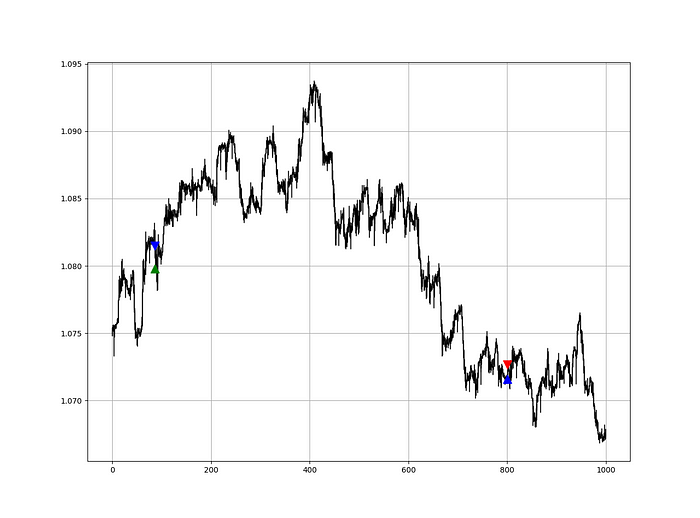
Lumiwealth shows how to develop all kinds of algorithms. I recommend their hands-on courses in algorithmic trading, blockchain, and machine learning.
Summary
To conclude, my goal is to contribute to objective technical analysis, which promotes more transparent methods and strategies that must be back-tested before implementation. Technical analysis will lose its reputation as subjective and unscientific.
After you find a trading method or approach, follow these steps:
Put emotions aside and adopt an analytical perspective.
Test it in the past in conditions and simulations taken from real life.
Try improving it and performing a forward test if you notice any possibility.
Transaction charges and any slippage simulation should always be included in your tests.
Risk management and position sizing should always be included in your tests.
After checking the aforementioned, monitor the plan because market dynamics may change and render it unprofitable.

Erik Engheim
3 years ago
You Misunderstand the Russian Nuclear Threat
Many believe Putin is simply sabre rattling and intimidating us. They see no threat of nuclear war. We can send NATO troops into Ukraine without risking a nuclear war.
I keep reading that Putin is just using nuclear blackmail and that a strong leader will call the bluff. That, in my opinion, misunderstands the danger of sending NATO into Ukraine.
It assumes that once NATO moves in, Putin can either push the red nuclear button or not.
Sure, Putin won't go nuclear if NATO invades Ukraine. So we're safe? Can't we just move NATO?
No, because history has taught us that wars often escalate far beyond our initial expectations. One domino falls, knocking down another. That's why having clear boundaries is vital. Crossing a seemingly harmless line can set off a chain of events that are unstoppable once started.
One example is WWI. The assassin of Archduke Franz Ferdinand could not have known that his actions would kill millions. They couldn't have known that invading Serbia to punish them for not handing over the accomplices would start a world war. Every action triggered a counter-action, plunging Europe into a brutal and bloody war. Each leader saw their actions as limited, not realizing how they kept the dominos falling.
Nobody can predict the future, but it's easy to imagine how NATO intervention could trigger a chain of events leading to a total war. Let me suggest some outcomes.
NATO creates a no-fly-zone. In retaliation, Russia bombs NATO airfields. Russia may see this as a limited counter-move that shouldn't cause further NATO escalation. They think it's a reasonable response to force NATO out of Ukraine. Nobody has yet thought to use the nuke.
Will NATO act? Polish airfields bombed, will they be stuck? Is this an article 5 event? If so, what should be done?
It could happen. Maybe NATO sends troops into Ukraine to punish Russia. Maybe NATO will bomb Russian airfields.
Putin's response Is bombing Russian airfields an invasion or an attack? Remember that Russia has always used nuclear weapons for defense, not offense. But let's not panic, let's assume Russia doesn't go nuclear.
Maybe Russia retaliates by attacking NATO military bases with planes. Maybe they use ships to attack military targets. How does NATO respond? Will they fight Russia in Ukraine or escalate? Will they invade Russia or attack more military installations there?
Seen the pattern? As each nation responds, smaller limited military operations can grow in scope.
So far, the Russian military has shown that they begin with less brutal methods. As losses and failures increase, brutal means are used. Syria had the same. Assad used chemical weapons and attacked hospitals, schools, residential areas, etc.
A NATO invasion of Ukraine would cost Russia dearly. “Oh, this isn't looking so good, better pull out and finish this war,” do you think? No way. Desperate, they will resort to more brutal tactics. If desperate, Russia has a huge arsenal of ugly weapons. They have nerve agents, chemical weapons, and other nasty stuff.
What happens if Russia uses chemical weapons? What if Russian nerve agents kill NATO soldiers horribly? West calls for retaliation will grow. Will we invade Russia? Will we bomb them?
We are angry and determined to punish war criminal Putin, so NATO tanks may be heading to Moscow. We want vengeance for his chemical attacks and bombing of our cities.
Do you think the distance between that red nuclear button and Putin's finger will be that far once NATO tanks are on their way to Moscow?
We might avoid a nuclear apocalypse. A NATO invasion force or even Western cities may be used by Putin. Not as destructive as ICBMs. Putin may think we won't respond to tactical nukes with a full nuclear counterattack. Why would we risk a nuclear Holocaust by launching ICBMs on Russia?
Maybe. My point is that at every stage of the escalation, one party may underestimate the other's response. This war is spiraling out of control and the chances of a nuclear exchange are increasing. Nobody really wants it.
Fear, anger, and resentment cause it. If Putin and his inner circle decide their time is up, they may no longer care about the rest of the world. We saw it with Hitler. Hitler, seeing the end of his empire, ordered the destruction of Germany. Nobody should win if he couldn't. He wanted to destroy everything, including Paris.
In other words, the danger isn't what happens after NATO intervenes The danger is the potential chain reaction. Gambling has a psychological equivalent. It's best to exit when you've lost less. We humans are willing to take small risks for big rewards. To avoid losses, we are willing to take high risks. Daniel Kahneman describes this behavior in his book Thinking, Fast and Slow.
And so bettors who have lost a lot begin taking bigger risks to make up for it. We get a snowball effect. NATO involvement in the Ukraine conflict is akin to entering a casino and placing a bet. We'll start taking bigger risks as we start losing to Russian retaliation. That's the game's psychology.
It's impossible to stop. So will politicians and citizens from both Russia and the West, until we risk the end of human civilization.
You can avoid spiraling into ever larger bets in the Casino by drawing a hard line and declaring “I will not enter that Casino.” We're doing it now. We supply Ukraine. We send money and intelligence but don't cross that crucial line.
It's difficult to watch what happened in Bucha without demanding NATO involvement. What should we do? Of course, I'm not in charge. I'm a writer. My hope is that people will think about the consequences of the actions we demand. My hope is that you think ahead not just one step but multiple dominos.
More and more, we are driven by our emotions. We cannot act solely on emotion in matters of life and death. If we make the wrong choice, more people will die.
Read the original post here.

Frank Andrade
3 years ago
I discovered a bug that allowed me to use ChatGPT to successfully web scrape. Here's how it operates.
This method scrapes websites with ChatGPT (demo with Amazon and Twitter)

In a recent article, I demonstrated how to scrape websites using ChatGPT prompts like scrape website X using Python.
But that doesn’t always work.
After scraping dozens of websites with ChatGPT, I realized that simple prompts rarely work for web scraping.
Using ChatGPT and basic HTML, we can scrape any website.
First things first, use ChatGPT's advanced version (Playground)
ChatGPT Playground's enhanced version is needed to scrape websites quickly. It generates code faster and has less constraints.
Here’s how it looks.
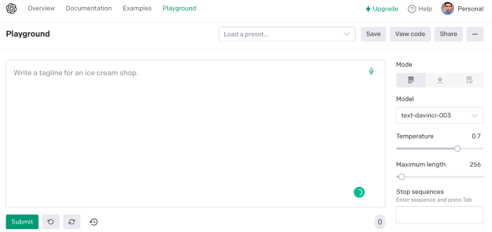
The classic ChatGPT display just allows you to type a prompt. Playground is more customizable and generates code faster than the basic version.
No more delays or restrictions.
In this tutorial, we'll write prompts underneath Playground.
How to Use ChatGPT to Scrape Any Website
To show you how to utilize ChatGPT to scrape any website, we'll use subslikescript, which lists movies.
Later in this post, I'll show you how to scrape Amazon and Twitter, but let's start easy.
If we try a basic prompt like “scrape the movie titles on this website: https://subslikescript.com/movies” it won’t scrape anything. Here’s when we need some HTML knowledge to build the right prompt for ChatGPT.Let's scrape the above movie titles. First, check the webpage. Right-click any element and choose Inspect.
Then see below.
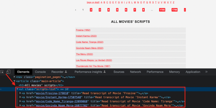
We identify the element to scrape (those in the red box). The data elements are ul, a, and scripts-list.
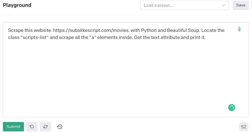
Here's the prompt for movie titles.
Scrape this website: https://subslikescript.com/movies with Python and Beautiful Soup. Locate the element with tag “ul” and class “scripts-list”. Scrape all the “a” elements inside. Get the text attribute and print it.
Code generated:
import requests
from bs4 import BeautifulSoup
page = requests.get('https://subslikescript.com/movies/')
soup = BeautifulSoup(page.content, 'html.parser')
scripts_list = soup.find(class_="scripts-list")
all_a_elements = scripts_list.find_all('a')
for element in all_a_elements:
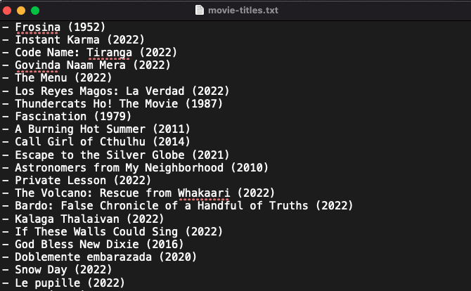
print(element.get_text())It extracts movie titles successfully.
Let's scrape Amazon and Twitter.
ChatGPT's Amazon scraping
Consider scraping Amazon for self-help books. First, copy the Amazon link for self-help books.
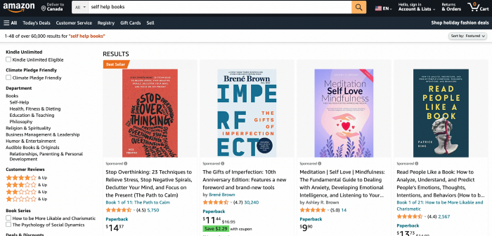
Here’s the link I got. Location-dependent connection. Use my link to replicate my results.
Now we'll check book titles. Here's our element.
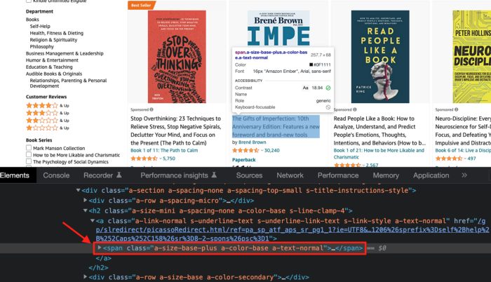
If we want to extract the book titles, we need to use the tag name span, class attribute name and a-size-base-plus a-color-base a-text-normalattribute value.
This time I'll use Selenium. I'll add Selenium-specific commands like wait 5 seconds and generate an XPath.
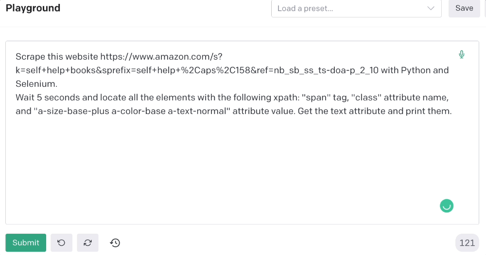
Scrape this website https://www.amazon.com/s?k=self+help+books&sprefix=self+help+%2Caps%2C158&ref=nb_sb_ss_ts-doa-p_2_10 with Python and Selenium.
Wait 5 seconds and locate all the elements with the following xpath: “span” tag, “class” attribute name, and “a-size-base-plus a-color-base a-text-normal” attribute value. Get the text attribute and print them.
Code generated: (I only had to manually add the path where my chromedriver is located).
from selenium import webdriver
from selenium.webdriver.common.by import By
from time import sleep
#initialize webdriver
driver = webdriver.Chrome('<add path of your chromedriver>')
#navigate to the website
driver.get("https://www.amazon.com/s?k=self+help+books&sprefix=self+help+%2Caps%2C158&ref=nb_sb_ss_ts-doa-p_2_10")
#wait 5 seconds to let the page load
sleep(5)
#locate all the elements with the following xpath
elements = driver.find_elements(By.XPATH, '//span[@class="a-size-base-plus a-color-base a-text-normal"]')
#get the text attribute of each element and print it
for element in elements:
print(element.text)
#close the webdriver
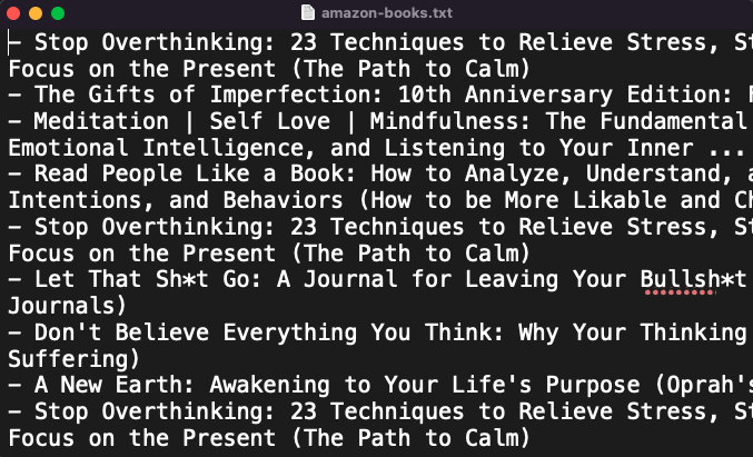
driver.close()It pulls Amazon book titles.
Utilizing ChatGPT to scrape Twitter
Say you wish to scrape ChatGPT tweets. Search Twitter for ChatGPT and copy the URL.
Here’s the link I got. We must check every tweet. Here's our element.
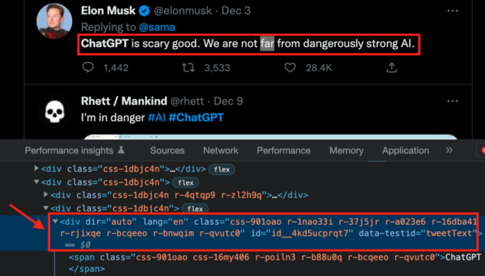
To extract a tweet, use the div tag and lang attribute.
Again, Selenium.
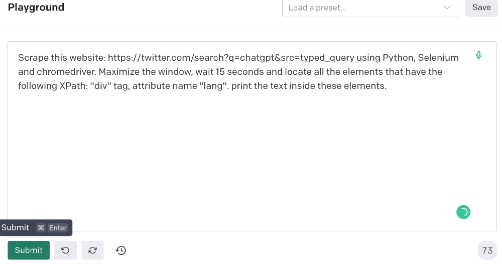
Scrape this website: https://twitter.com/search?q=chatgpt&src=typed_query using Python, Selenium and chromedriver.
Maximize the window, wait 15 seconds and locate all the elements that have the following XPath: “div” tag, attribute name “lang”. Print the text inside these elements.
Code generated: (again, I had to add the path where my chromedriver is located)
from selenium import webdriver
import time

driver = webdriver.Chrome("/Users/frankandrade/Downloads/chromedriver")
driver.maximize_window()
driver.get("https://twitter.com/search?q=chatgpt&src=typed_query")
time.sleep(15)

elements = driver.find_elements_by_xpath("//div[@lang]")
for element in elements:
    print(element.text)

driver.quit()
You'll get the first 2 or 3 tweets from a search. To scrape additional tweets, click X times.
Congratulations! You scraped websites without coding by using ChatGPT.