

:max_bytes(150000):strip_icc():format(webp)/adam_hayes-5bfc262a46e0fb005118b414.jpg)
Bernard Lawrence "Bernie" Madoff, the largest Ponzi scheme in history
Madoff who?
Bernie Madoff ran the largest Ponzi scheme in history, defrauding thousands of investors over at least 17 years, and possibly longer. He pioneered electronic trading and chaired Nasdaq in the 1990s. On April 14, 2021, he died while serving a 150-year sentence for money laundering, securities fraud, and other crimes.
Understanding Madoff
Madoff claimed to generate large, steady returns through a trading strategy called split-strike conversion, but he simply deposited client funds into a single bank account and paid out existing clients. He funded redemptions by attracting new investors and their capital, but the market crashed in late 2008. He confessed to his sons, who worked at his firm, on Dec. 10, 2008. Next day, they turned him in. The fund reported $64.8 billion in client assets.
Madoff pleaded guilty to 11 federal felony counts, including securities fraud, wire fraud, mail fraud, perjury, and money laundering. Ponzi scheme became a symbol of Wall Street's greed and dishonesty before the financial crisis. Madoff was sentenced to 150 years in prison and ordered to forfeit $170 billion, but no other Wall Street figures faced legal ramifications.
Bernie Madoff's Brief Biography
Bernie Madoff was born in Queens, New York, on April 29, 1938. He began dating Ruth (née Alpern) when they were teenagers. Madoff told a journalist by phone from prison that his father's sporting goods store went bankrupt during the Korean War: "You watch your father, who you idolize, build a big business and then lose everything." Madoff was determined to achieve "lasting success" like his father "whatever it took," but his career had ups and downs.
Early Madoff investments
At 22, he started Bernard L. Madoff Investment Securities LLC. First, he traded penny stocks with $5,000 he earned installing sprinklers and as a lifeguard. Family and friends soon invested with him. Madoff's bets soured after the "Kennedy Slide" in 1962, and his father-in-law had to bail him out.
Madoff felt he wasn't part of the Wall Street in-crowd. "We weren't NYSE members," he told Fishman. "It's obvious." According to Madoff, he was a scrappy market maker. "I was happy to take the crumbs," he told Fishman, citing a client who wanted to sell eight bonds; a bigger firm would turn it down.
Recognition
Success came when he and his brother Peter built electronic trading capabilities, or "artificial intelligence," that attracted massive order flow and provided market insights. "I had all these major banks coming down, entertaining me," Madoff told Fishman. "It was mind-bending."
By the late 1980s, he and four other Wall Street mainstays processed half of the NYSE's order flow. Controversially, he paid for much of it, and by the late 1980s, Madoff was making in the vicinity of $100 million a year. He was Nasdaq chairman from 1990 to 1993.
Madoff's Ponzi scheme
It is not certain exactly when Madoff's Ponzi scheme began. He testified in court that it began in 1991, but his account manager, Frank DiPascali, had been at the firm since 1975.
Why Madoff did the scheme is unclear. "I had enough money to support my family's lifestyle. "I don't know why," he told Fishman." Madoff could have won Wall Street's respect as a market maker and electronic trading pioneer.
Madoff told Fishman he wasn't solely responsible for the fraud. "I let myself be talked into something, and that's my fault," he said, without saying who convinced him. "I thought I could escape eventually. I thought it'd be quick, but I couldn't."
Carl Shapiro, Jeffry Picower, Stanley Chais, and Norm Levy have been linked to Bernard L. Madoff Investment Securities LLC for years. Madoff's scheme made these men hundreds of millions of dollars in the 1960s and 1970s.
Madoff told Fishman, "Everyone was greedy, everyone wanted to go on." He says the Big Four and others who pumped client funds to him, outsourcing their asset management, must have suspected his returns or should have. "How can you make 15%-18% when everyone else is making less?" said Madoff.
How Madoff Got Away with It for So Long
Madoff's high returns made clients look the other way. He deposited their money in a Chase Manhattan Bank account, which merged to become JPMorgan Chase & Co. in 2000. The bank may have made $483 million from those deposits, so it didn't investigate.
When clients redeemed their investments, Madoff funded the payouts with new capital he attracted by promising unbelievable returns and earning his victims' trust. Madoff created an image of exclusivity by turning away clients. This model let half of Madoff's investors profit. These investors must pay into a victims' fund for defrauded investors.
Madoff wooed investors with his philanthropy. He defrauded nonprofits, including the Elie Wiesel Foundation for Peace and Hadassah. He approached congregants through his friendship with J. Ezra Merkin, a synagogue officer. Madoff allegedly stole $1 billion to $2 billion from his investors.
Investors believed Madoff for several reasons:
- His public portfolio seemed to be blue-chip stocks.
- His returns were high (10-20%) but consistent and not outlandish. In a 1992 interview with Madoff, the Wall Street Journal reported: "[Madoff] insists the returns were nothing special, given that the S&P 500-stock index returned 16.3% annually from 1982 to 1992. 'I'd be surprised if anyone thought matching the S&P over 10 years was remarkable,' he says.
- "He said he was using a split-strike collar strategy. A collar protects underlying shares by purchasing an out-of-the-money put option.
SEC inquiry
The Securities and Exchange Commission had been investigating Madoff and his securities firm since 1999, which frustrated many after he was prosecuted because they felt the biggest damage could have been prevented if the initial investigations had been rigorous enough.
Harry Markopolos was a whistleblower. In 1999, he figured Madoff must be lying in an afternoon. The SEC ignored his first Madoff complaint in 2000.
Markopolos wrote to the SEC in 2005: "The largest Ponzi scheme is Madoff Securities. This case has no SEC reward, so I'm turning it in because it's the right thing to do."
Many believed the SEC's initial investigations could have prevented Madoff's worst damage.
Markopolos found irregularities using a "Mosaic Method." Madoff's firm claimed to be profitable even when the S&P fell, which made no mathematical sense given what he was investing in. Markopolos said Madoff Securities' "undisclosed commissions" were the biggest red flag (1 percent of the total plus 20 percent of the profits).
Markopolos concluded that "investors don't know Bernie Madoff manages their money." Markopolos learned Madoff was applying for large loans from European banks (seemingly unnecessary if Madoff's returns were high).
The regulator asked Madoff for trading account documentation in 2005, after he nearly went bankrupt due to redemptions. The SEC drafted letters to two of the firms on his six-page list but didn't send them. Diana Henriques, author of "The Wizard of Lies: Bernie Madoff and the Death of Trust," documents the episode.
In 2008, the SEC was criticized for its slow response to Madoff's fraud.
Confession, sentencing of Bernie Madoff
Bernard L. Madoff Investment Securities LLC reported 5.6% year-to-date returns in November 2008; the S&P 500 fell 39%. As the selling continued, Madoff couldn't keep up with redemption requests, and on Dec. 10, he confessed to his sons Mark and Andy, who worked at his firm. "After I told them, they left, went to a lawyer, who told them to turn in their father, and I never saw them again. 2008-12-11: Bernie Madoff arrested.
Madoff insists he acted alone, but several of his colleagues were jailed. Mark Madoff died two years after his father's fraud was exposed. Madoff's investors committed suicide. Andy Madoff died of cancer in 2014.
2009 saw Madoff's 150-year prison sentence and $170 billion forfeiture. Marshals sold his three homes and yacht. Prisoner 61727-054 at Butner Federal Correctional Institution in North Carolina.
Madoff's lawyers requested early release on February 5, 2020, claiming he has a terminal kidney disease that may kill him in 18 months. Ten years have passed since Madoff's sentencing.
Bernie Madoff's Ponzi scheme aftermath
The paper trail of victims' claims shows Madoff's complexity and size. Documents show Madoff's scam began in the 1960s. His final account statements show $47 billion in "profit" from fake trades and shady accounting.
Thousands of investors lost their life savings, and multiple stories detail their harrowing loss.
Irving Picard, a New York lawyer overseeing Madoff's bankruptcy, has helped investors. By December 2018, Picard had recovered $13.3 billion from Ponzi scheme profiteers.
A Madoff Victim Fund (MVF) was created in 2013 to help compensate Madoff's victims, but the DOJ didn't start paying out the $4 billion until late 2017. Richard Breeden, a former SEC chair who oversees the fund, said thousands of claims were from "indirect investors"
Breeden and his team had to reject many claims because they weren't direct victims. Breeden said he based most of his decisions on one simple rule: Did the person invest more than they withdrew? Breeden estimated 11,000 "feeder" investors.
Breeden wrote in a November 2018 update for the Madoff Victim Fund, "We've paid over 27,300 victims 56.65% of their losses, with thousands more to come." In December 2018, 37,011 Madoff victims in the U.S. and around the world received over $2.7 billion. Breeden said the fund expected to make "at least one more significant distribution in 2019"
This post is a summary. Read full article here
More on Economics & Investing

Cody Collins
3 years ago
The direction of the economy is as follows.
What quarterly bank earnings reveal

Big banks know the economy best. Unless we’re talking about a housing crisis in 2007…
Banks are crucial to the U.S. economy. The Fed, communities, and investments exchange money.
An economy depends on money flow. Banks' views on the economy can affect their decision-making.
Most large banks released quarterly earnings and forward guidance last week. Others were pessimistic about the future.
What Makes Banks Confident
Bank of America's profit decreased 30% year-over-year, but they're optimistic about the economy. Comparatively, they're bullish.
Who banks serve affects what they see. Bank of America supports customers.
They think consumers' future is bright. They believe this for many reasons.
The average customer has decent credit, unless the system is flawed. Bank of America's new credit card and mortgage borrowers averaged 771. New-car loan and home equity borrower averages were 791 and 797.
2008's housing crisis affected people with scores below 620.
Bank of America and the economy benefit from a robust consumer. Major problems can be avoided if individuals maintain spending.
Reasons Other Banks Are Less Confident
Spending requires income. Many companies, mostly in the computer industry, have announced they will slow or freeze hiring. Layoffs are frequently an indication of poor times ahead.
BOA is positive, but investment banks are bearish.
Jamie Dimon, CEO of JPMorgan, outlined various difficulties our economy could confront.
But geopolitical tension, high inflation, waning consumer confidence, the uncertainty about how high rates have to go and the never-before-seen quantitative tightening and their effects on global liquidity, combined with the war in Ukraine and its harmful effect on global energy and food prices are very likely to have negative consequences on the global economy sometime down the road.
That's more headwinds than tailwinds.
JPMorgan, which helps with mergers and IPOs, is less enthusiastic due to these concerns. Incoming headwinds signal drying liquidity, they say. Less business will be done.
Final Reflections
I don't think we're done. Yes, stocks are up 10% from a month ago. It's a long way from old highs.
I don't think the stock market is a strong economic indicator.
Many executives foresee a 2023 recession. According to the traditional definition, we may be in a recession when Q2 GDP statistics are released next week.
Regardless of criteria, I predict the economy will have a terrible year.
Weekly layoffs are announced. Inflation persists. Will prices return to 2020 levels if inflation cools? Perhaps. Still expensive energy. Ukraine's war has global repercussions.
I predict BOA's next quarter earnings won't be as bullish about the consumer's strength.
Justin Kuepper
3 years ago
Day Trading Introduction
Historically, only large financial institutions, brokerages, and trading houses could actively trade in the stock market. With instant global news dissemination and low commissions, developments such as discount brokerages and online trading have leveled the playing—or should we say trading—field. It's never been easier for retail investors to trade like pros thanks to trading platforms like Robinhood and zero commissions.
Day trading is a lucrative career (as long as you do it properly). But it can be difficult for newbies, especially if they aren't fully prepared with a strategy. Even the most experienced day traders can lose money.
So, how does day trading work?
Day Trading Basics
Day trading is the practice of buying and selling a security on the same trading day. It occurs in all markets, but is most common in forex and stock markets. Day traders are typically well educated and well funded. For small price movements in highly liquid stocks or currencies, they use leverage and short-term trading strategies.
Day traders are tuned into short-term market events. News trading is a popular strategy. Scheduled announcements like economic data, corporate earnings, or interest rates are influenced by market psychology. Markets react when expectations are not met or exceeded, usually with large moves, which can help day traders.
Intraday trading strategies abound. Among these are:
- Scalping: This strategy seeks to profit from minor price changes throughout the day.
- Range trading: To determine buy and sell levels, range traders use support and resistance levels.
- News-based trading exploits the increased volatility around news events.
- High-frequency trading (HFT): The use of sophisticated algorithms to exploit small or short-term market inefficiencies.
A Disputed Practice
Day trading's profit potential is often debated on Wall Street. Scammers have enticed novices by promising huge returns in a short time. Sadly, the notion that trading is a get-rich-quick scheme persists. Some daytrade without knowledge. But some day traders succeed despite—or perhaps because of—the risks.
Day trading is frowned upon by many professional money managers. They claim that the reward rarely outweighs the risk. Those who day trade, however, claim there are profits to be made. Profitable day trading is possible, but it is risky and requires considerable skill. Moreover, economists and financial professionals agree that active trading strategies tend to underperform passive index strategies over time, especially when fees and taxes are factored in.
Day trading is not for everyone and is risky. It also requires a thorough understanding of how markets work and various short-term profit strategies. Though day traders' success stories often get a lot of media attention, keep in mind that most day traders are not wealthy: Many will fail, while others will barely survive. Also, while skill is important, bad luck can sink even the most experienced day trader.
Characteristics of a Day Trader
Experts in the field are typically well-established professional day traders.
They usually have extensive market knowledge. Here are some prerequisites for successful day trading.
Market knowledge and experience
Those who try to day-trade without understanding market fundamentals frequently lose. Day traders should be able to perform technical analysis and read charts. Charts can be misleading if not fully understood. Do your homework and know the ins and outs of the products you trade.
Enough capital
Day traders only use risk capital they can lose. This not only saves them money but also helps them trade without emotion. To profit from intraday price movements, a lot of capital is often required. Most day traders use high levels of leverage in margin accounts, and volatile market swings can trigger large margin calls on short notice.
Strategy
A trader needs a competitive advantage. Swing trading, arbitrage, and trading news are all common day trading strategies. They tweak these strategies until they consistently profit and limit losses.
Strategy Breakdown:
Type | Risk | Reward
Swing Trading | High | High
Arbitrage | Low | Medium
Trading News | Medium | Medium
Mergers/Acquisitions | Medium | High
Discipline
A profitable strategy is useless without discipline. Many day traders lose money because they don't meet their own criteria. “Plan the trade and trade the plan,” they say. Success requires discipline.
Day traders profit from market volatility. For a day trader, a stock's daily movement is appealing. This could be due to an earnings report, investor sentiment, or even general economic or company news.
Day traders also prefer highly liquid stocks because they can change positions without affecting the stock's price. Traders may buy a stock if the price rises. If the price falls, a trader may decide to sell short to profit.
A day trader wants to trade a stock that moves (a lot).
Day Trading for a Living
Professional day traders can be self-employed or employed by a larger institution.
Most day traders work for large firms like hedge funds and banks' proprietary trading desks. These traders benefit from direct counterparty lines, a trading desk, large capital and leverage, and expensive analytical software (among other advantages). By taking advantage of arbitrage and news events, these traders can profit from less risky day trades before individual traders react.
Individual traders often manage other people’s money or simply trade with their own. They rarely have access to a trading desk, but they frequently have strong ties to a brokerage (due to high commissions) and other resources. However, their limited scope prevents them from directly competing with institutional day traders. Not to mention more risks. Individuals typically day trade highly liquid stocks using technical analysis and swing trades, with some leverage.
Day trading necessitates access to some of the most complex financial products and services. Day traders usually need:
Access to a trading desk
Traders who work for large institutions or manage large sums of money usually use this. The trading or dealing desk provides these traders with immediate order execution, which is critical during volatile market conditions. For example, when an acquisition is announced, day traders interested in merger arbitrage can place orders before the rest of the market.
News sources
The majority of day trading opportunities come from news, so being the first to know when something significant happens is critical. It has access to multiple leading newswires, constant news coverage, and software that continuously analyzes news sources for important stories.
Analytical tools
Most day traders rely on expensive trading software. Technical traders and swing traders rely on software more than news. This software's features include:
-
Automatic pattern recognition: It can identify technical indicators like flags and channels, or more complex indicators like Elliott Wave patterns.
-
Genetic and neural applications: These programs use neural networks and genetic algorithms to improve trading systems and make more accurate price predictions.
-
Broker integration: Some of these apps even connect directly to the brokerage, allowing for instant and even automatic trade execution. This reduces trading emotion and improves execution times.
-
Backtesting: This allows traders to look at past performance of a strategy to predict future performance. Remember that past results do not always predict future results.
Together, these tools give traders a competitive advantage. It's easy to see why inexperienced traders lose money without them. A day trader's earnings potential is also affected by the market in which they trade, their capital, and their time commitment.
Day Trading Risks
Day trading can be intimidating for the average investor due to the numerous risks involved. The SEC highlights the following risks of day trading:
Because day traders typically lose money in their first months of trading and many never make profits, they should only risk money they can afford to lose.
Trading is a full-time job that is stressful and costly: Observing dozens of ticker quotes and price fluctuations to spot market trends requires intense concentration. Day traders also spend a lot on commissions, training, and computers.
Day traders heavily rely on borrowing: Day-trading strategies rely on borrowed funds to make profits, which is why many day traders lose everything and end up in debt.
Avoid easy profit promises: Avoid “hot tips” and “expert advice” from day trading newsletters and websites, and be wary of day trading educational seminars and classes.
Should You Day Trade?
As stated previously, day trading as a career can be difficult and demanding.
- First, you must be familiar with the trading world and know your risk tolerance, capital, and goals.
- Day trading also takes a lot of time. You'll need to put in a lot of time if you want to perfect your strategies and make money. Part-time or whenever isn't going to cut it. You must be fully committed.
- If you decide trading is for you, remember to start small. Concentrate on a few stocks rather than jumping into the market blindly. Enlarging your trading strategy can result in big losses.
- Finally, keep your cool and avoid trading emotionally. The more you can do that, the better. Keeping a level head allows you to stay focused and on track.
If you follow these simple rules, you may be on your way to a successful day trading career.
Is Day Trading Illegal?
Day trading is not illegal or unethical, but it is risky. Because most day-trading strategies use margin accounts, day traders risk losing more than they invest and becoming heavily in debt.
How Can Arbitrage Be Used in Day Trading?
Arbitrage is the simultaneous purchase and sale of a security in multiple markets to profit from small price differences. Because arbitrage ensures that any deviation in an asset's price from its fair value is quickly corrected, arbitrage opportunities are rare.
Why Don’t Day Traders Hold Positions Overnight?
Day traders rarely hold overnight positions for several reasons: Overnight trades require more capital because most brokers require higher margin; stocks can gap up or down on overnight news, causing big trading losses; and holding a losing position overnight in the hope of recovering some or all of the losses may be against the trader's core day-trading philosophy.
What Are Day Trader Margin Requirements?
Regulation D requires that a pattern day trader client of a broker-dealer maintain at all times $25,000 in equity in their account.
How Much Buying Power Does Day Trading Have?
Buying power is the total amount of funds an investor has available to trade securities. FINRA rules allow a pattern day trader to trade up to four times their maintenance margin excess as of the previous day's close.
The Verdict
Although controversial, day trading can be a profitable strategy. Day traders, both institutional and retail, keep the markets efficient and liquid. Though day trading is still popular among novice traders, it should be left to those with the necessary skills and resources.
Chritiaan Hetzner
3 years ago
Mystery of the $1 billion'meme stock' that went to $400 billion in days
Who is AMTD Digital?
An unknown Hong Kong corporation joined the global megacaps worth over $500 billion on Tuesday.
The American Depository Share (ADS) with the ticker code HKD gapped at the open, soaring 25% over the previous closing price as trading began, before hitting an intraday high of $2,555.
At its peak, its market cap was almost $450 billion, more than Facebook parent Meta or Alibaba.
Yahoo Finance reported a daily volume of 350,500 shares, the lowest since the ADS began trading and much below the average of 1.2 million.
Despite losing a fifth of its value on Wednesday, it's still worth more than Toyota, Nike, McDonald's, or Walt Disney.
The company sold 16 million shares at $7.80 each in mid-July, giving it a $1 billion market valuation.
Why the boom?
That market cap seems unjustified.
According to SEC reports, its income-generating assets barely topped $400 million in March. Fortune's emails and calls went unanswered.
Website discloses little about company model. Its one-minute business presentation film uses a Star Wars–like design to sell the company as a "one-stop digital solutions platform in Asia"
The SEC prospectus explains.
AMTD Digital sells a "SpiderNet Ecosystems Solutions" kind of club membership that connects enterprises. This is the bulk of its $25 million annual revenue in April 2021.
Pretax profits have been higher than top line over the past three years due to fair value accounting gains on Appier, DayDayCook, WeDoctor, and five Asian fintechs.
AMTD Group, the company's parent, specializes in investment banking, hotel services, luxury education, and media and entertainment. AMTD IDEA, a $14 billion subsidiary, is also traded on the NYSE.
“Significant volatility”
Why AMTD Digital listed in the U.S. is unknown, as it informed investors in its share offering prospectus that could delist under SEC guidelines.
Beijing's red tape prevents the Sarbanes-Oxley Board from inspecting its Chinese auditor.
This frustrates Chinese stock investors. If the U.S. and China can't achieve a deal, 261 Chinese companies worth $1.3 trillion might be delisted.
Calvin Choi left UBS to become AMTD Group's CEO.
His capitalist background and status as a Young Global Leader with the World Economic Forum don't stop him from praising China's Communist party or celebrating the "glory and dream of the Great Rejuvenation of the Chinese nation" a century after its creation.
Despite having an executive vice chairman with a record of battling corruption and ties to Carrie Lam, Beijing's previous proconsul in Hong Kong, Choi is apparently being targeted for a two-year industry ban by the city's securities regulator after an investor accused Choi of malfeasance.
Some CMIG-funded initiatives produced money, but he didn't give us the proceeds, a corporate official told China's Caixin in October 2020. We don't know if he misappropriated or lost some money.
A seismic anomaly
In fundamental analysis, where companies are valued based on future cash flows, AMTD Digital's mind-boggling market cap is a statistical aberration that should occur once every hundred years.
AMTD Digital doesn't know why it's so valuable. In a thank-you letter to new shareholders, it said it was confused by the stock's performance.
Since its IPO, the company has seen significant ADS price volatility and active trading volume, it said Tuesday. "To our knowledge, there have been no important circumstances, events, or other matters since the IPO date."
Permabears awoke after the jump. Jim Chanos asked if "we're all going to ignore the $400 billion meme stock in the room," while Nate Anderson called AMTD Group "sketchy."
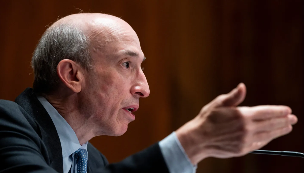
It happened the same day SEC Chair Gary Gensler praised the 20th anniversary of the Sarbanes-Oxley Act, aimed to restore trust in America's financial markets after the Enron and WorldCom accounting fraud scandals.
The run-up revived unpleasant memories of Robinhood's decision to limit retail investors' ability to buy GameStop, regarded as a measure to protect hedge funds invested in the meme company.
Why wasn't HKD's buy button removed? Because retail wasn't behind it?" tweeted Gensler on Tuesday. "Real stock fraud. "You're worthless."
You might also like

Farhan Ali Khan
2 years ago
Introduction to Zero-Knowledge Proofs: The Art of Proving Without Revealing
Zero-Knowledge Proofs for Beginners
Published here originally.
Introduction
I Spy—did you play as a kid? One person chose a room object, and the other had to guess it by answering yes or no questions. I Spy was entertaining, but did you know it could teach you cryptography?
Zero Knowledge Proofs let you show your pal you know what they picked without exposing how. Math replaces electronics in this secret spy mission. Zero-knowledge proofs (ZKPs) are sophisticated cryptographic tools that allow one party to prove they have particular knowledge without revealing it. This proves identification and ownership, secures financial transactions, and more. This article explains zero-knowledge proofs and provides examples to help you comprehend this powerful technology.
What is a Proof of Zero Knowledge?
Zero-knowledge proofs prove a proposition is true without revealing any other information. This lets the prover show the verifier that they know a fact without revealing it. So, a zero-knowledge proof is like a magician's trick: the prover proves they know something without revealing how or what. Complex mathematical procedures create a proof the verifier can verify.
Want to find an easy way to test it out? Try out with tis awesome example! ZK Crush
Describe it as if I'm 5
Alex and Jack found a cave with a center entrance that only opens when someone knows the secret. Alex knows how to open the cave door and wants to show Jack without telling him.
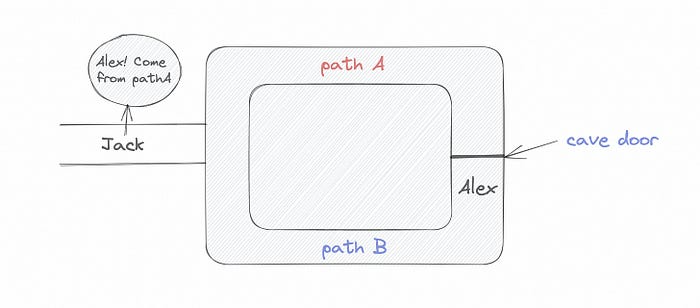
Alex and Jack name both pathways (let’s call them paths A and B).
In the first phase, Alex is already inside the cave and is free to select either path, in this case A or B.
As Alex made his decision, Jack entered the cave and asked him to exit from the B path.
Jack can confirm that Alex really does know the key to open the door because he came out for the B path and used it.
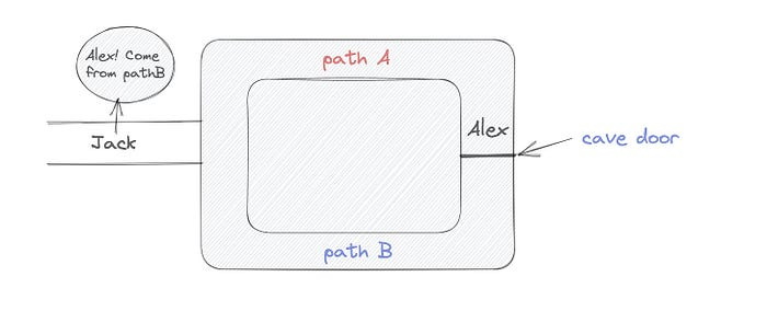
To conclude, Alex and Jack repeat:
Alex walks into the cave.
Alex follows a random route.
Jack walks into the cave.
Alex is asked to follow a random route by Jack.
Alex follows Jack's advice and heads back that way.
What is a Zero Knowledge Proof?
At a high level, the aim is to construct a secure and confidential conversation between the prover and the verifier, where the prover convinces the verifier that they have the requisite information without disclosing it. The prover and verifier exchange messages and calculate in each round of the dialogue.
The prover uses their knowledge to prove they have the information the verifier wants during these rounds. The verifier can verify the prover's truthfulness without learning more by checking the proof's mathematical statement or computation.
Zero knowledge proofs use advanced mathematical procedures and cryptography methods to secure communication. These methods ensure the evidence is authentic while preventing the prover from creating a phony proof or the verifier from extracting unnecessary information.
ZK proofs require examples to grasp. Before the examples, there are some preconditions.
Criteria for Proofs of Zero Knowledge
Completeness: If the proposition being proved is true, then an honest prover will persuade an honest verifier that it is true.
Soundness: If the proposition being proved is untrue, no dishonest prover can persuade a sincere verifier that it is true.
Zero-knowledge: The verifier only realizes that the proposition being proved is true. In other words, the proof only establishes the veracity of the proposition being supported and nothing more.
The zero-knowledge condition is crucial. Zero-knowledge proofs show only the secret's veracity. The verifier shouldn't know the secret's value or other details.
Example after example after example
To illustrate, take a zero-knowledge proof with several examples:
Initial Password Verification Example
You want to confirm you know a password or secret phrase without revealing it.
Use a zero-knowledge proof:
You and the verifier settle on a mathematical conundrum or issue, such as figuring out a big number's components.
The puzzle or problem is then solved using the hidden knowledge that you have learned. You may, for instance, utilize your understanding of the password to determine the components of a particular number.
You provide your answer to the verifier, who can assess its accuracy without knowing anything about your private data.
You go through this process several times with various riddles or issues to persuade the verifier that you actually are aware of the secret knowledge.
You solved the mathematical puzzles or problems, proving to the verifier that you know the hidden information. The proof is zero-knowledge since the verifier only sees puzzle solutions, not the secret information.
In this scenario, the mathematical challenge or problem represents the secret, and solving it proves you know it. The evidence does not expose the secret, and the verifier just learns that you know it.
My simple example meets the zero-knowledge proof conditions:
Completeness: If you actually know the hidden information, you will be able to solve the mathematical puzzles or problems, hence the proof is conclusive.
Soundness: The proof is sound because the verifier can use a publicly known algorithm to confirm that your answer to the mathematical conundrum or difficulty is accurate.
Zero-knowledge: The proof is zero-knowledge because all the verifier learns is that you are aware of the confidential information. Beyond the fact that you are aware of it, the verifier does not learn anything about the secret information itself, such as the password or the factors of the number. As a result, the proof does not provide any new insights into the secret.
Explanation #2: Toss a coin.
One coin is biased to come up heads more often than tails, while the other is fair (i.e., comes up heads and tails with equal probability). You know which coin is which, but you want to show a friend you can tell them apart without telling them.
Use a zero-knowledge proof:
One of the two coins is chosen at random, and you secretly flip it more than once.
You show your pal the following series of coin flips without revealing which coin you actually flipped.
Next, as one of the two coins is flipped in front of you, your friend asks you to tell which one it is.
Then, without revealing which coin is which, you can use your understanding of the secret order of coin flips to determine which coin your friend flipped.
To persuade your friend that you can actually differentiate between the coins, you repeat this process multiple times using various secret coin-flipping sequences.
In this example, the series of coin flips represents the knowledge of biased and fair coins. You can prove you know which coin is which without revealing which is biased or fair by employing a different secret sequence of coin flips for each round.
The evidence is zero-knowledge since your friend does not learn anything about which coin is biased and which is fair other than that you can tell them differently. The proof does not indicate which coin you flipped or how many times you flipped it.
The coin-flipping example meets zero-knowledge proof requirements:
Completeness: If you actually know which coin is biased and which is fair, you should be able to distinguish between them based on the order of coin flips, and your friend should be persuaded that you can.
Soundness: Your friend may confirm that you are correctly recognizing the coins by flipping one of them in front of you and validating your answer, thus the proof is sound in that regard. Because of this, your acquaintance can be sure that you are not just speculating or picking a coin at random.
Zero-knowledge: The argument is that your friend has no idea which coin is biased and which is fair beyond your ability to distinguish between them. Your friend is not made aware of the coin you used to make your decision or the order in which you flipped the coins. Consequently, except from letting you know which coin is biased and which is fair, the proof does not give any additional information about the coins themselves.
Figure out the prime number in Example #3.
You want to prove to a friend that you know their product n=pq without revealing p and q. Zero-knowledge proof?
Use a variant of the RSA algorithm. Method:
You determine a new number s = r2 mod n by computing a random number r.
You email your friend s and a declaration that you are aware of the values of p and q necessary for n to equal pq.
A random number (either 0 or 1) is selected by your friend and sent to you.
You send your friend r as evidence that you are aware of the values of p and q if e=0. You calculate and communicate your friend's s/r if e=1.
Without knowing the values of p and q, your friend can confirm that you know p and q (in the case where e=0) or that s/r is a legitimate square root of s mod n (in the situation where e=1).
This is a zero-knowledge proof since your friend learns nothing about p and q other than their product is n and your ability to verify it without exposing any other information. You can prove that you know p and q by sending r or by computing s/r and sending that instead (if e=1), and your friend can verify that you know p and q or that s/r is a valid square root of s mod n without learning anything else about their values. This meets the conditions of completeness, soundness, and zero-knowledge.
Zero-knowledge proofs satisfy the following:
Completeness: The prover can demonstrate this to the verifier by computing q = n/p and sending both p and q to the verifier. The prover also knows a prime number p and a factorization of n as p*q.
Soundness: Since it is impossible to identify any pair of numbers that correctly factorize n without being aware of its prime factors, the prover is unable to demonstrate knowledge of any p and q that do not do so.
Zero knowledge: The prover only admits that they are aware of a prime number p and its associated factor q, which is already known to the verifier. This is the extent of their knowledge of the prime factors of n. As a result, the prover does not provide any new details regarding n's prime factors.
Types of Proofs of Zero Knowledge
Each zero-knowledge proof has pros and cons. Most zero-knowledge proofs are:
Interactive Zero Knowledge Proofs: The prover and the verifier work together to establish the proof in this sort of zero-knowledge proof. The verifier disputes the prover's assertions after receiving a sequence of messages from the prover. When the evidence has been established, the prover will employ these new problems to generate additional responses.
Non-Interactive Zero Knowledge Proofs: For this kind of zero-knowledge proof, the prover and verifier just need to exchange a single message. Without further interaction between the two parties, the proof is established.
A statistical zero-knowledge proof is one in which the conclusion is reached with a high degree of probability but not with certainty. This indicates that there is a remote possibility that the proof is false, but that this possibility is so remote as to be unimportant.
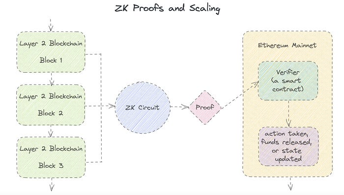
Succinct Non-Interactive Argument of Knowledge (SNARKs): SNARKs are an extremely effective and scalable form of zero-knowledge proof. They are utilized in many different applications, such as machine learning, blockchain technology, and more. Similar to other zero-knowledge proof techniques, SNARKs enable one party—the prover—to demonstrate to another—the verifier—that they are aware of a specific piece of information without disclosing any more information about that information.
The main characteristic of SNARKs is their succinctness, which refers to the fact that the size of the proof is substantially smaller than the amount of the original data being proved. Because to its high efficiency and scalability, SNARKs can be used in a wide range of applications, such as machine learning, blockchain technology, and more.
Uses for Zero Knowledge Proofs
ZKP applications include:
Verifying Identity ZKPs can be used to verify your identity without disclosing any personal information. This has uses in access control, digital signatures, and online authentication.
Proof of Ownership ZKPs can be used to demonstrate ownership of a certain asset without divulging any details about the asset itself. This has uses for protecting intellectual property, managing supply chains, and owning digital assets.
Financial Exchanges Without disclosing any details about the transaction itself, ZKPs can be used to validate financial transactions. Cryptocurrency, internet payments, and other digital financial transactions can all use this.
By enabling parties to make calculations on the data without disclosing the data itself, Data Privacy ZKPs can be used to preserve the privacy of sensitive data. Applications for this can be found in the financial, healthcare, and other sectors that handle sensitive data.
By enabling voters to confirm that their vote was counted without disclosing how they voted, elections ZKPs can be used to ensure the integrity of elections. This is applicable to electronic voting, including internet voting.
Cryptography Modern cryptography's ZKPs are a potent instrument that enable secure communication and authentication. This can be used for encrypted messaging and other purposes in the business sector as well as for military and intelligence operations.
Proofs of Zero Knowledge and Compliance
Kubernetes and regulatory compliance use ZKPs in many ways. Examples:
Security for Kubernetes ZKPs offer a mechanism to authenticate nodes without disclosing any sensitive information, enhancing the security of Kubernetes clusters. ZKPs, for instance, can be used to verify, without disclosing the specifics of the program, that the nodes in a Kubernetes cluster are running permitted software.
Compliance Inspection Without disclosing any sensitive information, ZKPs can be used to demonstrate compliance with rules like the GDPR, HIPAA, and PCI DSS. ZKPs, for instance, can be used to demonstrate that data has been encrypted and stored securely without divulging the specifics of the mechanism employed for either encryption or storage.
Access Management Without disclosing any private data, ZKPs can be used to offer safe access control to Kubernetes resources. ZKPs can be used, for instance, to demonstrate that a user has the necessary permissions to access a particular Kubernetes resource without disclosing the details of those permissions.
Safe Data Exchange Without disclosing any sensitive information, ZKPs can be used to securely transmit data between Kubernetes clusters or between several businesses. ZKPs, for instance, can be used to demonstrate the sharing of a specific piece of data between two parties without disclosing the details of the data itself.
Kubernetes deployments audited Without disclosing the specifics of the deployment or the data being processed, ZKPs can be used to demonstrate that Kubernetes deployments are working as planned. This can be helpful for auditing purposes and for ensuring that Kubernetes deployments are operating as planned.
ZKPs preserve data and maintain regulatory compliance by letting parties prove things without revealing sensitive information. ZKPs will be used more in Kubernetes as it grows.
Joseph Mavericks
3 years ago
You Don't Have to Spend $250 on TikTok Ads Because I Did
900K impressions, 8K clicks, and $$$ orders…
I recently started dropshipping. Now that I own my business and can charge it as a business expense, it feels less like money wasted if it doesn't work. I also made t-shirts to sell. I intended to open a t-shirt store and had many designs on a hard drive. I read that Tiktok advertising had a high conversion rate and low cost because they were new. According to many, the advertising' cost/efficiency ratio would plummet and become as bad as Google or Facebook Ads. Now felt like the moment to try Tiktok marketing and dropshipping. I work in marketing for a SaaS firm and have seen how poorly ads perform. I wanted to try it alone.
I set up $250 and ran advertising for a week. Before that, I made my own products, store, and marketing. In this post, I'll show you my process and results.
Setting up the store
Dropshipping is a sort of retail business in which the manufacturer ships the product directly to the client through an online platform maintained by a seller. The seller takes orders but has no stock. The manufacturer handles all orders. This no-stock concept increases profitability and flexibility.
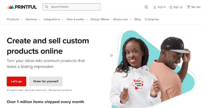
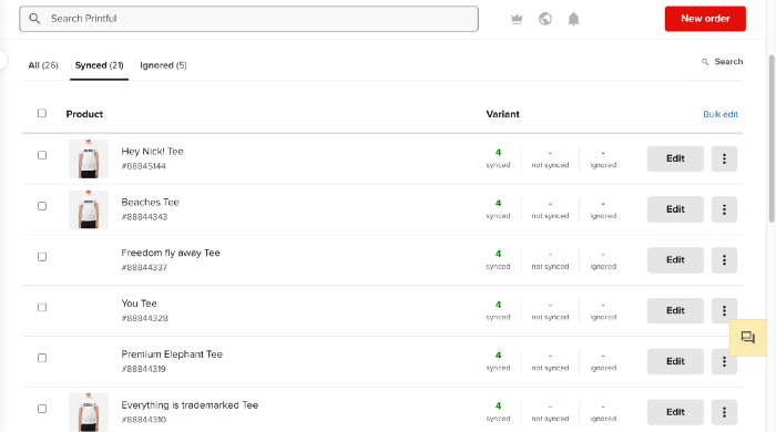
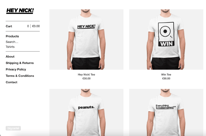
In my situation, I used previous t-shirt designs to make my own product. I didn't want to handle order fulfillment logistics, so I looked for a way to print my designs on demand, ship them, and handle order tracking/returns automatically. So I found Printful.
I needed to connect my backend and supplier to a storefront so visitors could buy. 99% of dropshippers use Shopify, but I didn't want to master the difficult application. I wanted a one-day project. I'd previously worked with Big Cartel, so I chose them.
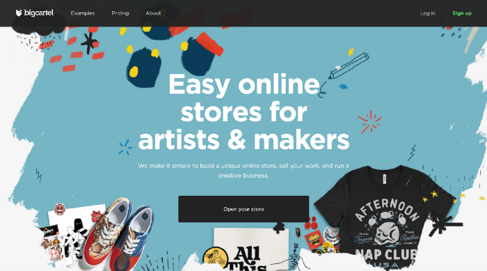
Big Cartel doesn't collect commissions on sales, simply a monthly flat price ($9.99 to $19.99 depending on your plan).
After opening a Big Cartel account, I uploaded 21 designs and product shots, then synced each product with Printful.
Developing the ads
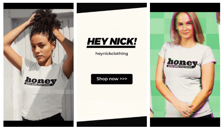
I mocked up my designs on cool people photographs from placeit.net, a great tool for creating product visuals when you don't have a studio, camera gear, or models to wear your t-shirts.
I opened an account on the website and had advertising visuals within 2 hours.
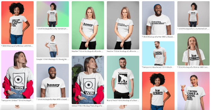
Because my designs are simple (black design on white t-shirt), I chose happy, stylish people on plain-colored backdrops. After that, I had to develop an animated slideshow.
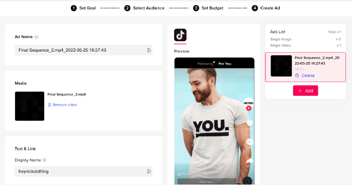
Because I'm a graphic designer, I chose to use Adobe Premiere to create animated Tiktok advertising.
Premiere is a fancy video editing application used for more than advertisements. Premiere is used to edit movies, not social media marketing. I wanted this experiment to be quick, so I got 3 social media ad templates from motionarray.com and threw my visuals in. All the transitions and animations were pre-made in the files, so it only took a few hours to compile. The result:
I downloaded 3 different soundtracks for the videos to determine which would convert best.
After that, I opened a Tiktok business account, uploaded my films, and inserted ad info. They went live within one hour.
The (poor) outcomes
As a European company, I couldn't deliver ads in the US. All of my advertisements' material (title, description, and call to action) was in English, hence they continued getting rejected in Europe for countries that didn't speak English. There are a lot of them:
I lost a lot of quality traffic, but I felt that if the images were engaging, people would check out the store and buy my t-shirts. I was wrong.
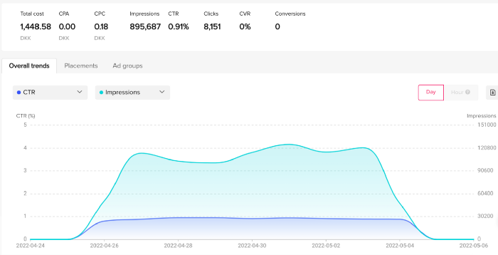
51,071 impressions on Day 1. 0 orders after 411 clicks
114,053 impressions on Day 2. 1.004 clicks and no orders
Day 3: 987 clicks, 103,685 impressions, and 0 orders
101,437 impressions on Day 4. 0 orders after 963 clicks
115,053 impressions on Day 5. 1,050 clicks and no purchases
125,799 impressions on day 6. 1,184 clicks, no purchases
115,547 impressions on Day 7. 1,050 clicks and no purchases
121,456 impressions on day 8. 1,083 clicks, no purchases
47,586 impressions on Day 9. 419 Clicks. No orders
My overall conversion rate for video advertisements was 0.9%. TikTok's paid ad formats all result in strong engagement rates (ads average 3% to 12% CTR to site), therefore a 1 to 2% CTR should have been doable.
My one-week experiment yielded 8,151 ad clicks but no sales. Even if 0.1% of those clicks converted, I should have made 8 sales. Even companies with horrible web marketing would get one download or trial sign-up for every 8,151 clicks. I knew that because my advertising were in English, I had no impressions in the main EU markets (France, Spain, Italy, Germany), and that this impacted my conversion potential. I still couldn't believe my numbers.
I dug into the statistics and found that Tiktok's stats didn't match my store traffic data.
Looking more closely at the numbers
My ads were approved on April 26 but didn't appear until April 27. My store dashboard showed 440 visitors but 1,004 clicks on Tiktok. This happens often while tracking campaign results since different platforms handle comparable user activities (click, view) differently. In online marketing, residual data won't always match across tools.
My data gap was too large. Even if half of the 1,004 persons who clicked closed their browser or left before the store site loaded, I would have gained 502 visitors. The significant difference between Tiktok clicks and Big Cartel store visits made me suspicious. It happened all week:
Day 1: 440 store visits and 1004 ad clicks
Day 2: 482 store visits, 987 ad clicks
3rd day: 963 hits on ads, 452 store visits
443 store visits and 1,050 ad clicks on day 4.
Day 5: 459 store visits and 1,184 ad clicks
Day 6: 430 store visits and 1,050 ad clicks
Day 7: 409 store visits and 1,031 ad clicks
Day 8: 166 store visits and 418 ad clicks
The disparity wasn't related to residual data or data processing. The disparity between visits and clicks looked regular, but I couldn't explain it.
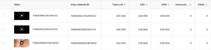
After the campaign concluded, I discovered all my creative assets (the videos) had a 0% CTR and a $0 expenditure in a separate dashboard. Whether it's a dashboard reporting issue or a budget allocation bug, online marketers shouldn't see this.
Tiktok can present any stats they want on their dashboard, just like any other platform that runs advertisements to promote content to its users. I can't verify that 895,687 individuals saw and clicked on my ad. I invested $200 for what appears to be around 900K impressions, which is an excellent ROI. No one bought a t-shirt, even an unattractive one, out of 900K people?
Would I do it again?
Nope. Whether I didn't make sales because Tiktok inflated the dashboard numbers or because I'm horrible at producing advertising and items that sell, I’ll stick to writing content and making videos. If setting up a business and ads in a few days was all it took to make money online, everyone would do it.
Video advertisements and dropshipping aren't dead. As long as the internet exists, people will click ads and buy stuff. Converting ads and selling stuff takes a lot of work, and I want to focus on other things.
I had always wanted to try dropshipping and I’m happy I did, I just won’t stick to it because that’s not something I’m interested in getting better at.
If I want to sell t-shirts again, I'll avoid Tiktok advertisements and find another route.

Katharine Valentino
3 years ago
A Gun-toting Teacher Is Like a Cook With Rat Poison
Pink or blue AR-15s?
A teacher teaches; a gun kills. Killing isn't teaching. Killing is opposite of teaching.
Without 27 school shootings this year, we wouldn't be talking about arming teachers. Gun makers, distributors, and the NRA cause most school shootings. Gun makers, distributors, and the NRA wouldn't be huge business if weapons weren't profitable.
Guns, ammo, body armor, holsters, concealed carriers, bore sights, cleaner kits, spare magazines and speed loaders, gun safes, and ear protection are sold. And more guns.
And lots more profit.
Guns aren't bread. You eat a loaf of bread in a week or so and then must buy more. Bread makers will make money. Winchester 94.30–30 1899 Lever Action Rifle from 1894 still kills. (For safety, I won't link to the ad.) Gun makers don't object if you collect antique weapons, but they need you to buy the latest, in-style killing machine. The youngster who killed 19 students and 2 teachers at Robb Elementary School in Uvalde, Texas, used an AR-15. Better yet, two.
Salvador Ramos, the Robb Elementary shooter, is a "killing influencer" He pushes consumers to buy items, which benefits manufacturers and distributors. Like every previous AR-15 influencer, he profits Colt, the rifle's manufacturer, and 52,779 gun dealers in the U.S. Ramos and other AR-15 influences make us fear for our safety and our children's. Fearing for our safety, we acquire 20 million firearms a year and live in a gun culture.
So now at school, we want to arm teachers.
Consider. Which of your teachers would you have preferred in body armor with a gun drawn?
Miss Summers? Remember her bringing daisies from her yard to second grade? She handed each student a beautiful flower. Miss Summers loved everyone, even those with AR-15s. She can't shoot.
Frasier? Mr. Frasier turned a youngster over down to explain "invert." Mr. Frasier's hands shook when he wasn't flipping fifth-graders and fractions. He may have shot wrong.
Mrs. Barkley barked in high school English class when anyone started an essay with "But." Mrs. Barkley dubbed Abie a "Jewboy" and gave him terrible grades. Arming Miss Barkley is like poisoning the chef.
Think back. Do you remember a teacher with a gun? No. Arming teachers so the gun industry can make more money is the craziest idea ever.
Or maybe you agree with Ted Cruz, the gun lobby-bought senator, that more guns reduce gun violence. After the next school shooting, you'll undoubtedly talk about arming teachers and pupils. Colt will likely develop a backpack-sized, lighter version of its popular killing machine in pink and blue for kids and boys. The MAR-15? (M for mini).
This post is a summary. Read the full one here.