

Donor-Advised Fund Tax Benefits (DAF)
Giving through a donor-advised fund can be tax-efficient. Using a donor-advised fund can reduce your tax liability while increasing your charitable impact.
Grow Your Donations Tax-Free.
Your DAF's charitable dollars can be invested before being distributed. Your DAF balance can grow with the market. This increases grantmaking funds. The assets of the DAF belong to the charitable sponsor, so you will not be taxed on any growth.
Avoid a Windfall Tax Year.
DAFs can help reduce tax burdens after a windfall like an inheritance, business sale, or strong market returns. Contributions to your DAF are immediately tax deductible, lowering your taxable income. With DAFs, you can effectively pre-fund years of giving with assets from a single high-income event.
Make a contribution to reduce or eliminate capital gains.
One of the most common ways to fund a DAF is by gifting publicly traded securities. Securities held for more than a year can be donated at fair market value and are not subject to capital gains tax. If a donor liquidates assets and then donates the proceeds to their DAF, capital gains tax reduces the amount available for philanthropy. Gifts of appreciated securities, mutual funds, real estate, and other assets are immediately tax deductible up to 30% of Adjusted gross income (AGI), with a five-year carry-forward for gifts that exceed AGI limits.
Using Appreciated Stock as a Gift
Donating appreciated stock directly to a DAF rather than liquidating it and donating the proceeds reduces philanthropists' tax liability by eliminating capital gains tax and lowering marginal income tax.
In the example below, a donor has $100,000 in long-term appreciated stock with a cost basis of $10,000:
Using a DAF would allow this donor to give more to charity while paying less taxes. This strategy often allows donors to give more than 20% more to their favorite causes.
For illustration purposes, this hypothetical example assumes a 35% income tax rate. All realized gains are subject to the federal long-term capital gains tax of 20% and the 3.8% Medicare surtax. No other state taxes are considered.
The information provided here is general and educational in nature. It is not intended to be, nor should it be construed as, legal or tax advice. NPT does not provide legal or tax advice. Furthermore, the content provided here is related to taxation at the federal level only. NPT strongly encourages you to consult with your tax advisor or attorney before making charitable contributions.
More on Economics & Investing

Ray Dalio
3 years ago
The latest “bubble indicator” readings.
As you know, I like to turn my intuition into decision rules (principles) that can be back-tested and automated to create a portfolio of alpha bets. I use one for bubbles. Having seen many bubbles in my 50+ years of investing, I described what makes a bubble and how to identify them in markets—not just stocks.
A bubble market has a high degree of the following:
- High prices compared to traditional values (e.g., by taking the present value of their cash flows for the duration of the asset and comparing it with their interest rates).
- Conditons incompatible with long-term growth (e.g., extrapolating past revenue and earnings growth rates late in the cycle).
- Many new and inexperienced buyers were drawn in by the perceived hot market.
- Broad bullish sentiment.
- Debt financing a large portion of purchases.
- Lots of forward and speculative purchases to profit from price rises (e.g., inventories that are more than needed, contracted forward purchases, etc.).
I use these criteria to assess all markets for bubbles. I have periodically shown you these for stocks and the stock market.
What Was Shown in January Versus Now
I will first describe the picture in words, then show it in charts, and compare it to the last update in January.
As of January, the bubble indicator showed that a) the US equity market was in a moderate bubble, but not an extreme one (ie., 70 percent of way toward the highest bubble, which occurred in the late 1990s and late 1920s), and b) the emerging tech companies (ie. As well, the unprecedented flood of liquidity post-COVID financed other bubbly behavior (e.g. SPACs, IPO boom, big pickup in options activity), making things bubbly. I showed which stocks were in bubbles and created an index of those stocks, which I call “bubble stocks.”
Those bubble stocks have popped. They fell by a third last year, while the S&P 500 remained flat. In light of these and other market developments, it is not necessarily true that now is a good time to buy emerging tech stocks.
The fact that they aren't at a bubble extreme doesn't mean they are safe or that it's a good time to get long. Our metrics still show that US stocks are overvalued. Once popped, bubbles tend to overcorrect to the downside rather than settle at “normal” prices.
The following charts paint the picture. The first shows the US equity market bubble gauge/indicator going back to 1900, currently at the 40% percentile. The charts also zoom in on the gauge in recent years, as well as the late 1920s and late 1990s bubbles (during both of these cases the gauge reached 100 percent ).
The chart below depicts the average bubble gauge for the most bubbly companies in 2020. Those readings are down significantly.
The charts below compare the performance of a basket of emerging tech bubble stocks to the S&P 500. Prices have fallen noticeably, giving up most of their post-COVID gains.
The following charts show the price action of the bubble slice today and in the 1920s and 1990s. These charts show the same market dynamics and two key indicators. These are just two examples of how a lot of debt financing stock ownership coupled with a tightening typically leads to a bubble popping.
Everything driving the bubbles in this market segment is classic—the same drivers that drove the 1920s bubble and the 1990s bubble. For instance, in the last couple months, it was how tightening can act to prick the bubble. Review this case study of the 1920s stock bubble (starting on page 49) from my book Principles for Navigating Big Debt Crises to grasp these dynamics.
The following charts show the components of the US stock market bubble gauge. Since this is a proprietary indicator, I will only show you some of the sub-aggregate readings and some indicators.
Each of these six influences is measured using a number of stats. This is how I approach the stock market. These gauges are combined into aggregate indices by security and then for the market as a whole. The table below shows the current readings of these US equity market indicators. It compares current conditions for US equities to historical conditions. These readings suggest that we’re out of a bubble.
1. How High Are Prices Relatively?
This price gauge for US equities is currently around the 50th percentile.
2. Is price reduction unsustainable?
This measure calculates the earnings growth rate required to outperform bonds. This is calculated by adding up the readings of individual securities. This indicator is currently near the 60th percentile for the overall market, higher than some of our other readings. Profit growth discounted in stocks remains high.
Even more so in the US software sector. Analysts' earnings growth expectations for this sector have slowed, but remain high historically. P/Es have reversed COVID gains but remain high historical.
3. How many new buyers (i.e., non-existing buyers) entered the market?
Expansion of new entrants is often indicative of a bubble. According to historical accounts, this was true in the 1990s equity bubble and the 1929 bubble (though our data for this and other gauges doesn't go back that far). A flood of new retail investors into popular stocks, which by other measures appeared to be in a bubble, pushed this gauge above the 90% mark in 2020. The pace of retail activity in the markets has recently slowed to pre-COVID levels.
4. How Broadly Bullish Is Sentiment?
The more people who have invested, the less resources they have to keep investing, and the more likely they are to sell. Market sentiment is now significantly negative.
5. Are Purchases Being Financed by High Leverage?
Leveraged purchases weaken the buying foundation and expose it to forced selling in a downturn. The leverage gauge, which considers option positions as a form of leverage, is now around the 50% mark.
6. To What Extent Have Buyers Made Exceptionally Extended Forward Purchases?
Looking at future purchases can help assess whether expectations have become overly optimistic. This indicator is particularly useful in commodity and real estate markets, where forward purchases are most obvious. In the equity markets, I look at indicators like capital expenditure, or how much businesses (and governments) invest in infrastructure, factories, etc. It reflects whether businesses are projecting future demand growth. Like other gauges, this one is at the 40th percentile.
What one does with it is a tactical choice. While the reversal has been significant, future earnings discounting remains high historically. In either case, bubbles tend to overcorrect (sell off more than the fundamentals suggest) rather than simply deflate. But I wanted to share these updated readings with you in light of recent market activity.

Theresa W. Carey
3 years ago
How Payment for Order Flow (PFOF) Works
What is PFOF?
PFOF is a brokerage firm's compensation for directing orders to different parties for trade execution. The brokerage firm receives fractions of a penny per share for directing the order to a market maker.
Each optionable stock could have thousands of contracts, so market makers dominate options trades. Order flow payments average less than $0.50 per option contract.
Order Flow Payments (PFOF) Explained
The proliferation of exchanges and electronic communication networks has complicated equity and options trading (ECNs) Ironically, Bernard Madoff, the Ponzi schemer, pioneered pay-for-order-flow.
In a December 2000 study on PFOF, the SEC said, "Payment for order flow is a method of transferring trading profits from market making to brokers who route customer orders to specialists for execution."
Given the complexity of trading thousands of stocks on multiple exchanges, market making has grown. Market makers are large firms that specialize in a set of stocks and options, maintaining an inventory of shares and contracts for buyers and sellers. Market makers are paid the bid-ask spread. Spreads have narrowed since 2001, when exchanges switched to decimals. A market maker's ability to play both sides of trades is key to profitability.
Benefits, requirements
A broker receives fees from a third party for order flow, sometimes without a client's knowledge. This invites conflicts of interest and criticism. Regulation NMS from 2005 requires brokers to disclose their policies and financial relationships with market makers.
Your broker must tell you if it's paid to send your orders to specific parties. This must be done at account opening and annually. The firm must disclose whether it participates in payment-for-order-flow and, upon request, every paid order. Brokerage clients can request payment data on specific transactions, but the response takes weeks.
Order flow payments save money. Smaller brokerage firms can benefit from routing orders through market makers and getting paid. This allows brokerage firms to send their orders to another firm to be executed with other orders, reducing costs. The market maker or exchange benefits from additional share volume, so it pays brokerage firms to direct traffic.
Retail investors, who lack bargaining power, may benefit from order-filling competition. Arrangements to steer the business in one direction invite wrongdoing, which can erode investor confidence in financial markets and their players.
Pay-for-order-flow criticism
It has always been controversial. Several firms offering zero-commission trades in the late 1990s routed orders to untrustworthy market makers. During the end of fractional pricing, the smallest stock spread was $0.125. Options spreads widened. Traders found that some of their "free" trades cost them a lot because they weren't getting the best price.
The SEC then studied the issue, focusing on options trades, and nearly decided to ban PFOF. The proliferation of options exchanges narrowed spreads because there was more competition for executing orders. Options market makers said their services provided liquidity. In its conclusion, the report said, "While increased multiple-listing produced immediate economic benefits to investors in the form of narrower quotes and effective spreads, these improvements have been muted with the spread of payment for order flow and internalization."
The SEC allowed payment for order flow to continue to prevent exchanges from gaining monopoly power. What would happen to trades if the practice was outlawed was also unclear. SEC requires brokers to disclose financial arrangements with market makers. Since then, the SEC has watched closely.
2020 Order Flow Payment
Rule 605 and Rule 606 show execution quality and order flow payment statistics on a broker's website. Despite being required by the SEC, these reports can be hard to find. The SEC mandated these reports in 2005, but the format and reporting requirements have changed over the years, most recently in 2018.
Brokers and market makers formed a working group with the Financial Information Forum (FIF) to standardize order execution quality reporting. Only one retail brokerage (Fidelity) and one market maker remain (Two Sigma Securities). FIF notes that the 605/606 reports "do not provide the level of information that allows a retail investor to gauge how well a broker-dealer fills a retail order compared to the NBBO (national best bid or offer’) at the time the order was received by the executing broker-dealer."
In the first quarter of 2020, Rule 606 reporting changed to require brokers to report net payments from market makers for S&P 500 and non-S&P 500 equity trades and options trades. Brokers must disclose payment rates per 100 shares by order type (market orders, marketable limit orders, non-marketable limit orders, and other orders).
Richard Repetto, Managing Director of New York-based Piper Sandler & Co., publishes a report on Rule 606 broker reports. Repetto focused on Charles Schwab, TD Ameritrade, E-TRADE, and Robinhood in Q2 2020. Repetto reported that payment for order flow was higher in the second quarter than the first due to increased trading activity, and that options paid more than equities.
Repetto says PFOF contributions rose overall. Schwab has the lowest options rates, while TD Ameritrade and Robinhood have the highest. Robinhood had the highest equity rating. Repetto assumes Robinhood's ability to charge higher PFOF reflects their order flow profitability and that they receive a fixed rate per spread (vs. a fixed rate per share by the other brokers).
Robinhood's PFOF in equities and options grew the most quarter-over-quarter of the four brokers Piper Sandler analyzed, as did their implied volumes. All four brokers saw higher PFOF rates.
TD Ameritrade took the biggest income hit when cutting trading commissions in fall 2019, and this report shows they're trying to make up the shortfall by routing orders for additional PFOF. Robinhood refuses to disclose trading statistics using the same metrics as the rest of the industry, offering only a vague explanation on their website.
Summary
Payment for order flow has become a major source of revenue as brokers offer no-commission equity (stock and ETF) orders. For retail investors, payment for order flow poses a problem because the brokerage may route orders to a market maker for its own benefit, not the investor's.
Infrequent or small-volume traders may not notice their broker's PFOF practices. Frequent traders and those who trade larger quantities should learn about their broker's order routing system to ensure they're not losing out on price improvement due to a broker prioritizing payment for order flow.
This post is a summary. Read full article here

Sam Hickmann
3 years ago
What is this Fed interest rate everybody is talking about that makes or breaks the stock market?
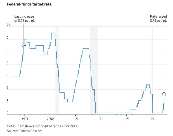
The Federal Funds Rate (FFR) is the target interest rate set by the Federal Reserve System (Fed)'s policy-making body (FOMC). This target is the rate at which the Fed suggests commercial banks borrow and lend their excess reserves overnight to each other.
The FOMC meets 8 times a year to set the target FFR. This is supposed to promote economic growth. The overnight lending market sets the actual rate based on commercial banks' short-term reserves. If the market strays too far, the Fed intervenes.
Banks must keep a certain percentage of their deposits in a Federal Reserve account. A bank's reserve requirement is a percentage of its total deposits. End-of-day bank account balances averaged over two-week reserve maintenance periods are used to determine reserve requirements.
If a bank expects to have end-of-day balances above what's needed, it can lend the excess to another institution.
The FOMC adjusts interest rates based on economic indicators that show inflation, recession, or other issues that affect economic growth. Core inflation and durable goods orders are indicators.
In response to economic conditions, the FFR target has changed over time. In the early 1980s, inflation pushed it to 20%. During the Great Recession of 2007-2009, the rate was slashed to 0.15 percent to encourage growth.
Inflation picked up in May 2022 despite earlier rate hikes, prompting today's 0.75 percent point increase. The largest increase since 1994. It might rise to around 3.375% this year and 3.1% by the end of 2024.
You might also like

Aure's Notes
3 years ago
I met a man who in just 18 months scaled his startup to $100 million.
A fascinating business conversation.

This week at Web Summit, I had mentor hour.
Mentor hour connects startups with experienced entrepreneurs.
The YC-selected founder who mentored me had grown his company to $100 million in 18 months.
I had 45 minutes to question him.
I've compiled this.
Context
Founder's name is Zack.
After working in private equity, Zack opted to acquire an MBA.
Surrounded by entrepreneurs at a prominent school, he decided to become one himself.
Unsure how to proceed, he bet on two horses.
On one side, he received an offer from folks who needed help running their startup owing to lack of time. On the other hand, he had an idea for a SaaS to start himself.
He just needed to validate it.
Validating
Since Zack's proposal helped companies, he contacted university entrepreneurs for comments.
He contacted university founders.
Once he knew he'd correctly identified the problem and that people were willing to pay to address it, he started developing.
He earned $100k in a university entrepreneurship competition.
His plan was evident by then.
The other startup's founders saw his potential and granted him $400k to launch his own SaaS.
Hiring
He started looking for a tech co-founder because he lacked IT skills.
He interviewed dozens and picked the finest.
As he didn't want to wait for his program to be ready, he contacted hundreds of potential clients and got 15 letters of intent promising they'd join up when it was available.
YC accepted him by then.
He had enough positive signals to raise.
Raising
He didn't say how many VCs he called, but he indicated 50 were interested.
He jammed meetings into two weeks to generate pressure and encourage them to invest.
Seed raise: $11 million.
Selling
His objective was to contact as many entrepreneurs as possible to promote his product.
He first contacted startups by scraping CrunchBase data.
Once he had more money, he started targeting companies with ZoomInfo.
His VC urged him not to hire salespeople until he closed 50 clients himself.
He closed 100 and hired a CRO through a headhunter.
Scaling
Three persons started the business.
He primarily works in sales.
Coding the product was done by his co-founder.
Another person performing operational duties.
He regretted recruiting the third co-founder, who was ineffective (could have hired an employee instead).
He wanted his company to be big, so he hired two young marketing people from a competing company.
After validating several marketing channels, he chose PR.
$100 Million and under
He developed a sales team and now employs 30 individuals.
He raised a $100 million Series A.
Additionally, he stated
He’s been rejected a lot. Like, a lot.
Two great books to read: Steve Jobs by Isaacson, and Why Startups Fail by Tom Eisenmann.
The best skill to learn for non-tech founders is “telling stories”, which means sales. A founder’s main job is to convince: co-founders, employees, investors, and customers. Learn code, or learn sales.
Conclusion
I often read about these stories but hardly take them seriously.
Zack was amazing.
Three things about him stand out:
His vision. He possessed a certain amount of fire.
His vitality. The man had a lot of enthusiasm and spoke quickly and decisively. He takes no chances and pushes the envelope in all he does.
His Rolex.
He didn't do all this in 18 months.
Not really.
He couldn't launch his company without private equity experience.
These accounts disregard entrepreneurs' original knowledge.
Hormozi will tell you how he founded Gym Launch, but he won't tell you how he had a gym first, how he worked at uni to pay for his gym, or how he went to the gym and learnt about fitness, which gave him the idea to open his own.
Nobody knows nothing. If you scale quickly, it's probable because you gained information early.
Lincoln said, "Give me six hours to chop down a tree, and I'll spend four sharpening the axe."
Sharper axes cut trees faster.
Eric Esposito
3 years ago
$100M in NFT TV shows from Fox

Fox executives will invest $100 million in NFT-based TV shows. Fox brought in "Rick and Morty" co-creator Dan Harmon to create "Krapopolis"
Fox's Blockchain Creative Labs (BCL) will develop these NFT TV shows with Bento Box Entertainment. BCL markets Fox's WWE "Moonsault" NFT.
Fox said it would use the $100 million to build a "creative community" and "brand ecosystem." The media giant mentioned using these funds for NFT "benefits."
"Krapopolis" will be a Greek-themed animated comedy, per Rarity Sniper. Initial reports said NFT buyers could collaborate on "character development" and get exclusive perks.
Fox Entertainment may drop "Krapopolis" NFTs on Ethereum, according to new reports. Fox says it will soon release more details on its NFT plans for "Krapopolis."
Media Giants Favor "NFT Storytelling"
"Krapopolis" is one of the largest "NFT storytelling" experiments due to Dan Harmon's popularity and Fox Entertainment's reach. Many celebrities have begun exploring Web3 for TV shows.
Mila Kunis' animated sitcom "The Gimmicks" lets fans direct the show. Any "Gimmick" NFT holder could contribute to episode plots.
"The Gimmicks" lets NFT holders write fan fiction about their avatars. If show producers like what they read, their NFT may appear in an episode.
Rob McElhenney recently launched "Adimverse," a Web3 writers' community. Anyone with a "Adimverse" NFT can collaborate on creative projects and share royalties.
Many blue-chip NFTs are appearing in movies and TV shows. Coinbase will release Bored Ape Yacht Club shorts at NFT. NYC. Reese Witherspoon is working on a World of Women NFT series.
PFP NFT collections have Hollywood media partners. Guy Oseary manages Madonna's World of Women and Bored Ape Yacht Club collections. The Doodles signed with Billboard's Julian Holguin and the Cool Cats with CAA.
Web3 and NFTs are changing how many filmmakers tell stories.

Startup Journal
3 years ago
The Top 14 Software Business Ideas That Are Sure To Succeed in 2023
Software can change any company.

Software is becoming essential. Everyone should consider how software affects their lives and others'.
Software on your phone, tablet, or computer offers many new options. We're experts in enough ways now.
Software Business Ideas will be popular by 2023.
ERP Programs
ERP software meets rising demand.
ERP solutions automate and monitor tasks that large organizations, businesses, and even schools would struggle to do manually.
ERP software could reach $49 billion by 2024.
CRM Program
CRM software is a must-have for any customer-focused business.
Having an open mind about your business services and products allows you to change platforms.
Another company may only want your CRM service.
Medical software
Healthcare facilities need reliable, easy-to-use software.
EHRs, MDDBs, E-Prescribing, and more are software options.
The global medical software market could reach $11 billion by 2025, and mobile medical apps may follow.
Presentation Software in the Cloud
SaaS presentation tools are great.
They're easy to use, comprehensive, and full of traditional Software features.
In today's cloud-based world, these solutions make life easier for people. We don't know about you, but we like it.
Software for Project Management
People began working remotely without signs or warnings before the 2020 COVID-19 pandemic.
Many organizations found it difficult to track projects and set deadlines.
With PMP software tools, teams can manage remote units and collaborate effectively.
App for Blockchain-Based Invoicing
This advanced billing and invoicing solution is for businesses and freelancers.
These blockchain-based apps can calculate taxes, manage debts, and manage transactions.
Intelligent contracts help blockchain track transactions more efficiently. It speeds up and improves invoice generation.
Software for Business Communications
Internal business messaging is tricky.
Top business software tools for communication can share files, collaborate on documents, host video conferences, and more.
Payroll Automation System
Software development also includes developing an automated payroll system.
These software systems reduce manual tasks for timely employee payments.
These tools help enterprise clients calculate total wages quickly, simplify tax calculations, improve record-keeping, and support better financial planning.
System for Detecting Data Leaks
Both businesses and individuals value data highly. Yahoo's data breach is dangerous because of this.
This area of software development can help people protect their data.
You can design an advanced data loss prevention system.
AI-based Retail System
AI-powered shopping systems are popular. The systems analyze customers' search and purchase patterns and store history and are equipped with a keyword database.
These systems offer many customers pre-loaded products.
AI-based shopping algorithms also help users make purchases.
Software for Detecting Plagiarism
Software can help ensure your projects are original and not plagiarized.
These tools detect plagiarized content that Google, media, and educational institutions don't like.
Software for Converting Audio to Text
Machine Learning converts speech to text automatically.
These programs can quickly transcribe cloud-based files.
Software for daily horoscopes
Daily and monthly horoscopes will continue to be popular.
Software platforms that can predict forecasts, calculate birth charts, and other astrology resources are good business ideas.
E-learning Programs
Traditional study methods are losing popularity as virtual schools proliferate and physical space shrinks.
Khan Academy online courses are the best way to keep learning.
Online education portals can boost your learning. If you want to start a tech startup, consider creating an e-learning program.
Conclusion
Software is booming. There's never been a better time to start a software development business, with so many people using computers and smartphones. This article lists eight business ideas for 2023. Consider these ideas if you're just starting out or looking to expand.