


The latest “bubble indicator” readings.
As you know, I like to turn my intuition into decision rules (principles) that can be back-tested and automated to create a portfolio of alpha bets. I use one for bubbles. Having seen many bubbles in my 50+ years of investing, I described what makes a bubble and how to identify them in markets—not just stocks.
A bubble market has a high degree of the following:
- High prices compared to traditional values (e.g., by taking the present value of their cash flows for the duration of the asset and comparing it with their interest rates).
- Conditons incompatible with long-term growth (e.g., extrapolating past revenue and earnings growth rates late in the cycle).
- Many new and inexperienced buyers were drawn in by the perceived hot market.
- Broad bullish sentiment.
- Debt financing a large portion of purchases.
- Lots of forward and speculative purchases to profit from price rises (e.g., inventories that are more than needed, contracted forward purchases, etc.).
I use these criteria to assess all markets for bubbles. I have periodically shown you these for stocks and the stock market.
What Was Shown in January Versus Now
I will first describe the picture in words, then show it in charts, and compare it to the last update in January.
As of January, the bubble indicator showed that a) the US equity market was in a moderate bubble, but not an extreme one (ie., 70 percent of way toward the highest bubble, which occurred in the late 1990s and late 1920s), and b) the emerging tech companies (ie. As well, the unprecedented flood of liquidity post-COVID financed other bubbly behavior (e.g. SPACs, IPO boom, big pickup in options activity), making things bubbly. I showed which stocks were in bubbles and created an index of those stocks, which I call “bubble stocks.”
Those bubble stocks have popped. They fell by a third last year, while the S&P 500 remained flat. In light of these and other market developments, it is not necessarily true that now is a good time to buy emerging tech stocks.
The fact that they aren't at a bubble extreme doesn't mean they are safe or that it's a good time to get long. Our metrics still show that US stocks are overvalued. Once popped, bubbles tend to overcorrect to the downside rather than settle at “normal” prices.
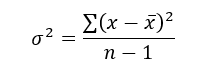
The following charts paint the picture. The first shows the US equity market bubble gauge/indicator going back to 1900, currently at the 40% percentile. The charts also zoom in on the gauge in recent years, as well as the late 1920s and late 1990s bubbles (during both of these cases the gauge reached 100 percent ).
The chart below depicts the average bubble gauge for the most bubbly companies in 2020. Those readings are down significantly.
The charts below compare the performance of a basket of emerging tech bubble stocks to the S&P 500. Prices have fallen noticeably, giving up most of their post-COVID gains.
The following charts show the price action of the bubble slice today and in the 1920s and 1990s. These charts show the same market dynamics and two key indicators. These are just two examples of how a lot of debt financing stock ownership coupled with a tightening typically leads to a bubble popping.
Everything driving the bubbles in this market segment is classic—the same drivers that drove the 1920s bubble and the 1990s bubble. For instance, in the last couple months, it was how tightening can act to prick the bubble. Review this case study of the 1920s stock bubble (starting on page 49) from my book Principles for Navigating Big Debt Crises to grasp these dynamics.
The following charts show the components of the US stock market bubble gauge. Since this is a proprietary indicator, I will only show you some of the sub-aggregate readings and some indicators.
Each of these six influences is measured using a number of stats. This is how I approach the stock market. These gauges are combined into aggregate indices by security and then for the market as a whole. The table below shows the current readings of these US equity market indicators. It compares current conditions for US equities to historical conditions. These readings suggest that we’re out of a bubble.
1. How High Are Prices Relatively?
This price gauge for US equities is currently around the 50th percentile.
2. Is price reduction unsustainable?
This measure calculates the earnings growth rate required to outperform bonds. This is calculated by adding up the readings of individual securities. This indicator is currently near the 60th percentile for the overall market, higher than some of our other readings. Profit growth discounted in stocks remains high.
Even more so in the US software sector. Analysts' earnings growth expectations for this sector have slowed, but remain high historically. P/Es have reversed COVID gains but remain high historical.
3. How many new buyers (i.e., non-existing buyers) entered the market?
Expansion of new entrants is often indicative of a bubble. According to historical accounts, this was true in the 1990s equity bubble and the 1929 bubble (though our data for this and other gauges doesn't go back that far). A flood of new retail investors into popular stocks, which by other measures appeared to be in a bubble, pushed this gauge above the 90% mark in 2020. The pace of retail activity in the markets has recently slowed to pre-COVID levels.
4. How Broadly Bullish Is Sentiment?
The more people who have invested, the less resources they have to keep investing, and the more likely they are to sell. Market sentiment is now significantly negative.
5. Are Purchases Being Financed by High Leverage?
Leveraged purchases weaken the buying foundation and expose it to forced selling in a downturn. The leverage gauge, which considers option positions as a form of leverage, is now around the 50% mark.
6. To What Extent Have Buyers Made Exceptionally Extended Forward Purchases?
Looking at future purchases can help assess whether expectations have become overly optimistic. This indicator is particularly useful in commodity and real estate markets, where forward purchases are most obvious. In the equity markets, I look at indicators like capital expenditure, or how much businesses (and governments) invest in infrastructure, factories, etc. It reflects whether businesses are projecting future demand growth. Like other gauges, this one is at the 40th percentile.
What one does with it is a tactical choice. While the reversal has been significant, future earnings discounting remains high historically. In either case, bubbles tend to overcorrect (sell off more than the fundamentals suggest) rather than simply deflate. But I wanted to share these updated readings with you in light of recent market activity.
More on Economics & Investing

Theresa W. Carey
3 years ago
How Payment for Order Flow (PFOF) Works
What is PFOF?
PFOF is a brokerage firm's compensation for directing orders to different parties for trade execution. The brokerage firm receives fractions of a penny per share for directing the order to a market maker.
Each optionable stock could have thousands of contracts, so market makers dominate options trades. Order flow payments average less than $0.50 per option contract.
Order Flow Payments (PFOF) Explained
The proliferation of exchanges and electronic communication networks has complicated equity and options trading (ECNs) Ironically, Bernard Madoff, the Ponzi schemer, pioneered pay-for-order-flow.
In a December 2000 study on PFOF, the SEC said, "Payment for order flow is a method of transferring trading profits from market making to brokers who route customer orders to specialists for execution."
Given the complexity of trading thousands of stocks on multiple exchanges, market making has grown. Market makers are large firms that specialize in a set of stocks and options, maintaining an inventory of shares and contracts for buyers and sellers. Market makers are paid the bid-ask spread. Spreads have narrowed since 2001, when exchanges switched to decimals. A market maker's ability to play both sides of trades is key to profitability.
Benefits, requirements
A broker receives fees from a third party for order flow, sometimes without a client's knowledge. This invites conflicts of interest and criticism. Regulation NMS from 2005 requires brokers to disclose their policies and financial relationships with market makers.
Your broker must tell you if it's paid to send your orders to specific parties. This must be done at account opening and annually. The firm must disclose whether it participates in payment-for-order-flow and, upon request, every paid order. Brokerage clients can request payment data on specific transactions, but the response takes weeks.
Order flow payments save money. Smaller brokerage firms can benefit from routing orders through market makers and getting paid. This allows brokerage firms to send their orders to another firm to be executed with other orders, reducing costs. The market maker or exchange benefits from additional share volume, so it pays brokerage firms to direct traffic.
Retail investors, who lack bargaining power, may benefit from order-filling competition. Arrangements to steer the business in one direction invite wrongdoing, which can erode investor confidence in financial markets and their players.
Pay-for-order-flow criticism
It has always been controversial. Several firms offering zero-commission trades in the late 1990s routed orders to untrustworthy market makers. During the end of fractional pricing, the smallest stock spread was $0.125. Options spreads widened. Traders found that some of their "free" trades cost them a lot because they weren't getting the best price.
The SEC then studied the issue, focusing on options trades, and nearly decided to ban PFOF. The proliferation of options exchanges narrowed spreads because there was more competition for executing orders. Options market makers said their services provided liquidity. In its conclusion, the report said, "While increased multiple-listing produced immediate economic benefits to investors in the form of narrower quotes and effective spreads, these improvements have been muted with the spread of payment for order flow and internalization."
The SEC allowed payment for order flow to continue to prevent exchanges from gaining monopoly power. What would happen to trades if the practice was outlawed was also unclear. SEC requires brokers to disclose financial arrangements with market makers. Since then, the SEC has watched closely.
2020 Order Flow Payment
Rule 605 and Rule 606 show execution quality and order flow payment statistics on a broker's website. Despite being required by the SEC, these reports can be hard to find. The SEC mandated these reports in 2005, but the format and reporting requirements have changed over the years, most recently in 2018.
Brokers and market makers formed a working group with the Financial Information Forum (FIF) to standardize order execution quality reporting. Only one retail brokerage (Fidelity) and one market maker remain (Two Sigma Securities). FIF notes that the 605/606 reports "do not provide the level of information that allows a retail investor to gauge how well a broker-dealer fills a retail order compared to the NBBO (national best bid or offer’) at the time the order was received by the executing broker-dealer."
In the first quarter of 2020, Rule 606 reporting changed to require brokers to report net payments from market makers for S&P 500 and non-S&P 500 equity trades and options trades. Brokers must disclose payment rates per 100 shares by order type (market orders, marketable limit orders, non-marketable limit orders, and other orders).
Richard Repetto, Managing Director of New York-based Piper Sandler & Co., publishes a report on Rule 606 broker reports. Repetto focused on Charles Schwab, TD Ameritrade, E-TRADE, and Robinhood in Q2 2020. Repetto reported that payment for order flow was higher in the second quarter than the first due to increased trading activity, and that options paid more than equities.
Repetto says PFOF contributions rose overall. Schwab has the lowest options rates, while TD Ameritrade and Robinhood have the highest. Robinhood had the highest equity rating. Repetto assumes Robinhood's ability to charge higher PFOF reflects their order flow profitability and that they receive a fixed rate per spread (vs. a fixed rate per share by the other brokers).
Robinhood's PFOF in equities and options grew the most quarter-over-quarter of the four brokers Piper Sandler analyzed, as did their implied volumes. All four brokers saw higher PFOF rates.
TD Ameritrade took the biggest income hit when cutting trading commissions in fall 2019, and this report shows they're trying to make up the shortfall by routing orders for additional PFOF. Robinhood refuses to disclose trading statistics using the same metrics as the rest of the industry, offering only a vague explanation on their website.
Summary
Payment for order flow has become a major source of revenue as brokers offer no-commission equity (stock and ETF) orders. For retail investors, payment for order flow poses a problem because the brokerage may route orders to a market maker for its own benefit, not the investor's.
Infrequent or small-volume traders may not notice their broker's PFOF practices. Frequent traders and those who trade larger quantities should learn about their broker's order routing system to ensure they're not losing out on price improvement due to a broker prioritizing payment for order flow.
This post is a summary. Read full article here

Sofien Kaabar, CFA
2 years ago
Innovative Trading Methods: The Catapult Indicator
Python Volatility-Based Catapult Indicator

As a catapult, this technical indicator uses three systems: Volatility (the fulcrum), Momentum (the propeller), and a Directional Filter (Acting as the support). The goal is to get a signal that predicts volatility acceleration and direction based on historical patterns. We want to know when the market will move. and where. This indicator outperforms standard indicators.
Knowledge must be accessible to everyone. This is why my new publications Contrarian Trading Strategies in Python and Trend Following Strategies in Python now include free PDF copies of my first three books (Therefore, purchasing one of the new books gets you 4 books in total). GitHub-hosted advanced indications and techniques are in the two new books above.
The Foundation: Volatility
The Catapult predicts significant changes with the 21-period Relative Volatility Index.
The Average True Range, Mean Absolute Deviation, and Standard Deviation all assess volatility. Standard Deviation will construct the Relative Volatility Index.
Standard Deviation is the most basic volatility. It underpins descriptive statistics and technical indicators like Bollinger Bands. Before calculating Standard Deviation, let's define Variance.
Variance is the squared deviations from the mean (a dispersion measure). We take the square deviations to compel the distance from the mean to be non-negative, then we take the square root to make the measure have the same units as the mean, comparing apples to apples (mean to standard deviation standard deviation). Variance formula:
As stated, standard deviation is:
# The function to add a number of columns inside an array
def adder(Data, times):

    for i in range(1, times + 1):

        new_col = np.zeros((len(Data), 1), dtype = float)
        Data = np.append(Data, new_col, axis = 1)

    return Data

# The function to delete a number of columns starting from an index
def deleter(Data, index, times):

    for i in range(1, times + 1):

        Data = np.delete(Data, index, axis = 1)

    return Data

# The function to delete a number of rows from the beginning
def jump(Data, jump):

    Data = Data[jump:, ]

    return Data

# Example of adding 3 empty columns to an array
my_ohlc_array = adder(my_ohlc_array, 3)

# Example of deleting the 2 columns after the column indexed at 3
my_ohlc_array = deleter(my_ohlc_array, 3, 2)

# Example of deleting the first 20 rows
my_ohlc_array = jump(my_ohlc_array, 20)

# Remember, OHLC is an abbreviation of Open, High, Low, and Close and it refers to the standard historical data file

def volatility(Data, lookback, what, where):

  for i in range(len(Data)):

     try:

        Data[i, where] = (Data[i - lookback + 1:i + 1, what].std())
     except IndexError:
        pass

  return Data
The RSI is the most popular momentum indicator, and for good reason—it excels in range markets. Its 0–100 range simplifies interpretation. Fame boosts its potential.
The more traders and portfolio managers look at the RSI, the more people will react to its signals, pushing market prices. Technical Analysis is self-fulfilling, therefore this theory is obvious yet unproven.
RSI is determined simply. Start with one-period pricing discrepancies. We must remove each closing price from the previous one. We then divide the smoothed average of positive differences by the smoothed average of negative differences. The RSI algorithm converts the Relative Strength from the last calculation into a value between 0 and 100.
def ma(Data, lookback, close, where):

    Data = adder(Data, 1)

    for i in range(len(Data)):

            try:
                Data[i, where] = (Data[i - lookback + 1:i + 1, close].mean())

            except IndexError:
                pass

    # Cleaning
    Data = jump(Data, lookback)

    return Data
def ema(Data, alpha, lookback, what, where):

    alpha = alpha / (lookback + 1.0)
    beta  = 1 - alpha

    # First value is a simple SMA
    Data = ma(Data, lookback, what, where)

    # Calculating first EMA
    Data[lookback + 1, where] = (Data[lookback + 1, what] * alpha) + (Data[lookback, where] * beta)

    # Calculating the rest of EMA
    for i in range(lookback + 2, len(Data)):
            try:
                Data[i, where] = (Data[i, what] * alpha) + (Data[i - 1, where] * beta)

            except IndexError:
                pass

    return Datadef rsi(Data, lookback, close, where, width = 1, genre = 'Smoothed'):

    # Adding a few columns
    Data = adder(Data, 7)

    # Calculating Differences
    for i in range(len(Data)):

        Data[i, where] = Data[i, close] - Data[i - width, close]

    # Calculating the Up and Down absolute values
    for i in range(len(Data)):

        if Data[i, where] > 0:

            Data[i, where + 1] = Data[i, where]

        elif Data[i, where] < 0:

            Data[i, where + 2] = abs(Data[i, where])

    # Calculating the Smoothed Moving Average on Up and Down
    absolute values

    lookback = (lookback * 2) - 1 # From exponential to smoothed
    Data = ema(Data, 2, lookback, where + 1, where + 3)
    Data = ema(Data, 2, lookback, where + 2, where + 4)

    # Calculating the Relative Strength
    Data[:, where + 5] = Data[:, where + 3] / Data[:, where + 4]

    # Calculate the Relative Strength Index
    Data[:, where + 6] = (100 - (100 / (1 + Data[:, where + 5])))

    # Cleaning
    Data = deleter(Data, where, 6)
    Data = jump(Data, lookback)

    return Data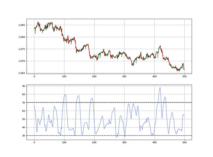
def relative_volatility_index(Data, lookback, close, where):

    # Calculating Volatility
    Data = volatility(Data, lookback, close, where)

    # Calculating the RSI on Volatility
    Data = rsi(Data, lookback, where, where + 1)

    # Cleaning
    Data = deleter(Data, where, 1)

    return Data
The Arm Section: Speed
The Catapult predicts momentum direction using the 14-period Relative Strength Index.
As a reminder, the RSI ranges from 0 to 100. Two levels give contrarian signals:
A positive response is anticipated when the market is deemed to have gone too far down at the oversold level 30, which is 30.
When the market is deemed to have gone up too much, at overbought level 70, a bearish reaction is to be expected.
Comparing the RSI to 50 is another intriguing use. RSI above 50 indicates bullish momentum, while below 50 indicates negative momentum.
The direction-finding filter in the frame
The Catapult's directional filter uses the 200-period simple moving average to keep us trending. This keeps us sane and increases our odds.
Moving averages confirm and ride trends. Its simplicity and track record of delivering value to analysis make them the most popular technical indicator. They help us locate support and resistance, stops and targets, and the trend. Its versatility makes them essential trading tools.
This is the plain mean, employed in statistics and everywhere else in life. Simply divide the number of observations by their total values. Mathematically, it's:
We defined the moving average function above. Create the Catapult indication now.
Indicator of the Catapult
The indicator is a healthy mix of the three indicators:
The first trigger will be provided by the 21-period Relative Volatility Index, which indicates that there will now be above average volatility and, as a result, it is possible for a directional shift.
If the reading is above 50, the move is likely bullish, and if it is below 50, the move is likely bearish, according to the 14-period Relative Strength Index, which indicates the likelihood of the direction of the move.
The likelihood of the move's direction will be strengthened by the 200-period simple moving average. When the market is above the 200-period moving average, we can infer that bullish pressure is there and that the upward trend will likely continue. Similar to this, if the market falls below the 200-period moving average, we recognize that there is negative pressure and that the downside is quite likely to continue.
lookback_rvi = 21
lookback_rsi = 14
lookback_ma  = 200
my_data = ma(my_data, lookback_ma, 3, 4)
my_data = rsi(my_data, lookback_rsi, 3, 5)
my_data = relative_volatility_index(my_data, lookback_rvi, 3, 6)
Two-handled overlay indicator Catapult. The first exhibits blue and green arrows for a buy signal, and the second shows blue and red for a sell signal.
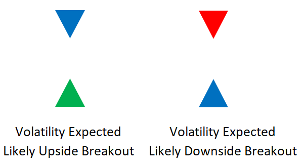
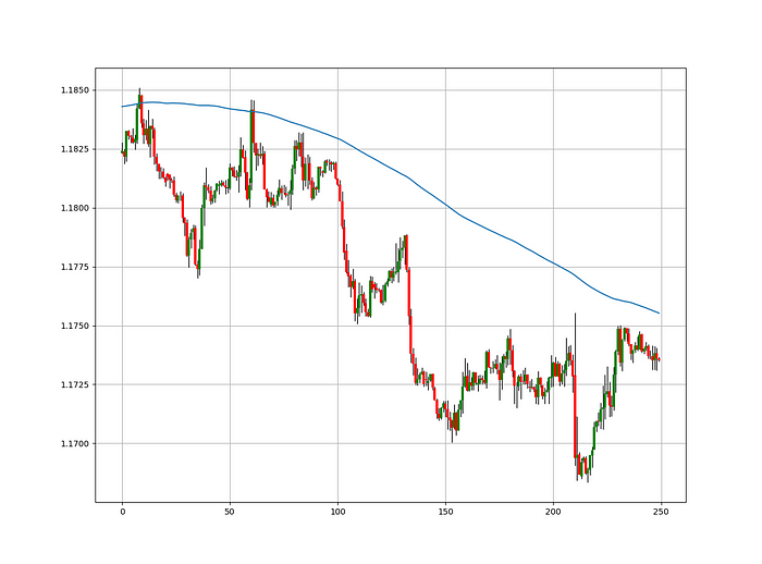
The chart below shows recent EURUSD hourly values.
def signal(Data, rvi_col, signal):

    Data = adder(Data, 10)

    for i in range(len(Data)):

        if Data[i,     rvi_col] < 30 and \
           Data[i - 1, rvi_col] > 30 and \
           Data[i - 2, rvi_col] > 30 and \
           Data[i - 3, rvi_col] > 30 and \
           Data[i - 4, rvi_col] > 30 and \
           Data[i - 5, rvi_col] > 30:

               Data[i, signal] = 1

    return Data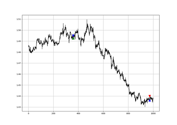
Signals are straightforward. The indicator can be utilized with other methods.
my_data = signal(my_data, 6, 7)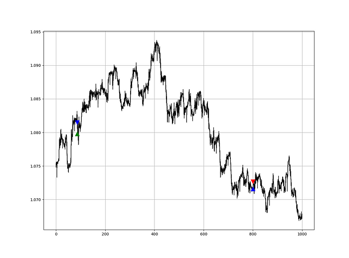
Lumiwealth shows how to develop all kinds of algorithms. I recommend their hands-on courses in algorithmic trading, blockchain, and machine learning.
Summary
To conclude, my goal is to contribute to objective technical analysis, which promotes more transparent methods and strategies that must be back-tested before implementation. Technical analysis will lose its reputation as subjective and unscientific.
After you find a trading method or approach, follow these steps:
Put emotions aside and adopt an analytical perspective.
Test it in the past in conditions and simulations taken from real life.
Try improving it and performing a forward test if you notice any possibility.
Transaction charges and any slippage simulation should always be included in your tests.
Risk management and position sizing should always be included in your tests.
After checking the aforementioned, monitor the plan because market dynamics may change and render it unprofitable.
Chritiaan Hetzner
3 years ago
Mystery of the $1 billion'meme stock' that went to $400 billion in days
Who is AMTD Digital?
An unknown Hong Kong corporation joined the global megacaps worth over $500 billion on Tuesday.

The American Depository Share (ADS) with the ticker code HKD gapped at the open, soaring 25% over the previous closing price as trading began, before hitting an intraday high of $2,555.
At its peak, its market cap was almost $450 billion, more than Facebook parent Meta or Alibaba.
Yahoo Finance reported a daily volume of 350,500 shares, the lowest since the ADS began trading and much below the average of 1.2 million.
Despite losing a fifth of its value on Wednesday, it's still worth more than Toyota, Nike, McDonald's, or Walt Disney.
The company sold 16 million shares at $7.80 each in mid-July, giving it a $1 billion market valuation.
Why the boom?
That market cap seems unjustified.
According to SEC reports, its income-generating assets barely topped $400 million in March. Fortune's emails and calls went unanswered.
Website discloses little about company model. Its one-minute business presentation film uses a Star Wars–like design to sell the company as a "one-stop digital solutions platform in Asia"
The SEC prospectus explains.
AMTD Digital sells a "SpiderNet Ecosystems Solutions" kind of club membership that connects enterprises. This is the bulk of its $25 million annual revenue in April 2021.
Pretax profits have been higher than top line over the past three years due to fair value accounting gains on Appier, DayDayCook, WeDoctor, and five Asian fintechs.
AMTD Group, the company's parent, specializes in investment banking, hotel services, luxury education, and media and entertainment. AMTD IDEA, a $14 billion subsidiary, is also traded on the NYSE.
“Significant volatility”
Why AMTD Digital listed in the U.S. is unknown, as it informed investors in its share offering prospectus that could delist under SEC guidelines.
Beijing's red tape prevents the Sarbanes-Oxley Board from inspecting its Chinese auditor.
This frustrates Chinese stock investors. If the U.S. and China can't achieve a deal, 261 Chinese companies worth $1.3 trillion might be delisted.
Calvin Choi left UBS to become AMTD Group's CEO.
His capitalist background and status as a Young Global Leader with the World Economic Forum don't stop him from praising China's Communist party or celebrating the "glory and dream of the Great Rejuvenation of the Chinese nation" a century after its creation.
Despite having an executive vice chairman with a record of battling corruption and ties to Carrie Lam, Beijing's previous proconsul in Hong Kong, Choi is apparently being targeted for a two-year industry ban by the city's securities regulator after an investor accused Choi of malfeasance.
Some CMIG-funded initiatives produced money, but he didn't give us the proceeds, a corporate official told China's Caixin in October 2020. We don't know if he misappropriated or lost some money.
A seismic anomaly
In fundamental analysis, where companies are valued based on future cash flows, AMTD Digital's mind-boggling market cap is a statistical aberration that should occur once every hundred years.
AMTD Digital doesn't know why it's so valuable. In a thank-you letter to new shareholders, it said it was confused by the stock's performance.
Since its IPO, the company has seen significant ADS price volatility and active trading volume, it said Tuesday. "To our knowledge, there have been no important circumstances, events, or other matters since the IPO date."
Permabears awoke after the jump. Jim Chanos asked if "we're all going to ignore the $400 billion meme stock in the room," while Nate Anderson called AMTD Group "sketchy."
It happened the same day SEC Chair Gary Gensler praised the 20th anniversary of the Sarbanes-Oxley Act, aimed to restore trust in America's financial markets after the Enron and WorldCom accounting fraud scandals.
The run-up revived unpleasant memories of Robinhood's decision to limit retail investors' ability to buy GameStop, regarded as a measure to protect hedge funds invested in the meme company.
Why wasn't HKD's buy button removed? Because retail wasn't behind it?" tweeted Gensler on Tuesday. "Real stock fraud. "You're worthless."
You might also like

Tim Denning
3 years ago
I gave up climbing the corporate ladder once I realized how deeply unhappy everyone at the top was.
Restructuring and layoffs cause career reevaluation. Your career can benefit.

Once you become institutionalized, the corporate ladder is all you know.
You're bubbled. Extremists term it the corporate Matrix. I'm not so severe because the business world brainwashed me, too.
This boosted my corporate career.
Until I hit bottom.
15 months later, I view my corporate life differently. You may wish to advance professionally. Read this before you do.
Your happiness in the workplace may be deceptive.
I've been fortunate to spend time with corporate aces.
Working for 2.5 years in banking social media gave me some of these experiences. Earlier in my career, I recorded interviews with business leaders.
These people have titles like Chief General Manager and Head Of. New titles brought life-changing salaries.
They seemed happy.
I’d pass them in the hallway and they’d smile or shake my hand. I dreamt of having their life.
The ominous pattern
Unfiltered talks with some of them revealed a different world.
They acted well. They were skilled at smiling and saying the correct things. All had the same dark pattern, though.
Something felt off.
I found my conversations with them were generally for their benefit. They hoped my online antics as a writer/coach would shed light on their dilemma.
They'd tell me they wanted more. When you're one position away from CEO, it's hard not to wonder if this next move will matter.
What really displeased corporate ladder chasers
Before ascending further, consider these.
Zero autonomy
As you rise in a company, your days get busier.
Many people and initiatives need supervision. Everyone expects you to know business details. Weak when you don't. A poor leader is fired during the next restructuring and left to pursue their corporate ambition.
Full calendars leave no time for reflection. You can't have a coffee with a friend or waste a day.
You’re always on call. It’s a roll call kinda life.
Unable to express oneself freely
My 8 years of LinkedIn writing helped me meet these leaders.
I didn't think they'd care. Mistake.
Corporate leaders envied me because they wanted to talk freely again without corporate comms or a PR firm directing them what to say.
They couldn't share their flaws or inspiring experiences.
They wanted to.
Every day they were muzzled eroded by their business dream.
Limited family time
Top leaders had families.
They've climbed the corporate ladder. Nothing excellent happens overnight.
Corporate dreamers rarely saw their families.
Late meetings, customer functions, expos, training, leadership days, team days, town halls, and product demos regularly occurred after work.
Or they had to travel interstate or internationally for work events. They used bags and motel showers.
Initially, they said business class flights and hotels were nice. They'd get bored. 5-star hotels become monotonous.
No hotel beats home.
One leader said he hadn't seen his daughter much. They used to Facetime, but now that he's been gone so long, she rarely wants to talk to him.
So they iPad-parented.
You're miserable without your family.
Held captive by other job titles
Going up the business ladder seems like a battle.
Leaders compete for business gains and corporate advancement.
I saw shocking filthy tricks. Leaders would lie to seem nice.
Captives included top officials.
A different section every week. If they ran technology, the Head of Sales would argue their CRM cost millions. Or an Operations chief would battle a product team over support requests.
After one conflict, another began.
Corporate echelons are antagonistic. Huge pay and bonuses guarantee bad behavior.
Overly centered on revenue
As you rise, revenue becomes more prevalent. Most days, you'd believe revenue was everything. Here’s the problem…
Numbers drain us.
Unless you're a closet math nerd, contemplating and talking about numbers drains your creativity.
Revenue will never substitute impact.
Incapable of taking risks
Corporate success requires taking fewer risks.
Risks can cause dismissal. Risks can interrupt business. Keep things moving so you may keep getting paid your enormous salary and bonus.
Restructuring or layoffs are inevitable. All corporate climbers experience it.
On this fateful day, a small few realize the game they’ve been trapped in and escape. Most return to play for a new company, but it takes time.
Addiction keeps them trapped. You know nothing else. The rest is strange.
You start to think “I’m getting old” or “it’s nearly retirement.” So you settle yet again for the trappings of the corporate ladder game to nowhere.
Should you climb the corporate ladder?
Let me end on a surprising note.
Young people should ascend the corporate ladder. It teaches you business skills and helps support your side gig and (potential) online business.
Don't get trapped, shackled, or muzzled.
Your ideas and creativity become stifled after too much gaming play.
Corporate success won't bring happiness.
Find fulfilling employment that matters. That's it.

Rajesh Gupta
3 years ago
Why Is It So Difficult to Give Up Smoking?

I started smoking in 2002 at IIT BHU. Most of us thought it was enjoyable at first. I didn't realize the cost later.
In 2005, during my final semester, I lost my father. Suddenly, I felt more accountable for my mother and myself.
I quit before starting my first job in Bangalore. I didn't see any smoking friends in my hometown for 2 months before moving to Bangalore.
For the next 5-6 years, I had no regimen and smoked only when drinking.
Due to personal concerns, I started smoking again after my 2011 marriage. Now smoking was a constant guilty pleasure.
I smoked 3-4 cigarettes a day, but never in front of my family or on weekends. I used to excuse this with pride! First office ritual: smoking. Even with guilt, I couldn't stop this time because of personal concerns.
After 8-9 years, in mid 2019, a personal development program solved all my problems. I felt complete in myself. After this, I just needed one cigarette each day.
The hardest thing was leaving this final cigarette behind, even though I didn't want it.
James Clear's Atomic Habits was published last year. I'd only read 2-3 non-tech books before reading this one in August 2021. I knew everything but couldn't use it.
In April 2022, I realized the compounding effect of a bad habit thanks to my subconscious mind. 1 cigarette per day (excluding weekends) equals 240 = 24 packs per year, which is a lot. No matter how much I did, it felt negative.
Then I applied the 2nd principle of this book, identifying the trigger. I tried to identify all the major triggers of smoking. I found social drinking is one of them & If I am able to control it during that time, I can easily control it in other situations as well. Going further whenever I drank, I was pre-determined to ignore the craving at any cost. Believe me, it was very hard initially but gradually this craving started fading away even with drinks.
I've been smoke-free for 3 months. Now I know a bad habit's effects. After realizing the power of habits, I'm developing other good habits which I ignored all my life.

Sukhad Anand
3 years ago
How Do Discord's Trillions Of Messages Get Indexed?
They depend heavily on open source..

Discord users send billions of messages daily. Users wish to search these messages. How do we index these to search by message keywords?
Let’s find out.
Discord utilizes Elasticsearch. Elasticsearch is a free, open search engine for textual, numerical, geographical, structured, and unstructured data. Apache Lucene powers Elasticsearch.
How does elastic search store data? It stores it as numerous key-value pairs in JSON documents.
How does elastic search index? Elastic search's index is inverted. An inverted index lists every unique word in every page and where it appears.
4. Elasticsearch indexes documents and generates an inverted index to make data searchable in near real-time. The index API adds or updates JSON documents in a given index.
Let's examine how discord uses Elastic Search. Elasticsearch prefers bulk indexing. Discord couldn't index real-time messages. You can't search posted messages. You want outdated messages.
6. Let's check what bulk indexing requires.
1. A temporary queue for incoming communications.
2. Indexer workers that index messages into elastic search.
Discord's queue is Celery. The queue is open-source. Elastic search won't run on a single server. It's clustered. Where should a message go? Where?
8. A shard allocator decides where to put the message. Nevertheless. Shattered? A shard combines elastic search and index on. So, these two form a shard which is used as a unit by discord. The elastic search itself has some shards. But this is different, so don’t get confused.
Now, the final part is service discovery — to discover the elastic search clusters and the hosts within that cluster. This, they do with the help of etcd another open source tool.
A great thing to notice here is that discord relies heavily on open source systems and their base implementations which is very different from a lot of other products.