


Wall Street's Bear Market May Stick Around
If history is any guide, this bear market might be long and severe.
This is the S&P 500 Index's fourth such incident in 20 years. The last bear market of 2020 was a "shock trade" caused by the Covid-19 pandemic, although earlier ones in 2000 and 2008 took longer to bottom out and recover.
Peter Garnry, head of equities strategy at Saxo Bank A/S, compares the current selloff to the dotcom bust of 2000 and the 1973-1974 bear market marked by soaring oil prices connected to an OPEC oil embargo. He blamed high tech valuations and the commodity crises.
"This drop might stretch over a year and reach 35%," Garnry wrote.
Here are six bear market charts.
Time/depth
The S&P 500 Index plummeted 51% between 2000 and 2002 and 58% during the global financial crisis; it took more than 1,000 trading days to recover. The former took 638 days to reach a bottom, while the latter took 352 days, suggesting the present selloff is young.
Valuations
Before the tech bubble burst in 2000, valuations were high. The S&P 500's forward P/E was 25 times then. Before the market fell this year, ahead values were near 24. Before the global financial crisis, stocks were relatively inexpensive, but valuations dropped more than 40%, compared to less than 30% now.
Earnings
Every stock crash, especially earlier bear markets, returned stocks to fundamentals. The S&P 500 decouples from earnings trends but eventually recouples.
Support
Central banks won't support equity investors just now. The end of massive monetary easing will terminate a two-year bull run that was among the strongest ever, and equities may struggle without cheap money. After years of "don't fight the Fed," investors must embrace a new strategy.
Bear Haunting Bear
If the past is any indication, rising government bond yields are bad news. After the financial crisis, skyrocketing rates and a falling euro pushed European stock markets back into bear territory in 2011.
Inflation/rates
The current monetary policy climate differs from past bear markets. This is the first time in a while that markets face significant inflation and rising rates.
This post is a summary. Read full article here
More on Economics & Investing

Sam Hickmann
3 years ago
What is this Fed interest rate everybody is talking about that makes or breaks the stock market?
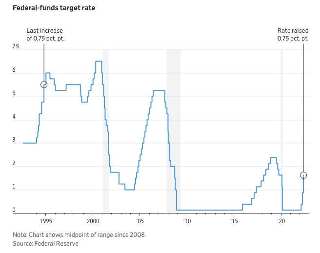
The Federal Funds Rate (FFR) is the target interest rate set by the Federal Reserve System (Fed)'s policy-making body (FOMC). This target is the rate at which the Fed suggests commercial banks borrow and lend their excess reserves overnight to each other.
The FOMC meets 8 times a year to set the target FFR. This is supposed to promote economic growth. The overnight lending market sets the actual rate based on commercial banks' short-term reserves. If the market strays too far, the Fed intervenes.
Banks must keep a certain percentage of their deposits in a Federal Reserve account. A bank's reserve requirement is a percentage of its total deposits. End-of-day bank account balances averaged over two-week reserve maintenance periods are used to determine reserve requirements.
If a bank expects to have end-of-day balances above what's needed, it can lend the excess to another institution.
The FOMC adjusts interest rates based on economic indicators that show inflation, recession, or other issues that affect economic growth. Core inflation and durable goods orders are indicators.
In response to economic conditions, the FFR target has changed over time. In the early 1980s, inflation pushed it to 20%. During the Great Recession of 2007-2009, the rate was slashed to 0.15 percent to encourage growth.
Inflation picked up in May 2022 despite earlier rate hikes, prompting today's 0.75 percent point increase. The largest increase since 1994. It might rise to around 3.375% this year and 3.1% by the end of 2024.
Sam Hickmann
3 years ago
What is headline inflation?
Headline inflation is the raw Consumer price index (CPI) reported monthly by the Bureau of labour statistics (BLS). CPI measures inflation by calculating the cost of a fixed basket of goods. The CPI uses a base year to index the current year's prices.
Explaining Inflation
As it includes all aspects of an economy that experience inflation, headline inflation is not adjusted to remove volatile figures. Headline inflation is often linked to cost-of-living changes, which is useful for consumers.
The headline figure doesn't account for seasonality or volatile food and energy prices, which are removed from the core CPI. Headline inflation is usually annualized, so a monthly headline figure of 4% inflation would equal 4% inflation for the year if repeated for 12 months. Top-line inflation is compared year-over-year.
Inflation's downsides
Inflation erodes future dollar values, can stifle economic growth, and can raise interest rates. Core inflation is often considered a better metric than headline inflation. Investors and economists use headline and core results to set growth forecasts and monetary policy.
Core Inflation
Core inflation removes volatile CPI components that can distort the headline number. Food and energy costs are commonly removed. Environmental shifts that affect crop growth can affect food prices outside of the economy. Political dissent can affect energy costs, such as oil production.
From 1957 to 2018, the U.S. averaged 3.64 percent core inflation. In June 1980, the rate reached 13.60%. May 1957 had 0% inflation. The Fed's core inflation target for 2022 is 3%.
Central bank:
A central bank has privileged control over a nation's or group's money and credit. Modern central banks are responsible for monetary policy and bank regulation. Central banks are anti-competitive and non-market-based. Many central banks are not government agencies and are therefore considered politically independent. Even if a central bank isn't government-owned, its privileges are protected by law. A central bank's legal monopoly status gives it the right to issue banknotes and cash. Private commercial banks can only issue demand deposits.
What are living costs?
The cost of living is the amount needed to cover housing, food, taxes, and healthcare in a certain place and time. Cost of living is used to compare the cost of living between cities and is tied to wages. If expenses are higher in a city like New York, salaries must be higher so people can live there.
What's U.S. bureau of labor statistics?
BLS collects and distributes economic and labor market data about the U.S. Its reports include the CPI and PPI, both important inflation measures.
:max_bytes(150000):strip_icc():format(webp)/adam_hayes-5bfc262a46e0fb005118b414.jpg)
Adam Hayes
3 years ago
Bernard Lawrence "Bernie" Madoff, the largest Ponzi scheme in history
Madoff who?
Bernie Madoff ran the largest Ponzi scheme in history, defrauding thousands of investors over at least 17 years, and possibly longer. He pioneered electronic trading and chaired Nasdaq in the 1990s. On April 14, 2021, he died while serving a 150-year sentence for money laundering, securities fraud, and other crimes.
Understanding Madoff
Madoff claimed to generate large, steady returns through a trading strategy called split-strike conversion, but he simply deposited client funds into a single bank account and paid out existing clients. He funded redemptions by attracting new investors and their capital, but the market crashed in late 2008. He confessed to his sons, who worked at his firm, on Dec. 10, 2008. Next day, they turned him in. The fund reported $64.8 billion in client assets.
Madoff pleaded guilty to 11 federal felony counts, including securities fraud, wire fraud, mail fraud, perjury, and money laundering. Ponzi scheme became a symbol of Wall Street's greed and dishonesty before the financial crisis. Madoff was sentenced to 150 years in prison and ordered to forfeit $170 billion, but no other Wall Street figures faced legal ramifications.
Bernie Madoff's Brief Biography
Bernie Madoff was born in Queens, New York, on April 29, 1938. He began dating Ruth (née Alpern) when they were teenagers. Madoff told a journalist by phone from prison that his father's sporting goods store went bankrupt during the Korean War: "You watch your father, who you idolize, build a big business and then lose everything." Madoff was determined to achieve "lasting success" like his father "whatever it took," but his career had ups and downs.
Early Madoff investments
At 22, he started Bernard L. Madoff Investment Securities LLC. First, he traded penny stocks with $5,000 he earned installing sprinklers and as a lifeguard. Family and friends soon invested with him. Madoff's bets soured after the "Kennedy Slide" in 1962, and his father-in-law had to bail him out.
Madoff felt he wasn't part of the Wall Street in-crowd. "We weren't NYSE members," he told Fishman. "It's obvious." According to Madoff, he was a scrappy market maker. "I was happy to take the crumbs," he told Fishman, citing a client who wanted to sell eight bonds; a bigger firm would turn it down.
Recognition
Success came when he and his brother Peter built electronic trading capabilities, or "artificial intelligence," that attracted massive order flow and provided market insights. "I had all these major banks coming down, entertaining me," Madoff told Fishman. "It was mind-bending."
By the late 1980s, he and four other Wall Street mainstays processed half of the NYSE's order flow. Controversially, he paid for much of it, and by the late 1980s, Madoff was making in the vicinity of $100 million a year. He was Nasdaq chairman from 1990 to 1993.
Madoff's Ponzi scheme
It is not certain exactly when Madoff's Ponzi scheme began. He testified in court that it began in 1991, but his account manager, Frank DiPascali, had been at the firm since 1975.
Why Madoff did the scheme is unclear. "I had enough money to support my family's lifestyle. "I don't know why," he told Fishman." Madoff could have won Wall Street's respect as a market maker and electronic trading pioneer.
Madoff told Fishman he wasn't solely responsible for the fraud. "I let myself be talked into something, and that's my fault," he said, without saying who convinced him. "I thought I could escape eventually. I thought it'd be quick, but I couldn't."
Carl Shapiro, Jeffry Picower, Stanley Chais, and Norm Levy have been linked to Bernard L. Madoff Investment Securities LLC for years. Madoff's scheme made these men hundreds of millions of dollars in the 1960s and 1970s.
Madoff told Fishman, "Everyone was greedy, everyone wanted to go on." He says the Big Four and others who pumped client funds to him, outsourcing their asset management, must have suspected his returns or should have. "How can you make 15%-18% when everyone else is making less?" said Madoff.
How Madoff Got Away with It for So Long
Madoff's high returns made clients look the other way. He deposited their money in a Chase Manhattan Bank account, which merged to become JPMorgan Chase & Co. in 2000. The bank may have made $483 million from those deposits, so it didn't investigate.
When clients redeemed their investments, Madoff funded the payouts with new capital he attracted by promising unbelievable returns and earning his victims' trust. Madoff created an image of exclusivity by turning away clients. This model let half of Madoff's investors profit. These investors must pay into a victims' fund for defrauded investors.
Madoff wooed investors with his philanthropy. He defrauded nonprofits, including the Elie Wiesel Foundation for Peace and Hadassah. He approached congregants through his friendship with J. Ezra Merkin, a synagogue officer. Madoff allegedly stole $1 billion to $2 billion from his investors.
Investors believed Madoff for several reasons:
- His public portfolio seemed to be blue-chip stocks.
- His returns were high (10-20%) but consistent and not outlandish. In a 1992 interview with Madoff, the Wall Street Journal reported: "[Madoff] insists the returns were nothing special, given that the S&P 500-stock index returned 16.3% annually from 1982 to 1992. 'I'd be surprised if anyone thought matching the S&P over 10 years was remarkable,' he says.
- "He said he was using a split-strike collar strategy. A collar protects underlying shares by purchasing an out-of-the-money put option.
SEC inquiry
The Securities and Exchange Commission had been investigating Madoff and his securities firm since 1999, which frustrated many after he was prosecuted because they felt the biggest damage could have been prevented if the initial investigations had been rigorous enough.
Harry Markopolos was a whistleblower. In 1999, he figured Madoff must be lying in an afternoon. The SEC ignored his first Madoff complaint in 2000.
Markopolos wrote to the SEC in 2005: "The largest Ponzi scheme is Madoff Securities. This case has no SEC reward, so I'm turning it in because it's the right thing to do."
Many believed the SEC's initial investigations could have prevented Madoff's worst damage.
Markopolos found irregularities using a "Mosaic Method." Madoff's firm claimed to be profitable even when the S&P fell, which made no mathematical sense given what he was investing in. Markopolos said Madoff Securities' "undisclosed commissions" were the biggest red flag (1 percent of the total plus 20 percent of the profits).
Markopolos concluded that "investors don't know Bernie Madoff manages their money." Markopolos learned Madoff was applying for large loans from European banks (seemingly unnecessary if Madoff's returns were high).
The regulator asked Madoff for trading account documentation in 2005, after he nearly went bankrupt due to redemptions. The SEC drafted letters to two of the firms on his six-page list but didn't send them. Diana Henriques, author of "The Wizard of Lies: Bernie Madoff and the Death of Trust," documents the episode.
In 2008, the SEC was criticized for its slow response to Madoff's fraud.
Confession, sentencing of Bernie Madoff
Bernard L. Madoff Investment Securities LLC reported 5.6% year-to-date returns in November 2008; the S&P 500 fell 39%. As the selling continued, Madoff couldn't keep up with redemption requests, and on Dec. 10, he confessed to his sons Mark and Andy, who worked at his firm. "After I told them, they left, went to a lawyer, who told them to turn in their father, and I never saw them again. 2008-12-11: Bernie Madoff arrested.
Madoff insists he acted alone, but several of his colleagues were jailed. Mark Madoff died two years after his father's fraud was exposed. Madoff's investors committed suicide. Andy Madoff died of cancer in 2014.
2009 saw Madoff's 150-year prison sentence and $170 billion forfeiture. Marshals sold his three homes and yacht. Prisoner 61727-054 at Butner Federal Correctional Institution in North Carolina.
Madoff's lawyers requested early release on February 5, 2020, claiming he has a terminal kidney disease that may kill him in 18 months. Ten years have passed since Madoff's sentencing.
Bernie Madoff's Ponzi scheme aftermath
The paper trail of victims' claims shows Madoff's complexity and size. Documents show Madoff's scam began in the 1960s. His final account statements show $47 billion in "profit" from fake trades and shady accounting.
Thousands of investors lost their life savings, and multiple stories detail their harrowing loss.
Irving Picard, a New York lawyer overseeing Madoff's bankruptcy, has helped investors. By December 2018, Picard had recovered $13.3 billion from Ponzi scheme profiteers.
A Madoff Victim Fund (MVF) was created in 2013 to help compensate Madoff's victims, but the DOJ didn't start paying out the $4 billion until late 2017. Richard Breeden, a former SEC chair who oversees the fund, said thousands of claims were from "indirect investors"
Breeden and his team had to reject many claims because they weren't direct victims. Breeden said he based most of his decisions on one simple rule: Did the person invest more than they withdrew? Breeden estimated 11,000 "feeder" investors.
Breeden wrote in a November 2018 update for the Madoff Victim Fund, "We've paid over 27,300 victims 56.65% of their losses, with thousands more to come." In December 2018, 37,011 Madoff victims in the U.S. and around the world received over $2.7 billion. Breeden said the fund expected to make "at least one more significant distribution in 2019"
This post is a summary. Read full article here
You might also like
Gill Pratt
3 years ago
War's Human Cost
War's Human Cost
I didn't start crying until I was outside a McDonald's in an Olempin, Poland rest area on highway S17.
Children pick toys at a refugee center, Olempin, Poland, March 4, 2022.
Refugee children, mostly alone with their mothers, but occasionally with a gray-haired grandfather or non-Ukrainian father, were coaxed into picking a toy from boxes provided by a kind-hearted company and volunteers.
I went to Warsaw to continue my research on my family's history during the Holocaust. In light of the ongoing Ukrainian conflict, I asked former colleagues in the US Department of Defense and Intelligence Community if it was safe to travel there. They said yes, as Poland was a NATO member.
I stayed in a hotel in the Warsaw Ghetto, where 90% of my mother's family was murdered in the Holocaust. Across the street was the first Warsaw Judenrat. It was two blocks away from the apartment building my mother's family had owned and lived in, now dilapidated and empty.
Building of my great-grandfather, December 2021.
A mass grave of thousands of rocks for those killed in the Warsaw Ghetto, I didn't cry when I touched its cold walls.
Warsaw Jewish Cemetery, 200,000–300,000 graves.
Mass grave, Warsaw Jewish Cemetery.
My mother's family had two homes, one in Warszawa and the rural one was a forest and sawmill complex in Western Ukraine. For the past half-year, a local Ukrainian historian had been helping me discover faint traces of her family’s life there — in fact, he had found some people still alive who remembered the sawmill and that it belonged to my mother’s grandfather. The historian was good at his job, and we had become close.
My historian friend, December 2021, talking to a Ukrainian.
With war raging, my second trip to Warsaw took on a different mission. To see his daughter and one-year-old grandson, I drove east instead of to Ukraine. They had crossed the border shortly after the war began, leaving men behind, and were now staying with a friend on Poland's eastern border.
I entered after walking up to the house and settling with the dog. The grandson greeted me with a huge smile and the Ukrainian word for “daddy,” “Tato!” But it was clear he was awaiting his real father's arrival, and any man he met would be so tentatively named.
After a few moments, the boy realized I was only a stranger. He had musical talent, like his mother and grandfather, both piano teachers, as he danced to YouTube videos of American children's songs dubbed in Ukrainian, picking the ones he liked and crying when he didn't.
Songs chosen by my historian friend's grandson, March 4, 2022
He had enough music and began crying regardless of the song. His mother picked him up and started nursing him, saying she was worried about him. She had no idea where she would live or how she would survive outside Ukraine. She showed me her father's family history of losses in the Holocaust, which matched my own research.
After an hour of drinking tea and trying to speak of hope, I left for the 3.5-hour drive west to Warsaw.
It was unlike my drive east. It was reminiscent of the household goods-filled carts pulled by horses and people fleeing war 80 years ago.
Jewish refugees relocating, USHMM Holocaust Encyclopaedia, 1939.
The carefully chosen trinkets by children to distract them from awareness of what is really happening and the anxiety of what lies ahead, made me cry despite all my research on the Holocaust. There is no way for them to communicate with their mothers, who are worried, absent, and without their fathers.
It's easy to see war as a contest of nations' armies, weapons, and land. The most costly aspect of war is its psychological toll. My father screamed in his sleep from nightmares of his own adolescent trauma in Warsaw 80 years ago.
Survivor father studying engineering, 1961.
In the airport, I waited to return home while Ukrainian public address systems announced refugee assistance. Like at McDonald's, many mothers were alone with their children, waiting for a flight to distant relatives.
That's when I had my worst trip experience.
A woman near me, clearly a refugee, answered her phone, cried out, and began wailing.
The human cost of war descended like a hammer, and I realized that while I was going home, she never would

Ellane W
3 years ago
The Last To-Do List Template I'll Ever Need, Years in the Making
The holy grail of plain text task management is finally within reach

Plain text task management? Are you serious?? Dedicated task managers exist for a reason, you know. Sheesh.
—Oh, I know. Believe me, I know! But hear me out.
I've managed projects and tasks in plain text for more than four years. Since reorganizing my to-do list, plain text task management is within reach.
Data completely yours? One billion percent. Beef it up with coding? Be my guest.
Enter: The List
The answer? A list. That’s it!
Write down tasks. Obsidian, Notenik, Drafts, or iA Writer are good plain text note-taking apps.
List too long? Of course, it is! A large list tells you what to do. Feel the itch and friction. Then fix it.
But I want to be able to distinguish between work and personal life! List two things.
However, I need to know what should be completed first. Put those items at the top.
However, some things keep coming up, and I need to be reminded of them! Put those in your calendar and make an alarm for them.
But since individual X hasn't completed task Y, I can't proceed with this. Create a Waiting section on your list by dividing it.
But I must know what I'm supposed to be doing right now! Read your list(s). Check your calendar. Think critically.
Before I begin a new one, I remind myself that "Listory Never Repeats."
There’s no such thing as too many lists if all are needed. There is such a thing as too many lists if you make them before they’re needed. Before they complain that their previous room was small or too crowded or needed a new light.
A list that feels too long has a voice; it’s telling you what to do next.
I use one Master List. It's a control panel that tells me what to focus on short-term. If something doesn't need semi-immediate attention, it goes on my Backlog list.
Todd Lewandowski's DWTS (Done, Waiting, Top 3, Soon) performance deserves praise. His DWTS to-do list structure has transformed my plain-text task management. I didn't realize it was upside down.
This is my take on it:
D = Done
Move finished items here. If they pile up, clear them out every week or month. I have a Done Archive folder.
W = Waiting
Things seething in the background, awaiting action. Stir them occasionally so they don't burn.
T = Top 3
Three priorities. Personal comes first, then work. There will always be a top 3 (no more than 5) in every category. Projects, not chores, usually.
S = Soon
This part is action-oriented. It's for anything you can accomplish to finish one of the Top 3. This collection includes thoughts and project lists. The sole requirement is that they should be short-term goals.
Some of you have probably concluded this isn't for you. Please read Todd's piece before throwing out the baby. Often. You shouldn't miss a newborn.
As much as Dancing With The Stars helps me recall this method, I may try switching their order. TSWD; Drilling Tunnel Seismic? Serenity After Task?
Master List Showcase
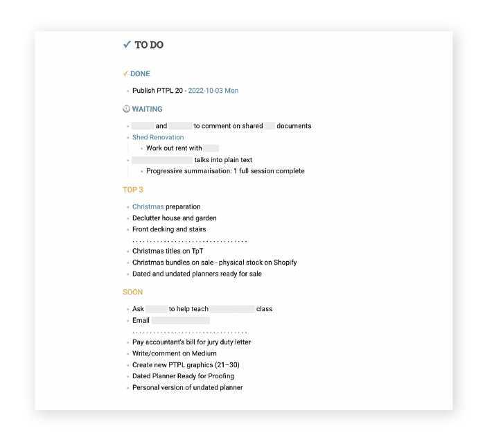
My Master List lives alone in its own file, but sometimes appears in other places. It's included in my Weekly List template. Here's a (soon-to-be-updated) demo vault of my Obsidian planning setup to download for free.
Here's the code behind my weekly screenshot:
## [[Master List - 2022|✓]]  TO DO

![[Master List - 2022]]
FYI, I use the Minimal Theme in Obsidian, with a few tweaks.
You may note I'm utilizing a checkmark as a link. For me, that's easier than locating the proper spot to click on the embed.
Blue headings for Done and Waiting are links. Done links to the Done Archive page and Waiting to a general waiting page.
Read my full article here.

Stephen Moore
3 years ago
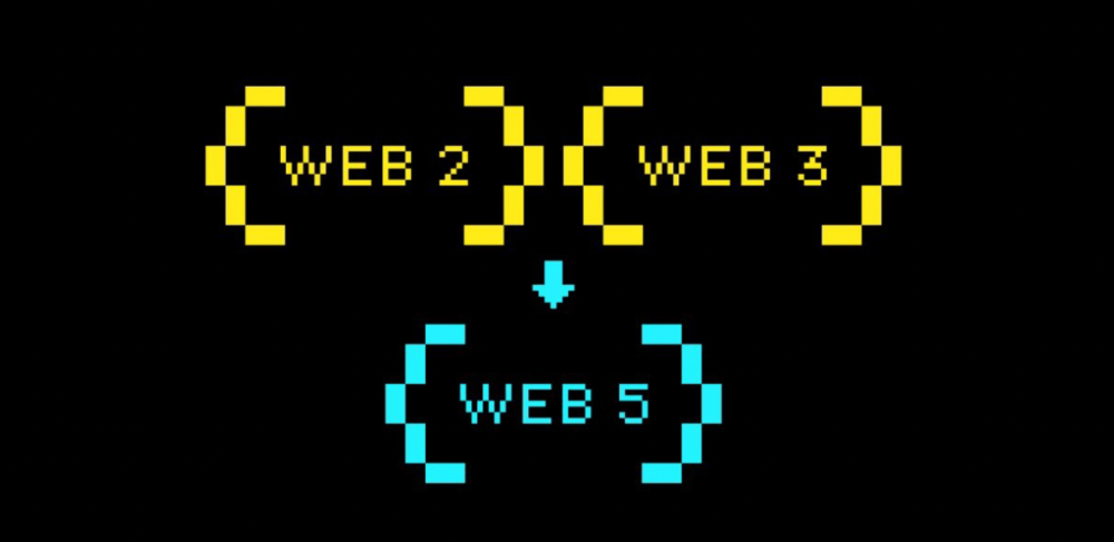
Web 2 + Web 3 = Web 5.
Monkey jpegs and shitcoins have tarnished Web3's reputation. Let’s move on.
Web3 was called "the internet's future."
Well, 'crypto bros' shouted about it loudly.
As quickly as it arrived to be the next internet, it appears to be dead. It's had scandals, turbulence, and crashes galore:
Web 3.0's cryptocurrencies have crashed. Bitcoin's all-time high was $66,935. This month, Ethereum fell from $2130 to $1117. Six months ago, the cryptocurrency market peaked at $3 trillion. Worst is likely ahead.
Gas fees make even the simplest Web3 blockchain transactions unsustainable.
Terra, Luna, and other dollar pegs collapsed, hurting crypto markets. Celsius, a crypto lender backed by VCs and Canada's second-largest pension fund, and Binance, a crypto marketplace, have withheld money and coins. They're near collapse.
NFT sales are falling rapidly and losing public interest.
Web3 has few real-world uses, like most crypto/blockchain technologies. Web3's image has been tarnished by monkey profile pictures and shitcoins while failing to become decentralized (the whole concept is controlled by VCs).
The damage seems irreparable, leaving Web3 in the gutter.
Step forward our new saviour — Web5
Fear not though, as hero awaits to drag us out of the Web3 hellscape. Jack Dorsey revealed his plan to save the internet quickly.
Dorsey has long criticized Web3, believing that VC capital and silicon valley insiders have created a centralized platform. In a tweet that upset believers and VCs (he was promptly blocked by Marc Andreessen), Dorsey argued, "You don't own "Web3." VCs and LPs do. Their incentives prevent it. It's a centralized organization with a new name.
Dorsey announced Web5 on June 10 in a very Elon-like manner. Block's TBD unit will work on the project (formerly Square).
Web5's pitch is that users will control their own data and identity. Bitcoin-based. Sound familiar? The presentation pack's official definition emphasizes decentralization. Web5 is a decentralized web platform that enables developers to write decentralized web apps using decentralized identifiers, verifiable credentials, and decentralized web nodes, returning ownership and control over identity and data to individuals.
Web5 would be permission-less, open, and token-less. What that means for Earth is anyone's guess. Identity. Ownership. Blockchains. Bitcoin. Different.
Web4 appears to have been skipped, forever destined to wish it could have shown the world what it could have been. (It was probably crap.) As this iteration combines Web2 and Web3, simple math and common sense add up to 5. Or something.
Dorsey and his team have had this idea simmering for a while. Daniel Buchner, a member of Block's Decentralized Identity team, said, "We're finishing up Web5's technical components."
Web5 could be the project that decentralizes the internet. It must be useful to users and convince everyone to drop the countless Web3 projects, products, services, coins, blockchains, and websites being developed as I write this.
Web5 may be too late for Dorsey and the incoming flood of creators.
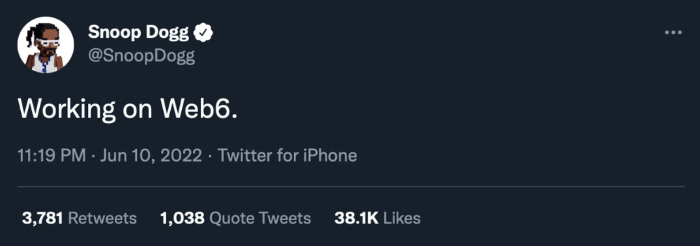
Web6 is planned!
The next months and years will be hectic and less stable than the transition from Web 1.0 to Web 2.0.
Web1 was around 1991-2004.
Web2 ran from 2004 to 2021. (though the Web3 term was first used in 2014, it only really gained traction years later.)
Web3 lasted a year.
Web4 is dead.
Silicon Valley billionaires are turning it into a startup-style race, each disrupting the next iteration until they crack it. Or destroy it completely.
Web5 won't last either.