


More on Economics & Investing

Desiree Peralta
3 years ago
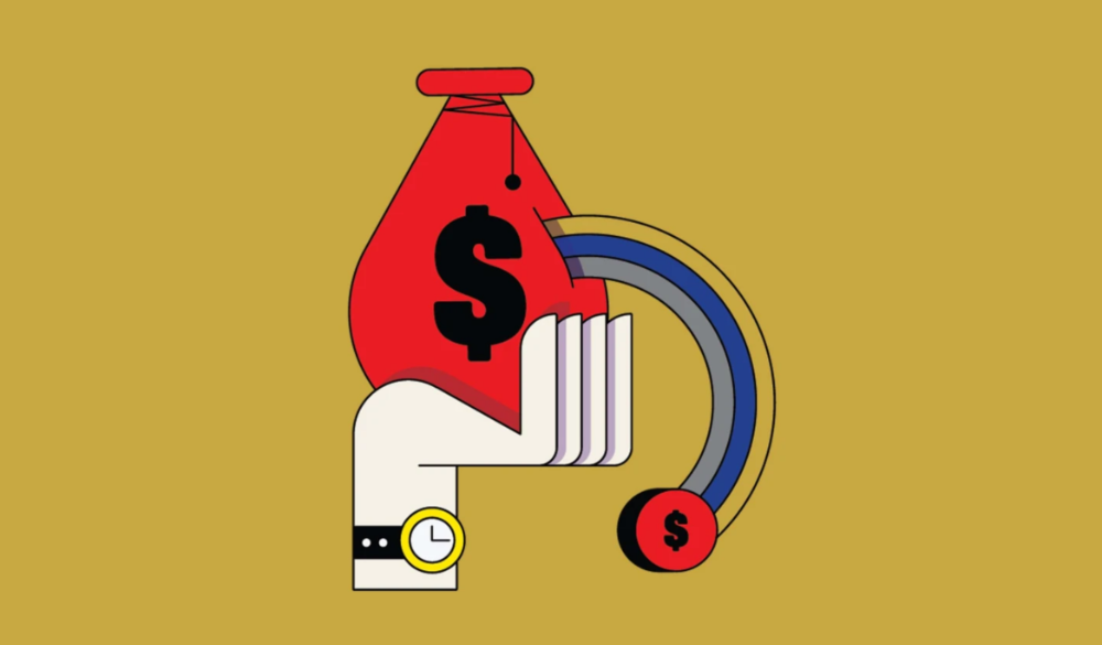
How to Use the 2023 Recession to Grow Your Wealth Exponentially
This season's three best money moves.
“Millionaires are made in recessions.” — Time Capital
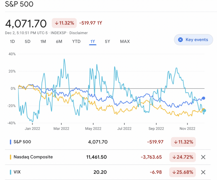
We're in a serious downturn, whether or not we're in a recession.
97% of business owners are decreasing costs by more than 10%, and all markets are down 30%.
If you know what you're doing and analyze the markets correctly, this is your chance to become a millionaire.
In any recession, there are always excellent possibilities to seize. Real estate, crypto, stocks, enterprises, etc.
What you do with your money could influence your future riches.
This article analyzes the three key markets, their circumstances for 2023, and how to profit from them.
Ways to make money on the stock market.
If you're conservative like me, you should invest in an index fund. Most of these funds are down 10-30% of ATH:
In earlier recessions, most money index funds lost 20%. After this downturn, they grew and passed the ATH in subsequent months.
Now is the greatest moment to invest in index funds to grow your money in a low-risk approach and make 20%.
If you want to be risky but wise, pick companies that will get better next year but are struggling now.
Even while we can't be 100% confident of a company's future performance, we know some are strong and will have a fantastic year.
Microsoft (down 22%), JPMorgan Chase (15.6%), Amazon (45%), and Disney (33.8%).
These firms give dividends, so you can earn passively while you wait.
So I consider that a good strategy to make wealth in the current stock market is to create two portfolios: one based on index funds to earn 10% to 20% profit when the corrections end, and the other based on individual stocks of popular and strong companies to earn 20%-30% return and dividends while you wait.
How to profit from the downturn in the real estate industry.
With rising mortgage rates, it's the worst moment to buy a home if you don't want to be eaten by banks. In the U.S., interest rates are double what they were three years ago, so buying now looks foolish.
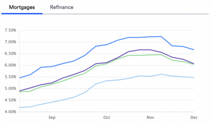
Due to these rates, property prices are falling, but that won't last long since individuals will take advantage.
According to historical data, now is the ideal moment to buy a house for the next five years and perhaps forever.
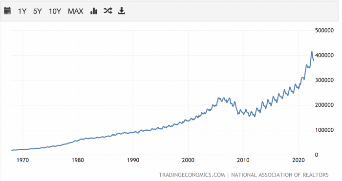
If you can buy a house, do it. You can refinance the interest at a lower rate with acceptable credit, but not the house price.
Take advantage of the housing market prices now because you won't find a decent deal when rates normalize.
How to profit from the cryptocurrency market.
This is the riskiest market to tackle right now, but it could offer the most opportunities if done appropriately.
The most powerful cryptocurrencies are down more than 60% from last year: $68,990 for BTC and $4,865 for ETH.
If you focus on those two coins, you can make 30%-60% without waiting for them to return to their ATH, and they're low enough to be a solid investment.
I don't encourage trying other altcoins because the crypto market is in crisis and you can lose everything if you're greedy.
Still, the main Cryptos are a good investment provided you store them in an external wallet and follow financial gurus' security advice.
Last thoughts
We can't anticipate a recession until it ends. We can't forecast a market or asset's lowest point, therefore waiting makes little sense.
If you want to develop your wealth, assess the money prospects on all the marketplaces and initiate long-term trades.
Many millionaires are made during recessions because they don't fear negative figures and use them to scale their money.
Chritiaan Hetzner
3 years ago
Mystery of the $1 billion'meme stock' that went to $400 billion in days
Who is AMTD Digital?
An unknown Hong Kong corporation joined the global megacaps worth over $500 billion on Tuesday.

The American Depository Share (ADS) with the ticker code HKD gapped at the open, soaring 25% over the previous closing price as trading began, before hitting an intraday high of $2,555.
At its peak, its market cap was almost $450 billion, more than Facebook parent Meta or Alibaba.
Yahoo Finance reported a daily volume of 350,500 shares, the lowest since the ADS began trading and much below the average of 1.2 million.
Despite losing a fifth of its value on Wednesday, it's still worth more than Toyota, Nike, McDonald's, or Walt Disney.
The company sold 16 million shares at $7.80 each in mid-July, giving it a $1 billion market valuation.
Why the boom?
That market cap seems unjustified.
According to SEC reports, its income-generating assets barely topped $400 million in March. Fortune's emails and calls went unanswered.
Website discloses little about company model. Its one-minute business presentation film uses a Star Wars–like design to sell the company as a "one-stop digital solutions platform in Asia"
The SEC prospectus explains.
AMTD Digital sells a "SpiderNet Ecosystems Solutions" kind of club membership that connects enterprises. This is the bulk of its $25 million annual revenue in April 2021.
Pretax profits have been higher than top line over the past three years due to fair value accounting gains on Appier, DayDayCook, WeDoctor, and five Asian fintechs.
AMTD Group, the company's parent, specializes in investment banking, hotel services, luxury education, and media and entertainment. AMTD IDEA, a $14 billion subsidiary, is also traded on the NYSE.
“Significant volatility”
Why AMTD Digital listed in the U.S. is unknown, as it informed investors in its share offering prospectus that could delist under SEC guidelines.
Beijing's red tape prevents the Sarbanes-Oxley Board from inspecting its Chinese auditor.
This frustrates Chinese stock investors. If the U.S. and China can't achieve a deal, 261 Chinese companies worth $1.3 trillion might be delisted.
Calvin Choi left UBS to become AMTD Group's CEO.
His capitalist background and status as a Young Global Leader with the World Economic Forum don't stop him from praising China's Communist party or celebrating the "glory and dream of the Great Rejuvenation of the Chinese nation" a century after its creation.
Despite having an executive vice chairman with a record of battling corruption and ties to Carrie Lam, Beijing's previous proconsul in Hong Kong, Choi is apparently being targeted for a two-year industry ban by the city's securities regulator after an investor accused Choi of malfeasance.
Some CMIG-funded initiatives produced money, but he didn't give us the proceeds, a corporate official told China's Caixin in October 2020. We don't know if he misappropriated or lost some money.
A seismic anomaly
In fundamental analysis, where companies are valued based on future cash flows, AMTD Digital's mind-boggling market cap is a statistical aberration that should occur once every hundred years.
AMTD Digital doesn't know why it's so valuable. In a thank-you letter to new shareholders, it said it was confused by the stock's performance.
Since its IPO, the company has seen significant ADS price volatility and active trading volume, it said Tuesday. "To our knowledge, there have been no important circumstances, events, or other matters since the IPO date."
Permabears awoke after the jump. Jim Chanos asked if "we're all going to ignore the $400 billion meme stock in the room," while Nate Anderson called AMTD Group "sketchy."
It happened the same day SEC Chair Gary Gensler praised the 20th anniversary of the Sarbanes-Oxley Act, aimed to restore trust in America's financial markets after the Enron and WorldCom accounting fraud scandals.
The run-up revived unpleasant memories of Robinhood's decision to limit retail investors' ability to buy GameStop, regarded as a measure to protect hedge funds invested in the meme company.
Why wasn't HKD's buy button removed? Because retail wasn't behind it?" tweeted Gensler on Tuesday. "Real stock fraud. "You're worthless."

Trevor Stark
3 years ago
Economics is complete nonsense.
Mainstream economics haven't noticed.
What come to mind when I say the word "economics"?
Probably GDP, unemployment, and inflation.
If you've ever watched the news or listened to an economist, they'll use data like these to defend a political goal.
The issue is that these statistics are total bunk.
I'm being provocative, but I mean it:
The economy is not measured by GDP.
How many people are unemployed is not counted in the unemployment rate.
Inflation is not measured by the CPI.
All orthodox economists' major economic statistics are either wrong or falsified.
Government institutions create all these stats. The administration wants to reassure citizens the economy is doing well.
GDP does not reflect economic expansion.
GDP measures a country's economic size and growth. It’s calculated by the BEA, a government agency.
The US has the world's largest (self-reported) GDP, growing 2-3% annually.
If GDP rises, the economy is healthy, say economists.
Why is the GDP flawed?
GDP measures a country's yearly spending.
The government may adjust this to make the economy look good.
GDP = C + G + I + NX
C = Consumer Spending
G = Government Spending
I = Investments (Equipment, inventories, housing, etc.)
NX = Exports minus Imports
GDP is a country's annual spending.
The government can print money to boost GDP. The government has a motive to increase and manage GDP.
Because government expenditure is part of GDP, printing money and spending it on anything will raise GDP.
They've done this. Since 1950, US government spending has grown 8% annually, faster than GDP.
In 2022, government spending accounted for 44% of GDP. It's the highest since WWII. In 1790-1910, it was 3% of GDP.
Who cares?
The economy isn't only spending. Focus on citizens' purchasing power or quality of life.
Since GDP just measures spending, the government can print money to boost GDP.
Even if Americans are poorer than last year, economists can say GDP is up and everything is fine.
How many people are unemployed is not counted in the unemployment rate.
The unemployment rate measures a country's labor market. If unemployment is high, people aren't doing well economically.
The BLS estimates the (self-reported) unemployment rate as 3-4%.
Why is the unemployment rate so high?
The US government surveys 100k persons to measure unemployment. They extrapolate this data for the country.
They come into 3 categories:
Employed
People with jobs are employed … duh.
Unemployed
People who are “jobless, looking for a job, and available for work” are unemployed
Not in the labor force
The “labor force” is the employed + the unemployed.
The unemployment rate is the percentage of unemployed workers.
Problem is unemployed definition. You must actively seek work to be considered unemployed.
You're no longer unemployed if you haven't interviewed in 4 weeks.
This shit makes no goddamn sense.
Why does this matter?
You can't interview if there are no positions available. You're no longer unemployed after 4 weeks.
In 1994, the BLS redefined "unemployed" to exclude discouraged workers.
If you haven't interviewed in 4 weeks, you're no longer counted in the unemployment rate.
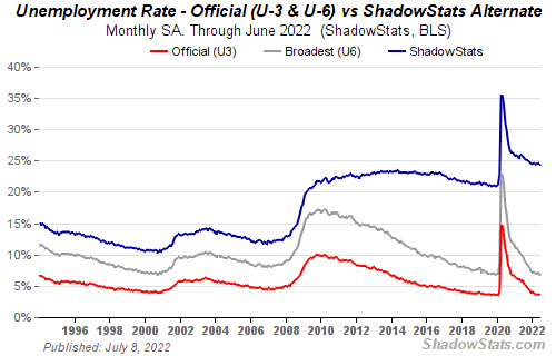
If unemployment were measured by total unemployed, it would be 25%.
Because the government wants to keep the unemployment rate low, they modify the definition.
If every US resident was unemployed and had no job interviews, economists would declare 0% unemployment. Excellent!
Inflation is not measured by the CPI.
The BLS measures CPI. This month was the highest since 1981.
CPI measures the cost of a basket of products across time. Food, energy, shelter, and clothes are included.
A 9.1% CPI means the basket of items is 9.1% more expensive.
What is the CPI problem?
Here's a more detailed explanation of CPI's flaws.
In summary, CPI is manipulated to be understated.
Housing costs are understated to manipulate CPI. Housing accounts for 33% of the CPI because it's the biggest expense for most people.
This signifies it's the biggest CPI weight.
Rather than using actual house prices, the Bureau of Labor Statistics essentially makes shit up. You can read more about the process here.
Surprise! It’s bullshit
The BLS stated Shelter's price rose 5.5% this month.
House prices are up 11-21%. (Source 1, Source 2, Source 3)
Rents are up 14-26%. (Source 1, Source 2)
Why is this important?
If CPI included housing prices, it would be 12-15 percent this month, not 9.1 percent.
9% inflation is nuts. Your money's value halves every 7 years at 9% inflation.
Worse is 15% inflation. Your money halves every 4 years at 15% inflation.
If everyone realized they needed to double their wage every 4-5 years to stay wealthy, there would be riots.
Inflation drains our money's value so the government can keep printing it.
The Solution
Most individuals know the existing system doesn't work, but can't explain why.
People work hard yet lag behind. The government lies about the economy's data.
In reality:
GDP has been down since 2008
25% of Americans are unemployed
Inflation is actually 15%
People might join together to vote out kleptocratic politicians if they knew the reality.
Having reliable economic data is the first step.
People can't understand the situation without sufficient information. Instead of immigrants or billionaires, people would blame liar politicians.
Here’s the vision:
A decentralized, transparent, and global dashboard that tracks economic data like GDP, unemployment, and inflation for every country on Earth.
Government incentives influence economic statistics.
ShadowStats has already started this effort, but the calculations must be transparent, decentralized, and global to be effective.
If interested, email me at trevorstark02@gmail.com.
Here are some links to further your research:
You might also like

Maria Urkedal York
3 years ago
When at work, don't give up; instead, think like a designer.
How to reframe irritation and go forward

“… before you can figure out where you are going, you need to know where you are, and once you know and accept where you are, you can design your way to where you want to be.” — Bill Burnett and Dave Evans
“You’ve been here before. But there are some new ingredients this time. What can tell yourself that will make you understand that now isn’t just like last year? That there’s something new in this August.”
My coach paused. I sighed, inhaled deeply, and considered her question.
What could I say? I simply needed a plan from her so everything would fall into place and I could be the happy, successful person I want to be.
Time passed. My mind was exhausted from running all morning, all summer, or the last five years, searching for what to do next and how to get there.
Calmer, I remembered that my coach's inquiry had benefited me throughout the summer. The month before our call, I read Designing Your Work Life — How to Thrive and Change and Find Happiness at Work from Standford University’s Bill Burnett and Dave Evans.
A passage in their book felt like a lifeline: “We have something important to say to you: Wherever you are in your work life, whatever job you are doing, it’s good enough. For now. Not forever. For now.”
As I remembered this book on the coaching call, I wondered if I could embrace where I am in August and say my job life is good enough for now. Only temporarily.
I've done that since. I'm getting unstuck.
Here's how you can take the first step in any area where you feel stuck.
How to acquire the perspective of "Good enough for now" for yourself
We’ve all heard the advice to just make the best of a bad situation. That´s not bad advice, but if you only make the best of a bad situation, you are still in a bad situation. It doesn’t get to the root of the problem or offer an opportunity to change the situation. You’re more cheerfully navigating lousiness, which is an improvement, but not much of one and rather hard to sustain over time.” — Bill Burnett and Dave Evans
Reframing Burnett at Evans says good enough for now is the key to being happier at work. Because, as they write, a designer always has options.
Choosing to believe things are good enough for now is liberating. It helps us feel less victimized and less judged. Accepting our situation helps us become unstuck.
Let's break down the process, which designers call constructing your way ahead, into steps you can take today.
Writing helps get started. First, write down your challenge and why it's essential to you. If pen and paper help, try this strategy:
Make the decision to accept the circumstance as it is. Designers always begin by acknowledging the truth of the situation. You now refrain from passing judgment. Instead, you simply describe the situation as accurately as you can. This frees us from negative thought patterns that prevent us from seeing the big picture and instead keep us in a tunnel of negativity.
Look for a reframing right now. Begin with good enough for the moment. Take note of how your body feels as a result. Tell yourself repeatedly that whatever is occurring is sufficient for the time being. Not always, but just now. If you want to, you can even put it in writing and repeatedly breathe it in, almost like a mantra.
You can select a reframe that is more relevant to your situation once you've decided that you're good enough for now and have allowed yourself to believe it. Try to find another perspective that is possible, for instance, if you feel unappreciated at work and your perspective of I need to use and be recognized for all my new skills in my job is making you sad and making you want to resign. For instance, I can learn from others at work and occasionally put my new abilities to use.
After that, leave your mind and act in accordance with your new perspective. Utilize the designer's bias for action to test something out and create a prototype that you can learn from. Your beginning point for creating experiences that will support the new viewpoint derived from the aforementioned point is the new perspective itself. By doing this, you recognize a circumstance at work where you can provide value to yourself or your workplace and then take appropriate action. Send two or three coworkers from whom you wish to learn anything an email, for instance, asking them to get together for coffee or a talk.
Choose tiny, doable actions. You prioritize them at work.
Let's assume you're feeling disconnected at work, so you make a list of folks you may visit each morning or invite to lunch. If you're feeling unmotivated and tired, take a daily walk and treat yourself to a decent coffee.
This may be plenty for now. If you want to take this procedure further, use Burnett and Evans' internet tools and frameworks.
Developing the daily practice of reframing
“We’re not discontented kids in the backseat of the family minivan, but how many of us live our lives, especially our work lives, as if we are?” — Bill Burnett and Dave Evans
I choose the good enough for me perspective every day, often. No quick fix. Am a failing? Maybe a little bit, but I like to think of it more as building muscle.
This way, every time I tell myself it's ok, I hear you. For now, that muscle gets stronger.
Hopefully, reframing will become so natural for us that it will become a habit, and not a technique anymore.
If you feel like you’re stuck in your career or at work, the reframe of Good enough, for now, might be valuable, so just go ahead and try it out right now.
And while you’re playing with this, why not think of other areas of your life too, like your relationships, where you live — even your writing, and see if you can feel a shift?
Vanessa Karel
3 years ago
10 hard lessons from founding a startup.
Here is the ugly stuff, read this if you have a founder in your life or are trying to become one. Your call.

#1 You'll try to talk yourself to sleep, but it won't always work.
As founders, we're all driven. Good and bad, you're restless. Success requires resistance and discipline. Your startup will be on your mind 24/7, and not everyone will have the patience to listen to your worries, ideas, and coffee runs. You become more self-sufficient than ever before.
#2 No one will understand what you're going through unless they've been a founder.
Some of my closest friends don't understand the work that goes into starting a business, and we can't blame them.
#3 You'll feel alienated.
Your problems aren't common; calling your bestie won't help. You must search hard for the right resources. It alienates you from conversations you no longer relate to. (No 4th of July, no long weekends!)
#4 Since you're your "own boss," people assume you have lots of free time.
Do you agree? I was on a webinar with lots of new entrepreneurs, and one woman said, "I started my own business so I could have more time for myself." This may be true for some lucky people, and you can be flexible with your schedule. If you want your business to succeed, you'll probably be its slave for a while.
#5 No time for illness or family emergencies.
Both last month. Oh, no! Physically and emotionally withdrawing at the worst times will give you perspective. I learned this the hard way because I was too stubborn to postpone an important interview. I thought if I rested all day and only took one call, I'd be fine. Nope. I had a fever and my mind wasn't as sharp, so my performance and audience interaction suffered. Nope. Better to delay than miss out.
Oh, and setting a "OoO" makes you cringe.
#6 Good luck with your mental health, perfectionists.
When building a startup, it's difficult to accept that there won't be enough time to do everything. You can't make them all, not perfectly. You must learn to accept things that are done but not perfect.
#7 As a founder, you'll make mistakes, but you'll want to make them quickly so you can learn.
Hard lessons are learned quicker. You'll need to pivot and try new things often; some won't work, and it's best to discover them sooner rather than later.
#8 Pyramid schemes abound.
I didn't realize how bad it was until I started a company. You must spy and constantly research. As a founder, you'll receive many emails from people claiming to "support" you. Be wary and keep your eyes open. When it's too good to be true. Some "companies" will try to get you to pay for "competitions" to "pitch at events." Don't do it.
#9 Keep your competitor research to a minimum.
Actually, competition is good. It means there's a market for those solutions. However, this can be mentally exhausting too. Learn about their geography and updates, but that's it.
#10 You'll feel guilty taking vacation.
I don't know what to say, but I no longer enjoy watching TV, and that's okay. Pay attention to things that enrich you, bring you joy, and have fun. It boosts creativity.
Being a startup founder may be one of the hardest professional challenges you face, but it's also a great learning experience. Your passion will take you places you never imagined and open doors to opportunities you wouldn't have otherwise. You'll meet amazing people. No regrets, no complaints. It's a roller coaster, but the good days are great.
Miss anything? Comment below
Langston Thomas
3 years ago
A Simple Guide to NFT Blockchains
Ethereum's blockchain rules NFTs. Many consider it the one-stop shop for NFTs, and it's become the most talked-about and trafficked blockchain in existence.
Other blockchains are becoming popular in NFTs. Crypto-artists and NFT enthusiasts have sought new places to mint and trade NFTs due to Ethereum's high transaction costs and environmental impact.
When choosing a blockchain to mint on, there are several factors to consider. Size, creator costs, consumer spending habits, security, and community input are important. We've created a high-level summary of blockchains for NFTs to help clarify the fast-paced world of web3 tech.
Ethereum
Ethereum currently has the most NFTs. It's decentralized and provides financial and legal services without intermediaries. It houses popular NFT marketplaces (OpenSea), projects (CryptoPunks and the Bored Ape Yacht Club), and artists (Pak and Beeple).
It's also expensive and energy-intensive. This is because Ethereum works using a Proof-of-Work (PoW) mechanism. PoW requires computers to solve puzzles to add blocks and transactions to the blockchain. Solving these puzzles requires a lot of computer power, resulting in astronomical energy loss.
You should consider this blockchain first due to its popularity, security, decentralization, and ease of use.
Solana
Solana is a fast programmable blockchain. Its proof-of-history and proof-of-stake (PoS) consensus mechanisms eliminate complex puzzles. Reduced validation times and fees result.
PoS users stake their cryptocurrency to become a block validator. Validators get SOL. This encourages and rewards users to become stakers. PoH works with PoS to cryptographically verify time between events. Solana blockchain ensures transactions are in order and found by the correct leader (validator).
Solana's PoS and PoH mechanisms keep transaction fees and times low. Solana isn't as popular as Ethereum, so there are fewer NFT marketplaces and blockchain traders.
Tezos
Tezos is a greener blockchain. Tezos rose in 2021. Hic et Nunc was hailed as an economic alternative to Ethereum-centric marketplaces until Nov. 14, 2021.
Similar to Solana, Tezos uses a PoS consensus mechanism and only a PoS mechanism to reduce computational work. This blockchain uses two million times less energy than Ethereum. It's cheaper than Ethereum (but does cost more than Solana).
Tezos is a good place to start minting NFTs in bulk. Objkt is the largest Tezos marketplace.
Flow
Flow is a high-performance blockchain for NFTs, games, and decentralized apps (dApps). Flow is built with scalability in mind, so billions of people could interact with NFTs on the blockchain.
Flow became the NBA's blockchain partner in 2019. Flow, a product of Dapper labs (the team behind CryptoKitties), launched and hosts NBA Top Shot, making the blockchain integral to the popularity of non-fungible tokens.
Flow uses PoS to verify transactions, like Tezos. Developers are working on a model to handle 10,000 transactions per second on the blockchain. Low transaction fees.
Flow NFTs are tradeable on Blocktobay, OpenSea, Rarible, Foundation, and other platforms. NBA, NFL, UFC, and others have launched NFT marketplaces on Flow. Flow isn't as popular as Ethereum, resulting in fewer NFT marketplaces and blockchain traders.
Asset Exchange (WAX)
WAX is king of virtual collectibles. WAX is popular for digitalized versions of legacy collectibles like trading cards, figurines, memorabilia, etc.
Wax uses a PoS mechanism, but also creates carbon offset NFTs and partners with Climate Care. Like Flow, WAX transaction fees are low, and network fees are redistributed to the WAX community as an incentive to collectors.
WAX marketplaces host Topps, NASCAR, Hot Wheels, and cult classic film franchises like Godzilla, The Princess Bride, and Spiderman.
Binance Smart Chain
BSC is another good option for balancing fees and performance. High-speed transactions and low fees hurt decentralization. BSC is most centralized.
Binance Smart Chain uses Proof of Staked Authority (PoSA) to support a short block time and low fees. The 21 validators needed to run the exchange switch every 24 hours. 11 of the 21 validators are directly connected to the Binance Crypto Exchange, according to reports.
While many in the crypto and NFT ecosystems dislike centralization, the BSC NFT market picked up speed in 2021. OpenBiSea, AirNFTs, JuggerWorld, and others are gaining popularity despite not having as robust an ecosystem as Ethereum.