


More on Productivity

David G Chen
3 years ago
If you want to earn money, stop writing for entertainment.
When you stop blogging for a few weeks, your views and profits plummet.
Because you're writing fascinating posts for others. Everyone's done ithat…
If I keep writing, the graph should maintain velocity, you could say. If I wrote more, it could rise.
However, entertaining pieces still tend to roller coaster and jump.
this type of writing is like a candle. They burn out and must be replaced. You must continuously light new ones to maintain the illumination.
When you quit writing, your income stops.
A substitute
Instead of producing amusing articles, try solving people's issues. You should answer their search questions.
Here's what happens when you answer their searches.
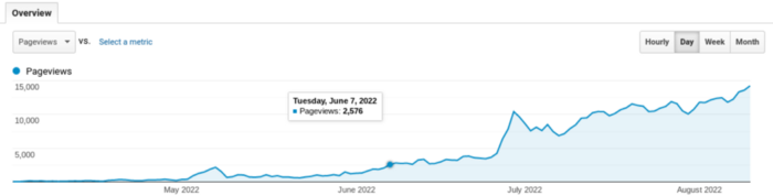
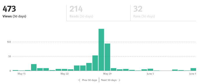
My website's Google analytics. As a dentist, I answer oral health questions.
This chart vs. Medium is pretty glaring, right?
As of yesterday, it was averaging 15k page views each day.
How much would you make on Medium with 15k daily views?
Evergreen materials
In SEO, this is called evergreen content.
Your content is like a lush, evergreen forest, and by green I mean Benjamins.

Do you have knowledge that you can leverage? Why not help your neighbors and the world?
Answer search inquiries and help others. You'll be well rewarded.
This is better than crafting candle-like content that fizzles out quickly.
Is beauty really ephemeral like how flowers bloom? Nah, I prefer watching forests grow instead (:

Leonardo Castorina
3 years ago
How to Use Obsidian to Boost Research Productivity
Tools for managing your PhD projects, reading lists, notes, and inspiration.
As a researcher, you have to know everything. But knowledge is useless if it cannot be accessed quickly. An easy-to-use method of archiving information makes taking notes effortless and enjoyable.
As a PhD student in Artificial Intelligence, I use Obsidian (https://obsidian.md) to manage my knowledge.
The article has three parts:
- What is a note, how to organize notes, tags, folders, and links? This section is tool-agnostic, so you can use most of these ideas with any note-taking app.
- Instructions for using Obsidian, managing notes, reading lists, and useful plugins. This section demonstrates how I use Obsidian, my preferred knowledge management tool.
- Workflows: How to use Zotero to take notes from papers, manage multiple projects' notes, create MOCs with Dataview, and more. This section explains how to use Obsidian to solve common scientific problems and manage/maintain your knowledge effectively.
This list is not perfect or complete, but it is my current solution to problems I've encountered during my PhD. Please leave additional comments or contact me if you have any feedback. I'll try to update this article.
Throughout the article, I'll refer to your digital library as your "Obsidian Vault" or "Zettelkasten".
Other useful resources are listed at the end of the article.
1. Philosophy: Taking and organizing notes
Carl Sagan: “To make an apple pie from scratch, you must first create the universe.”
Before diving into Obsidian, let's establish a Personal Knowledge Management System and a Zettelkasten. You can skip to Section 2 if you already know these terms.
Niklas Luhmann, a prolific sociologist who wrote 400 papers and 70 books, inspired this section and much of Zettelkasten. Zettelkasten means “slip box” (or library in this article). His Zettlekasten had around 90000 physical notes, which can be found here.
There are now many tools available to help with this process. Obsidian's website has a good introduction section: https://publish.obsidian.md/hub/
Notes
We'll start with "What is a note?" Although it may seem trivial, the answer depends on the topic or your note-taking style. The idea is that a note is as “atomic” (i.e. You should read the note and get the idea right away.
The resolution of your notes depends on their detail. Deep Learning, for example, could be a general description of Neural Networks, with a few notes on the various architectures (eg. Recurrent Neural Networks, Convolutional Neural Networks etc..).
Limiting length and detail is a good rule of thumb. If you need more detail in a specific section of this note, break it up into smaller notes. Deep Learning now has three notes:
- Deep Learning
- Recurrent Neural Networks
- Convolutional Neural Networks
Repeat this step as needed until you achieve the desired granularity. You might want to put these notes in a “Neural Networks” folder because they are all about the same thing. But there's a better way:
#Tags and [[Links]] over /Folders/
The main issue with folders is that they are not flexible and assume that all notes in the folder belong to a single category. This makes it difficult to make connections between topics.
Deep Learning has been used to predict protein structure (AlphaFold) and classify images (ImageNet). Imagine a folder structure like this:
- /Proteins/
- Protein Folding
- /Deep Learning/
- /Proteins/
Your notes about Protein Folding and Convolutional Neural Networks will be separate, and you won't be able to find them in the same folder.
This can be solved in several ways. The most common one is to use tags rather than folders. A note can be grouped with multiple topics this way. Obsidian tags can also be nested (have subtags).
You can also link two notes together. You can build your “Knowledge Graph” in Obsidian and other note-taking apps like Obsidian.
My Knowledge Graph. Green: Biology, Red: Machine Learning, Yellow: Autoencoders, Blue: Graphs, Brown: Tags.
My Knowledge Graph and the note “Backrpropagation” and its links.
Backpropagation note and all its links
Why use Folders?
Folders help organize your vault as it grows. The main suggestion is to have few folders that "weakly" collect groups of notes or better yet, notes from different sources.
Among my Zettelkasten folders are:
My Zettelkasten's 5 folders
They usually gather data from various sources:
MOC: Map of Contents for the Zettelkasten.
Projects: Contains one note for each side-project of my PhD where I log my progress and ideas. Notes are linked to these.
Bio and ML: These two are the main content of my Zettelkasten and could theoretically be combined.
Papers: All my scientific paper notes go here. A bibliography links the notes. Zotero .bib file
Books: I make a note for each book I read, which I then split into multiple notes.
Keeping images separate from other files can help keep your main folders clean.
I will elaborate on these in the Workflow Section.
My general recommendation is to use tags and links instead of folders.
Maps of Content (MOC)
Making Tables of Contents is a good solution (MOCs).
These are notes that "signposts" your Zettelkasten library, directing you to the right type of notes. It can link to other notes based on common tags. This is usually done with a title, then your notes related to that title. As an example:
An example of a Machine Learning MOC generated with Dataview.
As shown above, my Machine Learning MOC begins with the basics. Then it's on to Variational Auto-Encoders. Not only does this save time, but it also saves scrolling through the tag search section.
So I keep MOCs at the top of my library so I can quickly find information and see my library. These MOCs are generated automatically using an Obsidian Plugin called Dataview (https://github.com/blacksmithgu/obsidian-dataview).
Ideally, MOCs could be expanded to include more information about the notes, their status, and what's left to do. In the absence of this, Dataview does a fantastic job at creating a good structure for your notes.
In the absence of this, Dataview does a fantastic job at creating a good structure for your notes.
2. Tools: Knowing Obsidian
Obsidian is my preferred tool because it is free, all notes are stored in Markdown format, and each panel can be dragged and dropped. You can get it here: https://obsidian.md/
Obsidian interface.
Obsidian is highly customizable, so here is my preferred interface:
The theme is customized from https://github.com/colineckert/obsidian-things
Alternatively, each panel can be collapsed, moved, or removed as desired. To open a panel later, click on the vertical "..." (bottom left of the note panel).
My interface is organized as follows:
How my Obsidian Interface is organized.
Folders/Search:
This is where I keep all relevant folders. I usually use the MOC note to navigate, but sometimes I use the search button to find a note.
Tags:
I use nested tags and look into each one to find specific notes to link.
cMenu:
Easy-to-use menu plugin cMenu (https://github.com/chetachiezikeuzor/cMenu-Plugin)
Global Graph:
The global graph shows all your notes (linked and unlinked). Linked notes will appear closer together. Zoom in to read each note's title. It's a bit overwhelming at first, but as your library grows, you get used to the positions and start thinking of new connections between notes.
Local Graph:
Your current note will be shown in relation to other linked notes in your library. When needed, you can quickly jump to another link and back to the current note.
Links:
Finally, an outline panel and the plugin Obsidian Power Search (https://github.com/aviral-batra/obsidian-power-search) allow me to search my vault by highlighting text.
Start using the tool and worry about panel positioning later. I encourage you to find the best use-case for your library.
Plugins
An additional benefit of using Obsidian is the large plugin library. I use several (Calendar, Citations, Dataview, Templater, Admonition):
Obsidian Calendar Plugin: https://github.com/liamcain
It organizes your notes on a calendar. This is ideal for meeting notes or keeping a journal.
Calendar addon from hans/obsidian-citation-plugin
Obsidian Citation Plugin: https://github.com/hans/
Allows you to cite papers from a.bib file. You can also customize your notes (eg. Title, Authors, Abstract etc..)
Plugin citation from hans/obsidian-citation-plugin
Obsidian Dataview: https://github.com/blacksmithgu/
A powerful plugin that allows you to query your library as a database and generate content automatically. See the MOC section for an example.
Allows you to create notes with specific templates like dates, tags, and headings.
Templater. Obsidian Admonition: https://github.com/valentine195/obsidian-admonition
Blocks allow you to organize your notes.
Plugin warning. Obsidian Admonition (valentine195)
There are many more, but this list should get you started.
3. Workflows: Cool stuff
Here are a few of my workflows for using obsidian for scientific research. This is a list of resources I've found useful for my use-cases. I'll outline and describe them briefly so you can skim them quickly.
3.1 Using Templates to Structure Notes
3.2 Free Note Syncing (Laptop, Phone, Tablet)
3.3 Zotero/Mendeley/JabRef -> Obsidian — Managing Reading Lists
3.4 Projects and Lab Books
3.5 Private Encrypted Diary
3.1 Using Templates to Structure Notes
Plugins: Templater and Dataview (optional).
To take effective notes, you must first make adding new notes as easy as possible. Templates can save you time and give your notes a consistent structure. As an example:
An example of a note using a template.
### [[YOUR MOC]]
# Note Title of your note
**Tags**::
**Links**::
The top line links to your knowledge base's Map of Content (MOC) (see previous sections). After the title, I add tags (and a link between the note and the tag) and links to related notes.
To quickly identify all notes that need to be expanded, I add the tag “#todo”. In the “TODO:” section, I list the tasks within the note.
The rest are notes on the topic.
Templater can help you create these templates. For new books, I use the following template:
### [[Books MOC]]
# Title
**Author**::
**Date::
**Tags::
**Links::
A book template example.
Using a simple query, I can hook Dataview to it.
dataview
table author as Author, date as “Date Finished”, tags as “Tags”, grade as “Grade”
from “4. Books”
SORT grade DESCENDING
using Dataview to query templates.
3.2 Free Note Syncing (Laptop, Phone, Tablet)
No plugins used.
One of my favorite features of Obsidian is the library's self-contained and portable format. Your folder contains everything (plugins included).
Ordinary folders and documents are available as well. There is also a “.obsidian” folder. This contains all your plugins and settings, so you can use it on other devices.
So you can use Google Drive, iCloud, or Dropbox for free as long as you sync your folder (note: your folder should be in your Cloud Folder).
For my iOS and macOS work, I prefer iCloud. You can also use the paid service Obsidian Sync.
3.3 Obsidian — Managing Reading Lists and Notes in Zotero/Mendeley/JabRef
Plugins: Quotes (required).
3.3 Zotero/Mendeley/JabRef -> Obsidian — Taking Notes and Managing Reading Lists of Scientific Papers
My preferred reference manager is Zotero, but this workflow should work with any reference manager that produces a .bib file. This file is exported to my cloud folder so I can access it from any platform.
My Zotero library is tagged as follows:
My reference manager's tags
For readings, I usually search for the tags “!!!” and “To-Read” and select a paper. Annotate the paper next (either on PDF using GoodNotes or on physical paper).
Then I make a paper page using a template in the Citations plugin settings:
An example of my citations template.
Create a new note, open the command list with CMD/CTRL + P, and find the Citations “Insert literature note content in the current pane” to see this lovely view.
Citation generated by the article https://doi.org/10.1101/2022.01.24.22269144
You can then convert your notes to digital. I found that transcribing helped me retain information better.
3.4 Projects and Lab Books
Plugins: Tweaker (required).
PhD students offering advice on thesis writing are common (read as regret). I started asking them what they would have done differently or earlier.
“Deep stuff Leo,” one person said. So my main issue is basic organization, losing track of my tasks and the reasons for them.
As a result, I'd go on other experiments that didn't make sense, and have to reverse engineer my logic for thesis writing. - PhD student now wise Postdoc
Time management requires planning. Keeping track of multiple projects and lab books is difficult during a PhD. How I deal with it:
- One folder for all my projects
- One file for each project
I use a template to create each project
### [[Projects MOC]]
# <% tp.file.title %>
**Tags**::
**Links**::
**URL**::
**Project Description**::## Notes:
### <% tp.file.last_modified_date(“dddd Do MMMM YYYY”) %>
#### Done:
#### TODO:
#### Notes
You can insert a template into a new note with CMD + P and looking for the Templater option.
I then keep adding new days with another template:
### <% tp.file.last_modified_date("dddd Do MMMM YYYY") %>
#### Done:
#### TODO:
#### Notes:
This way you can keep adding days to your project and update with reasonings and things you still have to do and have done. An example below:
Example of project note with timestamped notes.
3.5 Private Encrypted Diary
This is one of my favorite Obsidian uses.
Mini Diary's interface has long frustrated me. After the author archived the project, I looked for a replacement. I had two demands:
- It had to be private, and nobody had to be able to read the entries.
- Cloud syncing was required for editing on multiple devices.
Then I learned about encrypting the Obsidian folder. Then decrypt and open the folder with Obsidian. Sync the folder as usual.
Use CryptoMator (https://cryptomator.org/). Create an encrypted folder in Cryptomator for your Obsidian vault, set a password, and let it do the rest.
If you need a step-by-step video guide, here it is:
Conclusion
So, I hope this was helpful!
In the first section of the article, we discussed notes and note-taking techniques. We discussed when to use tags and links over folders and when to break up larger notes.
Then we learned about Obsidian, its interface, and some useful plugins like Citations for citing papers and Templater for creating note templates.
Finally, we discussed workflows and how to use Zotero to take notes from scientific papers, as well as managing Lab Books and Private Encrypted Diaries.
Thanks for reading and commenting :)
Read original post here

Dr Mehmet Yildiz
3 years ago
How I train my brain daily for clarity and productivity.
I use a conceptual and practical system I developed decades ago as an example.
Since childhood, I've been interested in the brain-mind connection, so I developed a system using scientific breakthroughs, experiments, and the experiences of successful people in my circles.
This story provides a high-level overview of a custom system to inform and inspire readers. Creating a mind gym was one of my best personal and professional investments.
Such a complex system may not be possible for everyone or appear luxurious at first. However, the process and approach may help you find more accessible and viable solutions.
Visualizing the brain as a muscle, I learned to stimulate it with physical and mental exercises, applying a new mindset and behavioral changes.
My methods and practices may not work for others because we're all different. I focus on the approach's principles and highlights so you can create your own program.
Some create a conceptual and practical system intuitively, and others intellectually. Both worked. I see intellect and intuition as higher selves.
The mental tools I introduce are based on lifestyle changes and can be personalized by anyone, barring physical constraints or underlying health conditions.
Some people can't meditate despite wanting to due to mental constraints. This story lacks exceptions.
People's systems may vary. Many have used my tools successfully. All have scientific backing because their benefits attracted scientists. None are unethical or controversial.
My focus is cognition, which is the neocortex's ability. These practices and tools can affect the limbic and reptilian brain regions.
A previous article discussed brain health's biological aspects. This article focuses on psychology.
Thinking, learning, and remembering are cognitive abilities. Cognitive abilities determine our health and performance.
Cognitive health is the ability to think, concentrate, learn, and remember. Cognitive performance boosting involves various tools and processes. My system and protocols address cognitive health and performance.
As a biological organ, the brain's abilities decline with age, especially if not used regularly. Older people have more neurodegenerative disorders like dementia.
As aging is inevitable, I focus on creating cognitive reserves to remain mentally functional as we age and face mental decline or cognitive impairment.
My protocols focus on neurogenesis, or brain growth and maintenance. Neurons and connections can grow at any age.
Metacognition refers to knowing our cognitive abilities, like thinking about thinking and learning how to learn.
In the following sections, I provide an overview of my system, mental tools, and protocols.
This system summarizes my 50-year career. Some may find it too abstract, so I give examples.
First, explain the system. Section 2 introduces activities. Third, how to measure and maintain mental growth.
1 — Developed a practical mental gym.
The mental gym is a metaphor for the physical fitness gym to improve our mental muscles.
This concept covers brain and mind functionality. Integrated biological and psychological components.
I'll describe my mental gym so my other points make sense. My mental gym has physical and mental tools.
Mindfulness, meditation, visualization, self-conversations, breathing exercises, expressive writing, working in a flow state, reading, music, dance, isometric training, barefoot walking, cold/heat exposure, CBT, and social engagements are regular tools.
Dancing, walking, and thermogenesis are body-related tools. As the brain is part of the body and houses the mind, these tools can affect mental abilities such as attention, focus, memory, task switching, and problem-solving.
Different people may like different tools. I chose these tools based on my needs, goals, and lifestyle. They're just examples. You can choose tools that fit your goals and personality.
2 — Performed tasks regularly.
These tools gave me clarity. They became daily hobbies. Some I did alone, others with others.
Some examples: I meditate daily. Even though my overactive mind made daily meditation difficult at first, I now enjoy it. Meditation three times a day sharpens my mind.
Self-talk is used for self-therapy and creativity. Self-talk was initially difficult, but neurogenesis rewired my brain to make it a habit.
Cold showers, warm baths with Epsom salts, fasting, barefoot walks on the beach or grass, dancing, calisthenics, trampoline hopping, and breathing exercises increase my mental clarity, creativity, and productivity.
These exercises can increase BDNF, which promotes nervous system growth. They improve mental capacity and performance by increasing blood flow and brain oxygenation.
I use weekly and occasional activities like dry saunas, talking with others, and community activities.
These activities stimulate the brain and mind, improving performance and cognitive capacity.
3 — Measured progress, set growth goals.
Measuring progress helps us stay on track. Without data, it's hard to stay motivated. When we face inevitable setbacks, we may abandon our dreams.
I created a daily checklist for a spreadsheet with macros. I tracked how often and long I did each activity.
I measured my progress objectively and subjectively. In the progress spreadsheet, I noted my meditation hours and subjective feelings.
In another column, I used good, moderate, and excellent to get qualitative data. It took time and effort. Later, I started benefiting from this automated structure.
Creating a page for each activity, such as meditation, self-talk, cold showers, walking, expressive writing, personal interactions, etc., gave me empirical data I could analyze, modify, and graph to show progress.
Colored charts showed each area's strengths and weaknesses.
Strengths motivate me to continue them. Identifying weaknesses helped me improve them.
As the system matured, data recording became a habit and took less time. I saw the result immediately because I automated the charts when I entered daily data. Early time investment paid off later.
Mind Gym Benefits, Effective Use, and Progress Measuring
This concept helped me move from comfort to risk. I accept things as they are.
Turnarounds were made. I stopped feeling "Fight-Flight-Freeze" and maintained self-control.
I tamed my overactive amygdala by strengthening my brain. Stress and anxiety decreased. With these shifts, I accepted criticism and turned envy into admiration. Clarity improved.
When the cognitive part of the brain became stronger and the primitive part was tamed, managing thoughts and emotions became easier. My AQ increased. I learned to tolerate people, physical, mental, and emotional obstacles.
Accessing vast information sources in my subconscious mind through an improved RAS allowed me to easily tap into my higher self and recognize flaws in my lower self.
Summary
The brain loves patterns and routines, so habits help. Observing, developing, and monitoring habits mindfully can be beneficial. Mindfulness helps us achieve this goal systematically.
As body and mind are connected, we must consider both when building habits. Consistent and joyful practices can strengthen neurons and neural connections.
Habits help us accomplish more with less effort. Regularly using mental tools and processes can improve our cognitive health and performance as we age.
Creating daily habits to improve cognitive abilities can sharpen our minds and boost our well-being.
Some apps monitor our activities and behavior to help build habits. If you can't replicate my system, try these apps. Some smartwatches and fitness devices include them.
Set aside time each day for mental activities you enjoy. Regular scheduling and practice can strengthen brain regions and form habits. Once you form habits, tasks become easy.
Improving our minds is a lifelong journey. It's easier and more sustainable to increase our efforts daily, weekly, monthly, or annually.
Despite life's ups and downs, many want to remain calm and cheerful.
This valuable skill is unrelated to wealth or fame. It's about our mindset, fueled by our biological and psychological needs.
Here are some lessons I've learned about staying calm and composed despite challenges and setbacks.
1 — Tranquillity starts with observing thoughts and feelings.
2 — Clear the mental clutter and emotional entanglements with conscious breathing and gentle movements.
3 — Accept situations and events as they are with no resistance.
4 — Self-love can lead to loving others and increasing compassion.
5 — Count your blessings and cultivate gratitude.
Clear thinking can bring joy and satisfaction. It's a privilege to wake up with a healthy body and clear mind, ready to connect with others and serve them.
Thank you for reading my perspectives. I wish you a healthy and happy life.
You might also like

Mike Meyer
3 years ago
Reality Distortion
Old power paradigm blocks new planetary paradigm
The difference between our reality and the media's reality is like a tale of two worlds. The greatest and worst of times, really.
Expanding information demands complex skills and understanding to separate important information from ignorance and crap. And that's just the start of determining the source's aim.
Trust who? We see people trust liars in public and then be destroyed by their decisions. Mistakes may be devastating.
Many give up and don't trust anyone. Reality is a choice, though. Same risks.
We must separate our needs and wants from reality. Needs and wants have rules. Greed and selfishness create an unlivable planet.
Culturally, we know this, but we ignore it as foolish. Selfish and greedy people obtain what they want, while others suffer.
We invade, plunder, rape, and burn. We establish civilizations by institutionalizing an exploitable underclass and denying its existence. These cultural lies promote greed and selfishness despite their destructiveness.
Controlling parts of society institutionalize these lies as fact. Many of each age are willing to gamble on greed because they were taught to see greed and selfishness as principles justified by prosperity.
Our cultural understanding recognizes the long-term benefits of collaboration and sharing. This older understanding generates an increasing tension between greedy people and those who see its planetary effects.
Survival requires distinguishing between global and regional realities. Simple, yet many can't do it. This is the first time human greed has had a global impact.
In the past, conflict stories focused on regional winners and losers. Losers lose, winners win, etc. Powerful people see potential decades of nuclear devastation as local, overblown, and not personally dangerous.
Mutually Assured Destruction (MAD) was a human choice that required people to acquiesce to irrational devastation. This prevented nuclear destruction. Most would refuse.
A dangerous “solution” relies on nuclear trigger-pullers not acting irrationally. Since then, we've collected case studies of sane people performing crazy things in experiments. We've been lucky, but the climate apocalypse could be different.
Climate disaster requires only continuing current behavior. These actions already cause global harm, but that's not a threat. These activities must be viewed differently.
Once grasped, denying planetary facts is hard to accept. Deniers can't think beyond regional power. Seeing planet-scale is unusual.
Decades of indoctrination defining any planetary perspective as un-American implies communal planetary assets are for plundering. The old paradigm limits any other view.
In the same way, the new paradigm sees the old regional power paradigm as a threat to planetary civilization and lifeforms. Insane!
While MAD relied on leaders not acting stupidly to trigger a nuclear holocaust, the delayed climatic holocaust needs correcting centuries of lunacy. We must stop allowing craziness in global leadership.
Nothing in our acknowledged past provides a paradigm for such. Only primitive people have failed to reach our level of sophistication.
Before European colonization, certain North American cultures built sophisticated regional nations but abandoned them owing to authoritarian cruelty and destruction. They were overrun by societies that saw no wrong in perpetual exploitation. David Graeber's The Dawn of Everything is an example of historical rediscovery, which is now crucial.
From the new paradigm's perspective, the old paradigm is irrational, yet it's too easy to see those in it as ignorant or malicious, if not both. These people are both, but the collapsing paradigm they promote is older or more ingrained than we think.
We can't shift that paradigm's view of a dead world. We must eliminate this mindset from our nations' leadership. No other way will preserve the earth.
Change is occurring. As always with tremendous transition, younger people are building the new paradigm.
The old paradigm's disintegration is insane. The ability to detect errors and abandon their sources is more important than age. This is gaining recognition.
The breakdown of the previous paradigm is not due to senile leadership, but to systemic problems that the current, conservative leadership cannot recognize.
Stop following the old paradigm.

Aaron Dinin, PhD
2 years ago
Are You Unintentionally Creating the Second Difficult Startup Type?
Most don't understand the issue until it's too late.
My first startup was what entrepreneurs call the hardest. A two-sided marketplace.
Two-sided marketplaces are the hardest startups because founders must solve the chicken or the egg conundrum.
A two-sided marketplace needs suppliers and buyers. Without suppliers, buyers won't come. Without buyers, suppliers won't come. An empty marketplace and a founder striving to gain momentum result.
My first venture made me a struggling founder seeking to achieve traction for a two-sided marketplace. The company failed, and I vowed never to start another like it.
I didn’t. Unfortunately, my second venture was almost as hard. It failed like the second-hardest startup.
What kind of startup is the second-hardest?
The second-hardest startup, which is almost as hard to develop, is rarely discussed in the startup community. Because of this, I predict more founders fail each year trying to develop the second-toughest startup than the hardest.
Fairly, I have no proof. I see many startups, so I have enough of firsthand experience. From what I've seen, for every entrepreneur developing a two-sided marketplace, I'll meet at least 10 building this other challenging startup.
I'll describe a startup I just met with its two co-founders to explain the second hardest sort of startup and why it's so hard. They created a financial literacy software for parents of high schoolers.
The issue appears plausible. Children struggle with money. Parents must teach financial responsibility. Problems?
It's possible.
Buyers and users are different.
Buyer-user mismatch.
The financial literacy app I described above targets parents. The parent doesn't utilize the app. Child is end-user. That may not seem like much, but it makes customer and user acquisition and onboarding difficult for founders.
The difficulty of a buyer-user imbalance
The company developing a product faces a substantial operational burden when the buyer and end customer are different. Consider classic firms where the buyer is the end user to appreciate that responsibility.
Entrepreneurs selling directly to end users must educate them about the product's benefits and use. Each demands a lot of time, effort, and resources.
Imagine selling a financial literacy app where the buyer and user are different. To make the first sale, the entrepreneur must establish all the items I mentioned above. After selling, the entrepreneur must supply a fresh set of resources to teach, educate, or train end-users.
Thus, a startup with a buyer-user mismatch must market, sell, and train two organizations at once, requiring twice the work with the same resources.
The second hardest startup is hard for reasons other than the chicken-or-the-egg conundrum. It takes a lot of creativity and luck to solve the chicken-or-egg conundrum.
The buyer-user mismatch problem cannot be overcome by innovation or luck. Buyer-user mismatches must be solved by force. Simply said, when a product buyer is different from an end-user, founders have a lot more work. If they can't work extra, their companies fail.

ʟ ᴜ ᴄ ʏ
3 years ago
The Untapped Gold Mine of Inspiration and Startup Ideas
I joined the 1000 Digital Startups Movement (Gerakan 1000 Startup Digital) in 2017 and learned a lot about the startup sector. My previous essay outlined what a startup is and what must be prepared. Here I'll offer raw ideas for better products.

Intro
A good startup solves a problem. These can include environmental, economic, energy, transportation, logistics, maritime, forestry, livestock, education, tourism, legal, arts and culture, communication, and information challenges. Everything I wrote is simply a basic idea (as inspiration) and requires more mapping and validation. Learn how to construct a startup to maximize launch success.
Adrian Gunadi (Investree Co-Founder) taught me that a Founder or Co-Founder must be willing to be CEO (Chief Everything Officer). Everything is independent, including drafting a proposal, managing finances, and scheduling appointments. The best individuals will come to you if you're the best. It's easier than consulting Andy Zain (Kejora Capital Founder).
Description
To help better understanding from your idea, try to answer this following questions:
- Describe your idea/application
Maximum 1000 characters.
- Background
Explain the reasons that prompted you to realize the idea/application.
- Objective
Explain the expected goals of the creation of the idea/application.
- Solution
A solution that tells your idea can be the right solution for the problem at hand.
- Uniqueness
What makes your idea/app unique?
- Market share
Who are the people who need and are looking for your idea?
- Marketing Ways and Business Models
What is the best way to sell your idea and what is the business model?
Not everything here is a startup idea. It's meant to inspire creativity and new perspectives.
Ideas
#Application
1. Medical students can operate on patients or not. Applications that train prospective doctors to distinguish body organs and their placement are useful. In the advanced stage, the app can be built with numerous approaches so future doctors can practice operating on patients based on their ailments. If they made a mistake, they'd start over. Future doctors will be more assured and make fewer mistakes this way.
2. VR (virtual reality) technology lets people see 3D space from afar. Later, similar technology was utilized to digitally sell properties, so buyers could see the inside and room contents. Every gadget has flaws. It's like a gold mine for robbers. VR can let prospective students see a campus's facilities. This facility can also help hotels promote their products.
3. How can retail entrepreneurs maximize sales? Most popular goods' sales data. By using product and brand/type sales figures, entrepreneurs can avoid overstocking. Walmart computerized their procedures to track products from the manufacturer to the store. As Retail Link products sell out, suppliers can immediately step in.
4. Failing to marry is something to be avoided. But if it had to happen, the loss would be like the proverb “rub salt into the wound”. On the I do Now I dont website, Americans who don't marry can resell their jewelry to other brides-to-be. If some want to cancel the wedding and receive their down money and dress back, others want a wedding with particular criteria, such as a quick date and the expected building. Create a DP takeover marketplace for both sides.
#Games
1. Like in the movie, players must exit the maze they enter within 3 minutes or the shape will change, requiring them to change their strategy. The maze's transformation time will shorten after a few stages.
2. Treasure hunts involve following clues to uncover hidden goods. Here, numerous sponsors are combined in one boat, and participants can choose a game based on the prizes. Let's say X-mart is a sponsor and provides riddles or puzzles to uncover the prize in their store. After gathering enough points, the player can trade them for a gift utilizing GPS and AR (augmented reality). Players can collaborate to increase their chances of success.
3. Where's Wally? Where’s Wally displays a thick image with several things and various Wally-like characters. We must find the actual Wally, his companions, and the desired object. Make a game with a map where players must find objects for the next level. The player must find 5 artifacts randomly placed in an Egyptian-style mansion, for example. In the room, there are standard tickets, pass tickets, and gold tickets that can be removed for safekeeping, as well as a wall-mounted carpet that can be stored but not searched and turns out to be a flying rug that can be used to cross/jump to a different place. Regular tickets are spread out since they can buy life or stuff. At a higher level, a black ticket can lower your ordinary ticket. Objects can explode, scattering previously acquired stuff. If a player runs out of time, they can exchange a ticket for more.
#TVprogram
1. At the airport there are various visitors who come with different purposes. Asking tourists to live for 1 or 2 days in the city will be intriguing to witness.
2. Many professions exist. Carpenters, cooks, and lawyers must have known about job desks. Does HRD (Human Resource Development) only recruit new employees? Many don't know how to become a CEO, CMO, COO, CFO, or CTO. Showing young people what a Program Officer in an NGO does can help them choose a career.
#StampsCreations
Philatelists know that only the government can issue stamps. I hope stamps are creative so they have more worth.
1. Thermochromic pigments (leuco dyes) are well-known for their distinctive properties. By putting pigments to black and white batik stamps, for example, the black color will be translucent and display the basic color when touched (at a hot temperature).
2. In 2012, Liechtenstein Post published a laser-art Chinese zodiac stamp. Belgium (Bruges Market Square 2012), Taiwan (Swallow Tail Butterfly 2009), etc. Why not make a stencil of the president or king/queen?
3. Each country needs its unique identity, like Taiwan's silk and bamboo stamps. Create from your country's history. Using traditional paper like washi (Japan), hanji (Korea), and daluang/saeh (Indonesia) can introduce a country's culture.
4. Garbage has long been a problem. Bagasse, banana fronds, or corn husks can be used as stamp material.
5. Austria Post published a stamp containing meteor dust in 2006. 2004 meteorite found in Morocco produced the dust. Gibraltar's Rock of Gilbraltar appeared on stamps in 2002. What's so great about your country? East Java is muddy (Lapindo mud). Lapindo mud stamps will be popular. Red sand at Pink Beach, East Nusa Tenggara, could replace the mud.
#PostcardCreations
1. Map postcards are popular because they make searching easier. Combining laser-cut road map patterns with perforated 200-gram paper glued on 400-gram paper as a writing medium. Vision-impaired people can use laser-cut maps.
2. Regional art can be promoted by tucking traditional textiles into postcards.
3. A thin canvas or plain paper on the card's front allows the giver to be creative.
4. What is local crop residue? Cork lids, maize husks, and rice husks can be recycled into postcard materials.
5. Have you seen a dried-flower bookmark? Cover the postcard with mica and add dried flowers. If you're worried about losing the flowers, you can glue them or make a postcard envelope.
6. Wood may be ubiquitous; try a 0.2-mm copper plate engraved with an image and connected to a postcard as a writing medium.
7. Utilized paper pulp can be used to hold eggs, smartphones, and food. Form a smooth paper pulp on the plate with the desired image, the Golden Gate bridge, and paste it on your card.
8. Postcards can promote perfume. When customers rub their hands on the card with the perfume image, they'll smell the aroma.
#Tour #Travel
Tourism activities can be tailored to tourists' interests or needs. Each tourist benefits from tourism's distinct aim.
Let's define tourism's objective and purpose.
Holiday Tour is a tour that its participants plan and do in order to relax, have fun, and amuse themselves.
A familiarization tour is a journey designed to help travelers learn more about (survey) locales connected to their line of work.
An educational tour is one that aims to give visitors knowledge of the field of work they are visiting or an overview of it.
A scientific field is investigated and knowledge gained as the major goal of a scientific tour.
A pilgrimage tour is one designed to engage in acts of worship.
A special mission tour is one that has a specific goal, such a commerce mission or an artistic endeavor.
A hunting tour is a destination for tourists that plans organized animal hunting that is only allowed by local authorities for entertainment purposes.
Every part of life has tourism potential. Activities include:
1. Those who desire to volunteer can benefit from the humanitarian theme and collaboration with NGOs. This activity's profit isn't huge but consider the environmental impact.
2. Want to escape the city? Meditation travel can help. Beautiful spots around the globe can help people forget their concerns. A certified yoga/meditation teacher can help travelers release bad energy.
3. Any prison visitors? Some prisons, like those for minors under 17, are open to visitors. This type of tourism helps mental convicts reach a brighter future.
4. Who has taken a factory tour/study tour? Outside-of-school study tour (for ordinary people who have finished their studies). Not everyone in school could tour industries, workplaces, or embassies to learn and be inspired. Shoyeido (an incense maker) and Royce (a chocolate maker) offer factory tours in Japan.
5. Develop educational tourism like astronomy and archaeology. Until now, only a few astronomy enthusiasts have promoted astronomy tourism. In Indonesia, archaeology activities focus on site preservation, and to participate, office staff must undertake a series of training (not everyone can take a sabbatical from their routine). Archaeological tourist activities are limited, whether held by history and culture enthusiasts or in regional tours.
6. Have you ever longed to observe a film being made or your favorite musician rehearsing? Such tours can motivate young people to pursue entertainment careers.
7. Pamper your pets to reduce stress. Many pet owners don't have time for walks or treats. These premium services target the wealthy.
8. A quirky idea to provide tours for imaginary couples or things. Some people marry inanimate objects or animals and seek to make their lover happy; others cherish their ashes after death.
#MISCideas
1. Fashion is a lifestyle, thus people often seek fresh materials. Chicken claws, geckos, snake skin casings, mice, bats, and fish skins are also used. Needs some improvement, definitely.
2. As fuel supplies become scarcer, people hunt for other energy sources. Sound is an underutilized renewable energy. The Batechsant technology converts environmental noise into electrical energy, according to study (Battery Technology Of Sound Power Plant). South Korean researchers use Sound-Driven Piezoelectric Nanowire based on Nanogenerators to recharge cell phone batteries. The Batechsant system uses existing noise levels to provide electricity for street lamp lights, aviation, and ships. Using waterfall sound can also energize hard-to-reach locations.
3. A New York Times reporter said IQ doesn't ensure success. Our school system prioritizes IQ above EQ (Emotional Quotient). EQ is a sort of human intelligence that allows a person to perceive and analyze the dynamics of his emotions when interacting with others (and with himself). EQ is suspected of being a bigger source of success than IQ. EQ training can gain greater attention to help people succeed. Prioritize role models from school stakeholders, teachers, and parents to improve children' EQ.
4. Teaching focuses more on theory than practice, so students are less eager to explore and easily forget if they don't pay attention. Has an engineer ever made bricks from arid red soil? Morocco's non-college-educated builders can create weatherproof bricks from red soil without equipment. Can mechanical engineering grads create a water pump to solve water shortages in remote areas? Art graduates can innovate beyond only painting. Artists may create kinetic sculpture by experimenting so much. Young people should understand these sciences so they can be more creative with their potential. These might be extracurricular activities in high school and university.
5. People have been trying to recycle agricultural waste for a long time. Mycelium helps replace light, easily crushed tiles and bricks (a collection of hyphae like in the manufacture of tempe). Waste must contain lignocellulose. In this vein, anti-mainstream painting canvases can be made. The goal is to create the canvas uneven like an amoeba outline, not square or spherical. The resulting canvas is lightweight and needs no frame. Then what? Open source your idea like Precious Plastic to establish a community. By propagating this notion, many knowledgeable people will help improve your product's quality and impact.
6. As technology and humans adapt, fraud increases. Making phony doctor's letters to fool superiors, fake credentials to get hired, fraudulent land certificates to make money, and fake news (hoax). The existence of a Wikimedia can aid the community by comparing bogus and original information.
7. Do you often hit a problem-solving impasse? Since the Doraemon bag hasn't been made, construct an Idea Bank. Everyone can contribute to solving problems here. How do you recruit volunteers? Obviously, a reward is needed. Contributors can become moderators or gain complimentary tickets to TIA (Tech in Asia) conferences. Idea Bank-related concepts: the rise of startups without a solid foundation generates an age as old as corn that does not continue. Those with startup ideas should describe them here so they can be validated by other users. Other users can contribute input if a comparable notion is produced to improve the product or integrate it. Similar-minded users can become Co-Founders.
8. Why not invest in fruit/vegetables, inspired by digital farming? The landowner obtains free fruit without spending much money on maintenance. Investors can get fruits/vegetables in larger quantities, fresher, and cheaper during harvest. Fruits and vegetables are often harmed if delivered too slowly. Rich investors with limited land can invest in teak, agarwood, and other trees. When harvesting, investors might choose raw results or direct wood sales earnings. Teak takes at least 7 years to harvest, therefore long-term wood investments carry the risk of crop failure.
9. Teenagers in distant locations can't count, read, or write. Many factors hinder locals' success. Life's demands force them to work instead of study. Creating a learning playground may attract young people to learning. Make a skatepark at school. Skateboarders must learn in school. Donations buy skateboards.
10. Globally, online taxi-bike is known. By hiring a motorcycle/car online, people no longer bother traveling without a vehicle. What if you wish to cross the island or visit remote areas? Is online boat or helicopter rental possible like online taxi-bike? Such a renting process has been done independently thus far and cannot be done quickly.
11. What do startups need now? A startup or investor consultant. How many startups fail to become Unicorns? Many founders don't know how to manage investor money, therefore they waste it on promotions and other things. Many investors only know how to invest and can't guide a struggling firm.
“In times of crisis, the wise build bridges, while the foolish build barriers.” — T’Challa [Black Panther]
Don't chase cash. Money is a byproduct. Profit-seeking is stressful. Market requirements are opportunities. If you have something to say, please comment.
This is only informational. Before implementing ideas, do further study.