

More on Web3 & Crypto

ANDREW SINGER
3 years ago
Crypto seen as the ‘future of money’ in inflation-mired countries
Crypto as the ‘future of money' in inflation-stricken nations
Citizens of devalued currencies “need” crypto. “Nice to have” in the developed world.
According to Gemini's 2022 Global State of Crypto report, cryptocurrencies “evolved from what many considered a niche investment into an established asset class” last year.
More than half of crypto owners in Brazil (51%), Hong Kong (51%), and India (54%), according to the report, bought cryptocurrency for the first time in 2021.
The study found that inflation and currency devaluation are powerful drivers of crypto adoption, especially in emerging market (EM) countries:
“Respondents in countries that have seen a 50% or greater devaluation of their currency against the USD over the last decade were more than 5 times as likely to plan to purchase crypto in the coming year.”
Between 2011 and 2021, the real lost 218 percent of its value against the dollar, and 45 percent of Brazilians surveyed by Gemini said they planned to buy crypto in 2019.
The rand (South Africa's currency) has fallen 103 percent in value over the last decade, second only to the Brazilian real, and 32 percent of South Africans expect to own crypto in the coming year. Mexico and India, the third and fourth highest devaluation countries, followed suit.
Compared to the US dollar, Hong Kong and the UK currencies have not devalued in the last decade. Meanwhile, only 5% and 8% of those surveyed in those countries expressed interest in buying crypto.
What can be concluded? Noah Perlman, COO of Gemini, sees various crypto use cases depending on one's location.
‘Need to have' investment in countries where the local currency has devalued against the dollar, whereas in the developed world it is still seen as a ‘nice to have'.
Crypto as money substitute
As an adjunct professor at New York University School of Law, Winston Ma distinguishes between an asset used as an inflation hedge and one used as a currency replacement.
Unlike gold, he believes Bitcoin (BTC) is not a “inflation hedge”. They acted more like growth stocks in 2022. “Bitcoin correlated more closely with the S&P 500 index — and Ether with the NASDAQ — than gold,” he told Cointelegraph. But in the developing world, things are different:
“Inflation may be a primary driver of cryptocurrency adoption in emerging markets like Brazil, India, and Mexico.”
According to Justin d'Anethan, institutional sales director at the Amber Group, a Singapore-based digital asset firm, early adoption was driven by countries where currency stability and/or access to proper banking services were issues. Simply put, he said, developing countries want alternatives to easily debased fiat currencies.
“The larger flows may still come from institutions and developed countries, but the actual users may come from places like Lebanon, Turkey, Venezuela, and Indonesia.”
“Inflation is one of the factors that has and continues to drive adoption of Bitcoin and other crypto assets globally,” said Sean Stein Smith, assistant professor of economics and business at Lehman College.
But it's only one factor, and different regions have different factors, says Stein Smith. As a “instantaneously accessible, traceable, and cost-effective transaction option,” investors and entrepreneurs increasingly recognize the benefits of crypto assets. Other places promote crypto adoption due to “potential capital gains and returns”.
According to the report, “legal uncertainty around cryptocurrency,” tax questions, and a general education deficit could hinder adoption in Asia Pacific and Latin America. In Africa, 56% of respondents said more educational resources were needed to explain cryptocurrencies.
Not only inflation, but empowering our youth to live better than their parents without fear of failure or allegiance to legacy financial markets or products, said Monica Singer, ConsenSys South Africa lead. Also, “the issue of cash and remittances is huge in Africa, as is the issue of social grants.”
Money's future?
The survey found that Brazil and Indonesia had the most cryptocurrency ownership. In each country, 41% of those polled said they owned crypto. Only 20% of Americans surveyed said they owned cryptocurrency.
These markets are more likely to see cryptocurrencies as the future of money. The survey found:
“The majority of respondents in Latin America (59%) and Africa (58%) say crypto is the future of money.”
Brazil (66%), Nigeria (63%), Indonesia (61%), and South Africa (57%). Europe and Australia had the fewest believers, with Denmark at 12%, Norway at 15%, and Australia at 17%.
Will the Ukraine conflict impact adoption?
The poll was taken before the war. Will the devastating conflict slow global crypto adoption growth?
With over $100 million in crypto donations directly requested by the Ukrainian government since the war began, Stein Smith says the war has certainly brought crypto into the mainstream conversation.
“This real-world demonstration of decentralized money's power could spur wider adoption, policy debate, and increased use of crypto as a medium of exchange.”
But the war may not affect all developing nations. “The Ukraine war has no impact on African demand for crypto,” Others loom larger. “Yes, inflation, but also a lack of trust in government in many African countries, and a young demographic very familiar with mobile phones and the internet.”
A major success story like Mpesa in Kenya has influenced the continent and may help accelerate crypto adoption. Creating a plan when everyone you trust fails you is directly related to the African spirit, she said.
On the other hand, Ma views the Ukraine conflict as a sort of crisis check for cryptocurrencies. For those in emerging markets, the Ukraine-Russia war has served as a “stress test” for the cryptocurrency payment rail, he told Cointelegraph.
“These emerging markets may see the greatest future gains in crypto adoption.”
Inflation and currency devaluation are persistent global concerns. In such places, Bitcoin and other cryptocurrencies are now seen as the “future of money.” Not in the developed world, but that could change with better regulation and education. Inflation and its impact on cash holdings are waking up even Western nations.
Read original post here.

Jeff John Roberts
3 years ago
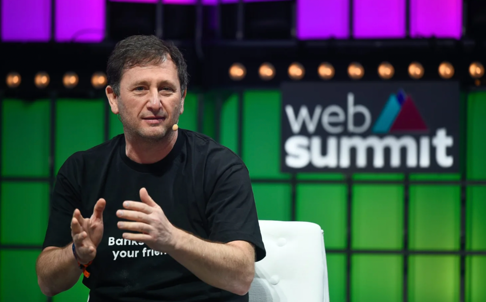
Jack Dorsey and Jay-Z Launch 'Bitcoin Academy' in Brooklyn rapper's home
The new Bitcoin Academy will teach Jay-Marcy Z's Houses neighbors "What is Cryptocurrency."
Jay-Z grew up in Brooklyn's Marcy Houses. The rapper and Block CEO Jack Dorsey are giving back to his hometown by creating the Bitcoin Academy.
The Bitcoin Academy will offer online and in-person classes, including "What is Money?" and "What is Blockchain?"
The program will provide participants with a mobile hotspot and a small amount of Bitcoin for hands-on learning.
Students will receive dinner and two evenings of instruction until early September. The Shawn Carter Foundation will help with on-the-ground instruction.
Jay-Z and Dorsey announced the program Thursday morning. It will begin at Marcy Houses but may be expanded.
Crypto Blockchain Plug and Black Bitcoin Billionaire, which has received a grant from Block, will teach the classes.
Jay-Z, Dorsey reunite
Jay-Z and Dorsey have previously worked together to promote a Bitcoin and crypto-based future.
In 2021, Dorsey's Block (then Square) acquired the rapper's streaming music service Tidal, which they propose using for NFT distribution.
Dorsey and Jay-Z launched an endowment in 2021 to fund Bitcoin development in Africa and India.
Dorsey is funding the new Bitcoin Academy out of his own pocket (as is Jay-Z), but he's also pushed crypto-related charitable endeavors at Block, including a $5 million fund backed by corporate Bitcoin interest.
This post is a summary. Read full article here

rekt
4 years ago
LCX is the latest CEX to have suffered a private key exploit.
The attack began around 10:30 PM +UTC on January 8th.
Peckshield spotted it first, then an official announcement came shortly after.
We’ve said it before; if established companies holding millions of dollars of users’ funds can’t manage their own hot wallet security, what purpose do they serve?
The Unique Selling Proposition (USP) of centralised finance grows smaller by the day.
The official incident report states that 7.94M USD were stolen in total, and that deposits and withdrawals to the platform have been paused.
LCX hot wallet: 0x4631018f63d5e31680fb53c11c9e1b11f1503e6f
Hacker’s wallet: 0x165402279f2c081c54b00f0e08812f3fd4560a05
Stolen funds:
- 162.68 ETH (502,671 USD)
- 3,437,783.23 USDC (3,437,783 USD)
- 761,236.94 EURe (864,840 USD)
- 101,249.71 SAND Token (485,995 USD)
- 1,847.65 LINK (48,557 USD)
- 17,251,192.30 LCX Token (2,466,558 USD)
- 669.00 QNT (115,609 USD)
- 4,819.74 ENJ (10,890 USD)
- 4.76 MKR (9,885 USD)
**~$1M worth of $LCX remains in the address, along with 611k EURe which has been frozen by Monerium.
The rest, a total of 1891 ETH (~$6M) was sent to Tornado Cash.**
Why can’t they keep private keys private?
Is it really that difficult for a traditional corporate structure to maintain good practice?
CeFi hacks leave us with little to say - we can only go on what the team chooses to tell us.
Next time, they can write this article themselves.
See below for a template.
You might also like

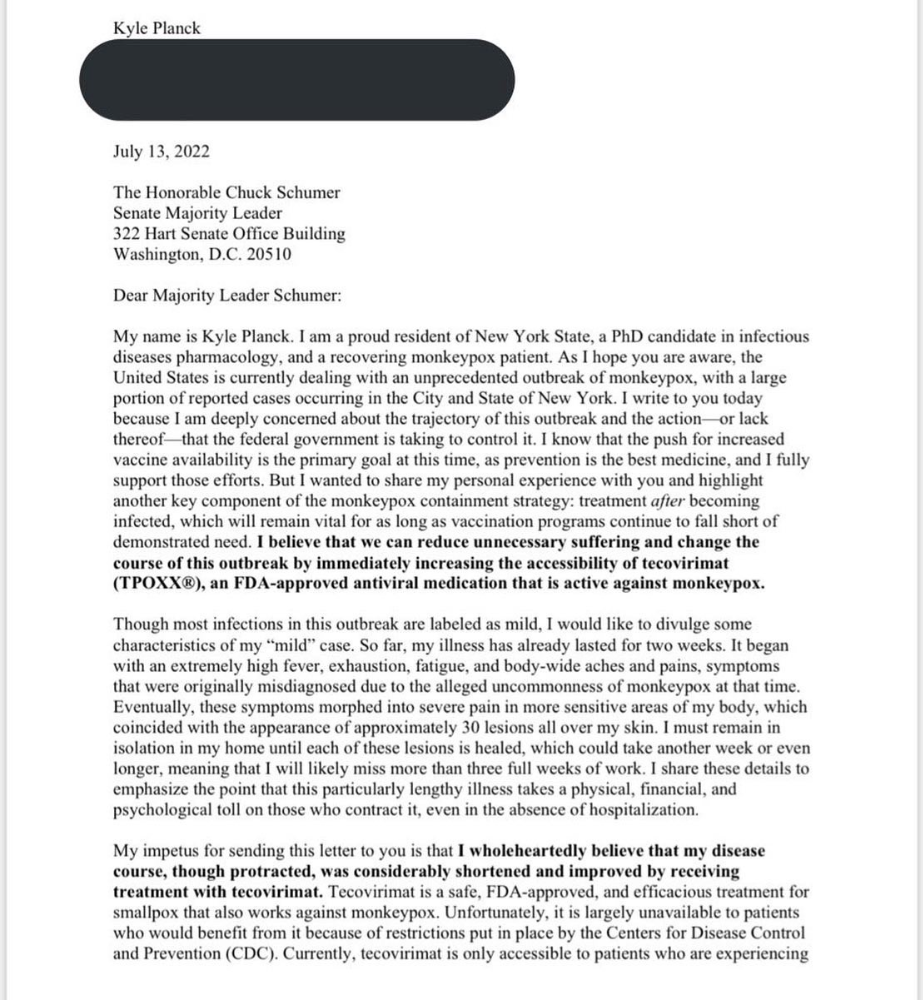
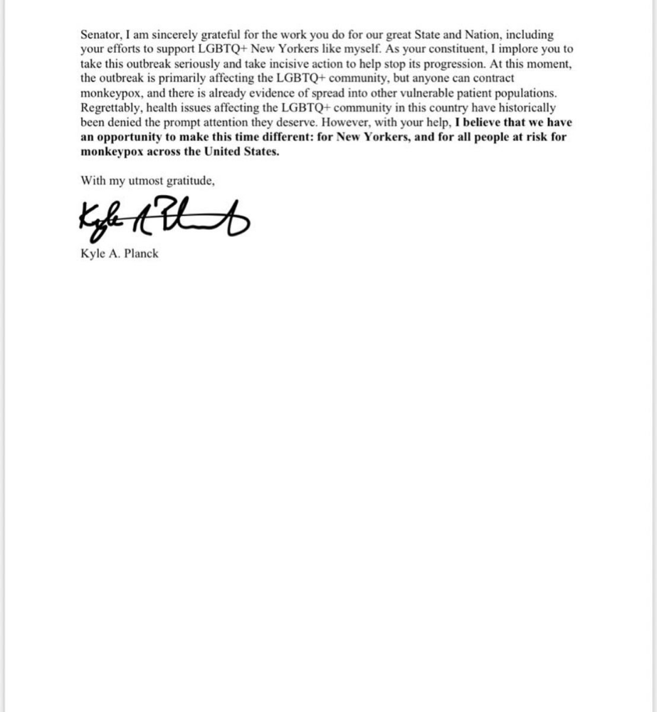
Kyle Planck
3 years ago
The chronicles of monkeypox.
or, how I spread monkeypox and got it myself.
This story contains nsfw (not safe for wife) stuff and shouldn't be read if you're under 18 or think I'm a newborn angel. After the opening, it's broken into three sections: a chronological explanation of my disease course, my ideas, and what I plan to do next.
Your journey awaits.
As early as mid-may, I was waltzing around the lab talking about monkeypox, a rare tropical disease with an inaccurate name. Monkeys are not its primary animal reservoir. It caused an outbreak among men who have sex with men across Europe, with unprecedented levels of person-to-person transmission. European health authorities speculated that the virus spread at raves and parties and was easily transferred through intimate, mainly sexual, contact. I had already read the nejm article about the first confirmed monkeypox patient in the u.s. and shared the photos on social media so people knew what to look for. The cdc information page only included 4 photographs of monkeypox lesions that looked like they were captured on a motorola razr.
I warned my ex-boyfriend about monkeypox. Monkeypox? responded.
Mom, I'm afraid about monkeypox. What's monkeypox?
My therapist is scared about monkeypox. What's monkeypox?
Was I alone? A few science gays on Twitter didn't make me feel overreacting.
This information got my gay head turning. The incubation period for the sickness is weeks. Many of my social media contacts are traveling to Europe this summer. What is pride? Travel, parties, and sex. Many people may become infected before attending these activities. Monkeypox will affect the lgbtq+ community.
Being right always stinks. My young scientist brain was right, though. Someone who saw this coming is one of the early victims. I'll talk about my feelings publicly, and trust me, I have many concerning what's occurring.
Part 1 is the specifics.
Wednesday nights are never smart but always entertaining. I didn't wake up until noon on june 23 and saw gay twitter blazing. Without warning, the nyc department of health announced a pop-up monkeypox immunization station in chelsea. Some days would be 11am-7pm. Walk-ins were welcome, however appointments were preferred. I tried to arrange an appointment after rubbing my eyes, but they were all taken. I got out of bed, washed my face, brushed my teeth, and put on short shorts because I wanted to get a walk-in dose and show off my legs. I got a 20-oz. cold brew on the way to the train and texted a chelsea-based acquaintance for help.
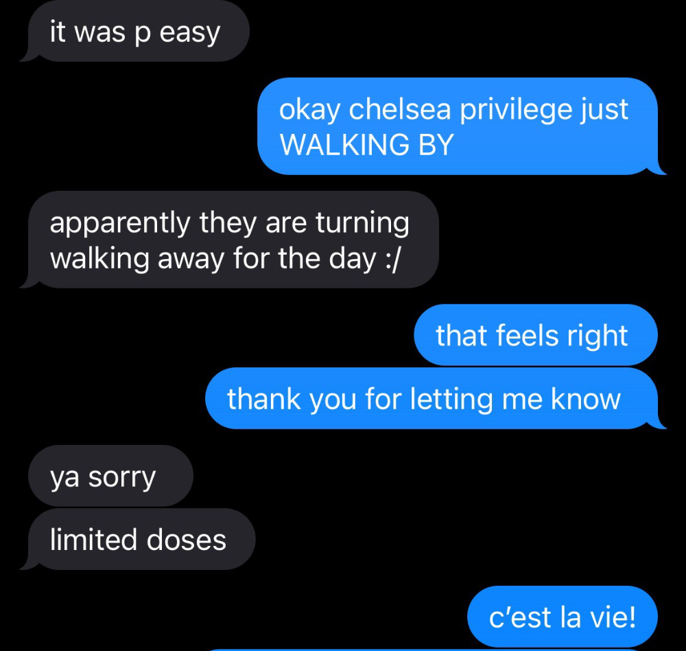
Clinic closed at 2pm. No more doses. Hundreds queued up. The government initially gave them only 1,000 dosages. For a city with 500,000 LGBT people, c'mon. What more could I do? I was upset by how things were handled. The evidence speaks for itself.
I decided to seek an appointment when additional doses were available and continued my weekend. I was celebrating nyc pride with pals. Fun! sex! *
On tuesday after that, I felt a little burn. This wasn't surprising because I'd been sexually active throughout the weekend, so I got a sti panel the next day. I expected to get results in a few days, take antibiotics, and move on.
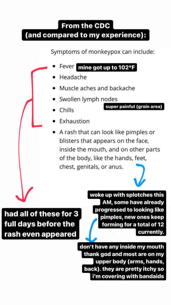
Emerging germs had other intentions. Wednesday night, I felt sore, and thursday morning, I had a blazing temperature and had sweat through my bedding. I had fever, chills, and body-wide aches and pains for three days. I reached 102 degrees. I believed I had covid over pride weekend, but I tested negative for three days straight.
STDs don't induce fevers or other systemic symptoms. If lymphogranuloma venereum advances, it can cause flu-like symptoms and swollen lymph nodes. I was suspicious and desperate for answers, so I researched monkeypox on the cdc website (for healthcare professionals). Much of what I saw on screen about monkeypox prodrome matched my symptoms. Multiple-day fever, headache, muscle aches, chills, tiredness, enlarged lymph nodes. Pox were lacking.
I told my doctor my concerns pre-medically. I'm occasionally annoying.
On saturday night, my fever broke and I felt better. Still burning, I was optimistic till sunday, when I woke up with five red splotches on my arms and fingertips.
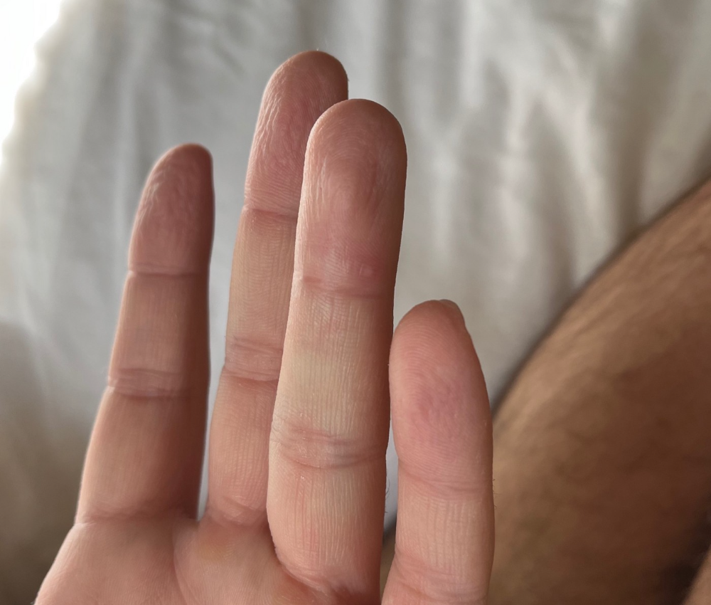
As spots formed, burning became pain. I observed as spots developed on my body throughout the day. I had more than a dozen by the end of the day, and the early spots were pustular. I had monkeypox, as feared.
Fourth of July weekend limited my options. I'm well-connected in my school's infectious disease academic community, so I texted a coworker for advice. He agreed it was likely monkeypox and scheduled me for testing on tuesday.
nyc health could only perform 10 monkeypox tests every day. Before doctors could take swabs and send them in, each test had to be approved by the department. Some commercial labs can now perform monkeypox testing, but the backlog is huge. I still don't have a positive orthopoxvirus test five days after my test. *My 12-day-old case may not be included in the official monkeypox tally. This outbreak is far wider than we first thought, therefore I'm attempting to spread the information and help contain it.
*Update, 7/11: I have orthopoxvirus.
I spent all day in the bathtub because of the agony. Warm lavender epsom salts helped me feel better. I can't stand lavender anymore. I brought my laptop into the bathroom and viewed everything everywhere at once (2022). If my ex and I hadn't recently broken up, I wouldn't have monkeypox. All of these things made me cry, and I sat in the bathtub on the 4th of July sobbing. I thought, Is this it? I felt like Bridesmaids' Kristen Wiig (2011). I'm a flop. From here, things can only improve.
Later that night, I wore a mask and went to my roof to see the fireworks. Even though I don't like fireworks, there was something wonderful about them this year: the colors, how they illuminated the black surfaces around me, and their transient beauty. Joyful moments rarely linger long in our life. We must enjoy them now.
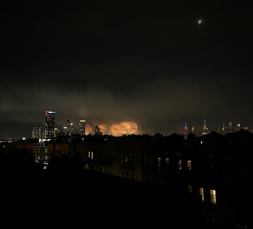
Several roofs away, my neighbors gathered. Happy 4th! I heard a woman yell. Why is this godforsaken country so happy? Instead of being rude, I replied. I didn't tell them I had monkeypox. I thought that would kill the mood.
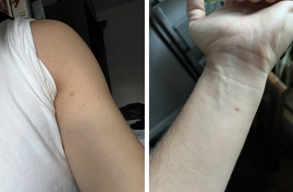
By the time I went to the hospital the next day to get my lesions swabbed, wearing long sleeves, pants, and a mask, they looked like this:
I had 30 lesions on my arms, hands, stomach, back, legs, buttcheeks, face, scalp, and right eyebrow. I had some in my mouth, gums, and throat. Current medical thought is that lesions on mucous membranes cause discomfort in sensitive places. Internal lesions are a new feature of this outbreak of monkeypox. Despite being unattractive, the other sores weren't unpleasant or bothersome.
I had a bacterial sti with the pox. Who knows if that would've created symptoms (often it doesn't), but different infections can happen at once. My care team remembered that having a sti doesn't exclude out monkeypox. doxycycline rocks!
The coworker who introduced me to testing also offered me his home. We share a restroom, and monkeypox can be spread through surfaces. (Being a dna virus gives it environmental hardiness that rna viruses like sars-cov-2 lack.) I disinfected our bathroom after every usage, but I was apprehensive. My friend's place has a guest room and second bathroom, so no cross-contamination. It was the ideal monkeypox isolation environment, so I accepted his offer and am writing this piece there. I don't know what I would have done without his hospitality and attention.
The next day, I started tecovirimat, or tpoxx, for 14 days. Smallpox has been eradicated worldwide since the 1980s but remains a bioterrorism concern. Tecovirimat has a unique, orthopoxvirus-specific method of action, which reduces side effects to headache and nausea. It hasn't been used in many people, therefore the cdc is encouraging patients who take it for monkeypox to track their disease and symptoms.

Tpoxx's oral absorption requires a fatty meal. The hospital ordered me to take the medication after a 600-calorie, 25-gram-fat meal every 12 hours. The coordinator joked, "Don't diet for the next two weeks." I wanted to get peanut butter delivered, but jif is recalling their supply due to salmonella. Please give pathogens a break. I got almond butter.
Tpoxx study enrollment was documented. After signing consent documents, my lesions were photographed and measured during a complete physical exam. I got bloodwork to assess my health. My medication delivery was precise; every step must be accounted for. I got a two-week supply and started taking it that night. I rewarded myself with McDonald's. I'd been hungry for a week. I was also prescribed ketorolac (aka toradol), a stronger ibuprofen, for my discomfort.
I thought tpoxx was a wonder medicine by day two of treatment. Early lesions looked like this.
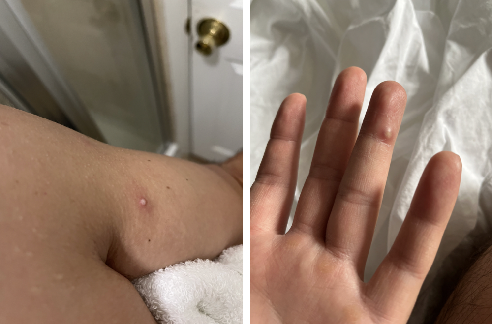
however, They vanished. The three largest lesions on my back flattened and practically disappeared into my skin. Some pustular lesions were diminishing. Tpoxx+toradol has helped me sleep, focus, and feel human again. I'm down to twice-daily baths and feeling hungrier than ever in this illness. On day five of tpoxx, some of the lesions look like this:
I have a ways to go. We must believe I'll be contagious until the last of my patches scabs over, falls off, and sprouts new skin. There's no way to tell. After a week and a half of tremendous pain and psychological stress, any news is good news. I'm grateful for my slow but steady development.
Part 2 of the rant.
Being close to yet not in the medical world is interesting. It lets me know a lot about it without being persuaded by my involvement. Doctors identify and treat patients using a tool called differential diagnosis.
A doctor interviews a patient to learn about them and their symptoms. More is better. Doctors may ask, "Have you traveled recently?" sex life? Have pets? preferred streaming service? (No, really. (Hbomax is right.) After the inquisition, the doctor will complete a body exam ranging from looking in your eyes, ears, and throat to a thorough physical.
After collecting data, the doctor makes a mental (or physical) inventory of all the conceivable illnesses that could cause or explain the patient's symptoms. Differential diagnosis list. After establishing the differential, the clinician can eliminate options. The doctor will usually conduct nucleic acid tests on swab samples or bloodwork to learn more. This helps eliminate conditions from the differential or boosts a condition's likelihood. In an ideal circumstance, the doctor can eliminate all but one reason of your symptoms, leaving your formal diagnosis. Once diagnosed, treatment can begin. yay! Love medicine.
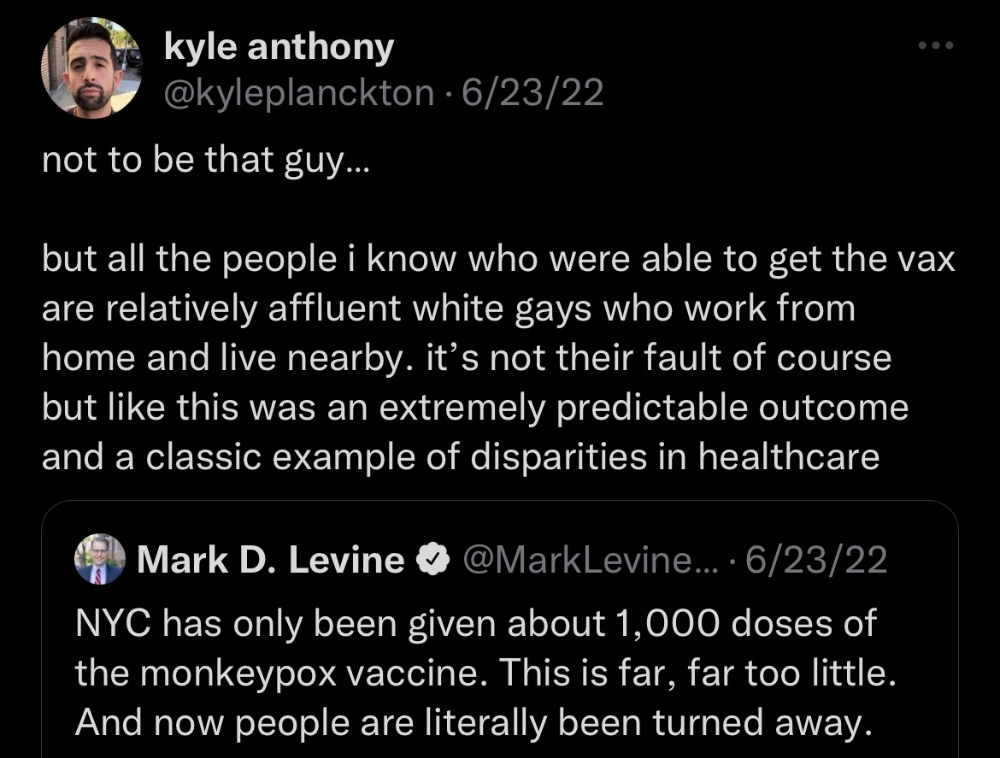
My symptoms two weeks ago did not suggest monkeypox. Fever, pains, weariness, and swollen lymph nodes are caused by several things. My scandalous symptoms weren't linked to common ones. My instance shows the importance of diversity and representation in healthcare. My doctor isn't gay, but he provides culturally sensitive care. I'd heard about monkeypox as a gay man in New York. I was hyper-aware of it and had heard of friends of friends who had contracted it the week before, even though the official case count in the US was 40. My physicians weren't concerned, but I was. How would it appear on his mental differential if it wasn't on his radar? Mental differential rhymes! I'll trademark it to prevent theft. differential!
I was in a rare position to recognize my condition and advocate for myself. I study infections. I'd spent months researching monkeypox. I work at a university where I rub shoulders with some of the country's greatest doctors. I'm a gay dude who follows nyc queer social networks online. All of these variables positioned me to think, "Maybe this is monkeypox," and to explain why.
This outbreak is another example of privilege at work. The brokenness of our healthcare system is once again exposed by the inequities produced by the vaccination rollout and the existence of people like myself who can pull strings owing to their line of work. I can't cure this situation on my own, but I can be a strong voice demanding the government do a better job addressing the outbreak and giving resources and advice to everyone I can.
lgbtqia+ community members' support has always impressed me in new york. The queer community has watched out for me and supported me in ways I never dreamed were possible.
Queer individuals are there for each other when societal structures fail. People went to the internet on the first day of the vaccine rollout to share appointment information and the vaccine clinic's message. Twitter timelines were more effective than marketing campaigns. Contrary to widespread anti-vaccine sentiment, the LGBT community was eager to protect themselves. Smallpox vaccination? sure. gimme. whether I'm safe. I credit the community's sex positivity. Many people are used to talking about STDs, so there's a reduced barrier to saying, "I think I have something, you should be on the watch too," and taking steps to protect our health.
Once I got monkeypox, I posted on Twitter and Instagram. Besides fueling my main character syndrome, I felt like I wasn't alone. My dc-based friend had monkeypox within hours. He told me about his experience and gave me ideas for managing the discomfort. I can't imagine life without him.
My buddy and colleague organized my medical care and let me remain in his home. His and his husband's friendliness and attention made a world of difference in my recovery. All of my friends and family who helped me, whether by venmo, doordash, or moral support, made me feel cared about. I don't deserve the amazing people in my life.
Finally, I think of everyone who commented on my social media posts regarding my trip. Friends from all sectors of my life and all sexualities have written me well wishes and complimented me for my vulnerability, but I feel the most gravitas from fellow lgbtq+ persons. They're learning to spot. They're learning where to go ill. They're learning self-advocacy. I'm another link in our network of caretaking. I've been cared for, therefore I want to do the same. Community and knowledge are powerful.
You're probably wondering where the diatribe is. You may believe he's gushing about his loved ones, and you'd be right. I say that just because the queer community can take care of itself doesn't mean we should.
Even when caused by the same pathogen, comparing health crises is risky. Aids is unlike covid-19 or monkeypox, yet all were caused by poorly understood viruses. The lgbtq+ community has a history of self-medicating. Queer people (and their supporters) have led the charge to protect themselves throughout history when the government refused. Surreal to experience this in real time.
First, vaccination access is a government failure. The strategic national stockpile contains tens of thousands of doses of jynneos, the newest fda-approved smallpox vaccine, and millions of doses of acam2000, an older vaccine for immunocompetent populations. Despite being a monkeypox hotspot and international crossroads, new york has only received 7,000 doses of the jynneos vaccine. Vaccine appointments are booked within minutes. It's showing Hunger Games, which bothers me.
Second, I think the government failed to recognize the severity of the european monkeypox outbreak. We saw abroad reports in may, but the first vaccines weren't available until june. Why was I a 26-year-old pharmacology grad student, able to see a monkeypox problem in europe but not the u.s. public health agency? Or was there too much bureaucracy and politicking, delaying action?
Lack of testing infrastructure for a known virus with vaccinations and therapies is appalling. More testing would have helped understand the problem's breadth. Many homosexual guys, including myself, didn't behave like monkeypox was a significant threat because there were only a dozen instances across the country. Our underestimating of the issue, spurred by a story of few infections, was huge.
Public health officials' response to infectious diseases frustrates me. A wait-and-see approach to infectious diseases is unsatisfactory. Before a sick person is recognized, they've exposed and maybe contaminated numerous others. Vaccinating susceptible populations before a disease becomes entrenched prevents disease. CDC might operate this way. When it was easier, they didn't control or prevent monkeypox. We'll learn when. Sometimes I fear never. Emerging viral infections are a menace in the era of climate change and globalization, and I fear our government will repeat the same mistakes. I don't work at the cdc, thus I have no idea what they do. As a scientist, a homosexual guy, and a citizen of this country, I feel confident declaring that the cdc has not done enough about monkeypox. Will they do enough about monkeypox? The strategic national stockpile can respond to a bioterrorism disaster in 12 hours. I'm skeptical following this outbreak.
It's simple to criticize the cdc, but they're not to blame. Underfunding public health services, especially the cdc, is another way our government fails to safeguard its citizens. I may gripe about the vaccination rollout all I want, but local health departments are doing their best with limited resources. They may not have enough workers to keep up with demand and run a contact-tracing program. Since my orthopoxvirus test is still negative, the doh hasn't asked about my close contacts. By then, my illness will be two weeks old, too long to do anything productive. Not their fault. They're functioning in a broken system that's underfunded for the work it does.
*Update, 7/11: I have orthopoxvirus.
Monkeypox is slow, so i've had time to contemplate. Now that I'm better, I'm angry. furious and sad I want to help. I wish to spare others my pain. This was preventable and solvable, I hope. HOW?
Third, the duty.
Family, especially selected family, helps each other. So many people have helped me throughout this difficult time. How can I give back? I have ideas.
1. Education. I've already started doing this by writing incredibly detailed posts on Instagram about my physical sickness and my thoughts on the entire scandal. via tweets. by producing this essay. I'll keep doing it even if people start to resent me! It's crucial! On my Instagram profile (@kyleplanckton), you may discover a story highlight with links to all of my bizarre yet educational posts.
2. Resources. I've forwarded the contact information for my institution's infectious diseases clinic to several folks who will hopefully be able to get tpoxx under the expanded use policy. Through my social networks, I've learned of similar institutions. I've also shared crowdsourced resources about symptom relief and vaccine appointment availability on social media. DM me or see my Instagram highlight for more.
3. Community action. During my illness, my friends' willingness to aid me has meant the most. It was nice to know I had folks on my side. One of my pals (thanks, kenny) snagged me a mcgriddle this morning when seamless canceled my order. This scenario has me thinking about methods to help people with monkeypox isolation. A two-week isolation period is financially damaging for many hourly workers. Certain governments required paid sick leave for covid-19 to allow employees to recover and prevent spread. No comparable program exists for monkeypox, and none seems to be planned shortly.
I want to aid monkeypox patients in severe financial conditions. I'm willing to pick up and bring groceries or fund meals/expenses for sick neighbors. I've seen several GoFundMe accounts, but I wish there was a centralized mechanism to link those in need with those who can help. Please contact me if you have expertise with mutual aid organizations. I hope we can start this shortly.
4. lobbying. Personal narratives are powerful. My narrative is only one, but I think it's compelling. Over the next day or so, i'll write to local, state, and federal officials about monkeypox. I wanted a vaccine but couldn't acquire one, and I feel tpoxx helped my disease. As a pharmacologist-in-training, I believe collecting data on a novel medicine is important, and there are ethical problems when making a drug with limited patient data broadly available. Many folks I know can't receive tpoxx due of red tape and a lack of contacts. People shouldn't have to go to an ivy league hospital to obtain the greatest care. Based on my experience and other people's tales, I believe tpoxx can drastically lessen monkeypox patients' pain and potentially curb transmission chains if administered early enough. This outbreak is manageable. It's not too late if we use all the instruments we have (diagnostic, vaccine, treatment).
*UPDATE 7/15: I submitted the following letter to Chuck Schumer and Kirsten Gillibrand. I've addressed identical letters to local, state, and federal officials, including the CDC and HHS.
I hope to join RESPND-MI, an LGBTQ+ community-led assessment of monkeypox symptoms and networks in NYC. Visit their website to learn more and give to this community-based charity.
How I got monkeypox is a mystery. I received it through a pride physical interaction, but i'm not sure which one. This outbreak will expand unless leaders act quickly. Until then, I'll keep educating and connecting people to care in my neighborhood.
Despite my misgivings, I see some optimism. Health department social media efforts are underway. During the outbreak, the CDC provided nonjudgmental suggestions for safer social and sexual activity. There's additional information regarding the disease course online, including how to request tpoxx for sufferers. These materials can help people advocate for themselves if they're sick. Importantly, homosexual guys are listening when they discuss about monkeypox online and irl. Learners They're serious.
The government has a terrible track record with lgtbq+ health issues, and they're not off to a good start this time. I hope this time will be better. If I can aid even one individual, I'll do so.
Thanks for reading, supporting me, and spreading awareness about the 2022 monkeypox outbreak. My dms are accessible if you want info, resources, queries, or to chat.
y'all well
kyle

Ash Parrish
3 years ago
Sonic Prime and indie games on Netflix
Netflix will stream Spiritfarer, Raji: An Ancient Epic, and Lucky Luna.
Netflix's Geeked Week brought a slew of announcements. The flurry of reveals for The Sandman, The Umbrella Academy season 3, One Piece, and more also included game and game-adjacent announcements.
Netflix released a teaser for Cuphead season 2 ahead of its August premiere, featuring more of Grey DeLisle's Ms. Chalice. DOTA: Dragon's Blood season 3 hits Netflix in August. Tekken, the fighting game that throws kids off cliffs, gets an anime, Tekken: Bloodline.
Netflix debuted a clip of Sonic Prime before Sonic Origins in June and Sonic Frontiers in 2022.
Castlevania: Nocturne will follow Richter Belmont.
Netflix is reviving licensed games with titles based on its shows. There's a Queen's Gambit chess game, a Shadow and Bone RPG, a La Casa de Papel heist adventure, and a Too Hot to Handle game where a pregnant woman must choose between stabbing her cheating ex or forgiving him.
Riot's rhythm platformer Hextech Mayhem debuted on Netflix last year, and now Netflix is adding games from Devolver Digital. Reigns: Three Kingdoms is a card game that lets players choose the fate of Three Kingdoms-era China by swiping left or right on cards. Spiritfarer, the "cozy game about death" from 2020, and Raji: An Ancient Epic are coming to Netflix. Poinpy, a vertical climber from the creator of Downwell, is now on Netflix.
Desta: The Memories Between is a turn-based strategy game set in dreams and memories.
Snowman's Lucky Luna will also be added soon.
With these games, Netflix is expanding beyond dinky mobile games — it plans to have 50 by the end of the year — and could be a serious platform for indies that want to expand into mobile. It takes gaming seriously.

Gareth Willey
3 years ago
I've had these five apps on my phone for a long time.
TOP APPS
Who survives spring cleaning?

Relax. Notion is off-limits. This topic is popular.
(I wrote about it 2 years ago, before everyone else did.) So).
These apps are probably new to you. I hope you find a new phone app after reading this.
Outdooractive
ViewRanger is Google Maps for outdoor enthusiasts.
This app has been so important to me as a freedom-loving long-distance walker and hiker.
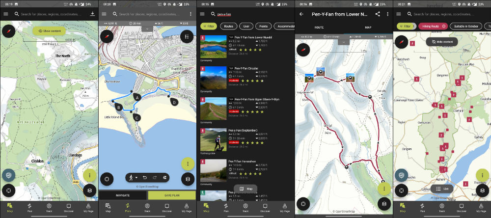
This app shows nearby trails and right-of-ways on top of an Open Street Map.
Helpful detail and data. Any route's distance,
You can download and follow tons of routes planned by app users.
This has helped me find new routes and places a fellow explorer has tried.
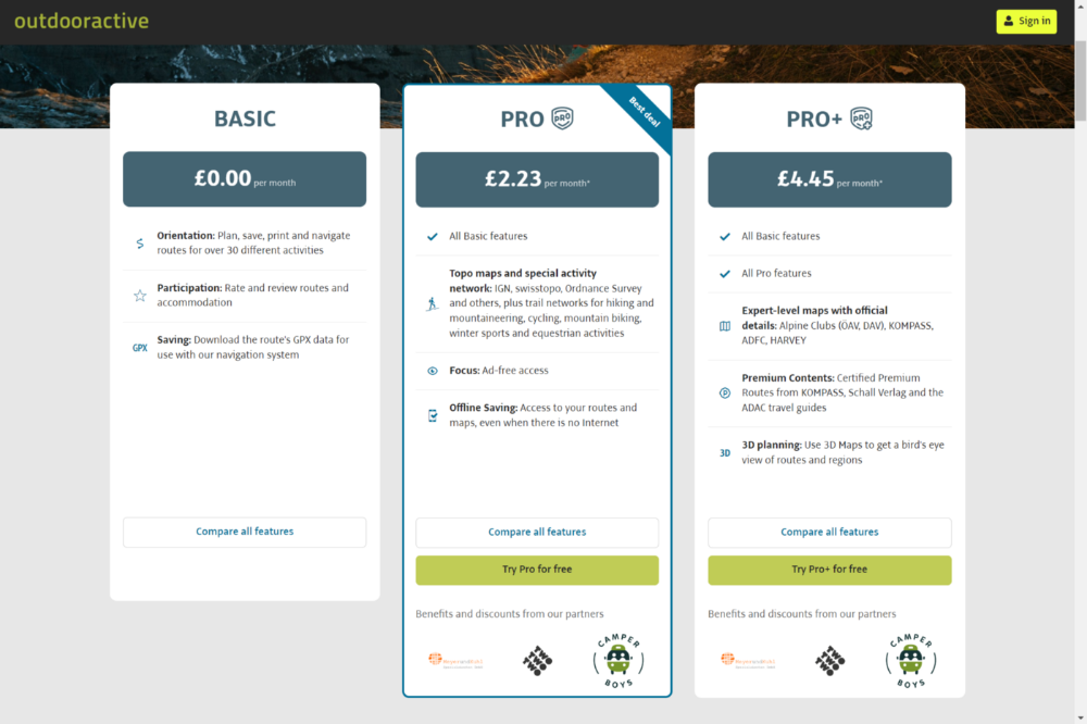
Free with non-intrusive ads. Years passed before I subscribed. Pro costs £2.23/month.
This app is for outdoor lovers.
Google Files
New phones come with bloatware. These rushed apps are frustrating.
We must replace these apps. 2017 was Google's year.
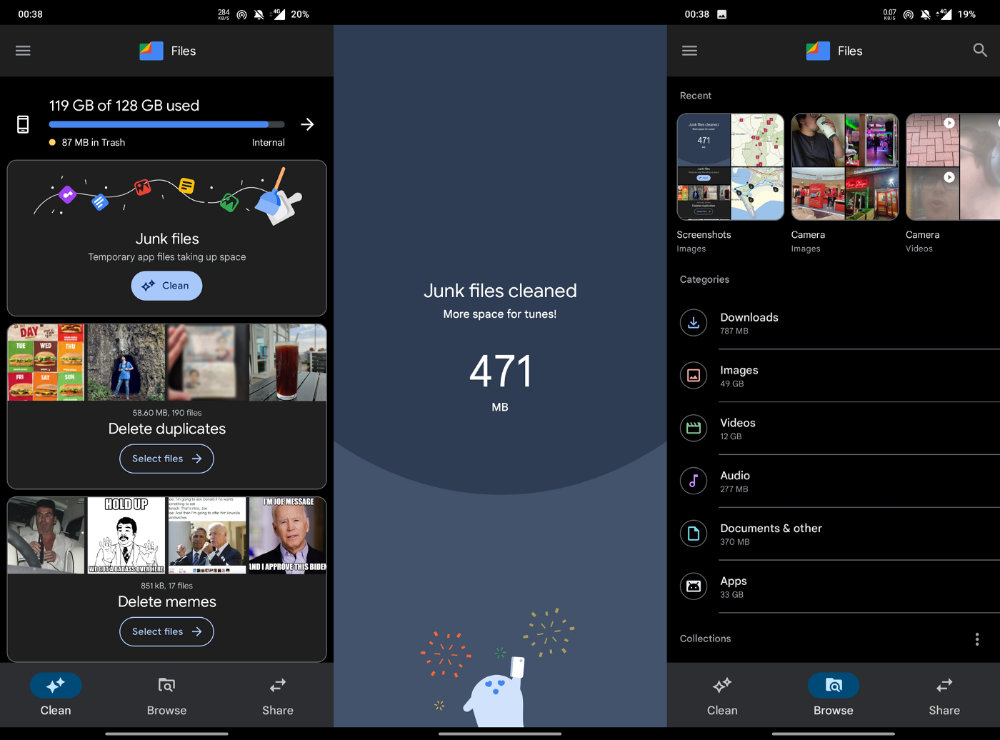
Files is a file manager. It's quick, innovative, and clean. They've given people what they want.
It's easy to organize files, clear space, and clear cache.
I recommend Gallery by Google as a gallery app alternative. It's quick and easy.
Trainline
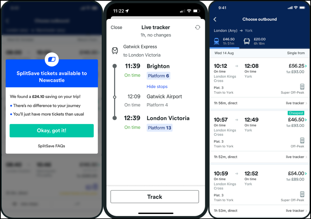
App for trains, buses, and coaches.
I've used this app for years. It did the basics well when I first used it.
Since then, it's improved. It's constantly adding features to make traveling easier and less stressful.
Split-ticketing helps me save hundreds a year on train fares. This app is only available in the UK and Europe.
This service doesn't link to a third-party site. Their app handles everything.
Not all train and coach companies use this app. All the big names are there, though.
Here's more on the app.
Battlefield: Mobile
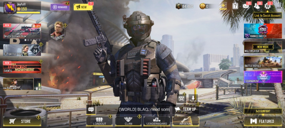
Play Store has 478,000 games. Few can turn my phone into a console.
Call of Duty Mobile and Asphalt 8/9 are examples.
Asphalt's loot boxes and ads make it unplayable. Call of Duty opens with a few ads. Close them to play without hassle.
This game uses all your phone's features to provide a high-quality, seamless experience. If my internet connection is good, I never experience lag or glitches.
The gameplay is energizing and intense, just like on consoles. Sometimes I'm too involved. I've thrown my phone in anger. I'm totally absorbed.
Customizability is my favorite. Since phones have limited screen space, we should only have the buttons we need, placed conveniently.
Size, opacity, and position are modifiable. Adjust audio, graphics, and textures. It's customizable.
This game has been on my phone for three years. It began well and has gotten better. When I think the creators can't do more, they do.
If you play, read my tips for winning a Battle Royale.
Lightroom
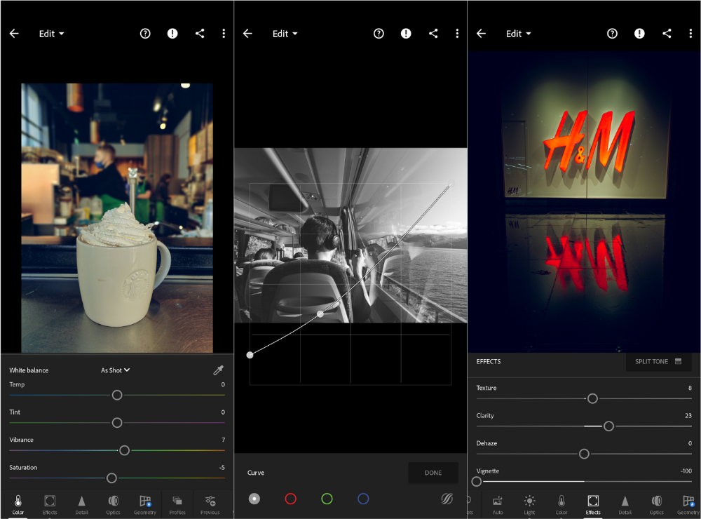
As a photographer, I believe your best camera is on you. The phone.
2017 was a big year for this app. I've tried many photo-editing apps since then. This always wins.
The app is dull. I've never seen better photo editing on a phone.
Adjusting settings and sliders doesn't damage or compress photos. It's detailed.
This is important for phone photos, which are lower quality than professional ones.
Some tools are behind a £4.49/month paywall. Adobe must charge a subscription fee instead of selling licenses. (I'm still bitter about Creative Cloud's price)
Snapseed is my pick. Lightroom is where I do basic editing before moving to Snapseed. Snapseed review:
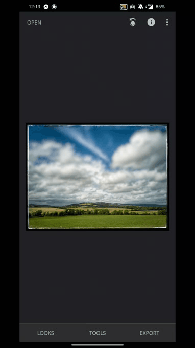
These apps are great. They cover basic and complex editing needs while traveling.
Final Reflections
I hope you downloaded one of these. Share your favorite apps. These apps are scarce.