


More on Society & Culture

Max Chafkin
3 years ago
Elon Musk Bets $44 Billion on Free Speech's Future
Musk’s purchase of Twitter has sealed his bond with the American right—whether the platform’s left-leaning employees and users like it or not.
Elon Musk's pursuit of Twitter Inc. began earlier this month as a joke. It started slowly, then spiraled out of control, culminating on April 25 with the world's richest man agreeing to spend $44 billion on one of the most politically significant technology companies ever. There have been bigger financial acquisitions, but Twitter's significance has always outpaced its balance sheet. This is a unique Silicon Valley deal.
To recap: Musk announced in early April that he had bought a stake in Twitter, citing the company's alleged suppression of free speech. His complaints were vague, relying heavily on the dog whistles of the ultra-right. A week later, he announced he'd buy the company for $54.20 per share, four days after initially pledging to join Twitter's board. Twitter's directors noticed the 420 reference as well, and responded with a “shareholder rights” plan (i.e., a poison pill) that included a 420 joke.
Musk - Patrick Pleul/Getty Images
No one knew if the bid was genuine. Musk's Twitter plans seemed implausible or insincere. In a tweet, he referred to automated accounts that use his name to promote cryptocurrency. He enraged his prospective employees by suggesting that Twitter's San Francisco headquarters be turned into a homeless shelter, renaming the company Titter, and expressing solidarity with his growing conservative fan base. “The woke mind virus is making Netflix unwatchable,” he tweeted on April 19.
But Musk got funding, and after a frantic weekend of negotiations, Twitter said yes. Unlike most buyouts, Musk will personally fund the deal, putting up up to $21 billion in cash and borrowing another $12.5 billion against his Tesla stock.
Free Speech and Partisanship
Percentage of respondents who agree with the following
The deal is expected to replatform accounts that were banned by Twitter for harassing others, spreading misinformation, or inciting violence, such as former President Donald Trump's account. As a result, Musk is at odds with his own left-leaning employees, users, and advertisers, who would prefer more content moderation rather than less.
Dorsey - Photographer: Joe Raedle/Getty Images
Previously, the company's leadership had similar issues. Founder Jack Dorsey stepped down last year amid concerns about slowing growth and product development, as well as his dual role as CEO of payments processor Block Inc. Compared to Musk, a father of seven who already runs four companies (besides Tesla and SpaceX), Dorsey is laser-focused.
Musk's motivation to buy Twitter may be political. Affirming the American far right with $44 billion spent on “free speech” Right-wing activists have promoted a series of competing upstart Twitter competitors—Parler, Gettr, and Trump's own effort, Truth Social—since Trump was banned from major social media platforms for encouraging rioters at the US Capitol on Jan. 6, 2021. But Musk can give them a social network with lax content moderation and a real user base. Trump said he wouldn't return to Twitter after the deal was announced, but he wouldn't be the first to do so.
Trump - Eli Hiller/Bloomberg
Conservative activists and lawmakers are already ecstatic. “A great day for free speech in America,” said Missouri Republican Josh Hawley. The day the deal was announced, Tucker Carlson opened his nightly Fox show with a 10-minute laudatory monologue. “The single biggest political development since Donald Trump's election in 2016,” he gushed over Musk.
But Musk's supporters and detractors misunderstand how much his business interests influence his political ideology. He marketed Tesla's cars as carbon-saving machines that were faster and cooler than gas-powered luxury cars during George W. Bush's presidency. Musk gained a huge following among wealthy environmentalists who reserved hundreds of thousands of Tesla sedans years before they were made during Barack Obama's presidency. Musk in the Trump era advocated for a carbon tax, but he also fought local officials (and his own workers) over Covid rules that slowed the reopening of his Bay Area factory.
Teslas at the Las Vegas Convention Center Loop Central Station in April 2021. The Las Vegas Convention Center Loop was Musk's first commercial project. Ethan Miller/Getty Images
Musk's rightward shift matched the rise of the nationalist-populist right and the desire to serve a growing EV market. In 2019, he unveiled the Cybertruck, a Tesla pickup, and in 2018, he announced plans to manufacture it at a new plant outside Austin. In 2021, he decided to move Tesla's headquarters there, citing California's "land of over-regulation." After Ford and General Motors beat him to the electric truck market, Musk reframed Tesla as a company for pickup-driving dudes.
Similarly, his purchase of Twitter will be entwined with his other business interests. Tesla has a factory in China and is friendly with Beijing. This could be seen as a conflict of interest when Musk's Twitter decides how to treat Chinese-backed disinformation, as Amazon.com Inc. founder Jeff Bezos noted.
Musk has focused on Twitter's product and social impact, but the company's biggest challenges are financial: Either increase cash flow or cut costs to comfortably service his new debt. Even if Musk can't do that, he can still benefit from the deal. He has recently used the increased attention to promote other business interests: Boring has hyperloops and Neuralink brain implants on the way, Musk tweeted. Remember Tesla's long-promised robotaxis!
Musk may be comfortable saying he has no expectation of profit because it benefits his other businesses. At the TED conference on April 14, Musk insisted that his interest in Twitter was solely charitable. “I don't care about money.”
The rockets and weed jokes make it easy to see Musk as unique—and his crazy buyout will undoubtedly add to that narrative. However, he is a megabillionaire who is risking a small amount of money (approximately 13% of his net worth) to gain potentially enormous influence. Musk makes everything seem new, but this is a rehash of an old media story.

Charlie Brown
3 years ago
What Happens When You Sell Your House, Never Buying It Again, Reverse the American Dream
Homeownership isn't the only life pattern.

Want to irritate people?
My party trick is to say I used to own a house but no longer do.
I no longer wish to own a home, not because I lost it or because I'm moving.
It was a long-term plan. It was more deliberate than buying a home. Many people are committed for this reason.
Poppycock.
Anyone who told me that owning a house (or striving to do so) is a must is wrong.
Because, URGH.
One pattern for life is to own a home, but there are millions of others.
You can afford to buy a home? Go, buddy.
You think you need 1,000 square feet (or more)? You think it's non-negotiable in life?
Nope.
It's insane that society forces everyone to own real estate, regardless of income, wants, requirements, or situation. As if this trade brings happiness, stability, and contentment.
Take it from someone who thought this for years: drywall isn't happy. Living your way brings contentment.
That's in real estate. It may also be renting a small apartment in a city that makes your soul sing, but you can't afford the downpayment or mortgage payments.
Living or traveling abroad is difficult when your life savings are connected to something that eats your money the moment you sign.
#vanlife, which seems like torment to me, makes some people feel alive.
I've seen co-living, vacation rental after holiday rental, living with family, and more work.
Insisting that home ownership is the only path in life is foolish and reduces alternative options.
How little we question homeownership is a disgrace.
No one challenges a homebuyer's motives. We congratulate them, then that's it.
When you offload one, you must answer every question, even if you have a loose screw.
Why do you want to sell?
Do you have any concerns about leaving the market?
Why would you want to renounce what everyone strives for?
Why would you want to abandon a beautiful place like that?
Why would you mismanage your cash in such a way?
But surely it's only temporary? RIGHT??
Incorrect questions. Buying a property requires several inquiries.
The typical American has $4500 saved up. When something goes wrong with the house (not if, it’s never if), can you actually afford the repairs?
Are you certain that you can examine a home in less than 15 minutes before committing to buying it outright and promising to pay more than twice the asking price on a 30-year 7% mortgage?
Are you certain you're ready to leave behind friends, family, and the services you depend on in order to acquire something?
Have you thought about the connotation that moving to a suburb, which more than half of Americans do, means you will be dependent on a car for the rest of your life?
Plus:
Are you sure you want to prioritize home ownership over debt, employment, travel, raising kids, and daily routines?
Homeownership entails that. This ex-homeowner says it will rule your life from the time you put the key in the door.
This isn't questioned. We don't question enough. The holy home-ownership grail was set long ago, and we don't challenge it.
Many people question after signing the deeds. 70% of homeowners had at least one regret about buying a property, including the expense.
Exactly. Tragic.
Homes are different from houses
We've been fooled into thinking home ownership will make us happy.
Some may agree. No one.
Bricks and brick hindered me from living the version of my life that made me most comfortable, happy, and steady.
I'm spending the next month in a modest apartment in southern Spain. Even though it's late November, today will be 68 degrees. My spouse and I will soon meet his visiting parents. We'll visit a Sherry store. We'll eat, nap, walk, and drink Sherry. Writing. Jerez means flamenco.
That's my home. This is such a privilege. Living a fulfilling life brings me the contentment that buying a home never did.
I'm happy and comfortable knowing I can make almost all of my days good. Rejecting home ownership is partly to blame.
I'm broke like most folks. I had to choose between home ownership and comfort. I said, I didn't find them together.
Feeling at home trumps owning brick-and-mortar every day.
The following is the reality of what it's like to turn the American Dream around.
Leaving the housing market.
Sometimes I wish I owned a home.
I miss having my own yard and bed. My kitchen, cookbooks, and pizza oven are missed.
But I rarely do.
Someone else's life plan pushed home ownership on me. I'm grateful I figured it out at 35. Many take much longer, and some never understand homeownership stinks (for them).
It's confusing. People will think you're dumb or suicidal.
If you read what I write, you'll know. You'll realize that all you've done is choose to live intentionally. Find a home beyond four walls and a picket fence.
Miss? As I said, they're not home. If it were, a pizza oven, a good mattress, and a well-stocked kitchen would bring happiness.
No.
If you can afford a house and desire one, more power to you.
There are other ways to discover home. Find calm and happiness. For fun.
For it, look deeper than your home's foundation.

Scott Galloway
3 years ago
Don't underestimate the foolish
ZERO GRACE/ZERO MALICE
Big companies and wealthy people make stupid mistakes too.
Your ancestors kept snakes and drank bad water. You (probably) don't because you've learnt from their failures via instinct+, the ultimate life-lessons streaming network in your head. Instincts foretell the future. If you approach a lion, it'll eat you. Our society's nuanced/complex decisions have surpassed instinct. Human growth depends on how we handle these issues. 80% of people believe they are above-average drivers, yet few believe they make many incorrect mistakes that make them risky. Stupidity hurts others like death. Basic Laws of Human Stupidity by Carlo Cipollas:
Everyone underestimates the prevalence of idiots in our society.
Any other trait a person may have has no bearing on how likely they are to be stupid.
A dumb individual is one who harms someone without benefiting themselves and may even lose money in the process.
Non-dumb people frequently underestimate how destructively powerful stupid people can be.
The most dangerous kind of person is a moron.
Professor Cippola defines stupid as bad for you and others. We underestimate the corporate world's and seemingly successful people's ability to make bad judgments that harm themselves and others. Success is an intoxication that makes you risk-aggressive and blurs your peripheral vision.

Stupid companies and decisions:
Big Dumber
Big-company bad ideas have more bulk and inertia. The world's most valuable company recently showed its board a VR headset. Jony Ive couldn't destroy Apple's terrible idea in 2015. Mr. Ive said that VR cut users off from the outer world, made them seem outdated, and lacked practical uses. Ives' design team doubted users would wear headsets for lengthy periods.
VR has cost tens of billions of dollars over a decade to prove nobody wants it. The next great SaaS startup will likely come from Florence, not Redmond or San Jose.
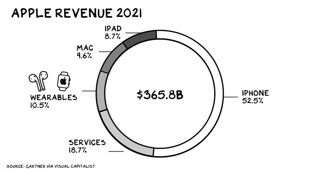
Apple Watch and Airpods have made the Cupertino company the world's largest jewelry maker. 10.5% of Apple's income, or $38 billion, comes from wearables in 2021. (seven times the revenue of Tiffany & Co.). Jewelry makes you more appealing and useful. Airpods and Apple Watch do both.
Headsets make you less beautiful and useful and promote isolation, loneliness, and unhappiness among American teenagers. My sons pretend they can't hear or see me when on their phones. VR headsets lack charisma.
Coinbase disclosed a plan to generate division and tension within its workplace weeks after Apple was pitched $2,000 smokes. The crypto-trading platform is piloting a program that rates staff after every interaction. If a coworker says anything you don't like, you should tell them how to improve. Everyone gets a 110-point scorecard. Coworkers should evaluate a person's rating while deciding whether to listen to them. It's ridiculous.
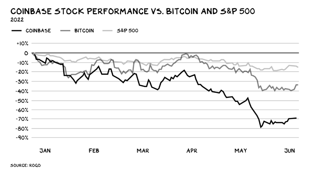
Organizations leverage our superpower of cooperation. This encourages non-cooperation, period. Bridgewater's founder Ray Dalio designed the approach to promote extreme transparency. Dalio has 223 billion reasons his managerial style works. There's reason to suppose only a small group of people, largely traders, will endure a granular scorecard. Bridgewater has 20% first-year turnover. Employees cry in bathrooms, and sex scandals are settled by ignoring individuals with poor believability levels. Coinbase might take solace that the stock is 80% below its initial offering price.
Poor Stupid
Fools' ledgers are valuable. More valuable are lists of foolish rich individuals.
Robinhood built a $8 billion corporation on financial ignorance. The firm's median account value is $240, and its stock has dropped 75% since last summer. Investors, customers, and society lose. Stupid. Luna published a comparable list on the blockchain, grew to $41 billion in market cap, then plummeted.
A podcast presenter is recruiting dentists and small-business owners to invest in Elon Musk's Twitter takeover. Investors pay a 7% fee and 10% of the upside for the chance to buy Twitter at a 35% premium to the current price. The proposal legitimizes CNBC's Trade Like Chuck advertising (Chuck made $4,600 into $460,000 in two years). This is stupid because it adds to the Twitter deal's desperation. Mr. Musk made an impression when he urged his lawyers to develop a legal rip-cord (There are bots on the platform!) to abandon the share purchase arrangement (for less than they are being marketed by the podcaster). Rolls-Royce may pay for this list of the dumb affluent because it includes potential Cullinan buyers.
Worst company? Flowcarbon, founded by WeWork founder Adam Neumann, operates at the convergence of carbon and crypto to democratize access to offsets and safeguard the earth's natural carbon sinks. Can I get an ayahuasca Big Gulp?
Neumann raised $70 million with their yogababble drink. More than half of the consideration came from selling GNT. Goddess Nature Token. I hope the company gets an S-1. Or I'll start a decentralized AI Meta Renewable NFTs company. My Community Based Ebitda coin will fund the company. Possible.
Stupidity inside oneself
This weekend, I was in NYC with my boys. My 14-year-old disappeared. He's realized I'm not cool and is mad I let the charade continue. When out with his dad, he likes to stroll home alone and depart before me. Friends told me hell would return, but I was surprised by how fast the eye roll came.
Not so with my 11-year-old. We went to The Edge, a Hudson Yards observation platform where you can see the city from 100 storeys up for $38. This is hell's seventh ring. Leaning into your boys' interests is key to engaging them (dad tip). Neither loves Crossfit, WW2 history, or antitrust law.
We take selfies on the Thrilling Glass Floor he spots. Dad, there's a bar! Coke? I nod, he rushes to the bar, stops, runs back for money, and sprints back. Sitting on stone seats, drinking Atlanta Champagne, he turns at me and asks, Isn't this amazing? I'll never reach paradise.
Later that night, the lads are asleep and I've had two Zacapas and Cokes. I SMS some friends about my day and how I feel about sons/fatherhood/etc. How I did. They responded and approached. The next morning, I'm sober, have distance from my son, and feel ashamed by my texts. Less likely to impulsively share my emotions with others. Stupid again.
You might also like

Antonio Neto
3 years ago
What's up with tech?
Massive Layoffs, record low VC investment, debate over crash... why is it happening and what’s the endgame?

This article generalizes a diverse industry. For objectivity, specific tech company challenges like growing competition within named segments won't be considered. Please comment on the posts.
According to Layoffs.fyi, nearly 120.000 people have been fired from startups since March 2020. More than 700 startups have fired 1% to 100% of their workforce. "The tech market is crashing"
Venture capital investment dropped 19% QoQ in the first four months of 2022, a 2018 low. Since January 2022, Nasdaq has dropped 27%. Some believe the tech market is collapsing.
It's bad, but nothing has crashed yet. We're about to get super technical, so buckle up!
I've written a follow-up article about what's next. For a more optimistic view of the crisis' aftermath, see: Tech Diaspora and Silicon Valley crisis
What happened?
Insanity reigned. Last decade, everyone became a unicorn. Seed investments can be made without a product or team. While the "real world" economy suffered from the pandemic for three years, tech companies enjoyed the "new normal."
COVID sped up technology adoption on several fronts, but this "new normal" wasn't so new after many restrictions were lifted. Worse, it lived with disrupted logistics chains, high oil prices, and WW3. The consumer market has felt the industry's boom for almost 3 years. Inflation, unemployment, mental distress...what looked like a fast economic recovery now looks like unfulfilled promises.
People rethink everything they eat. Paying a Netflix subscription instead of buying beef is moronic if you can watch it for free on your cousin’s account. No matter how great your real estate app's UI is, buying a house can wait until mortgage rates drop. PLGProduct Led Growth (PLG) isn't the go-to strategy when consumers have more basic expense priorities.
Exponential growth and investment
Until recently, tech companies believed that non-exponential revenue growth was fatal. Exponential growth entails doing more with less. From Salim Ismail words:
An Exponential Organization (ExO) has 10x the impact of its peers.
Many tech companies' theories are far from reality.
Investors have funded (sometimes non-exponential) growth. Scale-driven companies throw people at problems until they're solved. Need an entire closing team because you’ve just bought a TV prime time add? Sure. Want gold-weight engineers to colorize buttons? Why not?
Tech companies don't need cash flow to do it; they can just show revenue growth and get funding. Even though it's hard to get funding, this was the market's momentum until recently.
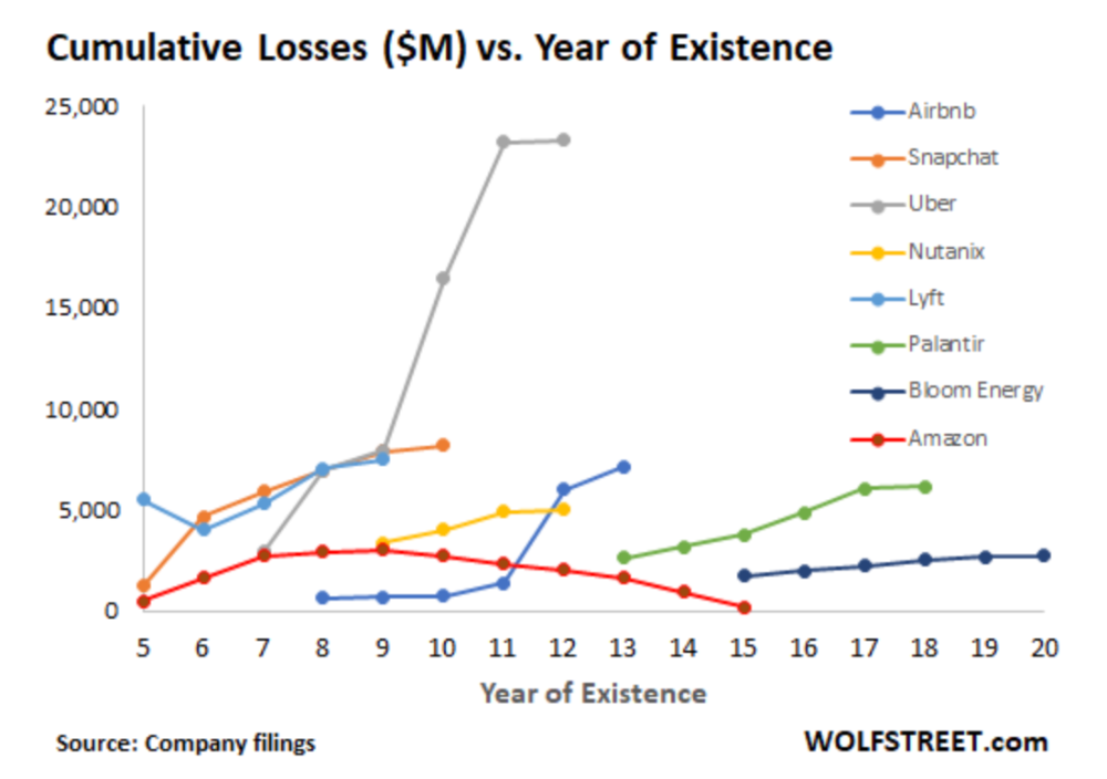
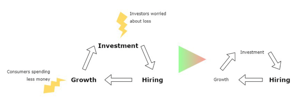
The graph at the beginning of this section shows how industry heavyweights burned money until 2020, despite being far from their market-share seed stage. Being big and being sturdy are different things, and a lot of the tech startups out there are paper tigers. Without investor money, they have no foundation.
A little bit about interest rates
Inflation-driven high interest rates are said to be causing tough times. Investors would rather leave money in the bank than spend it (I myself said it some days ago). It’s not wrong, but it’s also not that simple.
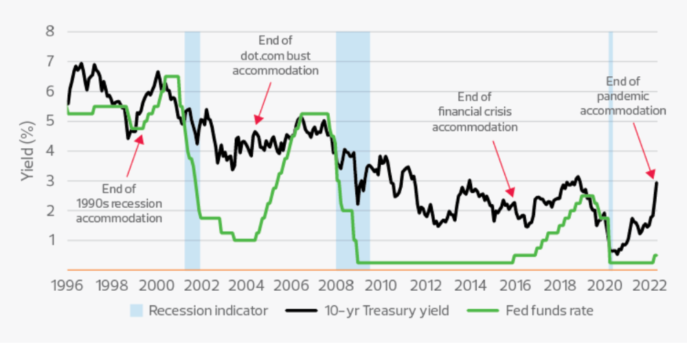
The USA central bank (FED) is a good proxy of global economics. Dollar treasury bonds are the safest investment in the world. Buying U.S. debt, the only country that can print dollars, guarantees payment.
The graph above shows that FED interest rates are low and 10+ year bond yields are near 2018 levels. Nobody was firing at 2018. What’s with that then?
Full explanation is too technical for this article, so I'll just summarize: Bond yields rise due to lack of demand or market expectations of longer-lasting inflation. Safe assets aren't a "easy money" tactic for investors. If that were true, we'd have seen the current scenario before.
Long-term investors are protecting their capital from inflation.
Not a crash, a landing
I bombarded you with info... Let's review:
Consumption is down, hurting revenue.
Tech companies of all ages have been hiring to grow revenue at the expense of profit.
Investors expect inflation to last longer, reducing future investment gains.
Inflation puts pressure on a wheel that was rolling full speed not long ago. Investment spurs hiring, growth, and more investment. Worried investors and consumers reduce the cycle, and hiring follows.
Long-term investors back startups. When the invested company goes public or is sold, it's ok to burn money. What happens when the payoff gets further away? What if all that money sinks? Investors want immediate returns.
Why isn't the market crashing? Technology is not losing capital. It’s expecting change. The market realizes it threw moderation out the window and is reversing course. Profitability is back on the menu.
People solve problems and make money, but they also cost money. Huge cost for the tech industry. Engineers, Product Managers, and Designers earn up to 100% more than similar roles. Businesses must be careful about who they keep and in what positions to avoid wasting money.
What the future holds
From here on, it's all speculation. I found many great articles while researching this piece. Some are cited, others aren't (like this and this). We're in an adjustment period that may or may not last long.
Big companies aren't laying off many workers. Netflix firing 100 people makes headlines, but it's only 1% of their workforce. The biggest seem to prefer not hiring over firing.
Smaller startups beyond the seeding stage may be hardest hit. Without structure or product maturity, many will die.
I expect layoffs to continue for some time, even at Meta or Amazon. I don't see any industry names falling like they did during the .com crisis, but the market will shrink.
If you are currently employed, think twice before moving out and where to.
If you've been fired, hurry, there are still many opportunities.
If you're considering a tech career, wait.
If you're starting a business, I respect you. Good luck.

Gajus Kuizinas
3 years ago
How a few lines of code were able to eliminate a few million queries from the database
I was entering tens of millions of records per hour when I first published Slonik PostgreSQL client for Node.js. The data being entered was usually flat, making it straightforward to use INSERT INTO ... SELECT * FROM unnset() pattern. I advocated the unnest approach for inserting rows in groups (that was part I).

However, today I’ve found a better way: jsonb_to_recordset.
jsonb_to_recordsetexpands the top-level JSON array of objects to a set of rows having the composite type defined by an AS clause.
jsonb_to_recordset allows us to query and insert records from arbitrary JSON, like unnest. Since we're giving JSON to PostgreSQL instead of unnest, the final format is more expressive and powerful.
SELECT *
FROM json_to_recordset('[{"name":"John","tags":["foo","bar"]},{"name":"Jane","tags":["baz"]}]')
AS t1(name text, tags text[]);
 name |   tags
------+-----------
 John | {foo,bar}
 Jane | {baz}
(2 rows)
Let’s demonstrate how you would use it to insert data.
Inserting data using json_to_recordset
Say you need to insert a list of people with attributes into the database.
const persons = [
  {
    name: 'John',
    tags: ['foo', 'bar']
  },
  {
    name: 'Jane',
    tags: ['baz']
  }
];
You may be tempted to traverse through the array and insert each record separately, e.g.
for (const person of persons) {
  await pool.query(sql`
    INSERT INTO person (name, tags)
    VALUES (
      ${person.name},
      ${sql.array(person.tags, 'text[]')}
    )
  `);
}
It's easier to read and grasp when working with a few records. If you're like me and troubleshoot a 2M+ insert query per day, batching inserts may be beneficial.
What prompted the search for better alternatives.
Inserting using unnest pattern might look like this:
await pool.query(sql`
  INSERT INTO public.person (name, tags)
  SELECT t1.name, t1.tags::text[]
  FROM unnest(
    ${sql.array(['John', 'Jane'], 'text')},
    ${sql.array(['{foo,bar}', '{baz}'], 'text')}
  ) AS t1.(name, tags);
`);
You must convert arrays into PostgreSQL array strings and provide them as text arguments, which is unsightly. Iterating the array to create slices for each column is likewise unattractive.
However, with jsonb_to_recordset, we can:
await pool.query(sql`
  INSERT INTO person (name, tags)
  SELECT *
  FROM jsonb_to_recordset(${sql.jsonb(persons)}) AS t(name text, tags text[])
`);
In contrast to the unnest approach, using jsonb_to_recordset we can easily insert complex nested data structures, and we can pass the original JSON document to the query without needing to manipulate it.
In terms of performance they are also exactly the same. As such, my current recommendation is to prefer jsonb_to_recordset whenever inserting lots of rows or nested data structures.

Hasan AboulHasan
3 years ago
High attachment products can help you earn money automatically.
Affiliate marketing is a popular online moneymaker. You promote others' products and get commissions. Affiliate marketing requires constant product promotion.
Affiliate marketing can be profitable even without much promotion. Yes, this is Autopilot Money.
How to Pick an Affiliate Program to Generate Income Autonomously
Autopilot moneymaking requires a recurring affiliate marketing program.
Finding the best product and testing it takes a lot of time and effort.
Here are three ways to choose the best service or product to promote:
Find a good attachment-rate product or service.
When choosing a product, ask if you can easily switch to another service. Attachment rate is how much people like a product.
Higher attachment rates mean better Autopilot products.
Consider promoting GetResponse. It's a 33% recurring commission email marketing tool. This means you get 33% of the customer's plan as long as he pays.
GetResponse has a high attachment rate because it's hard to leave and start over with another tool.
2. Pick a good or service with a lot of affiliate assets.
Check if a program has affiliate assets or creatives before joining.
Images and banners to promote the product in your business.
They save time; I look for promotional creatives. Creatives or affiliate assets are website banners or images. This reduces design time.
3. Select a service or item that consumers already adore.
New products are hard to sell. Choosing a trusted company's popular product or service is helpful.
As a beginner, let people buy a product they already love.
Online entrepreneurs and digital marketers love Systeme.io. It offers tools for creating pages, email marketing, funnels, and more. This product guarantees a high ROI.
Make the product known!
Affiliate marketers struggle to get traffic. Using affiliate marketing to make money is easier than you think if you have a solid marketing strategy.
Your plan should include:
1- Publish affiliate-related blog posts and SEO-optimize them
2- Sending new visitors product-related emails
3- Create a product resource page.
4-Review products
5-Make YouTube videos with links in the description.
6- Answering FAQs about your products and services on your blog and Quora.
7- Create an eCourse on how to use this product.
8- Adding Affiliate Banners to Your Website.
With these tips, you can promote your products and make money on autopilot.