


More on NFTs & Art

Amelia Winger-Bearskin
3 years ago
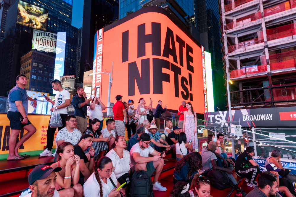
Hate NFTs? I must break some awful news to you...
If you think NFTs are awful, check out the art market.
The fervor around NFTs has subsided in recent months due to the crypto market crash and the media's short attention span. They were all anyone could talk about earlier this spring. Last semester, when passions were high and field luminaries were discussing "slurp juices," I asked my students and students from over 20 other universities what they thought of NFTs.
According to many, NFTs were either tasteless pyramid schemes or a new way for artists to make money. NFTs contributed to the climate crisis and harmed the environment, but so did air travel, fast fashion, and smartphones. Some students complained that NFTs were cheap, tasteless, algorithmically generated schlock, but others asked how this was different from other art.
I'm not sure what I expected, but the intensity of students' reactions surprised me. They had strong, emotional opinions about a technology I'd always considered administrative. NFTs address ownership and accounting, like most crypto/blockchain projects.
Art markets can be irrational, arbitrary, and subject to the same scams and schemes as any market. And maybe a few shenanigans that are unique to the art world.
The Fairness Question
Fairness, a deflating moral currency, was the general sentiment (the less of it in circulation, the more ardently we clamor for it.) These students, almost all of whom are artists, complained to the mismatch between the quality of the work in some notable NFT collections and the excessive amounts these items were fetching on the market. They can sketch a Bored Ape or Lazy Lion in their sleep. Why should they buy ramen with school loans while certain swindlers get rich?

I understand students. Art markets are unjust. They can be irrational, arbitrary, and governed by chance and circumstance, like any market. And art-world shenanigans.
Almost every mainstream critique leveled against NFTs applies just as easily to art markets
Over 50% of artworks in circulation are fake, say experts. Sincere art collectors and institutions are upset by the prevalence of fake goods on the market. Not everyone. Wealthy people and companies use art as investments. They can use cultural institutions like museums and galleries to increase the value of inherited art collections. People sometimes buy artworks and use family ties or connections to museums or other cultural taste-makers to hype the work in their collection, driving up the price and allowing them to sell for a profit. Money launderers can disguise capital flows by using market whims, hype, and fluctuating asset prices.
Almost every mainstream critique leveled against NFTs applies just as easily to art markets.
Art has always been this way. Edward Kienholz's 1989 print series satirized art markets. He stamped 395 identical pieces of paper from $1 to $395. Each piece was initially priced as indicated. Kienholz was joking about a strange feature of art markets: once the last print in a series sells for $395, all previous works are worth at least that much. The entire series is valued at its highest auction price. I don't know what a Kienholz print sells for today (inquire with the gallery), but it's more than $395.
I love Lee Lozano's 1969 "Real Money Piece." Lozano put cash in various denominations in a jar in her apartment and gave it to visitors. She wrote, "Offer guests coffee, diet pepsi, bourbon, half-and-half, ice water, grass, and money." "Offer real money as candy."
Lee Lozano kept track of who she gave money to, how much they took, if any, and how they reacted to the offer of free money without explanation. Diverse reactions. Some found it funny, others found it strange, and others didn't care. Lozano rarely says:
Apr 17 Keith Sonnier refused, later screws lid very tightly back on. Apr 27 Kaltenbach takes all the money out of the jar when I offer it, examines all the money & puts it all back in jar. Says he doesn’t need money now. Apr 28 David Parson refused, laughing. May 1 Warren C. Ingersoll refused. He got very upset about my “attitude towards money.” May 4 Keith Sonnier refused, but said he would take money if he needed it which he might in the near future. May 7 Dick Anderson barely glances at the money when I stick it under his nose and says “Oh no thanks, I intend to earn it on my own.” May 8 Billy Bryant Copley didn’t take any but then it was sort of spoiled because I had told him about this piece on the phone & he had time to think about it he said.
Smart Contracts (smart as in fair, not smart as in Blockchain)
Cornell University's Cheryl Finley has done a lot of research on secondary art markets. I first learned about her research when I met her at the University of Florida's Harn Museum, where she spoke about smart contracts (smart as in fair, not smart as in Blockchain) and new protocols that could help artists who are often left out of the economic benefits of their own work, including women and women of color.

Her talk included findings from her ArtNet op-ed with Lauren van Haaften-Schick, Christian Reeder, and Amy Whitaker.
NFTs allow us to think about and hack on formal contractual relationships outside a system of laws that is currently not set up to service our community.
The ArtNet article The Recent Sale of Amy Sherald's ‘Welfare Queen' Symbolizes the Urgent Need for Resale Royalties and Economic Equity for Artists discussed Sherald's 2012 portrait of a regal woman in a purple dress wearing a sparkling crown and elegant set of pearls against a vibrant red background.
Amy Sherald sold "Welfare Queen" to Princeton professor Imani Perry. Sherald agreed to a payment plan to accommodate Perry's budget.
Amy Sherald rose to fame for her 2016 portrait of Michelle Obama and her full-length portrait of Breonna Taylor, one of the most famous works of the past decade.
As is common, Sherald's rising star drove up the price of her earlier works. Perry's "Welfare Queen" sold for $3.9 million in 2021.
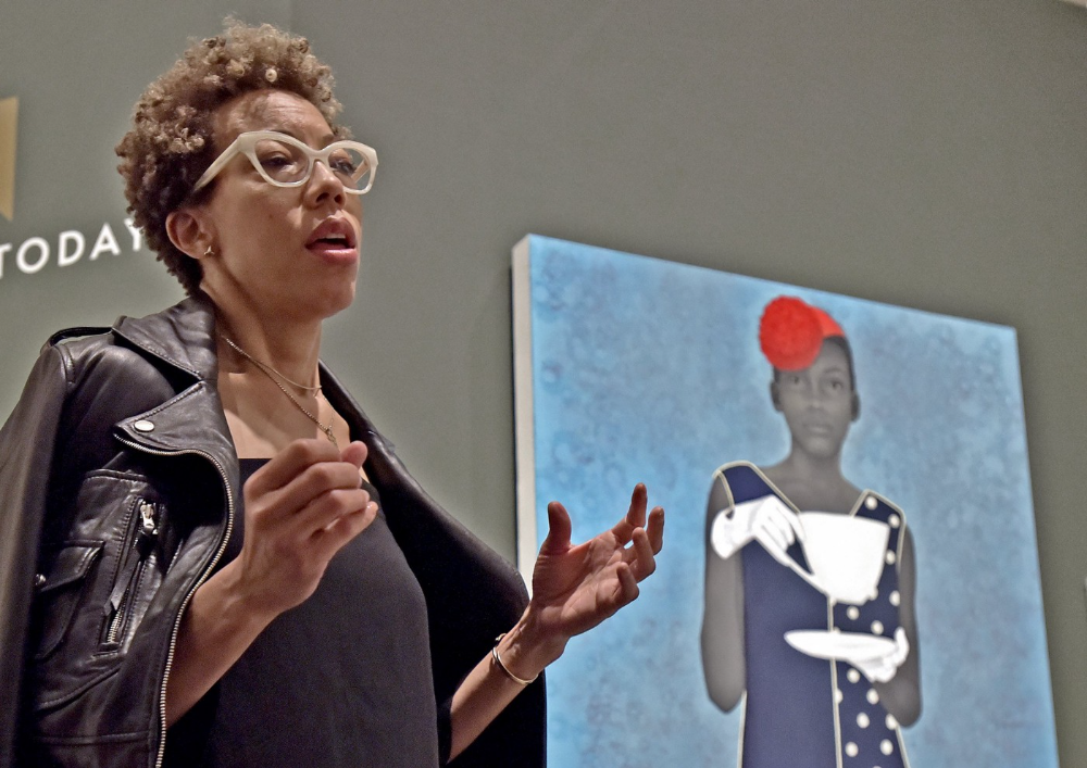
Imani Perry's early investment paid off big-time. Amy Sherald, whose work directly increased the painting's value and who was on an artist's shoestring budget when she agreed to sell "Welfare Queen" in 2012, did not see any of the 2021 auction money. Perry and the auction house got that money.
Sherald sold her Breonna Taylor portrait to the Smithsonian and Louisville's Speed Art Museum to fund a $1 million scholarship. This is a great example of what an artist can do for the community if they can amass wealth through their work.
NFTs haven't solved all of the art market's problems — fakes, money laundering, market manipulation — but they didn't create them. Blockchain and NFTs are credited with making these issues more transparent. More ideas emerge daily about what a smart contract should do for artists.
NFTs are a copyright solution. They allow us to hack formal contractual relationships outside a law system that doesn't serve our community.
Amy Sherald shows the good smart contracts can do (as in, well-considered, self-determined contracts, not necessarily blockchain contracts.) Giving back to our community, deciding where and how our work can be sold or displayed, and ensuring artists share in the equity of our work and the economy our labor creates.

Sea Launch
3 years ago
A guide to NFT pre-sales and whitelists
Before we dig through NFT whitelists and pre-sales, if you know absolutely nothing about NFTs, check our NFT Glossary.
What are pre-sales and whitelists on NFTs?
An NFT pre-sale, as the name implies, allows community members or early supporters of an NFT project to mint before the public, usually via a whitelist or mint pass.
Coin collectors can use mint passes to claim NFTs during the public sale. Because the mint pass is executed by “burning” an NFT into a specific crypto wallet, the collector is not concerned about gas price spikes.
A whitelist is used to approve a crypto wallet address for an NFT pre-sale. In a similar way to an early access list, it guarantees a certain number of crypto wallets can mint one (or more) NFT.
New NFT projects can do a pre-sale without a whitelist, but whitelists are good practice to avoid gas wars and a fair shot at minting an NFT before launching in competitive NFT marketplaces like Opensea, Magic Eden, or CNFT.
Should NFT projects do pre-sales or whitelists? 👇
The reasons to do pre-sales or a whitelist for NFT creators:
Time the market and gain traction.
Pre-sale or whitelists can help NFT projects gauge interest early on.
Whitelist spots filling up quickly is usually a sign of a successful launch, though it does not guarantee NFT longevity (more on that later). Also, full whitelists create FOMO and momentum for the public sale among non-whitelisted NFT collectors.
If whitelist signups are low or slow, projects may need to work on their vision, community, or product. Or the market is in a bear cycle. In either case, it aids NFT projects in market timing.
Reward the early NFT Community members.
Pre-sale and whitelists can help NFT creators reward early supporters.
First, by splitting the minting process into two phases, early adopters get a chance to mint one or more NFTs from their collection at a discounted or even free price.
Did you know that BAYC started at 0.08 eth each? A serum that allowed you to mint a Mutant Ape has become as valuable as the original BAYC.
(2) Whitelists encourage early supporters to help build a project's community in exchange for a slot or status. If you invite 10 people to the NFT Discord community, you get a better ranking or even a whitelist spot.
Pre-sale and whitelisting have become popular ways for new projects to grow their communities and secure future buyers.
Prevent gas wars.
Most new NFTs are created on the Ethereum blockchain, which has the highest transaction fees (also known as gas) (Solana, Cardano, Polygon, Binance Smart Chain, etc).
An NFT public sale is a gas war when a large number of NFT collectors (or bots) try to mint an NFT at the same time.
Competing collectors are willing to pay higher gas fees to prioritize their transaction and out-price others when upcoming NFT projects are hyped and very popular.
Pre-sales and whitelisting prevent gas wars by breaking the minting process into smaller batches of members or season launches.
The reasons to do pre-sales or a whitelists for NFT collectors:
How do I get on an NFT whitelist?
- Popular NFT collections act as a launchpad for other new or hyped NFT collections.
Example: Interfaces NFTs gives out 100 whitelist spots to Deadfellaz NFTs holders. Both NFT projects win. Interfaces benefit from Deadfellaz's success and brand equity.
In this case, to get whitelisted NFT collectors need to hold that specific NFT that is acting like a launchpad.
- A NFT studio or collection that launches a new NFT project and rewards previous NFT holders with whitelist spots or pre-sale access.
The whitelist requires previous NFT holders or community members.
NFT Alpha Groups are closed, small, tight-knit Discord servers where members share whitelist spots or giveaways from upcoming NFTs.
The benefit of being in an alpha group is getting information about new NFTs first and getting in on pre-sale/whitelist before everyone else.
There are some entry barriers to alpha groups, but if you're active in the NFT community, you'll eventually bump into, be invited to, or form one.
- A whitelist spot is awarded to members of an NFT community who are the most active and engaged.
This participation reward is the most democratic. To get a chance, collectors must work hard and play to their strengths.
Whitelisting participation examples:
- Raffle, games and contest: NFT Community raffles, games, and contests. To get a whitelist spot, invite 10 people to X NFT Discord community.
- Fan art: To reward those who add value and grow the community by whitelisting the best fan art and/or artists is only natural.
- Giveaways: Lucky number crypto wallet giveaways promoted by an NFT community. To grow their communities and for lucky collectors, NFT projects often offer free NFT.
- Activate your voice in the NFT Discord Community. Use voice channels to get NFT teams' attention and possibly get whitelisted.
The advantage of whitelists or NFT pre-sales.
Chainalysis's NFT stats quote is the best answer:
“Whitelisting isn’t just some nominal reward — it translates to dramatically better investing results. OpenSea data shows that users who make the whitelist and later sell their newly-minted NFT gain a profit 75.7% of the time, versus just 20.8% for users who do so without being whitelisted. Not only that, but the data suggests it’s nearly impossible to achieve outsized returns on minting purchases without being whitelisted.” Full report here.
Sure, it's not all about cash. However, any NFT collector should feel secure in their investment by owning a piece of a valuable and thriving NFT project. These stats help collectors understand that getting in early on an NFT project (via whitelist or pre-sale) will yield a better and larger return.
The downsides of pre-sales & whitelists for NFT creators.
Pre-sales and whitelist can cause issues for NFT creators and collectors.
NFT flippers
NFT collectors who only want to profit from early minting (pre-sale) or low mint cost (via whitelist). To sell the NFT in a secondary market like Opensea or Solanart, flippers go after the discounted price.
For example, a 1000 Solana NFT collection allows 100 people to mint 1 Solana NFT at 0.25 SOL. The public sale price for the remaining 900 NFTs is 1 SOL. If an NFT collector sells their discounted NFT for 0.5 SOL, the secondary market floor price is below the public mint.
This may deter potential NFT collectors. Furthermore, without a cap in the pre-sale minting phase, flippers can get as many NFTs as possible to sell for a profit, dumping them in secondary markets and driving down the floor price.
Hijacking NFT sites, communities, and pre-sales phase
People try to scam the NFT team and their community by creating oddly similar but fake websites, whitelist links, or NFT's Discord channel.
Established and new NFT projects must be vigilant to always make sure their communities know which are the official links, how a whitelist or pre-sale rules and how the team will contact (or not) community members.
Another way to avoid the scams around the pre-sale phase, NFT projects opt to create a separate mint contract for the whitelisted crypto wallets and then another for the public sale phase.
Scam NFT projects
We've seen a lot of mid-mint or post-launch rug pulls, indicating that some bad NFT projects are trying to scam NFT communities and marketplaces for quick profit. What happened to Magic Eden's launchpad recently will help you understand the scam.
We discussed the benefits and drawbacks of NFT pre-sales and whitelists for both projects and collectors.
Finally, some practical tools and tips for finding new NFTs 👇
Tools & resources to find new NFT on pre-sale or to get on a whitelist:
In order to never miss an update, important pre-sale dates, or a giveaway, create a Tweetdeck or Tweeten Twitter dashboard with hyped NFT project pages, hashtags ( #NFTGiveaways , #NFTCommunity), or big NFT influencers.
Search for upcoming NFT launches that have been vetted by the marketplace and try to get whitelisted before the public launch.
Save-timing discovery platforms like sealaunch.xyz for NFT pre-sales and upcoming launches. How can we help 100x NFT collectors get projects? A project's official social media links, description, pre-sale or public sale dates, price and supply. We're also working with Dune on NFT data analysis to help NFT collectors make better decisions.
Don't invest what you can't afford to lose because a) the project may fail or become rugged. Find NFTs projects that you want to be a part of and support.
Read original post here

Jennifer Tieu
3 years ago
Why I Love Azuki
Azuki Banner (www.azuki.com)
Disclaimer: This is my personal viewpoint. I'm not on the Azuki team. Please keep in mind that I am merely a fan, community member, and holder. Please do your own research and pardon my grammar. Thanks!
Azuki has changed my view of NFTs.
When I first entered the NFT world, I had no idea what to expect. I liked the idea. So I invested in some projects, fought for whitelists, and discovered some cool NFTs projects (shout-out to CATC). I lost more money than I earned at one point, but I hadn't invested excessively (only put in what you can afford to lose). Despite my losses, I kept looking. I almost waited for the “ah-ha” moment. A NFT project that changed my perspective on NFTs. What makes an NFT project more than a work of art?
Answer: Azuki.
The Art
The Azuki art drew me in as an anime fan. It looked like something out of an anime, and I'd never seen it before in NFT.
The project was still new. The first two animated teasers were released with little fanfare, but I was impressed with their quality. You can find them on Instagram or in their earlier Tweets.
The teasers hinted that this project could be big and that the team could deliver. It was amazing to see Shao cut the Azuki posters with her katana. Especially at the end when she sheaths her sword and the music cues. Then the live action video of the young boy arranging the Azuki posters seemed movie-like. I felt like I was entering the Azuki story, brand, and dope theme.
The team did not disappoint with the Azuki NFTs. The level of detail in the art is stunning. There were Azukis of all genders, skin and hair types, and more. These 10,000 Azukis have so much representation that almost anyone can find something that resonates. Rather than me rambling on, I suggest you visit the Azuki gallery
The Team
If the art is meant to draw you in and be the project's face, the team makes it more. The NFT would be a JPEG without a good team leader. Not that community isn't important, but no community would rally around a bad team.
Because I've been rugged before, I'm very focused on the team when considering a project. While many project teams are anonymous, I try to find ones that are doxxed (public) or at least appear to be established. Unlike Azuki, where most of the Azuki team is anonymous, Steamboy is public. He is (or was) Overwatch's character art director and co-creator of Azuki. I felt reassured and could trust the project after seeing someone from a major game series on the team.
Then I tried to learn as much as I could about the team. Following everyone on Twitter, reading their tweets, and listening to recorded AMAs. I was impressed by the team's professionalism and dedication to their vision for Azuki, led by ZZZAGABOND.
I believe the phrase “actions speak louder than words” applies to Azuki. I can think of a few examples of what the Azuki team has done, but my favorite is ERC721A.
With ERC721A, Azuki has created a new algorithm that allows minting multiple NFTs for essentially the same cost as minting one NFT.
I was ecstatic when the dev team announced it. This fascinates me as a self-taught developer. Azuki released a product that saves people money, improves the NFT space, and is open source. It showed their love for Azuki and the NFT community.
The Community
Community, community, community. It's almost a chant in the NFT space now. A community, like a team, can make or break a project. We are the project's consumers, shareholders, core, and lifeblood. The team builds the house, and we fill it. We stay for the community.
When I first entered the Azuki Discord, I was surprised by the calm atmosphere. There was no news about the project. No release date, no whitelisting requirements. No grinding or spamming either. People just wanted to hangout, get to know each other, and talk. It was nice. So the team could pick genuine people for their mintlist (aka whitelist).
But nothing fundamental has changed since the release. It has remained an authentic, fun, and helpful community. I'm constantly logging into Discord to chat with others or follow conversations. I see the community's openness to newcomers. Everyone respects each other (barring a few bad apples) and the variety of people passing through is fascinating. This human connection and interaction is what I enjoy about this place. Being a part of a group that supports a cause.
Finally, I want to thank the amazing Azuki mod team and the kissaten channel for their contributions.
The Brand
So, what sets Azuki apart from other projects? They are shaping a brand or identity. The Azuki website, I believe, best captures their vision. (This is me gushing over the site.)
If you go to the website, turn on the dope playlist in the bottom left. The playlist features a mix of Asian and non-Asian hip-hop and rap artists, with some lo-fi thrown in. The songs on the playlist change, but I think you get the vibe Azuki embodies just by turning on the music.
The Garden is our next stop where we are introduced to Azuki.
A brand.
We're creating a new brand together.
A metaverse brand. By the people.
A collection of 10,000 avatars that grant Garden membership. It starts with exclusive streetwear collabs, NFT drops, live events, and more. Azuki allows for a new media genre that the world has yet to discover. Let's build together an Azuki, your metaverse identity.
The Garden is a magical internet corner where art, community, and culture collide. The boundaries between the physical and digital worlds are blurring.
Try a Red Bean.
The text begins with Azuki's intention in the space. It's a community-made metaverse brand. Then it goes into more detail about Azuki's plans. Initiation of a story or journey. "Would you like to take the red bean and jump down the rabbit hole with us?" I love the Matrix red pill or blue pill play they used. (Azuki in Japanese means red bean.)
Morpheus, the rebel leader, offers Neo the choice of a red or blue pill in The Matrix. “You take the blue pill... After the story, you go back to bed and believe whatever you want. Your red pill... Let me show you how deep the rabbit hole goes.” Aware that the red pill will free him from the enslaving control of the machine-generated dream world and allow him to escape into the real world, he takes it. However, living the “truth of reality” is harsher and more difficult.
It's intriguing and draws you in. Taking the red bean causes what? Where am I going? I think they did well in piqueing a newcomer's interest.
Not convinced by the Garden? Read the Manifesto. It reinforces Azuki's role.
Here comes a new wave…
And surfing here is different.
Breaking down barriers.
Building open communities.
Creating magic internet money with our friends.
To those who don’t get it, we tell them: gm.
They’ll come around eventually.
Here’s to the ones with the courage to jump down a peculiar rabbit hole.
One that pulls you away from a world that’s created by many and owned by few…
To a world that’s created by more and owned by all.
From The Garden come the human beans that sprout into your family.
We rise together.
We build together.
We grow together.
Ready to take the red bean?
Not to mention the Mindmap, it sets Azuki apart from other projects and overused Roadmaps. I like how the team recognizes that the NFT space is not linear. So many of us are still trying to figure it out. It is Azuki's vision to adapt to changing environments while maintaining their values. I admire their commitment to long-term growth.
Conclusion
To be honest, I have no idea what the future holds. Azuki is still new and could fail. But I'm a long-term Azuki fan. I don't care about quick gains. The future looks bright for Azuki. I believe in the team's output. I love being an Azuki.
Thank you! IKUZO!
Full post here
You might also like

Ben "The Hosk" Hosking
3 years ago
The Yellow Cat Test Is Typically Failed by Software Developers.
Believe what you see, what people say
It’s sad that we never get trained to leave assumptions behind. - Sebastian Thrun
Many problems in software development are not because of code but because developers create the wrong software. This isn't rare because software is emergent and most individuals only realize what they want after it's built.
Inquisitive developers who pass the yellow cat test can improve the process.
Carpenters measure twice and cut the wood once. Developers are rarely so careful.
The Yellow Cat Test
Game of Thrones made dragons cool again, so I am reading The Game of Thrones book.
The yellow cat exam is from Syrio Forel, Arya Stark's fencing instructor.
Syrio tells Arya he'll strike left when fencing. He hits her after she dodges left. Arya says “you lied”. Syrio says his words lied, but his eyes and arm told the truth.
Arya learns how Syrio became Bravos' first sword.
“On the day I am speaking of, the first sword was newly dead, and the Sealord sent for me. Many bravos had come to him, and as many had been sent away, none could say why. When I came into his presence, he was seated, and in his lap was a fat yellow cat. He told me that one of his captains had brought the beast to him, from an island beyond the sunrise. ‘Have you ever seen her like?’ he asked of me.
“And to him I said, ‘Each night in the alleys of Braavos I see a thousand like him,’ and the Sealord laughed, and that day I was named the first sword.”
Arya screwed up her face. “I don’t understand.”
Syrio clicked his teeth together. “The cat was an ordinary cat, no more. The others expected a fabulous beast, so that is what they saw. How large it was, they said. It was no larger than any other cat, only fat from indolence, for the Sealord fed it from his own table. What curious small ears, they said. Its ears had been chewed away in kitten fights. And it was plainly a tomcat, yet the Sealord said ‘her,’ and that is what the others saw. Are you hearing?” Reddit discussion.
Development teams should not believe what they are told.
We created an appointment booking system. We thought it was an appointment-booking system. Later, we realized the software's purpose was to book the right people for appointments and discourage the unneeded ones.
The first 3 months of the project had half-correct requirements and software understanding.
Open your eyes
“Open your eyes is all that is needed. The heart lies and the head plays tricks with us, but the eyes see true. Look with your eyes, hear with your ears. Taste with your mouth. Smell with your nose. Feel with your skin. Then comes the thinking afterwards, and in that way, knowing the truth” Syrio Ferel
We must see what exists, not what individuals tell the development team or how developers think the software should work. Initial criteria cover 50/70% and change.
Developers build assumptions problems by assuming how software should work. Developers must quickly explain assumptions.
When a development team's assumptions are inaccurate, they must alter the code, DevOps, documentation, and tests.
It’s always faster and easier to fix requirements before code is written.
First-draft requirements can be based on old software. Development teams must grasp corporate goals and consider needs from many angles.
Testers help rethink requirements. They look at how software requirements shouldn't operate.
Technical features and benefits might misdirect software projects.
The initiatives that focused on technological possibilities developed hard-to-use software that needed extensive rewriting following user testing.
Software development
High-level criteria are different from detailed ones.
The interpretation of words determines their meaning.
Presentations are lofty, upbeat, and prejudiced.
People's perceptions may be unclear, incorrect, or just based on one perspective (half the story)
Developers can be misled by requirements, circumstances, people, plans, diagrams, designs, documentation, and many other things.
Developers receive misinformation, misunderstandings, and wrong assumptions. The development team must avoid building software with erroneous specifications.
Once code and software are written, the development team changes and fixes them.
Developers create software with incomplete information, they need to fill in the blanks to create the complete picture.
Conclusion
Yellow cats are often inaccurate when communicating requirements.
Before writing code, clarify requirements, assumptions, etc.
Everyone will pressure the development team to generate code rapidly, but this will slow down development.
Code changes are harder than requirements.

Guillaume Dumortier
2 years ago
Mastering the Art of Rhetoric: A Guide to Rhetorical Devices in Successful Headlines and Titles
Unleash the power of persuasion and captivate your audience with compelling headlines.
As the old adage goes, "You never get a second chance to make a first impression."
In the world of content creation and social ads, headlines and titles play a critical role in making that first impression.
A well-crafted headline can make the difference between an article being read or ignored, a video being clicked on or bypassed, or a product being purchased or passed over.
To make an impact with your headlines, mastering the art of rhetoric is essential. In this post, we'll explore various rhetorical devices and techniques that can help you create headlines that captivate your audience and drive engagement.
tl;dr : Headline Magician will help you craft the ultimate headline titles powered by rhetoric devices
Example with a high-end luxury organic zero-waste skincare brand
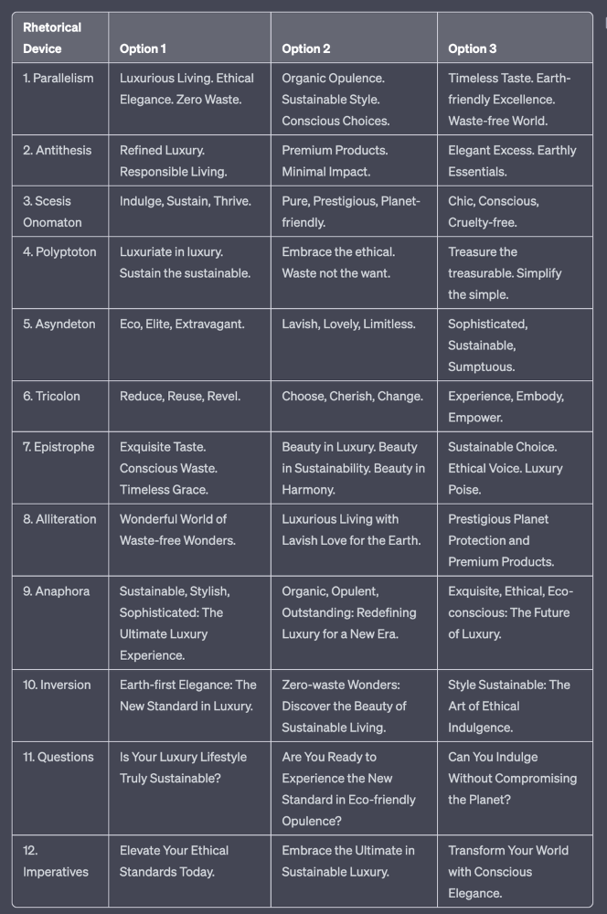
✍️ The Power of Alliteration
Alliteration is the repetition of the same consonant sound at the beginning of words in close proximity. This rhetorical device lends itself well to headlines, as it creates a memorable, rhythmic quality that can catch a reader's attention.
By using alliteration, you can make your headlines more engaging and easier to remember.
Examples:
"Crafting Compelling Content: A Comprehensive Course"
"Mastering the Art of Memorable Marketing"
🔁 The Appeal of Anaphora
Anaphora is the repetition of a word or phrase at the beginning of successive clauses. This rhetorical device emphasizes a particular idea or theme, making it more memorable and persuasive.
In headlines, anaphora can be used to create a sense of unity and coherence, which can draw readers in and pique their interest.
Examples:
"Create, Curate, Captivate: Your Guide to Social Media Success"
"Innovation, Inspiration, and Insight: The Future of AI"
🔄 The Intrigue of Inversion
Inversion is a rhetorical device where the normal order of words is reversed, often to create an emphasis or achieve a specific effect.
In headlines, inversion can generate curiosity and surprise, compelling readers to explore further.
Examples:
"Beneath the Surface: A Deep Dive into Ocean Conservation"
"Beyond the Stars: The Quest for Extraterrestrial Life"
⚖️ The Persuasive Power of Parallelism
Parallelism is a rhetorical device that involves using similar grammatical structures or patterns to create a sense of balance and symmetry.
In headlines, parallelism can make your message more memorable and impactful, as it creates a pleasing rhythm and flow that can resonate with readers.
Examples:
"Eat Well, Live Well, Be Well: The Ultimate Guide to Wellness"
"Learn, Lead, and Launch: A Blueprint for Entrepreneurial Success"
⏭️ The Emphasis of Ellipsis
Ellipsis is the omission of words, typically indicated by three periods (...), which suggests that there is more to the story.
In headlines, ellipses can create a sense of mystery and intrigue, enticing readers to click and discover what lies behind the headline.
Examples:
"The Secret to Success... Revealed"
"Unlocking the Power of Your Mind... A Step-by-Step Guide"
🎭 The Drama of Hyperbole
Hyperbole is a rhetorical device that involves exaggeration for emphasis or effect.
In headlines, hyperbole can grab the reader's attention by making bold, provocative claims that stand out from the competition. Be cautious with hyperbole, however, as overuse or excessive exaggeration can damage your credibility.
Examples:
"The Ultimate Guide to Mastering Any Skill in Record Time"
"Discover the Revolutionary Technique That Will Transform Your Life"
❓The Curiosity of Questions
Posing questions in your headlines can be an effective way to pique the reader's curiosity and encourage engagement.
Questions compel the reader to seek answers, making them more likely to click on your content. Additionally, questions can create a sense of connection between the content creator and the audience, fostering a sense of dialogue and discussion.
Examples:
"Are You Making These Common Mistakes in Your Marketing Strategy?"
"What's the Secret to Unlocking Your Creative Potential?"
💥 The Impact of Imperatives
Imperatives are commands or instructions that urge the reader to take action. By using imperatives in your headlines, you can create a sense of urgency and importance, making your content more compelling and actionable.
Examples:
"Master Your Time Management Skills Today"
"Transform Your Business with These Innovative Strategies"
💢 The Emotion of Exclamations
Exclamations are powerful rhetorical devices that can evoke strong emotions and convey a sense of excitement or urgency.
Including exclamations in your headlines can make them more attention-grabbing and shareable, increasing the chances of your content being read and circulated.
Examples:
"Unlock Your True Potential: Find Your Passion and Thrive!"
"Experience the Adventure of a Lifetime: Travel the World on a Budget!"
🎀 The Effectiveness of Euphemisms
Euphemisms are polite or indirect expressions used in place of harsher, more direct language.
In headlines, euphemisms can make your message more appealing and relatable, helping to soften potentially controversial or sensitive topics.
Examples:
"Navigating the Challenges of Modern Parenting"
"Redefining Success in a Fast-Paced World"
⚡Antithesis: The Power of Opposites
Antithesis involves placing two opposite words side-by-side, emphasizing their contrasts. This device can create a sense of tension and intrigue in headlines.
Examples:
"Once a day. Every day"
"Soft on skin. Kill germs"
"Mega power. Mini size."
To utilize antithesis, identify two opposing concepts related to your content and present them in a balanced manner.
🎨 Scesis Onomaton: The Art of Verbless Copy
Scesis onomaton is a rhetorical device that involves writing verbless copy, which quickens the pace and adds emphasis.
Example:
"7 days. 7 dollars. Full access."
To use scesis onomaton, remove verbs and focus on the essential elements of your headline.
🌟 Polyptoton: The Charm of Shared Roots
Polyptoton is the repeated use of words that share the same root, bewitching words into memorable phrases.
Examples:
"Real bread isn't made in factories. It's baked in bakeries"
"Lose your knack for losing things."
To employ polyptoton, identify words with shared roots that are relevant to your content.
✨ Asyndeton: The Elegance of Omission
Asyndeton involves the intentional omission of conjunctions, adding crispness, conviction, and elegance to your headlines.
Examples:
"You, Me, Sushi?"
"All the latte art, none of the environmental impact."
To use asyndeton, eliminate conjunctions and focus on the core message of your headline.
🔮 Tricolon: The Magic of Threes
Tricolon is a rhetorical device that uses the power of three, creating memorable and impactful headlines.
Examples:
"Show it, say it, send it"
"Eat Well, Live Well, Be Well."
To use tricolon, craft a headline with three key elements that emphasize your content's main message.
🔔 Epistrophe: The Chime of Repetition
Epistrophe involves the repetition of words or phrases at the end of successive clauses, adding a chime to your headlines.
Examples:
"Catch it. Bin it. Kill it."
"Joint friendly. Climate friendly. Family friendly."
To employ epistrophe, repeat a key phrase or word at the end of each clause.

DC Palter
3 years ago
How Will You Generate $100 Million in Revenue? The Startup Business Plan
A top-down company plan facilitates decision-making and impresses investors.

A startup business plan starts with the product, the target customers, how to reach them, and how to grow the business.
Bottom-up is terrific unless venture investors fund it.
If it can prove how it can exceed $100M in sales, investors will invest. If not, the business may be wonderful, but it's not venture capital-investable.
As a rule, venture investors only fund firms that expect to reach $100M within 5 years.
Investors get nothing until an acquisition or IPO. To make up for 90% of failed investments and still generate 20% annual returns, portfolio successes must exit with a 25x return. A $20M-valued company must be acquired for $500M or more.
This requires $100M in sales (or being on a nearly vertical trajectory to get there). The company has 5 years to attain that milestone and create the requisite ROI.
This motivates venture investors (venture funds and angel investors) to hunt for $100M firms within 5 years. When you pitch investors, you outline how you'll achieve that aim.
I'm wary of pitches after seeing a million hockey sticks predicting $5M to $100M in year 5 that never materialized. Doubtful.
Startups fail because they don't have enough clients, not because they don't produce a great product. That jump from $5M to $100M never happens. The company reaches $5M or $10M, growing at 10% or 20% per year. That's great, but not enough for a $500 million deal.
Once it becomes clear the company won’t reach orbit, investors write it off as a loss. When a corporation runs out of money, it's shut down or sold in a fire sale. The company can survive if expenses are trimmed to match revenues, but investors lose everything.
When I hear a pitch, I'm not looking for bright income projections but a viable plan to achieve them. Answer these questions in your pitch.
Is the market size sufficient to generate $100 million in revenue?
Will the initial beachhead market serve as a springboard to the larger market or as quicksand that hinders progress?
What marketing plan will bring in $100 million in revenue? Is the market diffuse and will cost millions of dollars in advertising, or is it one, focused market that can be tackled with a team of salespeople?
Will the business be able to bridge the gap from a small but fervent set of early adopters to a larger user base and avoid lock-in with their current solution?
Will the team be able to manage a $100 million company with hundreds of people, or will hypergrowth force the organization to collapse into chaos?
Once the company starts stealing market share from the industry giants, how will it deter copycats?
The requirement to reach $100M may be onerous, but it provides a context for difficult decisions: What should the product be? Where should we concentrate? who should we hire? Every strategic choice must consider how to reach $100M in 5 years.
Focusing on $100M streamlines investor pitches. Instead of explaining everything, focus on how you'll attain $100M.
As an investor, I know I'll lose my money if the startup doesn't reach this milestone, so the revenue prediction is the first thing I look at in a pitch deck.
Reaching the $100M goal needs to be the first thing the entrepreneur thinks about when putting together the business plan, the central story of the pitch, and the criteria for every important decision the company makes.