


More on NFTs & Art

Sea Launch
3 years ago
📖 Guide to NFT terms: an NFT glossary.
NFT lingo can be overwhelming. As the NFT market matures and expands so does its own jargon, slang, colloquialisms or acronyms.
This ever-growing NFT glossary goal is to unpack key NFT terms to help you better understand the NFT market or at least not feel like a total n00b in a conversation about NFTs on Reddit, Discord or Twitter.
#
1:1 Art
Art where each piece is one of a kind (1 of 1). Unlike 10K projects, PFP or Generative Art collections have a cap of NFTs released that can range from a few hundreds to 10K.
1/1 of X
Contrary to 1:1 Art, 1/1 of X means each NFT is unique, but part of a large and cohesive collection. E.g: Fidenzas by Tyler Hobbs or Crypto Punks (each Punk is 1/1 of 10,000).
10K Project
A type of NFT collection that consists of approximately 10,000 NFTs (but not strictly).
A
AB
ArtBlocks, the most important platform for generative art currently.
AFAIK
As Far As I Know.
Airdrop
Distribution of an NFT token directly into a crypto wallet for free. Can be used as a marketing campaign or as scam by airdropping fake tokens to empty someone’s wallet.
Alpha
The first or very primitive release of a project. Or Investment term to track how a certain investment outdoes the market. E.g: Alpha of 1.0 = 1% improvement or Alpha of 20.0 = 20% improvement.
Altcoin
Any other crypto that is not Bitcoin. Bitcoin Maximalists can also refer to them as shitcoins.
AMA
Ask Me Anything. NFT creators or artists do sessions where anyone can ask questions about the NFT project, team, vision, etc. Usually hosted on Discord, but also on Reddit or even Youtube.
Ape
Someone can be aping, ape in or aped on an NFT meaning someone is taking a large position relative to its own portfolio size. Some argue that when someone apes can mean that they're following the hype, out of FOMO or without due diligence. Not related directly to the Bored Ape Yatch Club.
ATH
All-Time High. When a NFT project or token reaches the highest price to date.
Avatar project
An NFT collection that consists of avatars that people can use as their profile picture (see PFP) in social media to show they are part of an NFT community like Crypto Punks.
Axie Infinity
ETH blockchain-based game where players battle and trade Axies (digital pets). The main ERC-20 tokens used are Axie Infinity Shards (AXS) and Smooth Love Potions (formerly Small Love Potion) (SLP).
Axie Infinity Shards
AXS is an Eth token that powers the Axie Infinity game.
B
Bag Holder
Someone who holds its position in a crypto or keeps an NFT until it's worthless.
BAYC
Bored Ape Yacht Club. A very successful PFP 1/1 of 10,000 individual ape characters collection. People use BAYC as a Twitter profile picture to brag about being part of this NFT community.
Bearish
Borrowed finance slang meaning someone is doubtful about the current market and that it will crash.
Bear Market
When the Crypto or NFT market is going down in value.
Bitcoin (BTC)
First and original cryptocurrency as outlined in a whitepaper by the anonymous creator(s) Satoshi Nakamoto.
Bitcoin Maximalist
Believer that Bitcoin is the only cryptocurrency needed. All other cryptocurrencies are altcoins or shitcoins.
Blockchain
Distributed, decentralized, immutable database that is the basis of trust in Web 3.0 technology.
Bluechip
When an NFT project has a long track record of success and its value is sustained over time, therefore considered a solid investment.
BTD
Buy The Dip. A bear market can be an opportunity for crypto investors to buy a crypto or NFT at a lower price.
Bullish
Borrowed finance slang meaning someone is optimistic that a market will increase in value aka moon.
Bull market
When the Crypto or NFT market is going up and up in value.
Burn
Common crypto strategy to destroy or delete tokens from the circulation supply intentionally and permanently in order to limit supply and increase the value.
Buying on secondary
Whenever you don’t mint an NFT directly from the project, you can always buy it in secondary NFT marketplaces like OpenSea. Most NFT sales are secondary market sales.
C
Cappin or Capping
Slang for lying or faking. Opposed to no cap which means “no lie”.
Coinbase
Nasdaq listed US cryptocurrency exchange. Coinbase Wallet is one of Coinbase’s products where users can use a Chrome extension or app hot wallet to store crypto and NFTs.
Cold wallet
Otherwise called hardware wallet or cold storage. It’s a physical device to store your cryptocurrencies and/or NFTs offline. They are not connected to the Internet so are at less risk of being compromised.
Collection
A set of NFTs under a common theme as part of a NFT drop or an auction sale in marketplaces like OpenSea or Rarible.
Collectible
A collectible is an NFT that is a part of a wider NFT collection, usually part of a 10k project, PFP project or NFT Game.
Collector
Someone who buys NFTs to build an NFT collection, be part of a NFT community or for speculative purposes to make a profit.
Cope
The opposite of FOMO. When someone doesn’t buy an NFT because one is still dealing with a previous mistake of not FOMOing at a fraction of the price. So choosing to stay out.
Consensus mechanism
Method of authenticating and validating a transaction on a blockchain without the need to trust or rely on a central authority. Examples of consensus mechanisms are Proof of Work (PoW) or Proof of Stake (PoS).
Cozomo de’ Medici
Twitter alias used by Snoop Dogg for crypto and NFT chat.
Creator
An NFT creator is a person that creates the asset for the NFT idea, vision and in many cases the art (e.g. a jpeg, audio file, video file).
Crowsale
Where a crowdsale is the sale of a token that will be used in the business, an Initial Coin Offering (ICO) is the sale of a token that’s linked to the value of the business. Buying an ICO token is akin to buying stock in the company because it entitles you a share of the earnings and profits. Also, some tokens give you voting rights similar to holding stock in the business. The US Securities and Exchange Commission recently ruled that ICOs, but not crowdselling, will be treated as the sale of a security. This basically means that all ICOs must be registered like IPOs and offered only to accredited investors. This dramatically increases the costs and limits the pool of potential buyers.
Crypto Bags/Bags
Refers to how much cryptocurrencies someone holds, as in their bag of coins.
Cryptocurrency
The native coin of a blockchain (or protocol coin), secured by cryptography to be exchanged within a Peer 2 Peer economic system. E.g: Bitcoin (BTC) for the Bitcoin blockchain, Ether (ETH) for the Ethereum blockchain, etc.
Crypto community
The community of a specific crypto or NFT project. NFT communities use Twitter and Discord as their primary social media to hang out.
Crypto exchange
Where someone can buy, sell or trade cryptocurrencies and tokens.
Cryptography
The foundation of blockchain technology. The use of mathematical theory and computer science to encrypt or decrypt information.
CryptoKitties
One of the first and most popular NFT based blockchain games. In 2017, the NFT project almost broke the Ethereum blockchain and increased the gas prices dramatically.
CryptoPunk
Currently one of the most valuable blue chip NFT projects. It was created by Larva Labs. Crypto Punk holders flex their NFT as their profile picture on Twitter.
CT
Crypto Twitter, the crypto-community on Twitter.
Cypherpunks
Movement in the 1980s, advocating for the use of strong cryptography and privacy-enhancing technologies as a route to social and political change. The movement contributed and shaped blockchain tech as we know today.
D
DAO
Stands for Decentralized Autonomous Organization. When a NFT project is structured like a DAO, it grants all the NFT holders voting rights, control over future actions and the NFT’s project direction and vision. Many NFT projects are also organized as DAO to be a community-driven project.
Dapp
Mobile or web based decentralized application that interacts on a blockchain via smart contracts. E.g: Dapp is the frontend and the smart contract is the backend.
DCA
Acronym for Dollar Cost Averaging. An investment strategy to reduce the impact of crypto market volatility. E.g: buying into a crypto asset on a regular monthly basis rather than a big one time purchase.
Ded
Abbreviation for dead like "I sold my Punk for 90 ETH. I am ded."
DeFi
Short for Decentralized Finance. Blockchain alternative for traditional finance, where intermediaries like banks or brokerages are replaced by smart contracts to offer financial services like trading, lending, earning interest, insure, etc.
Degen
Short for degenerate, a gambler who buys into unaudited or unknown NFT or DeFi projects, without proper research hoping to chase high profits.
Delist
No longer offer an NFT for sale on a secondary market like Opensea. NFT Marketplaces can delist an NFT that infringes their rules. Or NFT owners can choose to delist their NFTs (has long as they have sufficient funds for the gas fees) due to price surges to avoid their NFT being bought or sold for a higher price.
Derivative
Projects derived from the original project that reinforces the value and importance of the original NFT. E.g: "alternative" punks.
Dev
A skilled professional who can build NFT projects using smart contracts and blockchain technology.
Dex
Decentralised Exchange that allows for peer-to-peer trustless transactions that don’t rely on a centralized authority to take place. E.g: Uniswap, PancakeSwap, dYdX, Curve Finance, SushiSwap, 1inch, etc.
Diamond Hands
Someone who believes and holds a cryptocurrency or NFT regardless of the crypto or NFT market fluctuations.
Discord
Chat app heavily used by crypto and NFT communities for knowledge sharing and shilling.
DLT
Acronym for Distributed Ledger Technology. It’s a protocol that allows the secure functioning of a decentralized database, through cryptography. This technological infrastructure scraps the need for a central authority to keep in check manipulation or exploitation of the network.
Dog coin
It’s a memecoin based on the Japanese dog breed, Shiba Inu, first popularised by Dogecoin. Other notable coins are Shiba Inu or Floki Inu. These dog coins are frequently subjected to pump and dumps and are extremely volatile. The original dog coin DOGE was created as a joke in 2013. Elon Musk is one of Dogecoin's most famous supporters.
Doxxed/Doxed
When the identity of an NFT team member, dev or creator is public, known or verifiable. In the NFT market, when a NFT team is doxed it’s a usually sign of confidence and transparency for NFT collectors to ensure they will not be scammed for an anonymous creator.
Drop
The release of an NFT (single or collection) into the NFT market.
DYOR
Acronym for Do Your Own Research. A common expression used in the crypto or NFT community to disclaim responsibility for the financial/strategy advice someone is providing the community and to avoid being called out by others in theNFT or crypto community.
E
EIP-1559 EIP
Referring to Ethereum Improvement Proposal 1559, commonly known as the London Fork. It’s an upgrade to the Ethereum protocol code to improve the blockchain security and scalability. The major change consists in shifting from a proof-of-work consensus mechanism (PoW) to a low energy and lower gas fees proof-of-stake system (PoS).
ERC-1155
Stands for Ethereum Request for Comment-1155. A multi-token standard that can represent any number of fungible (ERC-20) and non-fungible tokens (ERC-721).
ERC-20
Ethereum Request for Comment-20 is a standard defining a fungible token like a cryptocurrency.
ERC-721
Ethereum Request for Comment-721 is a standard defining a non-fungible token (NFT).
ETH
Aka Ether, the currency symbol for the native cryptocurrency of the Ethereum blockchain.
ETH2.0
Also known as the London Fork or EIP-1559 EIP. It’s an upgrade to the Ethereum network to improve the network’s security and scalability. The most dramatic change is the shift from the proof-of-work consensus mechanism (PoW) to proof-of-stake system (PoS).
Ether
Or ETH, the native cryptocurrency of the Ethereum blockchain.
Ethereum
Network protocol that allows users to create and run smart contracts over a decentralized network.
F
FCFS
Acronym for First Come First Served. Commonly used strategy in a NFT collection drop when the demand surpasses the supply.
Few
Short for "few understand". Similar to the irony behind the "probably nothing" expression. Like X person bought into a popular NFT, because it understands its long term value.
Fiat Currencies or Money
National government-issued currencies like the US Dollar (USD), Euro (EUR) or Great British Pound (GBP) that are not backed by a commodity like silver or gold. FIAT means an authoritative or arbitrary order like a government decree.
Flex
Slang for showing off. In the crypto community, it’s a Lamborghini or a gold Rolex. In the NFT world, it’s a CryptoPunk or BAYC PFP on Twitter.
Flip
Quickly buying and selling crypto or NFTs to make a profit.
Flippening
Colloquial expression coined in 2017 for when Ethereum’s market capitalisation surpasses Bitcoin’s.
Floor Price
It means the lowest asking price for an NFT collection or subset of a collection on a secondary market like OpenSea.
Floor Sweep
Refers when a NFT collector or investor buys all the lowest listed NFTs on a secondary NFT marketplace.
FOMO
Acronym for Fear Of Missing Out. Buying a crypto or NFT out of fear of missing out on the next big thing.
FOMO-in
Buying a crypto or NFT regardless if it's at the top of the market for FOMO.
Fractionalize
Turning one NFT like a Crypto Punk into X number of fractions ERC-20 tokens that prove ownership of that Punk. This allows for i) collective ownership of an NFT, ii) making an expensive NFT affordable for the common NFT collector and iii) adds more liquidity to a very illiquid NFT market.
FR
Abbreviation for For Real?
Fren
Means Friend and what people in the NFT community call each other in an endearing and positive way.
Foundation
An exclusive, by invitation only, NFT marketplace that specializes in NFT art.
Fungible
Means X can be traded for another X and still hold the same value. E.g: My dollars = your dollars. My 1 ether = your 1 ether. My casino chip = your casino chip. On Ethereum, fungible tokens are defined by the ERC-20 standard.
FUD
Acronym for Fear Uncertainty Doubt. It can be a) when someone spreads negative and sometimes false news to discredit a certain crypto or NFT project. Or b) the overall negative feeling regarding the future of the NFT/Crypto project or market, especially when going through a bear market.
Fudder
Someone who has FUD or engages in FUD about a NFT project.
Fudding your own bags
When an NFT collector or crypto investor speaks negatively about an NFT or crypto project he/she has invested in or has a stake in. Usually negative comments about the team or vision.
G
G
Means Gangster. A term of endearment used amongst the NFT Community.
Gas/Gas fees/Gas prices
The fee charged to complete a transaction in a blockchain. These gas prices vary tremendously between the blockchains, the consensus mechanism used to validate transactions or the number of transactions being made at a specific time.
Gas war
When a lot of NFT collectors (or bots) are trying to mint an NFT at once and therefore resulting in gas price surge.
Generative art
Artwork that is algorithmically created by code with unique traits and rarity.
Genesis drop
It refers to the first NFT drop a creator makes on an NFT auction platform.
GG
Interjection for Good Game.
GM
Interjection for Good Morning.
GMI
Acronym for Going to Make It. Opposite of NGMI (NOT Going to Make It).
GOAT
Acronym for Greatest Of All Time.
GTD
Acronym for Going To Dust. When a token or NFT project turns out to be a bad investment.
GTFO
Get The F*ck Out, as in “gtfo with that fud dude” if someone is talking bull.
GWEI
One billionth of an Ether (ETH) also known as a Shannon / Nanoether / Nano — unit of account used to price Ethereum gas transactions.
H
HEN (Hic Et Nunc)
A popular NFT art marketplace for art built on the Tezos blockchain. Big NFT marketplace for inexpensive NFTs but not a very user-friendly UI/website.
HODL
Misspelling of HOLD coined in an old Reddit post. Synonym with “Hold On for Dear Life” meaning hold your coin or NFT until the end, whether that they’ll moon or dust.
Hot wallet
Wallets connected to the Internet, less secure than cold wallet because they’re more susceptible to hacks.
Hype
Term used to show excitement or anticipation about an upcoming crypto project or NFT.
I
ICO
Acronym for Initial Coin Offering. It’s the crypto equivalent to a stocks’ IPO (Initial Public Offering) but with far less scrutiny or regulation (leading to a lot of scams). ICO’s are a popular way for crypto projects to raise funds.
IDO
Acronym for Initial Dex Offering. To put it simply it means to launch NFTs or tokens via a decentralized liquidity exchange. It’s a common fundraising method used by upcoming crypto or NFT projects. Many consider IDOs a far better fundraising alternative to ICOs.
IDK
Acronym for I Don’t Know.
IDEK
Acronym for I Don’t Even Know.
Imma
Short for I’m going to be.
IRL
Acronym for In Real Life. Refers to the physical world outside of the online/virtual world of crypto, NFTs, gaming or social media.
IPFS
Acronym for Interplanetary File System. A peer-to-peer file storage system using hashes to recall and preserve the integrity of the file, commonly used to store NFTs outside of the blockchain.
It’s Money Laundering
Someone can use this expression to suggest that NFT prices aren’t real and that actually people are using NFTs to launder money, without providing much proof or explanation on how it works.
IYKYK
Stands for If You Know, You Know This. Similar to the expression "few", used when someone buys into a popular crypto or NFT project, slightly because of FOMO but also because it believes in its long term value.
J
JPEG/JPG
File format typically used to encode NFT art. Some people also use Jpeg to mock people buying NFTs as in “All that money for a jpeg”.
K
KMS
Short for Kill MySelf.
L
Larva Labs/ LL
NFT Creators behind the popular NFT projects like Cryptopunks,Meebits or Autoglyphs.
Laser eyes
Bitcoin meme signalling support for BTC and/or it will break the $100k per coin valuation.
LFG
Acronym for Let’s F*cking Go! A common rallying call used in the crypto or NFT community to lead people into buying an NFT or a crypto.
Liquidity
Term that means that a token or NFT has a high volume activity in the crypto/NFT market. It’s easily sold and resold. But usually the NFT market it’s illiquid when compared to the general crypto market, due to the non-fungibility nature of an NFT (there are less buyers for every NFTs out there).
LMFAO
Stands for Laughing My F*cking Ass Off.
Looks Rare
Ironic expression commonly used in the NFT Community. Rarity is a driver of an NFT’s value.
London Hard Fork
Known as EIP-1559, was an Ethereum code upgrade proposal designed to improve the blockchain security and scalability. It’s major change is to shift from PoW to PoS consensus mechanism.
Long run
Means someone is committed to the NFT market or an NFT project in the long term.
M
Maximalist
Typically refers to Bitcoin Maximalists. People who only believe that Bitcoin is the most secure and resilient blockchain. For Maximalists, all other cryptocurrencies are shitcoins therefore a waste of time, development and money.
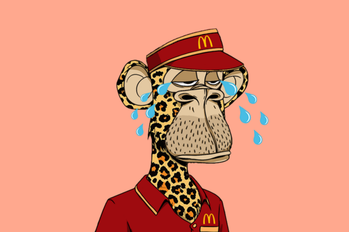
McDonald's
Common and ironic expression amongst the crypto community. It means that Mcdonald’s is always a valid backup plan or career in the case all cryptocurrencies crash and disappear.
Meatspace
Synonymous with IRL - In Real Life.
Memecoin
Cryptocurrency like Dogecoin that is based on an internet joke or meme.
Metamask
Popular crypto hot wallet platform to store crypto and NFTs.
Metaverse
Term was coined by writer Neal Stephenson in the 1992 dystopian novel “Snow Crash”. It’s an immersive and digital place where people interact via their avatars. Big tech players like Meta (formerly known as Facebook) and other independent players have been designing their own version of a metaverse. NFTs can have utility for users like buying, trading, winning, accessing, experiencing or interacting with things inside a metaverse.
Mfer
Short for “mother fker”.
Miners
Single person or company that mines one or more cryptocurrencies like Bitcoin or Ethereum. Both blockchains need computing power for their Proof of Work consensus mechanism. Miners provide the computing power and receive coins/tokens in return as payment.
Mining
Mining is the process by which new tokens enter in circulation as for example in the Bitcoin blockchain. Also, mining ensures the validity of new transactions happening in a given blockchain that uses the PoW consensus mechanism. Therefore, the ones who mine are rewarded by ensuring the validity of a blockchain.
Mint/Minting
Mint an NFT is the act of publishing your unique instance to a specific blockchain like Ethereum or Tezos blockchain. In simpler terms, a creator is adding a one-of-kind token (NFT) into circulation in a specific blockchain.
Once the NFT is minted - aka created - NFT collectors can i) direct mint, therefore purchase the NFT by paying the specified amount directly into the project’s wallet. Or ii) buy it via an intermediary like an NFT marketplace (e.g: OpenSea, Foundation, Rarible, etc.). Later, the NFT owner can choose to resell the NFT, most NFT creators set up a royalty for every time their NFT is resold.
Minting interval
How often an NFT creator can mint or create tokens.
MOAR
A misspelling that means “more”.
Moon/Mooning
When a coin (e.g. ETH), or token, like an NFT goes exponential in price and the price graph sees a vertical climb. Crypto or NFT users then use the expression that “X token is going to the moon!”.
Moon boys
Slang for crypto or NFT holders who are looking to pump the price dramatically - taking a token to the moon - for short term gains and with no real long term vision or commitment.
N
Never trust, always verify
Treat everyone or every project like something potentially malicious.
New coiner
Crypto slang for someone new to the cryptocurrency space. Usually newcomers can be more susceptible to FUD or scammers.
NFA
Acronym for Not Financial Advice.
NFT
Acronym for Non-Fungible Token. The type of token that can be created, bought, sold, resold and viewed in different dapps. The ERC-721 smart contract standard (Ethereum blockchain) is the most popular amongst NFTs.
NFT Marketplace / NFT Auction platform
Platforms where people can sell and buy NFTs, either via an auction or pay the seller’s price. The largest NFT marketplace is OpenSea. But there are other popular NFT marketplace examples like Foundation, SuperRare, Nifty Gateway, Rarible, Hic et Nunc (HeN), etc.
NFT Whale
A NFT collector or investor who buys a large amount of NFTs.
NGMI
Acronym for Not Going to Make It. For example, something said to someone who has paper hands.
NMP
Acronym for Not My Problem.
Nocoiner
It can be someone who simply doesn’t hold cryptocurrencies, mistrust the crypto market or believes that crypto is either a scam or a ponzi scheme.
Noob/N00b/Newbie
Slang for someone new or not experienced in cryptocurrency or NFTs. These people are more susceptible to scams, drawn into pump and dumps or getting rekt on bad coins.
Normie/Normy
Similar expression for a nocoiner.
NSFW
Acronym for Not Suitable For Work. Referring to online content inappropriate for viewing in public or at work. It began as mostly a tag for sexual content, nudity, or violence, but it has envolved to range a number of other topics that might be delicate or trigger viewers.
Nuclear NFTs
An NFT or collectible with more than 1,000 owners. For the NFT to be sold or resold, every co-owners must give their permission beforehand. Otherwise, the NFT transaction can’t be made.
O
OG
Acronym for Original Gangster and it popularized by 90s Hip Hop culture. It means the first, the original or the person who has been around since the very start and earned respect in the community. In NFT terms, Cryptopunks are the OG of NFTs.
On-chain vs Off-chain
An on-chain NFT is when the artwork (like a jpeg, video or music file) is stored directly into the blockchain making it more secure and less susceptible to being stolen. But, note that most blockchains can only store small amounts of data.
Off-chain NFTs means that the high quality image, music or video file is not stored in the blockchain. But, the NFT data is stored on an external party like a) a centralized server, highly vulnerable to the server being shut down/exploited. Or b) an InterPlanetary File System (IPFS), also an external party but more secure way of finding data because it utilizes a distributed, decentralized system.
OpenSea
By far the largest NFT marketplace in the world, currently.
P
Paper Hands
A crypto or NFT holder who is permeable to negative market sentiment or FUD. And does not hold their crypto or NFT for long. Expression used to describe someone who sells as soon as NFTs enter a bear market.
PFP
Stands for Picture For Profile. Twitter users who hold popular NFTs like Crypto Punk or BAYC use their punk or monkey avatar as their profile picture.
POAP NFT
Stands for Proof of Attendance Protocol. These types of NFTs are awarded to attendees of events, regardless if they’re physical or virtual, as proof you attended.
PoS
Stands for Proof of Stake. A consensus mechanism used by blockchains like Bitcoin or Ethereum to achieve agreement, trust and security in every transaction and keep the integrity of the blockchain intact. PoS mechanisms are considered more environmentally friendly than PoW as they’re lower energy and in emissions.
PoW
Stands for Proof of Work. A consensus mechanism used by blockchains like Bitcoin to achieve agreement, trust and security and keep the transactional integrity of the blockchain intact. PoW mechanism requires a lot of computational power, therefore uses more energy resources and higher CO2 emissions than the PoS mechanism.
Private Key
It can be similar to a password. It’s a secret number that allows users to access their cold or hot wallet funds, prove ownership of a certain address and sign transactions on the blockchain.
It’s not advisable to share a private key with anyone as it makes a person vulnerable to thefts. In case someone loses or forgets its private key, it can use a recovery phrase to restore access to a crypto or NFT wallet.
Pre-mine
A term used in crypto to refer to the act of creating a set amount of tokens before their public launch. It can also be known as a Genesis Sale and is usually associated with Initial Coin Offerings (ICOs) in order to compensate founders, developers or early investors.
Probably nothing
It’s an ironic expression used by NFT enthusiasts to refer to an important or soon to be big news, project or person in the NFT space. Meaning when someone says probably nothing it actually means that it is probably something.
Protocol Coin
Stands for the native coin of a blockchain. As in Ether for the Ethereum blockchain or BTC on the Bitcoin blockchain.
Pump & Dump
The term pump means when a person or a group of people buy or convince others to buy large quantities of a crypto or an NFT with the single goal to drive the price to a peak. When the price peaks, these people sell their position high and for a hefty profit, therefore dumping the price and leaving other slower investors or newbies rekt or at a loss.
R
Rarity
Rarity in NFT terms refers to how rare an NFT is. The rarity can be defined by the number of traits, scarcity or properties of an NFT.
Reaching
Slang for an exaggeration over something to make it sound worse than what it actually is or to take a point/scenario too far.
Recovery phrase
A 12-word phrase that acts like backup for your crypto private keys. A person can recover all of the crypto wallet accounts’ private keys from the recovery phrase. Is not advisable to share the recovery phrase with anyone.
Rekt
Slang for wrecked. When a crypto or NFT project goes wrong or down in value sharply. Or more broadly, when something goes wrong like a person is price out by the gas surge or an NFT floor price goes down.
Right Click Save As
An Ironic expression used by people who don’t understand the value or potential unlocked by NFTs. Person who makes fun that she/he can easily get a digital artwork by Right Click Save As and mock the NFT space and its hype.
Roadmap
The strategy outlined by an NFT project. A way to explain to the NFT community or a potential NFT investor, the different stages, value and the long term vision of the NFT project.
Royalties
NFT creators can set up their NFT so each time their NFT is resold, the creator gets paid a percentage of the sale price.
RN
Acronym for Right Now.
Rug Pull/Rugged
Slang for a scam when the founders, team or developers suddenly leave a crypto project and run away with all the investors’ funds leaving them with nothing.
S
Satoshi Nakamoto
The anonymous creator of the Bitcoin whitepaper and whose identity has never been verified.
Scammer
Someone actively trying to steal other people’s crypto or NFTs.
Secondary
Secondary refers to secondary NFT marketplaces, where NFT collectors or investors can resell NFTs after they’ve been minted. The price of an NFT or NFT collection is determined by those who list them.
Seed phrase
Another name for recovery phrase is the 12-word phrase that allows you to recover all of the crypto wallet accounts’ private keys and regain control of the wallet. Is not advisable to share the seed phrase with anyone.
Seems legit
When an NFT project or a person in the NFT community looks promising and the real deal, meaning seems legitimate. Depending on the context can also be used ironically.
Seems rare
An ironic expression or dismissive comment used by the NFT community. For example, It can be used sarcastically when someone asks for feedback on an NFT they own or created.
Ser
Slang for sir and a polite way of addressing others in an NFT community.
Shill
Expression when someone wants to promote or get exposure to an NFT they own or created.
Shill Thread
It’s a common Twitter strategy to gain traction by encouraging NFT creators to share a link to their NFT project in the hopes of getting bought or noticed by the NFT Community and potential buyers.
Simp/Simping
A NFT holder or creator who comes off as trying to hard impress an NFT whale or investor.
Sh*tposter
A person who mostly posts meme content on Twitter for fun.
SLP
Acronym for Smooth Love Potion. It’s a token players can earn as a reward in the NFT game Axie Infinity.
Smart Contract
A self-executing contract where the terms of the agreement between buyer and seller are directly written into the code and without third party or human intervention. Ethereum is a blockchain that can execute smart contracts, on the contrary to Bitcoin which does not have that capability.
SMFH
Acronym for Shaking My F*cking Head. Common reply to a person showing unbelievable idiocy.
Sock Puppet
Scam account used to lure noob investors into fake investment services.
Snag
It means to buy an NFT quickly and for a very low price. Can also be known as sniping.
Sotheby’s
Very famous auction house that has recently auctioned Beeple’s NFTs or Bored Ape Yacht Club and Crypto Punks’ NFT collections.
Stake
Crypto term for locking up a certain amount of crypto tokens for a set period of time to earn interest. In the NFT space, there are popping up a lot of projects or services that allow NFT holders to earn interest for holding a certain NFT.
Szn
Stands for season referring to crypto or NFT market cycles.
T
TINA
Acronym for There Is No Alternative. Example: someone asks “why are you investing in BTC?”, to which the reply is “TINA”.
TINA RIF
Acronym for There Is No Alternative Resistance Is Futile.
This is the way
A commendation for positive behavior by someone in the NFT Community.
Tokenomics
Referring to the economics of cryptocurrencies, DeFi or NFT projects.
V
Valhalla
Ironic use of the Viking “heaven”. Meaning someone’s NFT collection is either going to be a profitable and blue chip project, therefore they can ascend to Valhalla or is going to tank and that person will have to work at a Mcdonald’s.
Vibe
Term used to express a positive emotional state.
Volatile/Volatility
Term used to describe rapid market fluctuations and crypto or NFT prices go up and down quickly in a short period.
W
WAGMI
Acronym for We Are Going to Make It. Rally cry to build momentum for a crypto or NFT project and lead even more people into buying, shilling or supporting a specific project.
Wallet
There can be a hot or cold wallet, but both are a place where someone can store their cryptocurrency and tokens. Hot wallets are always connected to the Internet like MetaMask, Trust wallet or Phantom. On the contrary cold wallets are hardware wallets to store crypto or NFTs offline like Nano Ledger.
Weak Hands
Synonymous with Paper Hands. Someone who immediately sells their crypto or NFT because of a bear market, FUD or any other negative sentiment.
Web 1.0
Refers to the beginning of the Web. A period from around 1990 to 2005, also known as the read-only web.
Web 2.0
Refers to an iteration of Web 1.0. From 2005 to the present moment, where social media platforms like Facebook, Instagram, TikTok, Google, Twitter, etc reshaped the web, therefore becoming the read-write web.
Web 3.0
A term coined by Ethereum co-founder Gavin Wood and it’s an idea of what the future of the web could look like. Most peoples’ data, info or content would no longer be centralized in Web 2.0 giants - the Big Tech - but decentralized, mostly thanks to blockchain technology. Web 3.0 could be known as read-write-trust web.
Wen
As in When.
Wen Moon
Popular expression from crypto Twitter not so much in the NFT space. Refers to the still distant future when a token will moon.
Whitepaper
Document released by a crypto or NFT project where it lays the technical information behind the concept, vision, roadmap and plans to grow a certain project.
Whale
Someone who owns a large position on a specific or many cryptos or NFTs.
Y
Yodo
Acronym for You Only Die Once. The opposite of Yolo.
Yolo
Acronym for You Only Live Once. A person can use this when they just realized they bought a shitcoin or crap NFT and they’re getting rekt.
Original post

Stephen Moore
3 years ago
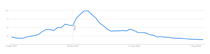
Trading Volume on OpenSea Drops by 99% as the NFT Boom Comes to an End
Wasn't that a get-rich-quick scheme?
OpenSea processed $2.7 billion in NFT transactions in May 2021.
Fueled by a crypto bull run, rumors of unfathomable riches, and FOMO, Bored Apes, Crypto Punks, and other JPEG-format trash projects flew off the virtual shelves, snatched up by retail investors and celebrities alike.
Over a year later, those shelves are overflowing and warehouses are backlogged. Since March, I've been writing less. In May and June, the bubble was close to bursting.
Apparently, the boom has finally peaked.
This bubble has punctured, and deflation has begun. On Aug. 28, OpenSea processed $9.34 million.
From that euphoric high of $2.7 billion, $9.34 million represents a spectacular decline of 99%.
OpenSea contradicts the data. A trading platform spokeswoman stated the comparison is unfair because it compares the site's highest and lowest trading days. They're the perfect two data points to assess the drop. OpenSea chooses to use ETH volume measures, which ignore crypto's shifting price. Since January 2022, monthly ETH volume has dropped 140%, according to Dune.
Unconvincing counterargument.
Further OpenSea indicators point to declining NFT demand:
Since January 2022, daily user visits have decreased by 50%.
Daily transactions have decreased by 50% since the beginning of the year in the same manner.
Off-platform, the floor price of Bored Apes has dropped from 145 ETH to 77 ETH. (At $4,800, a reduction from $700,000 to $370,000). Google search data shows waning popular interest.
It is a trend that will soon vanish, just like laser eyes.
NFTs haven't moved since the new year. Eminem and Snoop Dogg can utilize their apes in music videos or as 3D visuals to perform at the VMAs, but the reality is that NFTs have lost their public appeal and the market is trying to regain its footing.
They've lost popularity because?
Breaking records. The technology still lacks genuine use cases a year and a half after being popular.
They're pricey prestige symbols that have made a few people rich through cunning timing or less-than-savory scams or rug pulling. Over $10.5 billion has been taken through frauds, most of which are NFT enterprises promising to be the next Bored Apes, according to Web3 is going wonderfully. As the market falls, many ordinary investors realize they purchased into a self-fulfilling ecosystem that's halted. Many NFTs are sold between owner-held accounts to boost their price, data suggests. Most projects rely on social media excitement to debut with a high price before the first owners sell and chuckle to the bank. When they don't, the initiative fails, leaving investors high and dry.
NFTs are fading like laser eyes. Most people pushing the technology don't believe in it or the future it may bring. No, they just need a Kool-Aid-drunk buyer.
Everybody wins. When your JPEGs are worth 99% less than when you bought them, you've lost.
When demand reaches zero, many will lose.
Sea Launch
3 years ago
A guide to NFT pre-sales and whitelists
Before we dig through NFT whitelists and pre-sales, if you know absolutely nothing about NFTs, check our NFT Glossary.
What are pre-sales and whitelists on NFTs?
An NFT pre-sale, as the name implies, allows community members or early supporters of an NFT project to mint before the public, usually via a whitelist or mint pass.
Coin collectors can use mint passes to claim NFTs during the public sale. Because the mint pass is executed by “burning” an NFT into a specific crypto wallet, the collector is not concerned about gas price spikes.
A whitelist is used to approve a crypto wallet address for an NFT pre-sale. In a similar way to an early access list, it guarantees a certain number of crypto wallets can mint one (or more) NFT.
New NFT projects can do a pre-sale without a whitelist, but whitelists are good practice to avoid gas wars and a fair shot at minting an NFT before launching in competitive NFT marketplaces like Opensea, Magic Eden, or CNFT.
Should NFT projects do pre-sales or whitelists? 👇
The reasons to do pre-sales or a whitelist for NFT creators:
Time the market and gain traction.
Pre-sale or whitelists can help NFT projects gauge interest early on.
Whitelist spots filling up quickly is usually a sign of a successful launch, though it does not guarantee NFT longevity (more on that later). Also, full whitelists create FOMO and momentum for the public sale among non-whitelisted NFT collectors.
If whitelist signups are low or slow, projects may need to work on their vision, community, or product. Or the market is in a bear cycle. In either case, it aids NFT projects in market timing.
Reward the early NFT Community members.
Pre-sale and whitelists can help NFT creators reward early supporters.
First, by splitting the minting process into two phases, early adopters get a chance to mint one or more NFTs from their collection at a discounted or even free price.
Did you know that BAYC started at 0.08 eth each? A serum that allowed you to mint a Mutant Ape has become as valuable as the original BAYC.
(2) Whitelists encourage early supporters to help build a project's community in exchange for a slot or status. If you invite 10 people to the NFT Discord community, you get a better ranking or even a whitelist spot.
Pre-sale and whitelisting have become popular ways for new projects to grow their communities and secure future buyers.
Prevent gas wars.
Most new NFTs are created on the Ethereum blockchain, which has the highest transaction fees (also known as gas) (Solana, Cardano, Polygon, Binance Smart Chain, etc).
An NFT public sale is a gas war when a large number of NFT collectors (or bots) try to mint an NFT at the same time.
Competing collectors are willing to pay higher gas fees to prioritize their transaction and out-price others when upcoming NFT projects are hyped and very popular.
Pre-sales and whitelisting prevent gas wars by breaking the minting process into smaller batches of members or season launches.
The reasons to do pre-sales or a whitelists for NFT collectors:
How do I get on an NFT whitelist?
- Popular NFT collections act as a launchpad for other new or hyped NFT collections.
Example: Interfaces NFTs gives out 100 whitelist spots to Deadfellaz NFTs holders. Both NFT projects win. Interfaces benefit from Deadfellaz's success and brand equity.
In this case, to get whitelisted NFT collectors need to hold that specific NFT that is acting like a launchpad.
- A NFT studio or collection that launches a new NFT project and rewards previous NFT holders with whitelist spots or pre-sale access.
The whitelist requires previous NFT holders or community members.
NFT Alpha Groups are closed, small, tight-knit Discord servers where members share whitelist spots or giveaways from upcoming NFTs.
The benefit of being in an alpha group is getting information about new NFTs first and getting in on pre-sale/whitelist before everyone else.
There are some entry barriers to alpha groups, but if you're active in the NFT community, you'll eventually bump into, be invited to, or form one.
- A whitelist spot is awarded to members of an NFT community who are the most active and engaged.
This participation reward is the most democratic. To get a chance, collectors must work hard and play to their strengths.
Whitelisting participation examples:
- Raffle, games and contest: NFT Community raffles, games, and contests. To get a whitelist spot, invite 10 people to X NFT Discord community.
- Fan art: To reward those who add value and grow the community by whitelisting the best fan art and/or artists is only natural.
- Giveaways: Lucky number crypto wallet giveaways promoted by an NFT community. To grow their communities and for lucky collectors, NFT projects often offer free NFT.
- Activate your voice in the NFT Discord Community. Use voice channels to get NFT teams' attention and possibly get whitelisted.
The advantage of whitelists or NFT pre-sales.
Chainalysis's NFT stats quote is the best answer:
“Whitelisting isn’t just some nominal reward — it translates to dramatically better investing results. OpenSea data shows that users who make the whitelist and later sell their newly-minted NFT gain a profit 75.7% of the time, versus just 20.8% for users who do so without being whitelisted. Not only that, but the data suggests it’s nearly impossible to achieve outsized returns on minting purchases without being whitelisted.” Full report here.
Sure, it's not all about cash. However, any NFT collector should feel secure in their investment by owning a piece of a valuable and thriving NFT project. These stats help collectors understand that getting in early on an NFT project (via whitelist or pre-sale) will yield a better and larger return.
The downsides of pre-sales & whitelists for NFT creators.
Pre-sales and whitelist can cause issues for NFT creators and collectors.
NFT flippers
NFT collectors who only want to profit from early minting (pre-sale) or low mint cost (via whitelist). To sell the NFT in a secondary market like Opensea or Solanart, flippers go after the discounted price.
For example, a 1000 Solana NFT collection allows 100 people to mint 1 Solana NFT at 0.25 SOL. The public sale price for the remaining 900 NFTs is 1 SOL. If an NFT collector sells their discounted NFT for 0.5 SOL, the secondary market floor price is below the public mint.
This may deter potential NFT collectors. Furthermore, without a cap in the pre-sale minting phase, flippers can get as many NFTs as possible to sell for a profit, dumping them in secondary markets and driving down the floor price.
Hijacking NFT sites, communities, and pre-sales phase
People try to scam the NFT team and their community by creating oddly similar but fake websites, whitelist links, or NFT's Discord channel.
Established and new NFT projects must be vigilant to always make sure their communities know which are the official links, how a whitelist or pre-sale rules and how the team will contact (or not) community members.
Another way to avoid the scams around the pre-sale phase, NFT projects opt to create a separate mint contract for the whitelisted crypto wallets and then another for the public sale phase.
Scam NFT projects
We've seen a lot of mid-mint or post-launch rug pulls, indicating that some bad NFT projects are trying to scam NFT communities and marketplaces for quick profit. What happened to Magic Eden's launchpad recently will help you understand the scam.
We discussed the benefits and drawbacks of NFT pre-sales and whitelists for both projects and collectors.
Finally, some practical tools and tips for finding new NFTs 👇
Tools & resources to find new NFT on pre-sale or to get on a whitelist:
In order to never miss an update, important pre-sale dates, or a giveaway, create a Tweetdeck or Tweeten Twitter dashboard with hyped NFT project pages, hashtags ( #NFTGiveaways , #NFTCommunity), or big NFT influencers.
Search for upcoming NFT launches that have been vetted by the marketplace and try to get whitelisted before the public launch.
Save-timing discovery platforms like sealaunch.xyz for NFT pre-sales and upcoming launches. How can we help 100x NFT collectors get projects? A project's official social media links, description, pre-sale or public sale dates, price and supply. We're also working with Dune on NFT data analysis to help NFT collectors make better decisions.
Don't invest what you can't afford to lose because a) the project may fail or become rugged. Find NFTs projects that you want to be a part of and support.
Read original post here
You might also like

Jay Peters
3 years ago
Apple AR/VR heaset
Apple is said to have opted for a standalone AR/VR headset over a more powerful tethered model.
It has had a tumultuous history.
Apple's alleged mixed reality headset appears to be the worst-kept secret in tech, and a fresh story from The Information is jam-packed with details regarding the device's rocky development.
Apple's decision to use a separate headgear is one of the most notable aspects of the story. Apple had yet to determine whether to pursue a more powerful VR headset that would be linked with a base station or a standalone headset. According to The Information, Apple officials chose the standalone product over the version with the base station, which had a processor that later arrived as the M1 Ultra. In 2020, Bloomberg published similar information.
That decision appears to have had a long-term impact on the headset's development. "The device's many processors had already been in development for several years by the time the choice was taken, making it impossible to go back to the drawing board and construct, say, a single chip to handle all the headset's responsibilities," The Information stated. "Other difficulties, such as putting 14 cameras on the headset, have given hardware and algorithm engineers stress."
Jony Ive remained to consult on the project's design even after his official departure from Apple, according to the story. Ive "prefers" a wearable battery, such as that offered by Magic Leap. Other prototypes, according to The Information, placed the battery in the headset's headband, and it's unknown which will be used in the final design.
The headset was purportedly shown to Apple's board of directors last week, indicating that a public unveiling is imminent. However, it is possible that it will not be introduced until later this year, and it may not hit shop shelves until 2023, so we may have to wait a bit to try it.
For further down the line, Apple is working on a pair of AR spectacles that appear like Ray-Ban wayfarer sunglasses, but according to The Information, they're "still several years away from release." (I'm interested to see how they compare to Meta and Ray-Bans' true wayfarer-style glasses.)

Jess Rifkin
3 years ago
As the world watches the Russia-Ukraine border situation, This bill would bar aid to Ukraine until the Mexican border is secured.
Although Mexico and Ukraine are thousands of miles apart, this legislation would link their responses.
Context
Ukraine was a Soviet republic until 1991. A significant proportion of the population, particularly in the east, is ethnically Russian. In February, the Russian military invaded Ukraine, intent on overthrowing its democratically elected government.
This could be the biggest European land invasion since WWII. In response, President Joe Biden sent 3,000 troops to NATO countries bordering Ukraine to help with Ukrainian refugees, with more troops possible if the situation worsened.
In July 2021, the US Border Patrol reported its highest monthly encounter total since March 2000. Some Republicans compare Biden's response to the Mexican border situation to his response to the Ukrainian border situation, though the correlation is unclear.
What the bills do
Two new Republican bills seek to link the US response to Ukraine to the situation in Mexico.
The Secure America's Borders First Act would prohibit federal funding for Ukraine until the US-Mexico border is “operationally controlled,” including a wall as promised by former President Donald Trump. (The bill even mandates a 30-foot-high wall.)
The USB (Ukraine and Southern Border) Act, introduced on February 8 by Rep. Matt Rosendale (R-MT0), would allow the US to support Ukraine, but only if the number of Armed Forces deployed there is less than the number deployed to the Mexican border. Madison Cawthorne introduced H.R. 6665 on February 9th (R-NC11).
What backers say
Supporters argue that even if the US should militarily assist Ukraine, our own domestic border situation should take precedence.
After failing to secure our own border and protect our own territorial integrity, ‘America Last' politicians on both sides of the aisle now tell us that we must do so for Ukraine. “Before rushing America into another foreign conflict over an Eastern European nation's border thousands of miles from our shores, they should first secure our southern border.”
“If Joe Biden truly cared about Americans, he would prioritize national security over international affairs,” Rep. Cawthorn said in a separate press release. The least we can do to secure our own country is send the same number of troops to the US-Mexico border to assist our border patrol agents working diligently to secure America.
What opponents say
The president has defended his Ukraine and Mexico policies, stating that both seek peace and diplomacy.
Our nations [the US and Mexico] have a long and complicated history, and we haven't always been perfect neighbors, but we have seen the power and purpose of cooperation,” Biden said in 2021. “We're safer when we work together, whether it's to manage our shared border or stop the pandemic. [In both the Obama and Biden administration], we made a commitment that we look at Mexico as an equal, not as somebody who is south of our border.”
No mistake: If Russia goes ahead with its plans, it will be responsible for a catastrophic and unnecessary war of choice. To protect our collective security, the United States and our allies are ready to defend every inch of NATO territory. We won't send troops into Ukraine, but we will continue to support the Ukrainian people... But, I repeat, Russia can choose diplomacy. It is not too late to de-escalate and return to the negotiating table.”
Odds of passage
The Secure America's Borders First Act has nine Republican sponsors. Either the House Armed Services or Foreign Affairs Committees may vote on it.
Rep. Paul Gosar, a Republican, co-sponsored the USB Act (R-AZ4). The House Armed Services Committee may vote on it.
With Republicans in control, passage is unlikely.

mbvissers.eth
3 years ago
Why does every smart contract seem to implement ERC165?
ERC165 (or EIP-165) is a standard utilized by various open-source smart contracts like Open Zeppelin or Aavegotchi.
What's it? You must implement? Why do we need it? I'll describe the standard and answer any queries.
What is ERC165
ERC165 detects and publishes smart contract interfaces. Meaning? It standardizes how interfaces are recognized, how to detect if they implement ERC165, and how a contract publishes the interfaces it implements. How does it work?
Why use ERC165? Sometimes it's useful to know which interfaces a contract implements, and which version.
Identifying interfaces
An interface function's selector. This verifies an ABI function. XORing all function selectors defines an interface in this standard. The following code demonstrates.
// SPDX-License-Identifier: UNLICENCED
pragma solidity >=0.8.0 <0.9.0;

interface Solidity101 {
    function hello() external pure;
    function world(int) external pure;
}

contract Selector {
    function calculateSelector() public pure returns (bytes4) {
        Solidity101 i;
        return i.hello.selector ^ i.world.selector;
        // Returns 0xc6be8b58
    }

    function getHelloSelector() public pure returns (bytes4) {
        Solidity101 i;
        return i.hello.selector;
        // Returns 0x19ff1d21
    }

    function getWorldSelector() public pure returns (bytes4) {
        Solidity101 i;
        return i.world.selector;
        // Returns 0xdf419679
    }
}
This code isn't necessary to understand function selectors and how an interface's selector can be determined from the functions it implements.
Run that sample in Remix to see how interface function modifications affect contract function output.
Contracts publish their implemented interfaces.
We can identify interfaces. Now we must disclose the interfaces we're implementing. First, import IERC165 like so.
pragma solidity ^0.4.20;

interface ERC165 {
    /// @notice Query if a contract implements an interface
    /// @param interfaceID The interface identifier, as specified in ERC-165
    /// @dev Interface identification is specified in ERC-165.
    /// @return `true` if the contract implements `interfaceID` and
    ///  `interfaceID` is not 0xffffffff, `false` otherwise
    function supportsInterface(bytes4 interfaceID) external view returns (bool);
}
We still need to build this interface in our smart contract. ERC721 from OpenZeppelin is a good example.
// SPDX-License-Identifier: MIT
// OpenZeppelin Contracts (last updated v4.5.0) (token/ERC721/ERC721.sol)

pragma solidity ^0.8.0;

import "./IERC721.sol";
import "./extensions/IERC721Metadata.sol";
import "../../utils/introspection/ERC165.sol";
// ...

contract ERC721 is Context, ERC165, IERC721, IERC721Metadata {
  // ...

  function supportsInterface(bytes4 interfaceId) public view virtual override(ERC165, IERC165) returns (bool) {
    return
      interfaceId == type(IERC721).interfaceId ||
      interfaceId == type(IERC721Metadata).interfaceId ||
      super.supportsInterface(interfaceId);
  }

  // ...
}
I deleted unnecessary code. The smart contract imports ERC165, IERC721 and IERC721Metadata. The is keyword at smart contract declaration implements all three.
Kind (interface).
Note that type(interface).interfaceId returns the same as the interface selector.
We override supportsInterface in the smart contract to return a boolean that checks if interfaceId is the same as one of the implemented contracts.
Super.supportsInterface() calls ERC165 code. Checks if interfaceId is IERC165.
function supportsInterface(bytes4 interfaceId) public view virtual override returns (bool) {
    return interfaceId == type(IERC165).interfaceId;
}
So, if we run supportsInterface with an interfaceId, our contract function returns true if it's implemented and false otherwise. True for IERC721, IERC721Metadata, andIERC165.
Conclusion
I hope this post has helped you understand and use ERC165 and why it's employed.
Have a great day, thanks for reading!