


More on NFTs & Art

Abhimanyu Bhargava
3 years ago
VeeFriends Series 2: The Biggest NFT Opportunity Ever
VeeFriends is one NFT project I'm sure will last.
I believe in blockchain technology and JPEGs, aka NFTs. NFTs aren't JPEGs. It's not as it seems.
Gary Vaynerchuk is leading the pack with his new NFT project VeeFriends, I wrote a year ago. I was spot-on. It's the most innovative project I've seen.
Since its minting in May 2021, it has given its holders enormous value, most notably the first edition of VeeCon, a multi-day superconference featuring iconic and emerging leaders in NFTs and Popular Culture. First-of-its-kind NFT-ticketed Web3 conference to build friendships, share ideas, and learn together.
VeeFriends holders got free VeeCon NFT tickets. Attendees heard iconic keynote speeches, innovative talks, panels, and Q&A sessions.
It was a unique conference that most of us, including me, are looking forward to in 2023. The lineup was epic, and it allowed many to network in new ways. Really memorable learning. Here are a couple of gratitude posts from the attendees.
VeeFriends Series 2
This article explains VeeFriends if you're still confused.
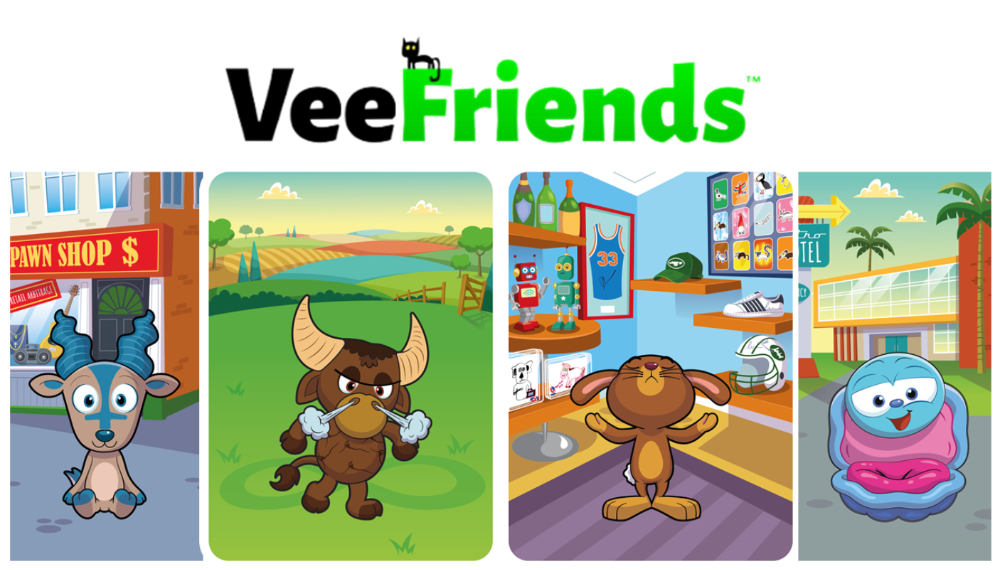
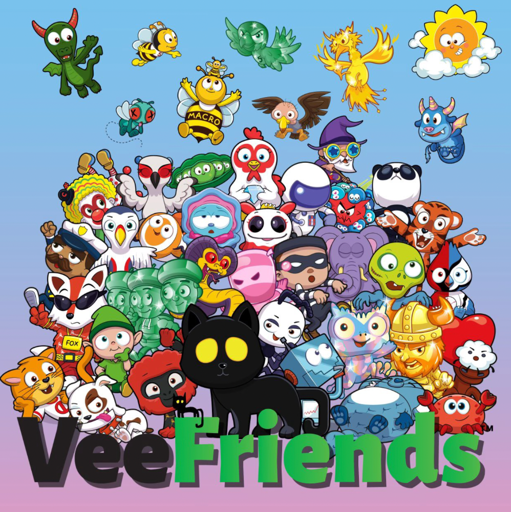
GaryVee's hand-drawn doodles have evolved into wonderful characters. The characters' poses and backgrounds bring the VeeFriends IP to life.
Yes, this is the second edition of VeeFriends, and at current prices, it's one of the best NFT opportunities in years. If you have the funds and risk appetite to invest in NFTs, VeeFriends Series 2 is worth every penny. Even if you can't invest, learn from their journey.
1. Art Is the Start
Many critics say VeeFriends artwork is below average and not by GaryVee. Art is often the key to future success.
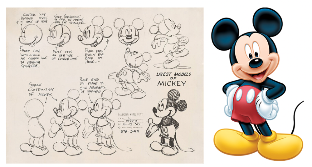
Let's look at one of the first Mickey Mouse drawings. No one would have guessed that this would become one of the most beloved animated short film characters. In Walt Before Mickey, Walt Disney's original mouse Mortimer was less refined.
First came a mouse...
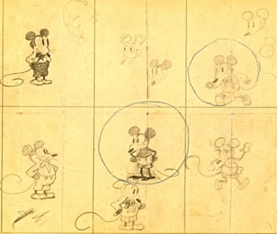
These sketches evolved into Steamboat Willie, Disney's first animated short film.
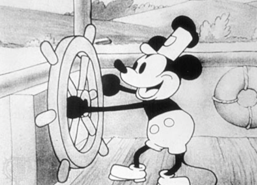
Fred Moore redesigned the character artwork into what we saw in cartoons as kids. Mickey Mouse's history is here.
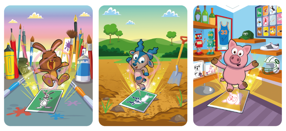
Looking at how different cartoon characters have evolved and gained popularity over decades, I believe Series 2 characters like Self-Aware Hare, Kind Kudu, and Patient Pig can do the same.
GaryVee captures this journey on the blockchain and lets early supporters become part of history. Time will tell if it rivals Disney, Pokemon, or Star Wars. Gary has been vocal about this vision.
2. VeeFriends is Intellectual Property for the Coming Generations
Most of us grew up watching cartoons, playing with toys, cards, and video games. Our interactions with fictional characters and the stories we hear shape us.
GaryVee is slowly curating an experience for the next generation with animated videos, card games, merchandise, toys, and more.
VeeFriends UNO, a collaboration with Mattel Creations, features 17 VeeFriends characters.
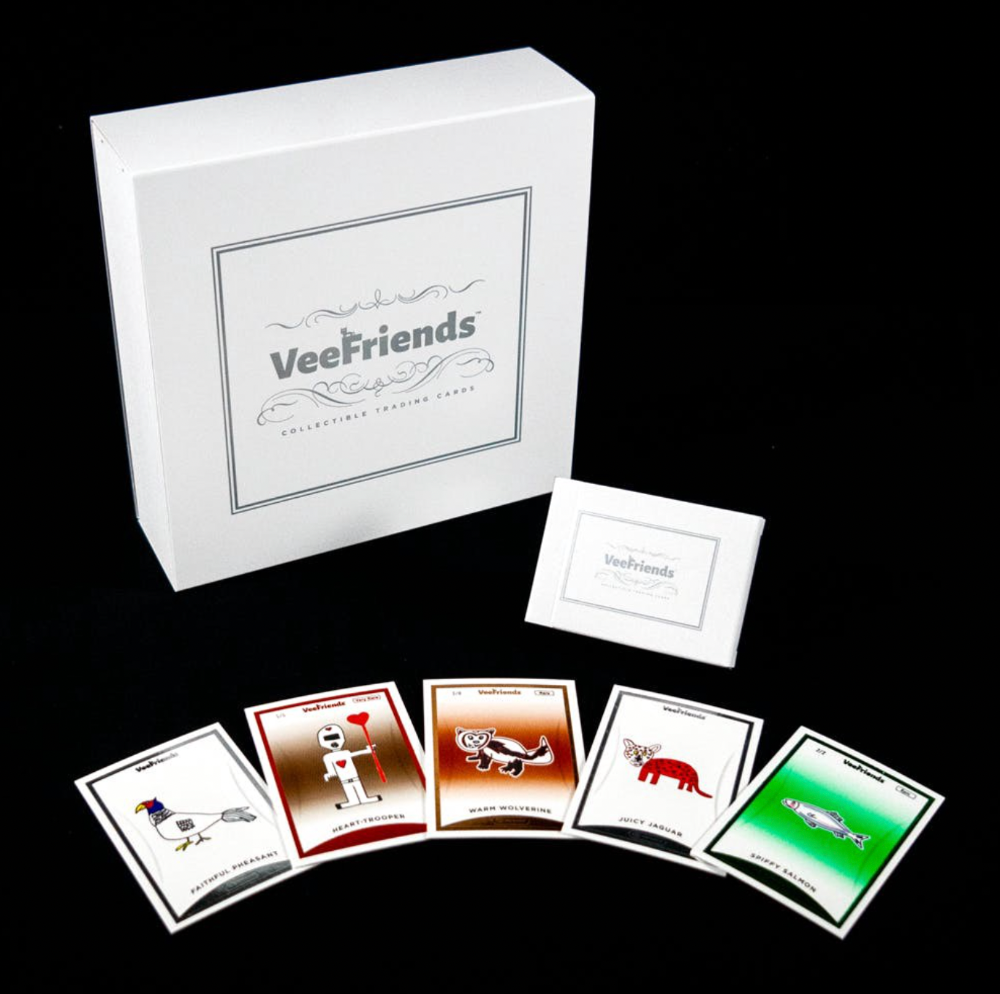
VeeFriends and Zerocool recently released Trading Cards featuring all 268 Series 1 characters and 15 new ones. Another way to build VeeFriends' collectibles brand.
At Veecon, all the characters were collectible toys. Something will soon emerge.
Kids and adults alike enjoy the YouTube channel's animated shorts and VeeFriends Tunes. Here's a song by the holder's Optimistic Otter-loving daughter.
This VeeFriends story is only the beginning. I'm looking forward to animated short film series, coloring books, streetwear, candy, toys, physical collectibles, and other forms of VeeFriends IP.
3. Veefriends will always provide utilities
Smart contracts can be updated at any time and authenticated on a ledger.
VeeFriends Series 2 gives no promise of any utility whatsoever. GaryVee released no project roadmap. In the first few months after launch, many owners of specific characters or scenes received utilities.
Every benefit or perk you receive helps promote the VeeFriends brand.
Recent partnerships are listed below.
MaryRuth's Multivitamin Gummies
Productive Puffin holders from VeeFriends x Primitive
Pickleball Scene & Clown Holders Only

Pickleball & Competitive Clown Exclusive experience, anteater multivitamin gummies, and Puffin x Primitive merch
Considering the price of NFTs, it may not seem like much. It's just the beginning; you never know what the future holds. No other NFT project offers such diverse, ongoing benefits.
4. Garyvee's team is ready
Gary Vaynerchuk's team and record are undisputed. He's a serial entrepreneur and the Chairman & CEO of VaynerX, which includes VaynerMedia, VaynerCommerce, One37pm, and The Sasha Group.
Gary founded VaynerSports, Resy, and Empathy Wines. He's a Candy Digital Board Member, VCR Group Co-Founder, ArtOfficial Co-Founder, and VeeFriends Creator & CEO. Gary was recently named one of Fortune's Top 50 NFT Influencers.
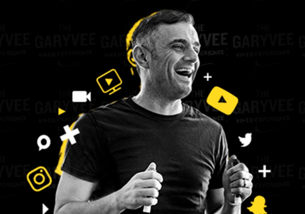
Gary Vayenerchuk aka GaryVee
Gary documents his daily life as a CEO on social media, which has 34 million followers and 272 million monthly views. GaryVee Audio Experience is a top podcast. He's a five-time New York Times best-seller and sought-after speaker.
Gary can observe consumer behavior to predict trends. He understood these trends early and pioneered them.
1997 — Realized e-potential commerce's and started winelibrary.com. In five years, he grew his father's wine business from $3M to $60M.
2006 — Realized content marketing's potential and started Wine Library on YouTube. TV
2009 — Estimated social media's potential (Web2) and invested in Facebook, Twitter, and Tumblr.
2014: Ethereum and Bitcoin investments
2021 — Believed in NFTs and Web3 enough to launch VeeFriends
GaryVee isn't all of VeeFriends. Andy Krainak, Dave DeRosa, Adam Ripps, Tyler Dowdle, and others work tirelessly to make VeeFriends a success.
GaryVee has said he'll let other businesses fail but not VeeFriends. We're just beginning his 40-year vision.
I have more confidence than ever in a company with a strong foundation and team.
5. Humans die, but characters live forever
What if GaryVee dies or can't work?
A writer's books can immortalize them. As long as their books exist, their words are immortal. Socrates, Hemingway, Aristotle, Twain, Fitzgerald, and others have become immortal.
Everyone knows Vincent Van Gogh's The Starry Night.
We all love reading and watching Peter Parker, Thor, or Jessica Jones. Their behavior inspires us. Stan Lee's message and stories live on despite his death.
GaryVee represents VeeFriends. Creating characters to communicate ensures that the message reaches even those who don't listen.
Gary wants his values and messages to be omnipresent in 268 characters. Messengers die, but their messages live on.
Gary envisions VeeFriends creating timeless stories and experiences. Ten years from now, maybe every kid will sing Patient Pig.
6. I love the intent.
Gary planned to create Workplace Warriors three years ago when he began designing Patient Panda, Accountable Ant, and Empathy elephant. The project stalled. When NFTs came along, he knew.
Gary wanted to create characters with traits he values, such as accountability, empathy, patience, kindness, and self-awareness. He wants future generations to find these traits cool. He hopes one or more of his characters will become pop culture icons.
These emotional skills aren't taught in schools or colleges, but they're crucial for business and life success. I love that someone is teaching this at scale.
In the end, intent matters.
Humans Are Collectors
Buy and collect things to communicate. Since the 1700s. Medieval people formed communities around hidden metals and stones. Many people still collect stamps and coins, and luxury and fashion are multi-trillion dollar industries. We're collectors.
The early 2020s NFTs will be remembered in the future. VeeFriends will define a cultural and technological shift in this era. VeeFriends Series 1 is the original hand-drawn art, but it's expensive. VeeFriends Series 2 is a once-in-a-lifetime opportunity at $1,000.
If you are new to NFTs, check out How to Buy a Non Fungible Token (NFT) For Beginners
This is a non-commercial article. Not financial or legal advice. Information isn't always accurate. Before making important financial decisions, consult a pro or do your own research.
This post is a summary. Read the full article here

Protos
3 years ago
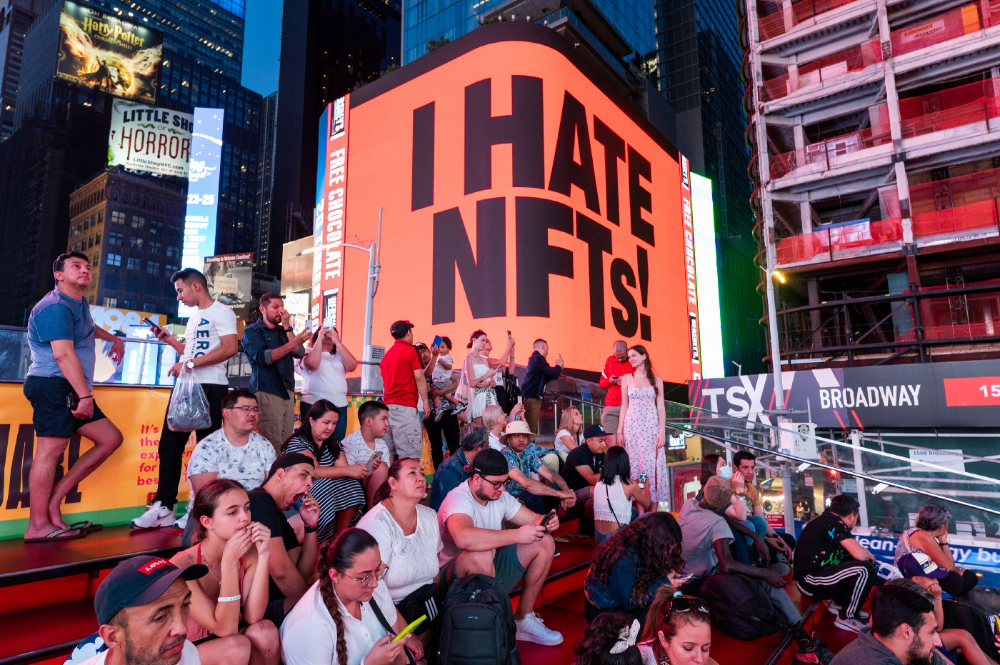
Plagiarism on OpenSea: humans and computers
OpenSea, a non-fungible token (NFT) marketplace, is fighting plagiarism. A new “two-pronged” approach will aim to root out and remove copies of authentic NFTs and changes to its blue tick verified badge system will seek to enhance customer confidence.
According to a blog post, the anti-plagiarism system will use algorithmic detection of “copymints” with human reviewers to keep it in check.
Last year, NFT collectors were duped into buying flipped images of the popular BAYC collection, according to The Verge. The largest NFT marketplace had to remove its delay pay minting service due to an influx of copymints.
80% of NFTs removed by the platform were minted using its lazy minting service, which kept the digital asset off-chain until the first purchase.
NFTs copied from popular collections are opportunistic money-grabs. Right-click, save, and mint the jacked JPEGs that are then flogged as an authentic NFT.
The anti-plagiarism system will scour OpenSea's collections for flipped and rotated images, as well as other undescribed permutations. The lack of detail here may be a deterrent to scammers, or it may reflect the new system's current rudimentary nature.
Thus, human detectors will be needed to verify images flagged by the detection system and help train it to work independently.
“Our long-term goal with this system is two-fold: first, to eliminate all existing copymints on OpenSea, and second, to help prevent new copymints from appearing,” it said.
“We've already started delisting identified copymint collections, and we'll continue to do so over the coming weeks.”
It works for Twitter, why not OpenSea
OpenSea is also changing account verification. Early adopters will be invited to apply for verification if their NFT stack is worth $100 or more. OpenSea plans to give the blue checkmark to people who are active on Twitter and Discord.
This is just the beginning. We are committed to a future where authentic creators can be verified, keeping scammers out.
Also, collections with a lot of hype and sales will get a blue checkmark. For example, a new NFT collection sold by the verified BAYC account will have a blue badge to verify its legitimacy.
New requests will be responded to within seven days, according to OpenSea.
These programs and products help protect creators and collectors while ensuring our community can confidently navigate the world of NFTs.
By elevating authentic content and removing plagiarism, these changes improve trust in the NFT ecosystem, according to OpenSea.
OpenSea is indeed catching up with the digital art economy. Last August, DevianArt upgraded its AI image recognition system to find stolen tokenized art on marketplaces like OpenSea.
It scans all uploaded art and compares it to “public blockchain events” like Ethereum NFTs to detect stolen art.

Jim Clyde Monge
3 years ago
Can You Sell Images Created by AI?
Some AI-generated artworks sell for enormous sums of money.
But can you sell AI-Generated Artwork?
Simple answer: yes.
However, not all AI services enable allow usage and redistribution of images.
Let's check some of my favorite AI text-to-image generators:
Dall-E2 by OpenAI
The AI art generator Dall-E2 is powerful. Since it’s still in beta, you can join the waitlist here.
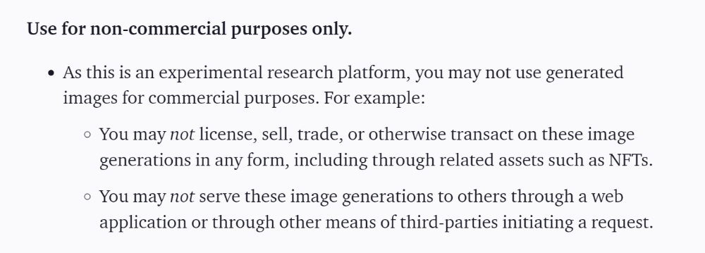
OpenAI DOES NOT allow the use and redistribution of any image for commercial purposes.
Here's the policy as of April 6, 2022.
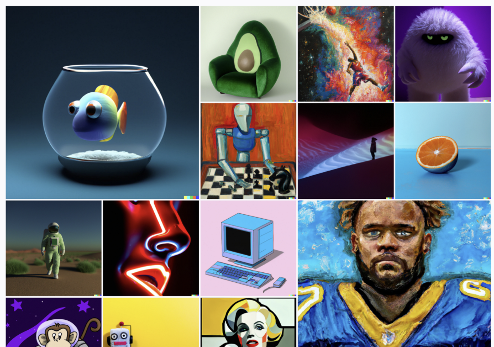
Here are some images from Dall-E2’s webpage to show its art quality.
Several Reddit users reported receiving pricing surveys from OpenAI.
This suggests the company may bring out a subscription-based tier and a commercial license to sell images soon.
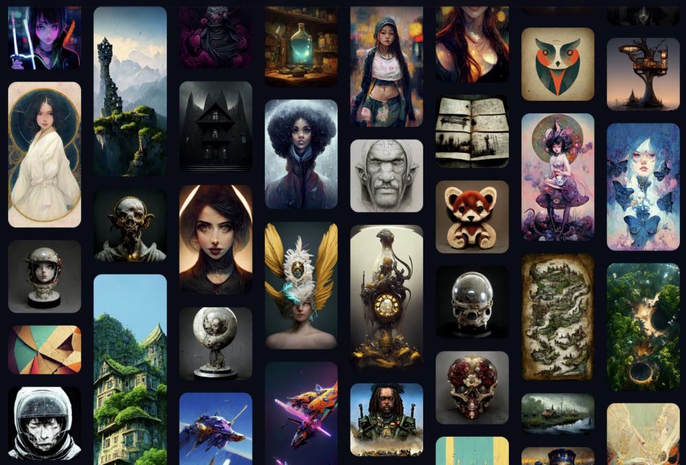
MidJourney
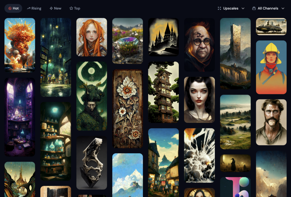
I like Midjourney's art generator. It makes great AI images. Here are some samples:
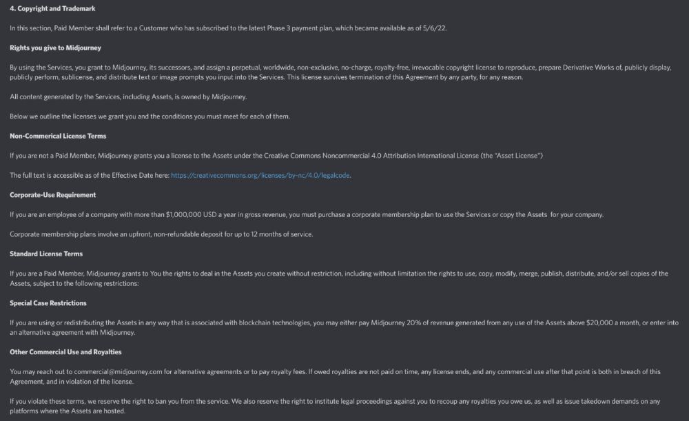
Standard Licenses are available for $10 per month.
Standard License allows you to use, copy, modify, merge, publish, distribute, and/or sell copies of the images, except for blockchain technologies.
If you utilize or distribute the Assets using blockchain technology, you must pay MidJourney 20% of revenue above $20,000 a month or engage in an alternative agreement.
Here's their copyright and trademark page.
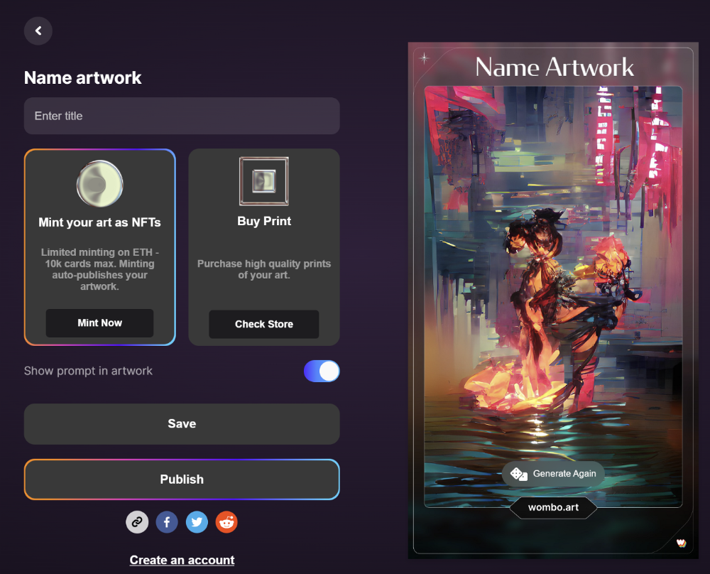
Dream by Wombo
Dream is one of the first public AI art generators.
This AI program is free, easy to use, and Wombo gives a royalty-free license to copy or share artworks.
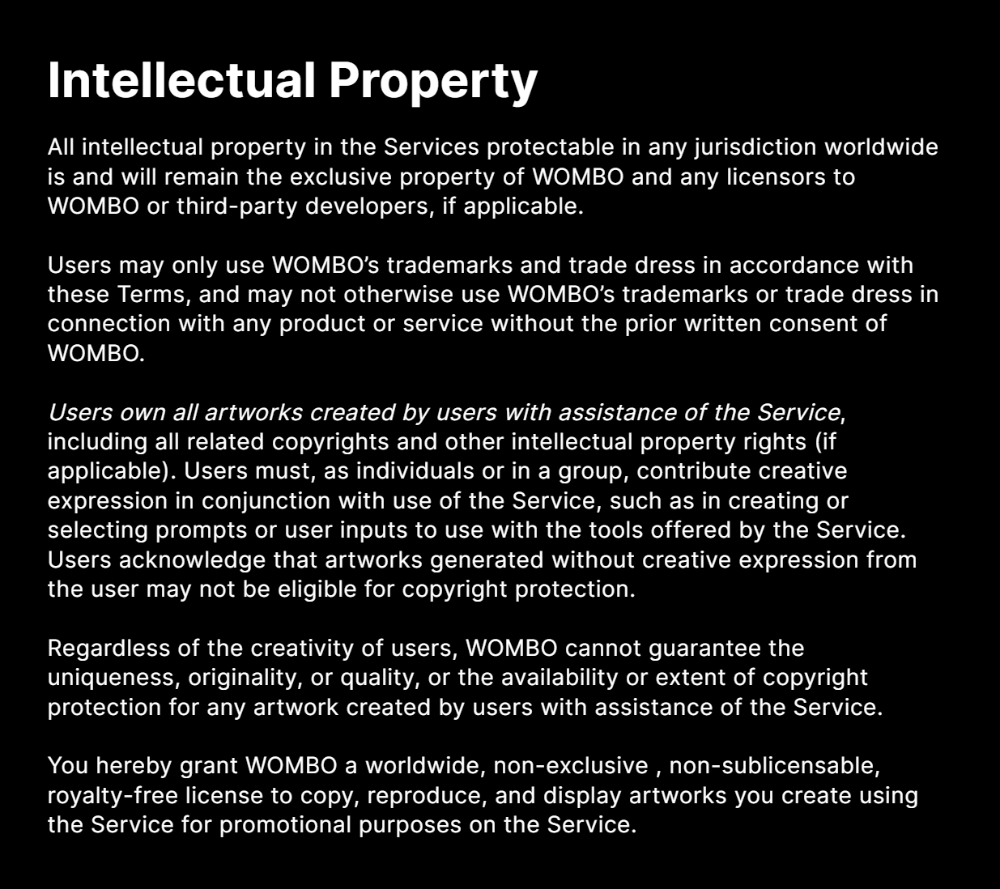
Users own all artworks generated by the tool. Including all related copyrights or intellectual property rights.
Here’s Wombos' intellectual property policy.
Final Reflections
AI is creating a new sort of art that's selling well. It’s becoming popular and valued, despite some skepticism.
Now that you know MidJourney and Wombo let you sell AI-generated art, you need to locate buyers. There are several ways to achieve this, but that’s for another story.
You might also like

Al Anany
2 years ago
Because of this covert investment that Bezos made, Amazon became what it is today.
He kept it under wraps for years until he legally couldn’t.
His shirt is incomplete. I can’t stop thinking about this…
Actually, ignore the article. Look at it. JUST LOOK at it… It’s quite disturbing, isn’t it?
Ughh…
Me: “Hey, what up?” Friend: “All good, watching lord of the rings on amazon prime video.” Me: “Oh, do you know how Amazon grew and became famous?” Friend: “Geek alert…Can I just watch in peace?” Me: “But… Bezos?” Friend: “Let it go, just let it go…”
I can question you, the reader, and start answering instantly without his consent. This far.
Reader, how did Amazon succeed? You'll say, Of course, it was an internet bookstore, then it sold everything.
Mistaken. They moved from zero to one because of this. How did they get from one to thousand? AWS-some. Understand? It's geeky and lame. If not, I'll explain my geekiness.
Over an extended period of time, Amazon was not profitable.
Business basics. You want customers if you own a bakery, right?
Well, 100 clients per day order $5 cheesecakes (because cheesecakes are awesome.)
$5 x 100 consumers x 30 days Equals $15,000 monthly revenue. You proudly work here.
Now you have to pay the barista (unless ChatGPT is doing it haha? Nope..)
The barista is requesting $5000 a month.
Each cheesecake costs the cheesecake maker $2.5 ($2.5 × 100 x 30 = $7500).
The monthly cost of running your bakery, including power, is about $5000.
Assume no extra charges. Your operating costs are $17,500.
Just $15,000? You have income but no profit. You might make money selling coffee with your cheesecake next month.
Is losing money bad? You're broke. Losing money. It's bad for financial statements.
It's almost a business ultimatum. Most startups fail. Amazon took nine years.
I'm reading Amazon Unbound: Jeff Bezos and the Creation of a Global Empire to comprehend how a company has a $1 trillion market cap.
Many things made Amazon big. The book claims that Bezos and Amazon kept a specific product secret for a long period.
Clouds above the bald head.
In 2006, Bezos started a cloud computing initiative. They believed many firms like Snapchat would pay for reliable servers.
In 2006, cloud computing was not what it is today. I'll simplify. 2006 had no iPhone.
Bezos invested in Amazon Web Services (AWS) without disclosing its revenue. That's permitted till a certain degree.
Google and Microsoft would realize Amazon is heavily investing in this market and worry.
Bezos anticipated high demand for this product. Microsoft built its cloud in 2010, and Google in 2008.
If you managed Google or Microsoft, you wouldn't know how much Amazon makes from their cloud computing service. It's enough. Yet, Amazon is an internet store, so they'll focus on that.
All but Bezos were wrong.
Time to come clean now.
They revealed AWS revenue in 2015. Two things were apparent:
Bezos made the proper decision to bet on the cloud and keep it a secret.
In this race, Amazon is in the lead.
They continued. Let me list some AWS users today.
Netflix
Airbnb
Twitch
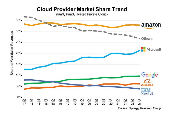
More. Amazon was unprofitable for nine years, remember? This article's main graph.
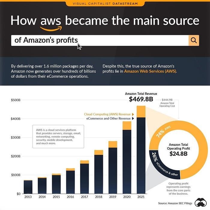
AWS accounted for 74% of Amazon's profit in 2021. This 74% might not exist if they hadn't invested in AWS.
Bring this with you home.
Amazon predated AWS. Yet, it helped the giant reach $1 trillion. Bezos' secrecy? Perhaps, until a time machine is invented (they might host the time machine software on AWS, though.)
Without AWS, Amazon would have been profitable but unimpressive. They may have invested in anything else that would have returned more (like crypto? No? Ok.)
Bezos has business flaws. His success. His failures include:
introducing the Fire Phone and suffering a $170 million loss.
Amazon's failure in China In 2011, Amazon had a about 15% market share in China. 2019 saw a decrease of about 1%.
not offering a higher price to persuade the creator of Netflix to sell the company to him. He offered a rather reasonable $15 million in his proposal. But what if he had offered $30 million instead (Amazon had over $100 million in revenue at the time)? He might have owned Netflix, which has a $156 billion market valuation (and saved billions rather than invest in Amazon Prime Video).
Some he could control. Some were uncontrollable. Nonetheless, every action he made in the foregoing circumstances led him to invest in AWS.

M.G. Siegler
3 years ago
Apple: Showing Ads on Your iPhone
This report from Mark Gurman has stuck with me:
In the News and Stocks apps, the display ads are no different than what you might get on an ad-supported website. In the App Store, the ads are for actual apps, which are probably more useful for Apple users than mortgage rates. Some people may resent Apple putting ads in the News and Stocks apps. After all, the iPhone is supposed to be a premium device. Let’s say you shelled out $1,000 or more to buy one, do you want to feel like Apple is squeezing more money out of you just to use its standard features? Now, a portion of ad revenue from the News app’s Today tab goes to publishers, but it’s not clear how much. Apple also lets publishers advertise within their stories and keep the vast majority of that money. Surprisingly, Today ads also appear if you subscribe to News+ for $10 per month (though it’s a smaller number).
I use Apple News often. It's a good general news catch-up tool, like Twitter without the BS. Customized notifications are helpful. Fast and lovely. Except for advertisements. I have Apple One, which includes News+, and while I understand why the magazines still have brand ads, it's ridiculous to me that Apple enables web publishers to introduce awful ads into this experience. Apple's junky commercials are ridiculous.
We know publishers want and probably requested this. Let's keep Apple News ad-free for the much smaller percentage of paid users, and here's your portion. (Same with Stocks, which is more sillier.)
Paid app placement in the App Store is a wonderful approach for developers to find new users (though far too many of those ads are trying to trick users, in my opinion).
Apple is also planning to increase ads in its Maps app. This sounds like Google Maps, and I don't like it. I never find these relevant, and they clutter up the user experience. Apple Maps now has a UI advantage (though not a data/search one, which matters more).
Apple is nickel-and-diming its customers. We spend thousands for their products and premium services like Apple One. We all know why: income must rise, and new firms are needed to scale. This will eventually backfire.

Tim Denning
3 years ago
Elon Musk’s Rich Life Is a Nightmare
I'm sure you haven't read about Elon's other side.
Elon divorced badly.
Nobody's surprised.
Imagine you're a parent. Someone isn't home year-round. What's next?
That’s what happened to YOLO Elon.
He can do anything. He can intervene in wars, shoot his mouth off, bang anyone he wants, avoid tax, make cool tech, buy anything his ego desires, and live anywhere exotic.
Few know his billionaire backstory. I'll tell you so you don't worship his lifestyle. It’s a cult.
Only his career succeeds. His life is a nightmare otherwise.
Psychopaths' schedule
Elon has said he works 120-hour weeks.
As he told the reporter about his job, he choked up, which was unusual for him.
His crazy workload and lack of sleep forced him to scold innocent Wall Street analysts. Later, he apologized.
In the same interview, he admits he hadn't taken more than a week off since 2001, when he was bedridden with malaria. Elon stays home after a near-death experience.
He's rarely outside.
Elon says he sometimes works 3 or 4 days straight.
He admits his crazy work schedule has cost him time with his kids and friends.
Elon's a slave
Elon's birthday description made him emotional.
Elon worked his entire birthday.
"No friends, nothing," he said, stuttering.
His brother's wedding in Catalonia was 48 hours after his birthday. That meant flying there from Tesla's factory prison.
He arrived two hours before the big moment, barely enough time to eat and change, let alone see his brother.
Elon had to leave after the bouquet was tossed to a crowd of billionaire lovers. He missed his brother's first dance with his wife.
Shocking.
He went straight to Tesla's prison.
The looming health crisis
Elon was asked if overworking affected his health.
Not great. Friends are worried.
Now you know why Elon tweets dumb things. Working so hard has probably caused him mental health issues.
Mental illness removed my reality filter. You do stupid things because you're tired.
Astronauts pelted Elon
Elon's overwork isn't the first time his life has made him emotional.
When asked about Neil Armstrong and Gene Cernan criticizing his SpaceX missions, he got emotional. Elon's heroes.
They're why he started the company, and they mocked his work. In another interview, we see how Elon’s business obsession has knifed him in the heart.
Once you have a company, you must feed, nurse, and care for it, even if it destroys you.
"Yep," Elon says, tearing up.
In the same interview, he's asked how Tesla survived the 2008 recession. Elon stopped the interview because he was crying. When Tesla and SpaceX filed for bankruptcy in 2008, he nearly had a nervous breakdown. He called them his "children."
All the time, he's risking everything.
Jack Raines explains best:
Too much money makes you a slave to your net worth.
Elon's emotions are admirable. It's one of the few times he seems human, not like an alien Cyborg.
Stop idealizing Elon's lifestyle
Building a side business that becomes a billion-dollar unicorn startup is a nightmare.
"Billionaire" means financially wealthy but otherwise broke. A rich life includes more than business and money.
This post is a summary. Read full article here