


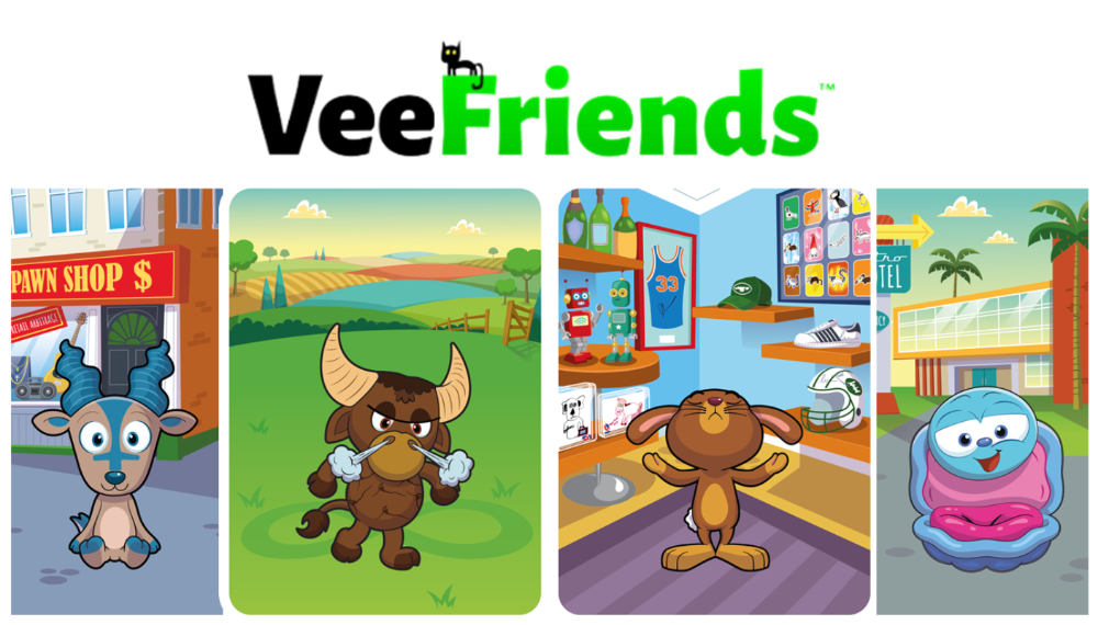


More on NFTs & Art
Eric Esposito
3 years ago
$100M in NFT TV shows from Fox

Fox executives will invest $100 million in NFT-based TV shows. Fox brought in "Rick and Morty" co-creator Dan Harmon to create "Krapopolis"
Fox's Blockchain Creative Labs (BCL) will develop these NFT TV shows with Bento Box Entertainment. BCL markets Fox's WWE "Moonsault" NFT.
Fox said it would use the $100 million to build a "creative community" and "brand ecosystem." The media giant mentioned using these funds for NFT "benefits."
"Krapopolis" will be a Greek-themed animated comedy, per Rarity Sniper. Initial reports said NFT buyers could collaborate on "character development" and get exclusive perks.
Fox Entertainment may drop "Krapopolis" NFTs on Ethereum, according to new reports. Fox says it will soon release more details on its NFT plans for "Krapopolis."
Media Giants Favor "NFT Storytelling"
"Krapopolis" is one of the largest "NFT storytelling" experiments due to Dan Harmon's popularity and Fox Entertainment's reach. Many celebrities have begun exploring Web3 for TV shows.
Mila Kunis' animated sitcom "The Gimmicks" lets fans direct the show. Any "Gimmick" NFT holder could contribute to episode plots.
"The Gimmicks" lets NFT holders write fan fiction about their avatars. If show producers like what they read, their NFT may appear in an episode.
Rob McElhenney recently launched "Adimverse," a Web3 writers' community. Anyone with a "Adimverse" NFT can collaborate on creative projects and share royalties.
Many blue-chip NFTs are appearing in movies and TV shows. Coinbase will release Bored Ape Yacht Club shorts at NFT. NYC. Reese Witherspoon is working on a World of Women NFT series.
PFP NFT collections have Hollywood media partners. Guy Oseary manages Madonna's World of Women and Bored Ape Yacht Club collections. The Doodles signed with Billboard's Julian Holguin and the Cool Cats with CAA.
Web3 and NFTs are changing how many filmmakers tell stories.

Steffan Morris Hernandez
3 years ago
10 types of cognitive bias to watch out for in UX research & design
10 biases in 10 visuals
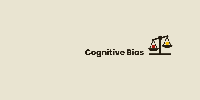
Cognitive biases are crucial for UX research, design, and daily life. Our biases distort reality.
After learning about biases at my UX Research bootcamp, I studied Erika Hall's Just Enough Research and used the Nielsen Norman Group's wealth of information. 10 images show my findings.
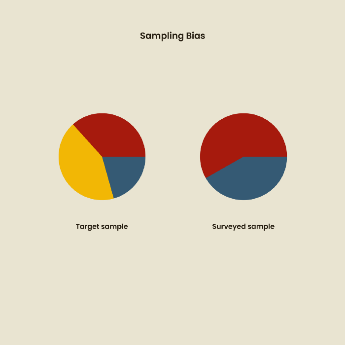
1. Bias in sampling
Misselection of target population members causes sampling bias. For example, you are building an app to help people with food intolerances log their meals and are targeting adult males (years 20-30), adult females (ages 20-30), and teenage males and females (ages 15-19) with food intolerances. However, a sample of only adult males and teenage females is biased and unrepresentative.
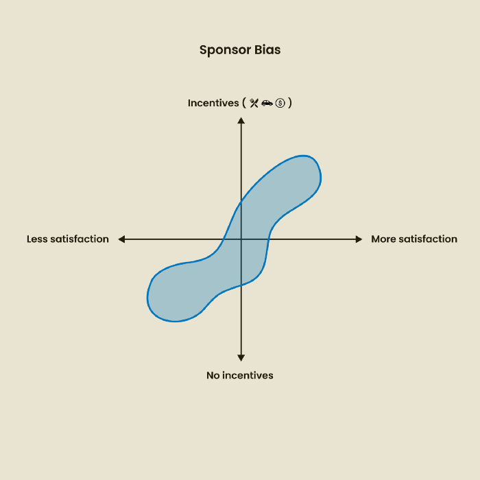
2. Sponsor Disparity
Sponsor bias occurs when a study's findings favor an organization's goals. Beware if X organization promises to drive you to their HQ, compensate you for your time, provide food, beverages, discounts, and warmth. Participants may endeavor to be neutral, but incentives and prizes may bias their evaluations and responses in favor of X organization.
In Just Enough Research, Erika Hall suggests describing the company's aims without naming it.
Third, False-Consensus Bias
False-consensus bias is when a person thinks others think and act the same way. For instance, if a start-up designs an app without researching end users' needs, it could fail since end users may have different wants. https://www.nngroup.com/videos/false-consensus-effect/
Working directly with the end user and employing many research methodologies to improve validity helps lessen this prejudice. When analyzing data, triangulation can boost believability.

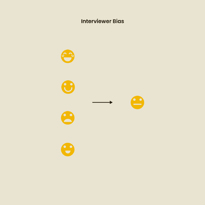
Bias of the interviewer
I struggled with this bias during my UX research bootcamp interviews. Interviewing neutrally takes practice and patience. Avoid leading questions that structure the story since the interviewee must interpret them. Nodding or smiling throughout the interview may subconsciously influence the interviewee's responses.
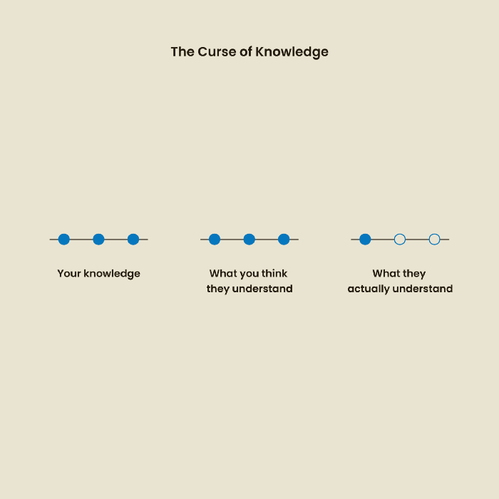
The Curse of Knowledge
The curse of knowledge occurs when someone expects others understand a subject as well as they do. UX research interviews and surveys should reduce this bias because technical language might confuse participants and harm the research. Interviewing participants as though you are new to the topic may help them expand on their replies without being influenced by the researcher's knowledge.
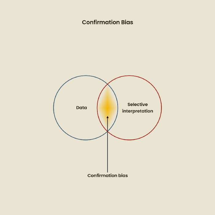
Confirmation Bias
Most prevalent bias. People highlight evidence that supports their ideas and ignore data that doesn't. The echo chamber of social media creates polarization by promoting similar perspectives.
A researcher with confirmation bias may dismiss data that contradicts their research goals. Thus, the research or product may not serve end users.
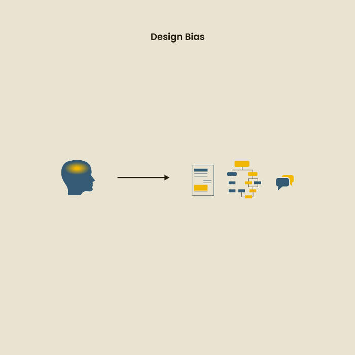
Design biases
UX Research design bias pertains to study construction and execution. Design bias occurs when data is excluded or magnified based on human aims, assumptions, and preferences.
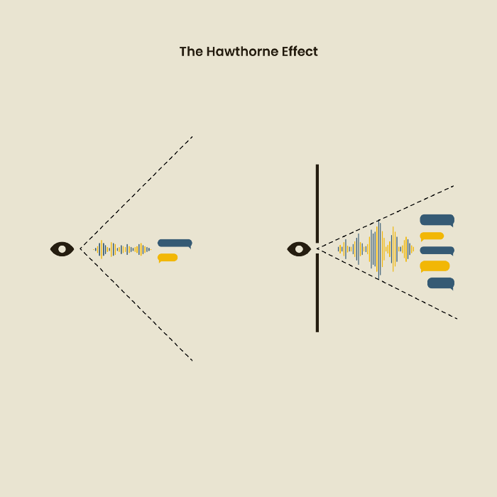
The Hawthorne Impact
Remember when you behaved differently while the teacher wasn't looking? When you behaved differently without your parents watching? A UX research study's Hawthorne Effect occurs when people modify their behavior because you're watching. To escape judgment, participants may act and speak differently.
To avoid this, researchers should blend into the background and urge subjects to act alone.
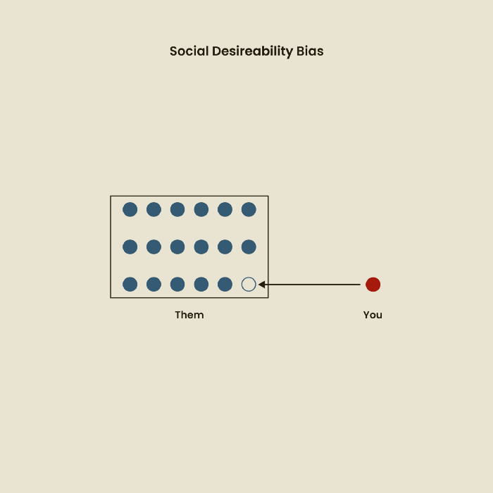
The bias against social desire
People want to belong to escape rejection and hatred. Research interviewees may mislead or slant their answers to avoid embarrassment. Researchers should encourage honesty and confidentiality in studies to address this. Observational research may reduce bias better than interviews because participants behave more organically.
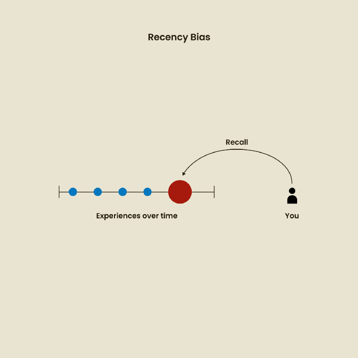
Relative Time Bias
Humans tend to appreciate recent experiences more. Consider school. Say you failed a recent exam but did well in the previous 7 exams. Instead, you may vividly recall the last terrible exam outcome.
If a UX researcher relies their conclusions on the most recent findings instead of all the data and results, recency bias might occur.
I hope you liked learning about UX design, research, and real-world biases.

Jake Prins
3 years ago
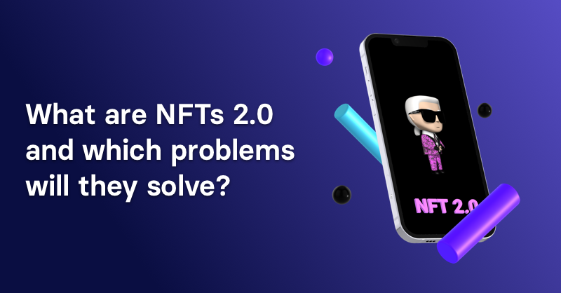
What are NFTs 2.0 and what issues are they meant to address?
New standards help NFTs reach their full potential.
NFTs lack interoperability and functionality. They have great potential but are mostly speculative. To maximize NFTs, we need flexible smart contracts.
Current requirements are too restrictive.
Most NFTs are based on ERC-721, which makes exchanging them easy. CryptoKitties, a popular online game, used the 2017 standard to demonstrate NFTs' potential.
This simple standard includes a base URI and incremental IDs for tokens. Add the tokenID to the base URI to get the token's metadata.
This let creators collect NFTs. Many NFT projects store metadata on IPFS, a distributed storage network, but others use Google Drive. NFT buyers often don't realize that if the creators delete or move the files, their NFT is just a pointer.
This isn't the standard's biggest issue. There's no way to validate NFT projects.
Creators are one of the most important aspects of art, but nothing is stored on-chain.
ERC-721 contracts only have a name and symbol.
Most of the data on OpenSea's collection pages isn't from the NFT's smart contract. It was added through a platform input field, so it's in the marketplace's database. Other websites may have different NFT information.
In five years, your NFT will be just a name, symbol, and ID.
Your NFT doesn't mention its creators. Although the smart contract has a public key, it doesn't reveal who created it.
The NFT's creators and their reputation are crucial to its value. Think digital fashion and big brands working with well-known designers when more professionals use NFTs. Don't you want them in your NFT?
Would paintings be as valuable if their artists were unknown? Would you believe it's real?
Buying directly from an on-chain artist would reduce scams. Current standards don't allow this data.
Most creator profiles live on centralized marketplaces and could disappear. Current platforms have outpaced underlying standards. The industry's standards are lagging.
For NFTs to grow beyond pointers to a monkey picture file, we may need to use new Web3-based standards.
Introducing NFTs 2.0
Fabian Vogelsteller, creator of ERC-20, developed new web3 standards. He proposed LSP7 Digital Asset and LSP8 Identifiable Digital Asset, also called NFT 2.0.
NFT and token metadata inputs are extendable. Changes to on-chain metadata inputs allow NFTs to evolve. Instead of public keys, the contract can have Universal Profile addresses attached. These profiles show creators' faces and reputations. NFTs can notify asset receivers, automating smart contracts.
LSP7 and LSP8 use ERC725Y. Using a generic data key-value store gives contracts much-needed features:
The asset can be customized and made to stand out more by allowing for unlimited data attachment.
Recognizing changes to the metadata
using a hash reference for metadata rather than a URL reference
This base will allow more metadata customization and upgradeability. These guidelines are:
Genuine and Verifiable Now, the creation of an NFT by a specific Universal Profile can be confirmed by smart contracts.
Dynamic NFTs can update Flexible & Updatable Metadata, allowing certain things to evolve over time.
Protected metadata Now, secure metadata that is readable by smart contracts can be added indefinitely.
Better NFTS prevent the locking of NFTs by only being sent to Universal Profiles or a smart contract that can interact with them.
Summary
NFTS standards lack standardization and powering features, limiting the industry.
ERC-721 is the most popular NFT standard, but it only represents incremental tokenIDs without metadata or asset representation. No standard sender-receiver interaction or security measures ensure safe asset transfers.
NFT 2.0 refers to the new LSP7-DigitalAsset and LSP8-IdentifiableDigitalAsset standards.
They have new standards for flexible metadata, secure transfers, asset representation, and interactive transfer.
With NFTs 2.0 and Universal Profiles, creators could build on-chain reputations.
NFTs 2.0 could bring the industry's needed innovation if it wants to move beyond trading profile pictures for speculation.
You might also like

Joseph Mavericks
3 years ago
The world's 36th richest man uses a 5-step system to get what he wants.
Ray Dalio's super-effective roadmap

Ray Dalio's $22 billion net worth ranks him 36th globally. From 1975 to 2011, he built the world's most successful hedge fund, never losing more than 4% from 1991 to 2020. (and only doing so during 3 calendar years).
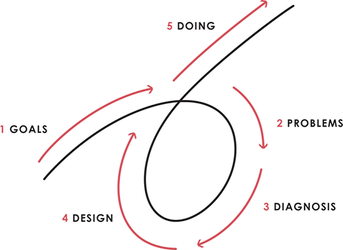
Dalio describes a 5-step process in his best-selling book Principles. It's the playbook he's used to build his hedge fund, beat the markets, and face personal challenges.
This 5-step system is so valuable and well-explained that I didn't edit or change anything; I only added my own insights in the parts I found most relevant and/or relatable as a young entrepreneur. The system's overview:
Have clear goals
Identify and don’t tolerate problems
Diagnose problems to get at their root causes
Design plans that will get you around those problems
Do what is necessary to push through the plans to get results
If you follow these 5 steps in a virtuous loop, you'll almost always see results. Repeat the process for each goal you have.
1. Have clear goals
a) Prioritize: You can have almost anything, but not everything.
I started and never launched dozens of projects for 10 years because I was scattered. I opened a t-shirt store, traded algorithms, sold art on Instagram, painted skateboards, and tinkered with electronics. I decided to try blogging for 6 months to see where it took me. Still going after 3 years.
b) Don’t confuse goals with desires.
A goal inspires you to act. Unreasonable desires prevent you from achieving your goals.
c) Reconcile your goals and desires to decide what you want.
d) Don't confuse success with its trappings.
e) Never dismiss a goal as unattainable.
Always one path is best. Your perception of what's possible depends on what you know now. I never thought I'd make money writing online so quickly, and now I see a whole new horizon of business opportunities I didn't know about before.
f) Expectations create abilities.
Don't limit your abilities. More you strive, the more you'll achieve.
g) Flexibility and self-accountability can almost guarantee success.
Flexible people accept what reality or others teach them. Self-accountability is the ability to recognize your mistakes and be more creative, flexible, and determined.
h) Handling setbacks well is as important as moving forward.
Learn when to minimize losses and when to let go and move on.
2. Don't ignore problems
a) See painful problems as improvement opportunities.
Every problem, painful situation, and challenge is an opportunity. Read The Art of Happiness for more.
b) Don't avoid problems because of harsh realities.
Recognizing your weaknesses isn't the same as giving in. It's the first step in overcoming them.
c) Specify your issues.
There is no "one-size-fits-all" solution.
d) Don’t mistake a cause of a problem with the real problem.
"I can't sleep" is a cause, not a problem. "I'm underperforming" could be a problem.
e) Separate big from small problems.
You have limited time and energy, so focus on the biggest problems.
f) Don't ignore a problem.
Identifying a problem and tolerating it is like not identifying it.
3. Identify problems' root causes
a) Decide "what to do" after assessing "what is."
"A good diagnosis takes 15 to 60 minutes, depending on its accuracy and complexity. [...] Like principles, root causes recur in different situations.
b) Separate proximate and root causes.
"You can only solve problems by removing their root causes, and to do that, you must distinguish symptoms from disease."
c) Knowing someone's (or your own) personality can help you predict their behavior.
4. Design plans that will get you around the problems
a) Retrace your steps.
Analyze your past to determine your future.
b) Consider your problem a machine's output.
Consider how to improve your machine. It's a game then.
c) There are many ways to reach your goals.
Find a solution.
d) Visualize who will do what in your plan like a movie script.
Consider your movie's actors and script's turning points, then act accordingly. The game continues.
e) Document your plan so others can judge your progress.
Accountability boosts success.
f) Know that a good plan doesn't take much time.
The execution is usually the hardest part, but most people either don't have a plan or keep changing it. Don't drive while building the car. Build it first, because it'll be bumpy.
5. Do what is necessary to push through the plans to get results
a) Great planners without execution fail.
Life is won with more than just planning. Similarly, practice without talent beats talent without practice.
b) Work ethic is undervalued.
Hyper-productivity is praised in corporate America, even if it leads nowhere. To get things done, use checklists, fewer emails, and more desk time.
c) Set clear metrics to ensure plan adherence.
I've written about the OKR strategy for organizations with multiple people here. If you're on your own, I recommend the Wheel of Life approach. Both systems start with goals and tasks to achieve them. Then start executing on a realistic timeline.
If you find solutions, weaknesses don't matter.
Everyone's weak. You, me, Gates, Dalio, even Musk. Nobody will be great at all 5 steps of the system because no one can think in all the ways required. Some are good at analyzing and diagnosing but bad at executing. Some are good planners but poor communicators. Others lack self-discipline.
Stay humble and ask for help when needed. Nobody has ever succeeded 100% on their own, without anyone else's help. That's the paradox of individual success: teamwork is the only way to get there.
Most people won't have the skills to execute even the best plan. You can get missing skills in two ways:
Self-taught (time-consuming)
Others' (requires humility) light
On knowing what to do with your life
“Some people have good mental maps and know what to do on their own. Maybe they learned them or were blessed with common sense. They have more answers than others. Others are more humble and open-minded. […] Open-mindedness and mental maps are most powerful.” — Ray Dalio
I've always known what I wanted to do, so I'm lucky. I'm almost 30 and have always had trouble executing. Good thing I never stopped experimenting, but I never committed to anything long-term. I jumped between projects. I decided 3 years ago to stick to one project for at least 6 months and haven't looked back.
Maybe you're good at staying focused and executing, but you don't know what to do. Maybe you have none of these because you haven't found your purpose. Always try new projects and talk to as many people as possible. It will give you inspiration and ideas and set you up for success.
There is almost always a way to achieve a crazy goal or idea.
Enjoy the journey, whichever path you take.

Will Lockett
3 years ago
Russia's nukes may be useless

Russia's nuclear threat may be nullified by physics.
Putin seems nostalgic and wants to relive the Cold War. He's started a deadly war to reclaim the old Soviet state of Ukraine and is threatening the West with nuclear war. NATO can't risk starting a global nuclear war that could wipe out humanity to support Ukraine's independence as much as they want to. Fortunately, nuclear physics may have rendered Putin's nuclear weapons useless. However? How will Ukraine and NATO react?
To understand why Russia's nuclear weapons may be ineffective, we must first know what kind they are.
Russia has the world's largest nuclear arsenal, with 4,447 strategic and 1,912 tactical weapons (all of which are ready to be rolled out quickly). The difference between these two weapons is small, but it affects their use and logistics. Strategic nuclear weapons are ICBMs designed to destroy a city across the globe. Russia's ICBMs have many designs and a yield of 300–800 kilotonnes. 300 kilotonnes can destroy Washington. Tactical nuclear weapons are smaller and can be fired from artillery guns or small truck-mounted missile launchers, giving them a 1,500 km range. Instead of destroying a distant city, they are designed to eliminate specific positions, bases, or military infrastructure. They produce 1–50 kilotonnes.
These two nuclear weapons use different nuclear reactions. Pure fission bombs are compact enough to fit in a shell or small missile. All early nuclear weapons used this design for their fission bombs. This technology is inefficient for bombs over 50 kilotonnes. Larger bombs are thermonuclear. Thermonuclear weapons use a small fission bomb to compress and heat a hydrogen capsule, which undergoes fusion and releases far more energy than ignition fission reactions, allowing for effective giant bombs.
Here's Russia's issue.
A thermonuclear bomb needs deuterium (hydrogen with one neutron) and tritium (hydrogen with two neutrons). Because these two isotopes fuse at lower energies than others, the bomb works. One problem. Tritium is highly radioactive, with a half-life of only 12.5 years, and must be artificially made.
Tritium is made by irradiating lithium in nuclear reactors and extracting the gas. Tritium is one of the most expensive materials ever made, at $30,000 per gram.
Why does this affect Putin's nukes?
Thermonuclear weapons need tritium. Tritium decays quickly, so they must be regularly refilled at great cost, which Russia may struggle to do.
Russia has a smaller economy than New York, yet they are running an invasion, fending off international sanctions, and refining tritium for 4,447 thermonuclear weapons.
The Russian military is underfunded. Because the state can't afford it, Russian troops must buy their own body armor. Arguably, Putin cares more about the Ukraine conflict than maintaining his nuclear deterrent. Putin will likely lose power if he loses the Ukraine war.
It's possible that Putin halted tritium production and refueling to save money for Ukraine. His threats of nuclear attacks and escalating nuclear war may be a bluff.
This doesn't help Ukraine, sadly. Russia's tactical nuclear weapons don't need expensive refueling and will help with the invasion. So Ukraine still risks a nuclear attack. The bomb that destroyed Hiroshima was 15 kilotonnes, and Russia's tactical Iskander-K nuclear missile has a 50-kiloton yield. Even "little" bombs are deadly.
We can't guarantee it's happening in Russia. Putin may prioritize tritium. He knows the power of nuclear deterrence. Russia may have enough tritium for this conflict. Stockpiling a material with a short shelf life is unlikely, though.
This means that Russia's most powerful weapons may be nearly useless, but they may still be deadly. If true, this could allow NATO to offer full support to Ukraine and push the Russian tyrant back where he belongs. If Putin withholds funds from his crumbling military to maintain his nuclear deterrent, he may be willing to sink the ship with him. Let's hope the former.

Dr. Linda Dahl
3 years ago
We eat corn in almost everything. Is It Important?

Corn Kid got viral on TikTok after being interviewed by Recess Therapy. Tariq, called the Corn Kid, ate a buttery ear of corn in the video. He's corn crazy. He thinks everyone just has to try it. It turns out, whether we know it or not, we already have.
Corn is a fruit, veggie, and grain. It's the second-most-grown crop. Corn makes up 36% of U.S. exports. In the U.S., it's easy to grow and provides high yields, as proven by the vast corn belt spanning the Midwest, Great Plains, and Texas panhandle. Since 1950, the corn crop has doubled to 10 billion bushels.
You say, "Fine." We shouldn't just grow because we can. Why so much corn? What's this corn for?
Why is practical and political. Michael Pollan's The Omnivore's Dilemma has the full narrative. Early 1970s food costs increased. Nixon subsidized maize to feed the public. Monsanto genetically engineered corn seeds to make them hardier, and soon there was plenty of corn. Everyone ate. Woot! Too much corn followed. The powers-that-be had to decide what to do with leftover corn-on-the-cob.
They are fortunate that corn has a wide range of uses.
First, the edible variants. I divide corn into obvious and stealth.
Obvious corn includes popcorn, canned corn, and corn on the cob. This form isn't always digested and often comes out as entire, polka-dotting poop. Cornmeal can be ground to make cornbread, polenta, and corn tortillas. Corn provides antioxidants, minerals, and vitamins in moderation. Most synthetic Vitamin C comes from GMO maize.
Corn oil, corn starch, dextrose (a sugar), and high-fructose corn syrup are often overlooked. They're stealth corn because they sneak into practically everything. Corn oil is used for frying, baking, and in potato chips, mayonnaise, margarine, and salad dressing. Baby food, bread, cakes, antibiotics, canned vegetables, beverages, and even dairy and animal products include corn starch. Dextrose appears in almost all prepared foods, excluding those with high-fructose corn syrup. HFCS isn't as easily digested as sucrose (from cane sugar). It can also cause other ailments, which we'll discuss later.
Most foods contain corn. It's fed to almost all food animals. 96% of U.S. animal feed is corn. 39% of U.S. corn is fed to livestock. But animals prefer other foods. Omnivore chickens prefer insects, worms, grains, and grasses. Captive cows are fed a total mixed ration, which contains corn. These animals' products, like eggs and milk, are also corn-fed.
There are numerous non-edible by-products of corn that are employed in the production of items like:
fuel-grade ethanol
plastics
batteries
cosmetics
meds/vitamins binder
carpets, fabrics
glutathione
crayons
Paint/glue

How does corn influence you? Consider quick food for dinner. You order a cheeseburger, fries, and big Coke at the counter (or drive-through in the suburbs). You tell yourself, "No corn." All that contains corn. Deconstruct:
Cows fed corn produce meat and cheese. Meat and cheese were bonded with corn syrup and starch (same). The bun (corn flour and dextrose) and fries were fried in maize oil. High fructose corn syrup sweetens the drink and helps make the cup and straw.
Just about everything contains corn. Then what? A cornspiracy, perhaps? Is eating too much maize an issue, or should we strive to stay away from it whenever possible?
As I've said, eating some maize can be healthy. 92% of U.S. corn is genetically modified, according to the Center for Food Safety. The adjustments are expected to boost corn yields. Some sweet corn is genetically modified to produce its own insecticide, a protein deadly to insects made by Bacillus thuringiensis. It's safe to eat in sweet corn. Concerns exist about feeding agricultural animals so much maize, modified or not.
High fructose corn syrup should be consumed in moderation. Fructose, a sugar, isn't easily metabolized. Fructose causes diabetes, fatty liver, obesity, and heart disease. It causes inflammation, which might aggravate gout. Candy, packaged sweets, soda, fast food, juice drinks, ice cream, ice cream topping syrups, sauces & condiments, jams, bread, crackers, and pancake syrup contain the most high fructose corn syrup. Everyday foods with little nutrients. Check labels and choose cane sugar or sucrose-sweetened goods. Or, eat corn like the Corn Kid.