


More on Technology

Nick Babich
2 years ago
Is ChatGPT Capable of Generating a Complete Mobile App?

TL;DR: It'll be harder than you think.
Mobile app development is a complicated product design sector. You require broad expertise to create a mobile app. You must write Swift or Java code and consider mobile interactions.
When ChatGPT was released, many were amazed by its capabilities and wondered if it could replace designers and developers. This article will use ChatGPT to answer a specific query.
Can ChatGPT build an entire iOS app?
This post will use ChatGPT to construct an iOS meditation app. Video of the article is available.
App concepts for meditation
After deciding on an app, think about the user experience. What should the app offer?
Let's ask ChatGPT for the answer.
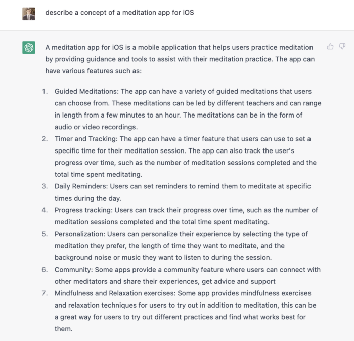
ChatGPT described a solid meditation app with various exercises. Use this list to plan product design. Our first product iteration will have few features. A simple, one-screen software will let users set the timeframe and play music during meditation.
Structure of information
Information architecture underpins product design. Our app's navigation mechanism should be founded on strong information architecture, so we need to identify our mobile's screens first.
ChatGPT can define our future app's information architecture since we already know it.

ChatGPT uses the more complicated product's structure. When adding features to future versions of our product, keep this information picture in mind.
Color palette
Meditation apps need colors. We want to employ relaxing colors in a meditation app because colors affect how we perceive items. ChatGPT can suggest product colors.
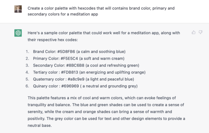
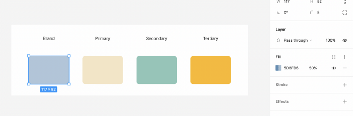
See the hues in person:
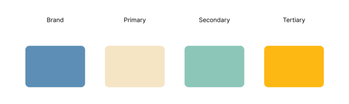
Neutral colors dominate the color scheme. Playing with color opacity makes this scheme useful.
Ambiance music
Meditation involves music. Well-chosen music calms the user.
Let ChatGPT make music for us.
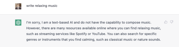
ChatGPT can only generate text. It directs us to Spotify or YouTube to look for such stuff and makes precise recommendations.
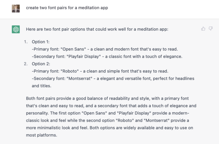
Fonts
Fonts can impress app users. Round fonts are easier on the eyes and make a meditation app look friendlier.
ChatGPT can suggest app typefaces. I compare two font pairs when making a product. I'll ask ChatGPT for two font pairs.
See the hues in person:
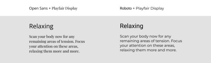
Despite ChatGPT's convincing font pairing arguments, the output is unattractive. The initial combo (Open Sans + Playfair Display) doesn't seem to work well for a mediation app.
Content
Meditation requires the script. Find the correct words and read them calmly and soothingly to help listeners relax and focus on each region of their body to enhance the exercise's effect.
ChatGPT's offerings:
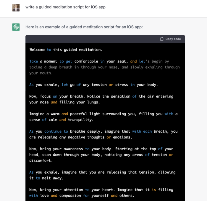
ChatGPT outputs code. My prompt's word script may cause it.
Timer
After fonts, colors, and content, construct functional pieces. Timer is our first functional piece. The meditation will be timed.
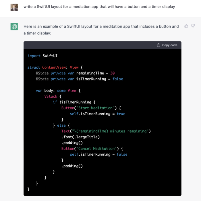
Let ChatGPT write Swift timer code (since were building an iOS app, we need to do it using Swift language).
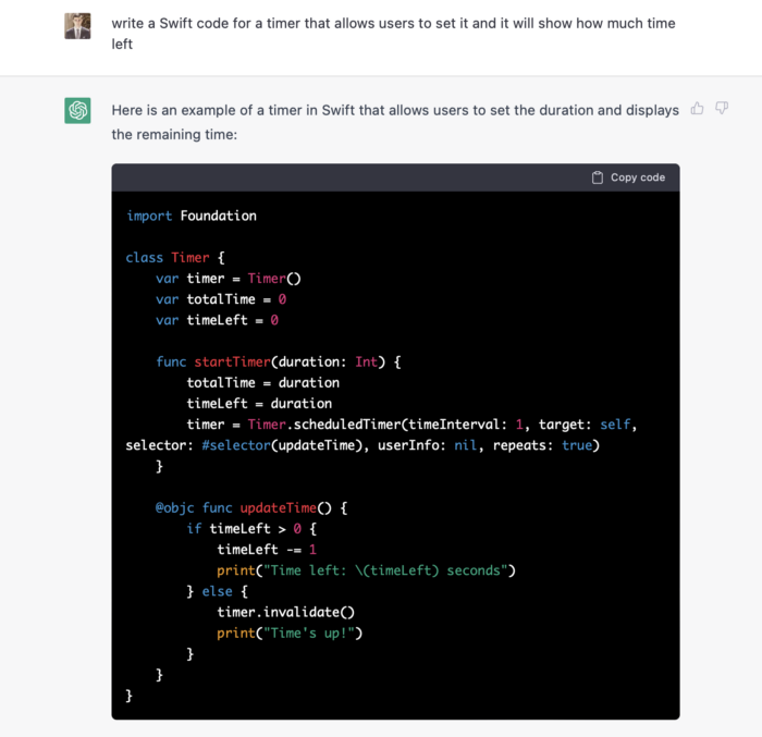
ChatGPT supplied a timer class, initializer, and usage guidelines.
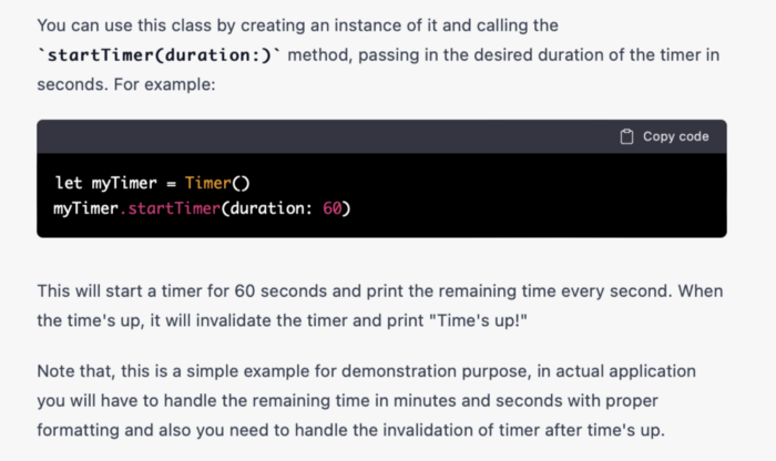
Apple Xcode requires a playground to test this code. Xcode will report issues after we paste the code to the playground.
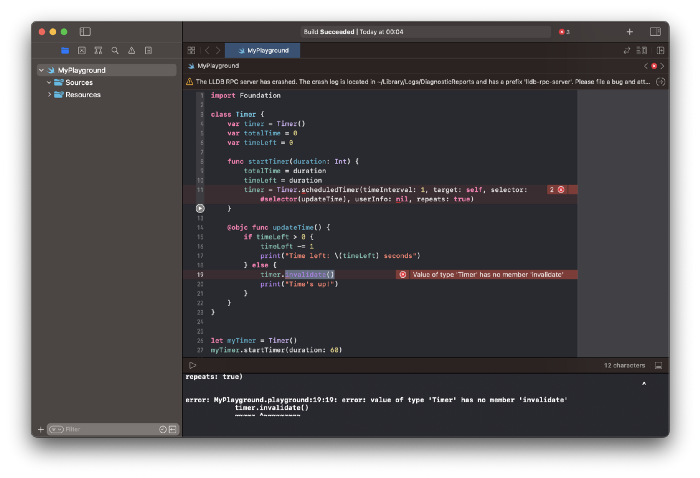
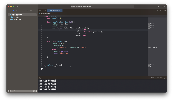
Fixing them is simple. Just change Timer to another class name (Xcode shows errors because it thinks that we access the properties of the class we’ve created rather than the system class Timer; it happens because both classes have the same name Timer). I titled our class Timero and implemented the project. After this quick patch, ChatGPT's code works.
Can ChatGPT produce a complete app?
Since ChatGPT can help us construct app components, we may question if it can write a full app in one go.
Question ChatGPT:
ChatGPT supplied basic code and instructions. It's unclear if ChatGPT purposely limits output or if my prompt wasn't good enough, but the tool cannot produce an entire app from a single prompt.
However, we can contact ChatGPT for thorough Swift app construction instructions.
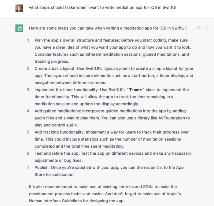
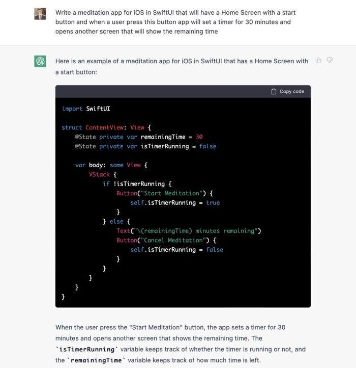
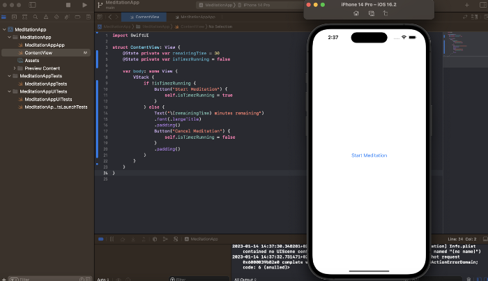
We can ask ChatGPT for step-by-step instructions now that we know what to do. Request a basic app layout from ChatGPT.
Copying this code to an Xcode project generates a functioning layout.
Takeaways
ChatGPT may provide step-by-step instructions on how to develop an app for a specific system, and individual steps can be utilized as prompts to ChatGPT. ChatGPT cannot generate the source code for the full program in one go.
The output that ChatGPT produces needs to be examined by a human. The majority of the time, you will need to polish or adjust ChatGPT's output, whether you develop a color scheme or a layout for the iOS app.
ChatGPT is unable to produce media material. Although ChatGPT cannot be used to produce images or sounds, it can assist you build prompts for programs like midjourney or Dalle-2 so that they can provide the appropriate images for you.

Gareth Willey
3 years ago
I've had these five apps on my phone for a long time.
TOP APPS
Who survives spring cleaning?

Relax. Notion is off-limits. This topic is popular.
(I wrote about it 2 years ago, before everyone else did.) So).
These apps are probably new to you. I hope you find a new phone app after reading this.
Outdooractive
ViewRanger is Google Maps for outdoor enthusiasts.
This app has been so important to me as a freedom-loving long-distance walker and hiker.
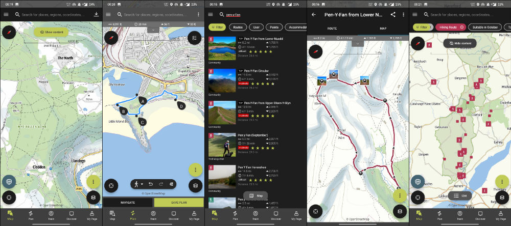
This app shows nearby trails and right-of-ways on top of an Open Street Map.
Helpful detail and data. Any route's distance,
You can download and follow tons of routes planned by app users.
This has helped me find new routes and places a fellow explorer has tried.
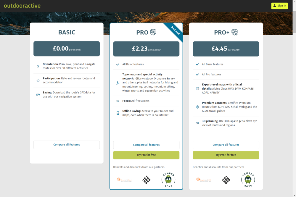
Free with non-intrusive ads. Years passed before I subscribed. Pro costs £2.23/month.
This app is for outdoor lovers.
Google Files
New phones come with bloatware. These rushed apps are frustrating.
We must replace these apps. 2017 was Google's year.
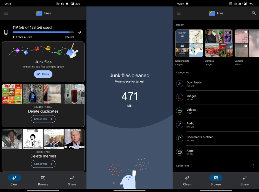
Files is a file manager. It's quick, innovative, and clean. They've given people what they want.
It's easy to organize files, clear space, and clear cache.
I recommend Gallery by Google as a gallery app alternative. It's quick and easy.
Trainline
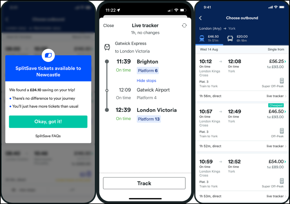
App for trains, buses, and coaches.
I've used this app for years. It did the basics well when I first used it.
Since then, it's improved. It's constantly adding features to make traveling easier and less stressful.
Split-ticketing helps me save hundreds a year on train fares. This app is only available in the UK and Europe.
This service doesn't link to a third-party site. Their app handles everything.
Not all train and coach companies use this app. All the big names are there, though.
Here's more on the app.
Battlefield: Mobile

Play Store has 478,000 games. Few can turn my phone into a console.
Call of Duty Mobile and Asphalt 8/9 are examples.
Asphalt's loot boxes and ads make it unplayable. Call of Duty opens with a few ads. Close them to play without hassle.
This game uses all your phone's features to provide a high-quality, seamless experience. If my internet connection is good, I never experience lag or glitches.
The gameplay is energizing and intense, just like on consoles. Sometimes I'm too involved. I've thrown my phone in anger. I'm totally absorbed.
Customizability is my favorite. Since phones have limited screen space, we should only have the buttons we need, placed conveniently.
Size, opacity, and position are modifiable. Adjust audio, graphics, and textures. It's customizable.
This game has been on my phone for three years. It began well and has gotten better. When I think the creators can't do more, they do.
If you play, read my tips for winning a Battle Royale.
Lightroom

As a photographer, I believe your best camera is on you. The phone.
2017 was a big year for this app. I've tried many photo-editing apps since then. This always wins.
The app is dull. I've never seen better photo editing on a phone.
Adjusting settings and sliders doesn't damage or compress photos. It's detailed.
This is important for phone photos, which are lower quality than professional ones.
Some tools are behind a £4.49/month paywall. Adobe must charge a subscription fee instead of selling licenses. (I'm still bitter about Creative Cloud's price)
Snapseed is my pick. Lightroom is where I do basic editing before moving to Snapseed. Snapseed review:

These apps are great. They cover basic and complex editing needs while traveling.
Final Reflections
I hope you downloaded one of these. Share your favorite apps. These apps are scarce.

Frank Andrade
3 years ago
I discovered a bug that allowed me to use ChatGPT to successfully web scrape. Here's how it operates.
This method scrapes websites with ChatGPT (demo with Amazon and Twitter)

In a recent article, I demonstrated how to scrape websites using ChatGPT prompts like scrape website X using Python.
But that doesn’t always work.
After scraping dozens of websites with ChatGPT, I realized that simple prompts rarely work for web scraping.
Using ChatGPT and basic HTML, we can scrape any website.
First things first, use ChatGPT's advanced version (Playground)
ChatGPT Playground's enhanced version is needed to scrape websites quickly. It generates code faster and has less constraints.
Here’s how it looks.
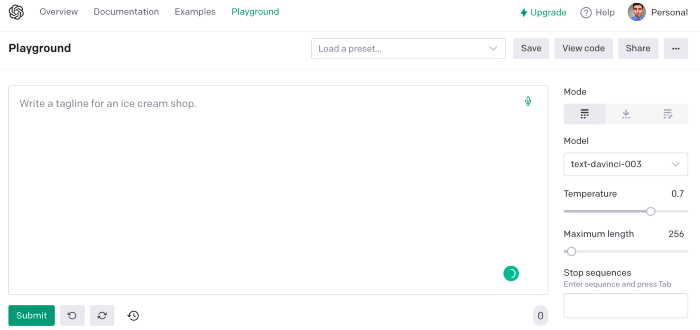
The classic ChatGPT display just allows you to type a prompt. Playground is more customizable and generates code faster than the basic version.
No more delays or restrictions.
In this tutorial, we'll write prompts underneath Playground.
How to Use ChatGPT to Scrape Any Website
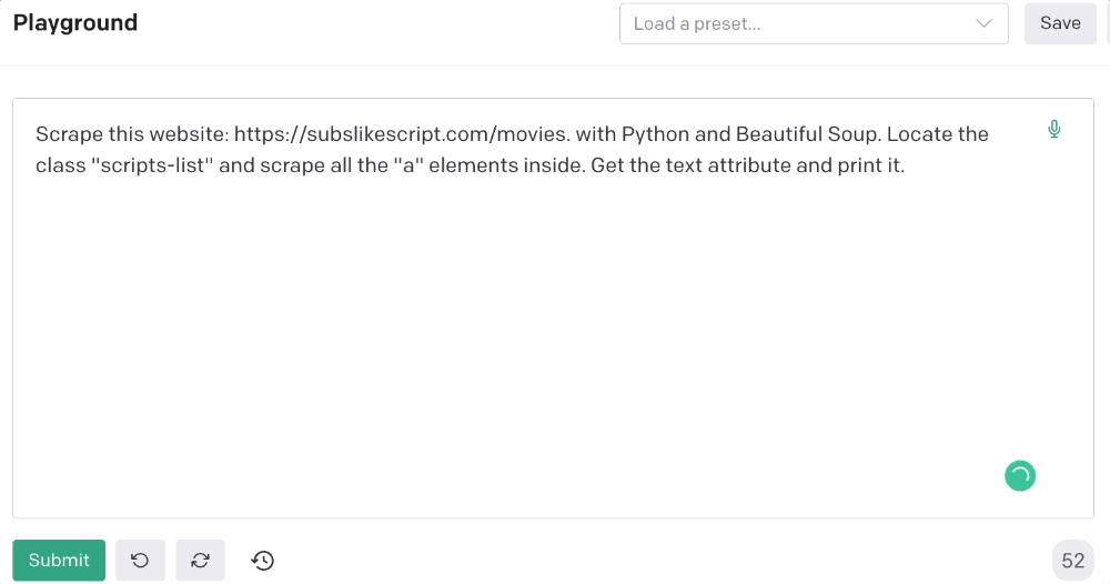
To show you how to utilize ChatGPT to scrape any website, we'll use subslikescript, which lists movies.
Later in this post, I'll show you how to scrape Amazon and Twitter, but let's start easy.
If we try a basic prompt like “scrape the movie titles on this website: https://subslikescript.com/movies” it won’t scrape anything. Here’s when we need some HTML knowledge to build the right prompt for ChatGPT.Let's scrape the above movie titles. First, check the webpage. Right-click any element and choose Inspect.
Then see below.
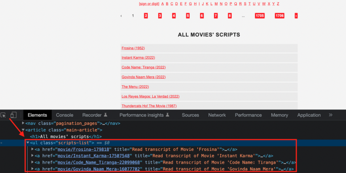
We identify the element to scrape (those in the red box). The data elements are ul, a, and scripts-list.
Here's the prompt for movie titles.
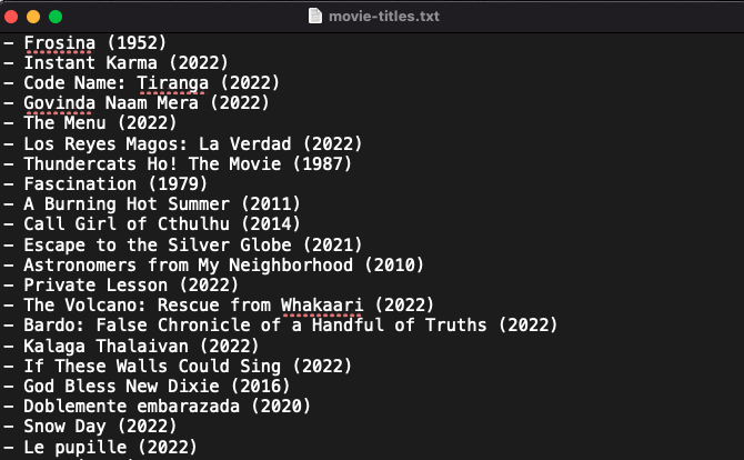
Scrape this website: https://subslikescript.com/movies with Python and Beautiful Soup. Locate the element with tag “ul” and class “scripts-list”. Scrape all the “a” elements inside. Get the text attribute and print it.
Code generated:
import requests
from bs4 import BeautifulSoup

page = requests.get('https://subslikescript.com/movies/')

soup = BeautifulSoup(page.content, 'html.parser')

scripts_list = soup.find(class_="scripts-list")

all_a_elements = scripts_list.find_all('a')

for element in all_a_elements:
    print(element.get_text())
It extracts movie titles successfully.
Let's scrape Amazon and Twitter.
ChatGPT's Amazon scraping
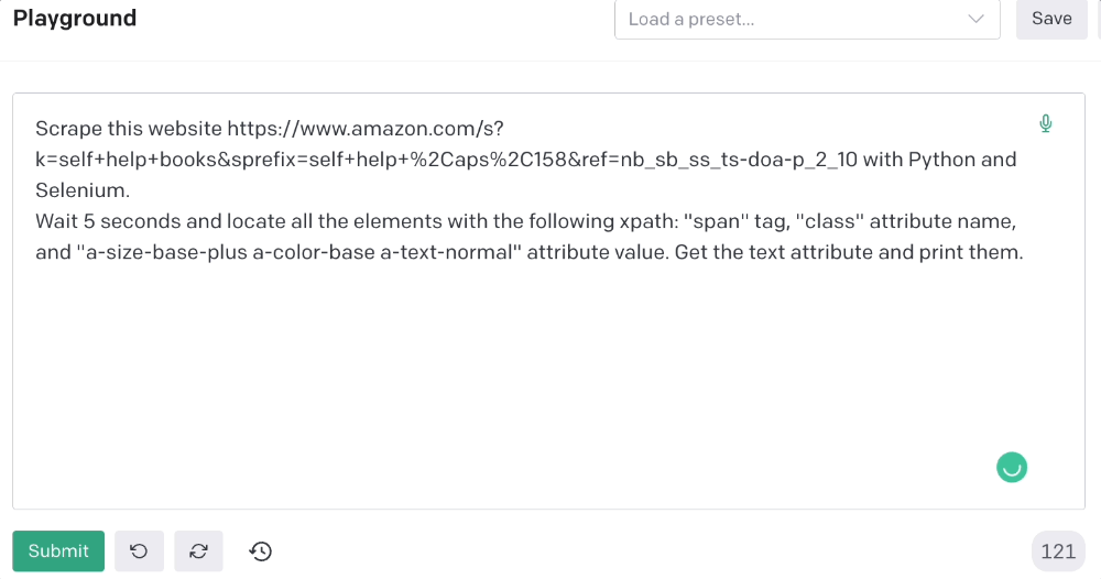
Consider scraping Amazon for self-help books. First, copy the Amazon link for self-help books.
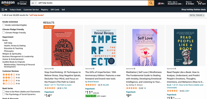
Here’s the link I got. Location-dependent connection. Use my link to replicate my results.
Now we'll check book titles. Here's our element.
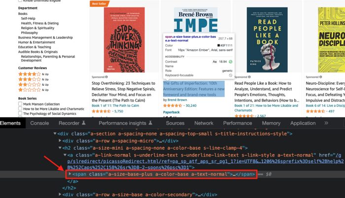
If we want to extract the book titles, we need to use the tag name span, class attribute name and a-size-base-plus a-color-base a-text-normalattribute value.
This time I'll use Selenium. I'll add Selenium-specific commands like wait 5 seconds and generate an XPath.
Scrape this website https://www.amazon.com/s?k=self+help+books&sprefix=self+help+%2Caps%2C158&ref=nb_sb_ss_ts-doa-p_2_10 with Python and Selenium.
Wait 5 seconds and locate all the elements with the following xpath: “span” tag, “class” attribute name, and “a-size-base-plus a-color-base a-text-normal” attribute value. Get the text attribute and print them.
Code generated: (I only had to manually add the path where my chromedriver is located).
from selenium import webdriver
from selenium.webdriver.common.by import By
from time import sleep

#initialize webdriver
driver = webdriver.Chrome('<add path of your chromedriver>')

#navigate to the website
driver.get("https://www.amazon.com/s?k=self+help+books&sprefix=self+help+%2Caps%2C158&ref=nb_sb_ss_ts-doa-p_2_10")

#wait 5 seconds to let the page load
sleep(5)

#locate all the elements with the following xpath
elements = driver.find_elements(By.XPATH, '//span[@class="a-size-base-plus a-color-base a-text-normal"]')

#get the text attribute of each element and print it
for element in elements:
    print(element.text)

#close the webdriver
driver.close()
It pulls Amazon book titles.
Utilizing ChatGPT to scrape Twitter
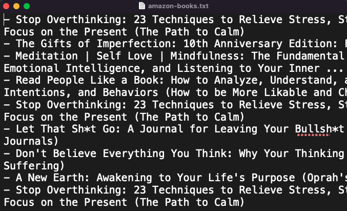
Say you wish to scrape ChatGPT tweets. Search Twitter for ChatGPT and copy the URL.
Here’s the link I got. We must check every tweet. Here's our element.
To extract a tweet, use the div tag and lang attribute.
Again, Selenium.
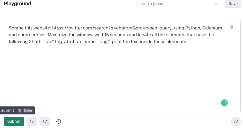
Scrape this website: https://twitter.com/search?q=chatgpt&src=typed_query using Python, Selenium and chromedriver.
Maximize the window, wait 15 seconds and locate all the elements that have the following XPath: “div” tag, attribute name “lang”. Print the text inside these elements.
Code generated: (again, I had to add the path where my chromedriver is located)
from selenium import webdriver
import time

driver = webdriver.Chrome("/Users/frankandrade/Downloads/chromedriver")
driver.maximize_window()
driver.get("https://twitter.com/search?q=chatgpt&src=typed_query")
time.sleep(15)

elements = driver.find_elements_by_xpath("//div[@lang]")
for element in elements:
    print(element.text)

driver.quit()
You'll get the first 2 or 3 tweets from a search. To scrape additional tweets, click X times.
Congratulations! You scraped websites without coding by using ChatGPT.
You might also like

Simone Basso
3 years ago
How I set up my teams to be successful
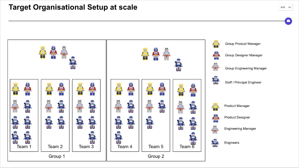
After 10 years of working in scale-ups, I've embraced a few concepts for scaling Tech and Product teams.
First, cross-functionalize teams. Product Managers represent the business, Product Designers the consumer, and Engineers build.
I organize teams of 5-10 individuals, following AWS's two pizza teams guidelines, with a Product Trio guiding each.
If more individuals are needed to reach a goal, I group teams under a Product Trio.
With Engineering being the biggest group, Staff/Principal Engineers often support the Trio on cross-team technical decisions.
Product Managers, Engineering Managers, or Engineers in the team may manage projects (depending on the project or aim), but the trio is collectively responsible for the team's output and outcome.
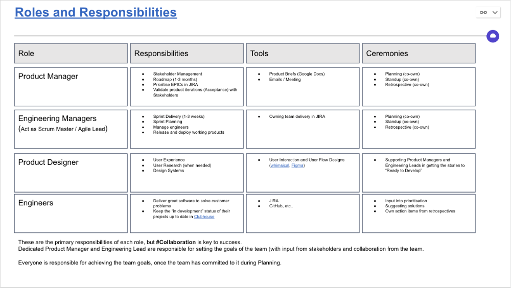
Once the Product Trio model is created, roles, duties, team ceremonies, and cooperation models must be clarified.
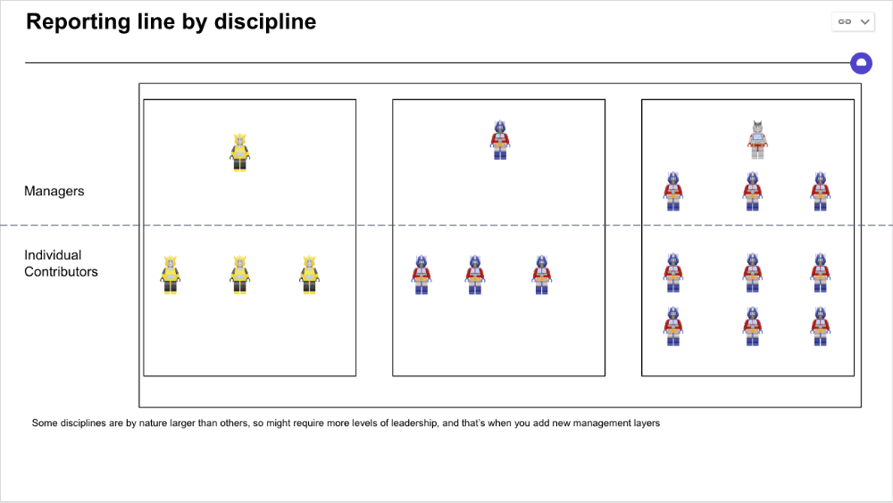
Keep reporting lines by discipline. Line managers are accountable for each individual's advancement, thus it's crucial that they know the work in detail.
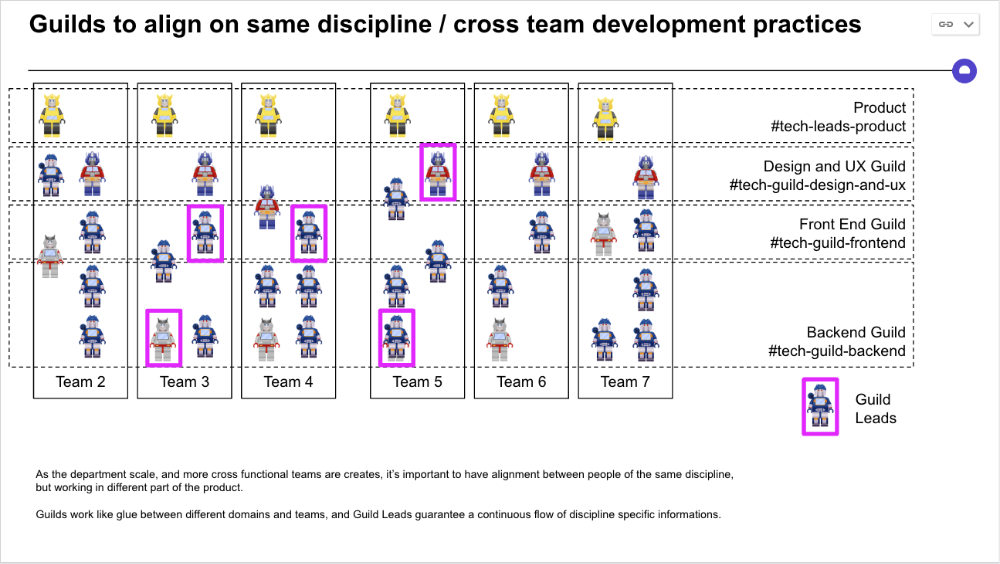
Cross-team collaboration becomes more important after 3 teams (15-30 people). Teams can easily diverge in how they write code, run ceremonies, and build products.
Establishing groups of people that are cross-team, but grouped by discipline and skills, sharing and agreeing on working practices becomes critical.
The “Spotify Guild” model has been where I’ve taken a lot of my inspiration from.
Last, establish a taxonomy for communication channels.
In Slack, I create one channel per team and one per guild (and one for me to have discussions with the team leads).
These are just some of the basic principles I follow to organize teams.
A book I particularly like about team types and how they interact with each other is https://teamtopologies.com/.

Jon Brosio
3 years ago
This Landing Page is a (Legal) Money-Printing Machine
and it’s easy to build.

A landing page with good copy is a money-maker.
Let's be honest, page-builder templates are garbage.
They can help you create a nice-looking landing page, but not persuasive writing.
Over the previous 90 days, I've examined 200+ landing pages.
What's crazy?
Top digital entrepreneurs use a 7-part strategy to bring in email subscribers, generate prospects, and (passively) sell their digital courses.
Steal this 7-part landing page architecture to maximize digital product sales.
The offer
Landing pages require offers.
Newsletter, cohort, or course offer.
Your reader should see this offer first. Includind:
Headline
Imagery
Call-to-action
Clear, persuasive, and simplicity are key. Example: the Linkedin OS course home page of digital entrepreneur Justin Welsh offers:
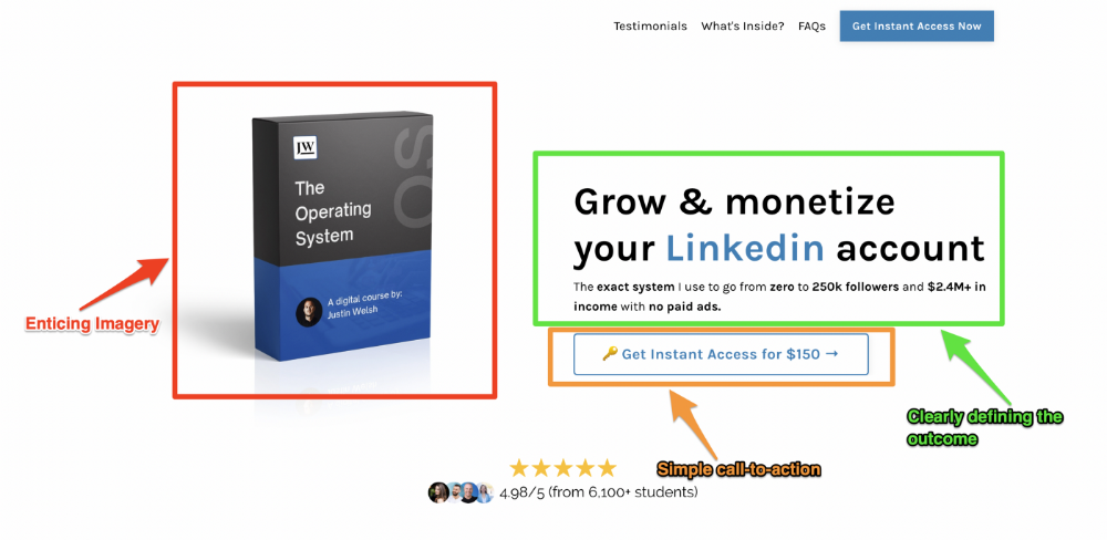
A distinctly defined problem
Everyone needs an enemy.
You need an opponent on your landing page. Problematic.
Next, employ psychology to create a struggle in your visitor's thoughts.
Don't be clever here; label your customer's problem. The more particular you are, the bigger the situation will seem.
When you build a clear monster, you invite defeat. I appreciate Theo Ohene's Growth Roadmaps landing page.
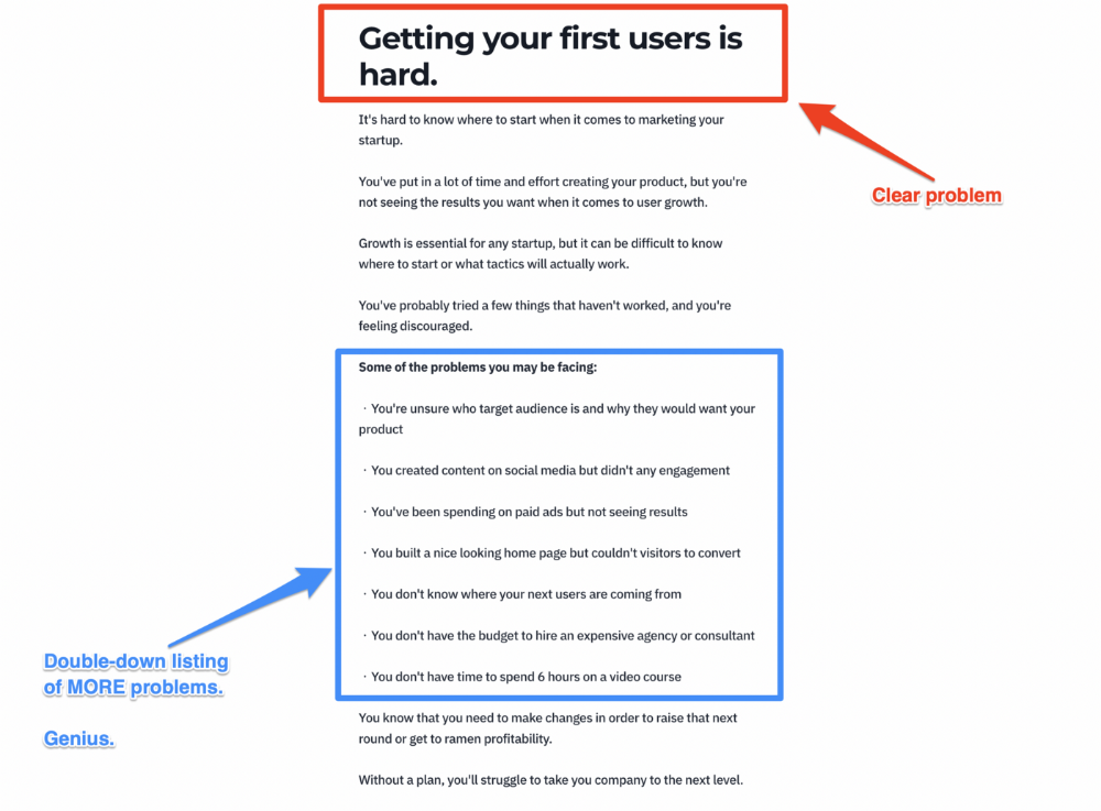
Exacerbation of the effects
Problem identification doesn't motivate action.
What would an unresolved problem mean?
This is landing page copy. When you describe the unsolved problem's repercussions, you accomplish several things:
You write a narrative (and stories are remembered better than stats)
You cause the reader to feel something.
You help the reader relate to the issue
Important!
My favorite script is:
"Sure, you can let [problem] go untreated. But what will happen if you do? Soon, you'll begin to notice [new problem 1] will start to arise. That might bring up [problem 2], etc."
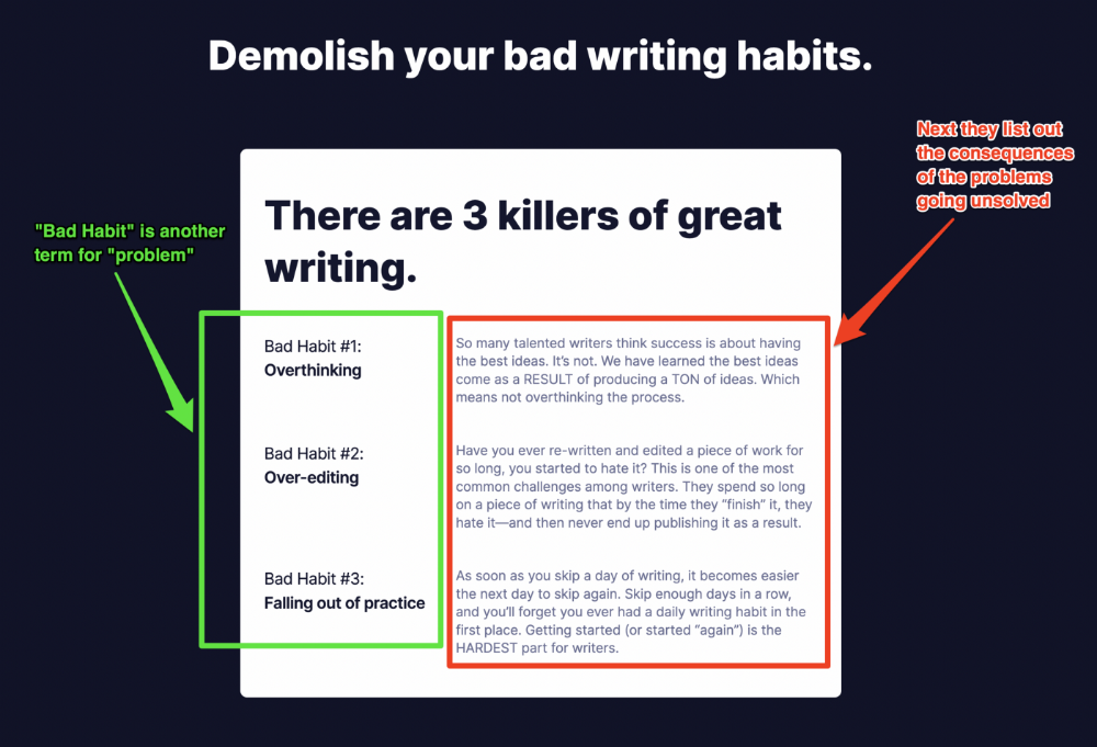
Take the copywriting course, digital writer and entrepreneur Dickie Bush illustrates below when he labels the problem (see: "poor habit") and then illustrates the repercussions.
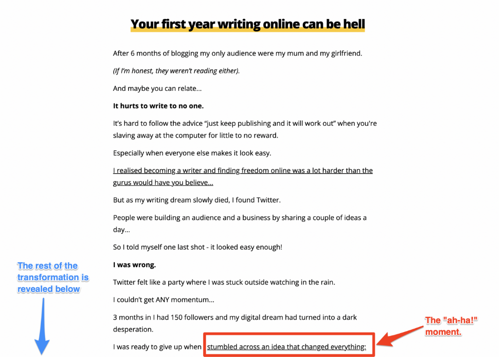
The tale of transformation
Every landing page needs that "ah-ha!" moment.
Transformation stories do this.
Did you find a solution? Someone else made the discovery? Have you tested your theory?
Next, describe your (or your subject's) metamorphosis.
Kieran Drew nails his narrative (and revelation) here. Right before the disclosure, he introduces his "ah-ha!" moment:
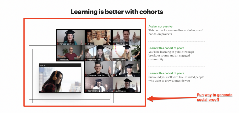
Testimonials
Social proof completes any landing page.
Social proof tells the reader, "If others do it, it must be worthwhile."
This is your argument.
Positive social proof helps (obviously).
Offer "free" training in exchange for a testimonial if you need social evidence. This builds social proof.
Most social proof is testimonies (recommended). Kurtis Hanni's creative take on social proof (using a screenshot of his colleague) is entertaining.
Bravo.
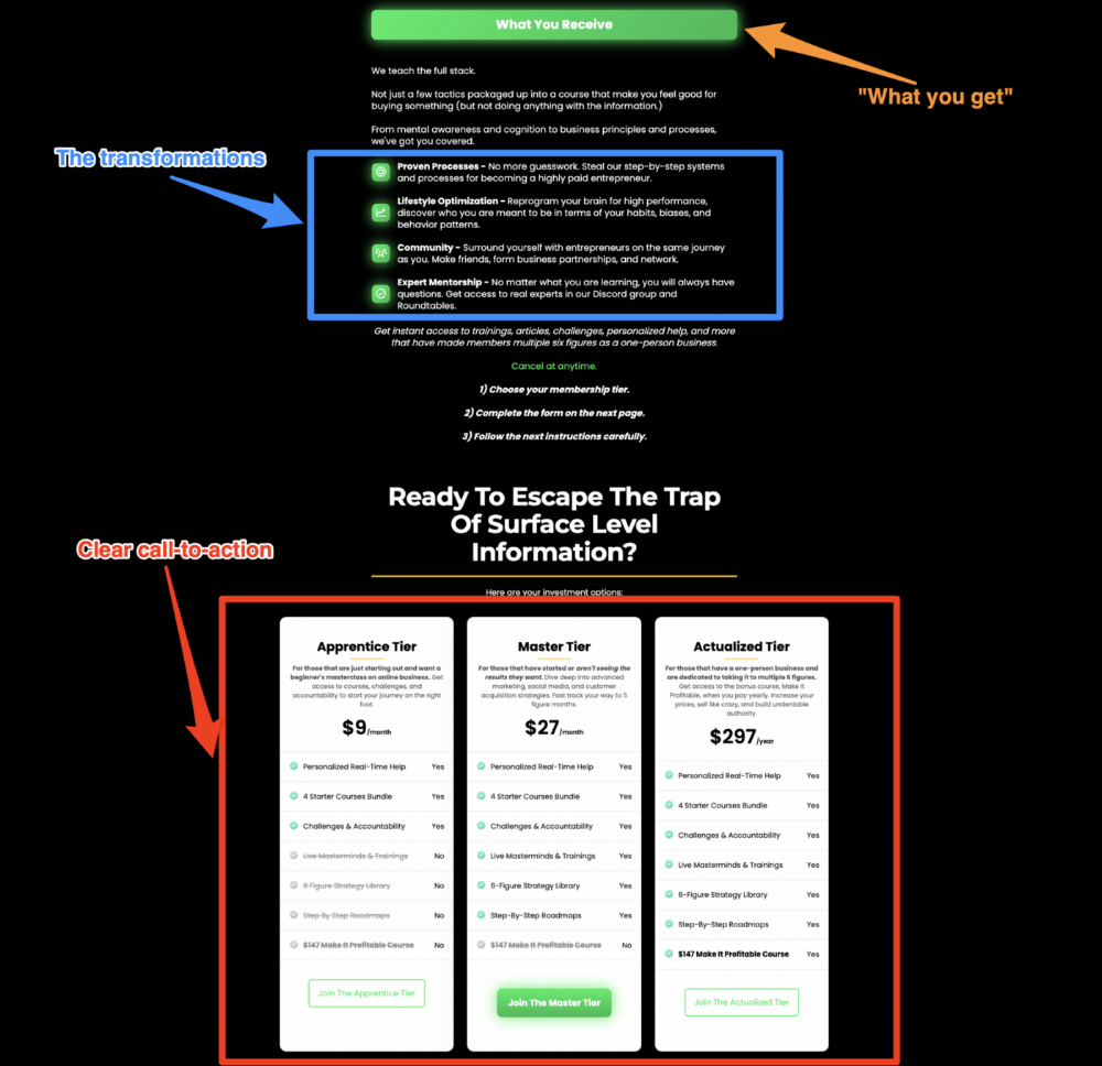
Reveal your offer
Now's the moment to act.
Describe the "bundle" that provides the transformation.
Here's:
Course
Cohort
Ebook
Whatever you're selling.
Include a product or service image, what the consumer is getting ("how it works"), the price, any "free" bonuses (preferred), and a CTA ("buy now").
Clarity is key. Don't make a cunning offer. Make sure your presentation emphasizes customer change (benefits). Dan Koe's Modern Mastery landing page makes an offer. Consider:
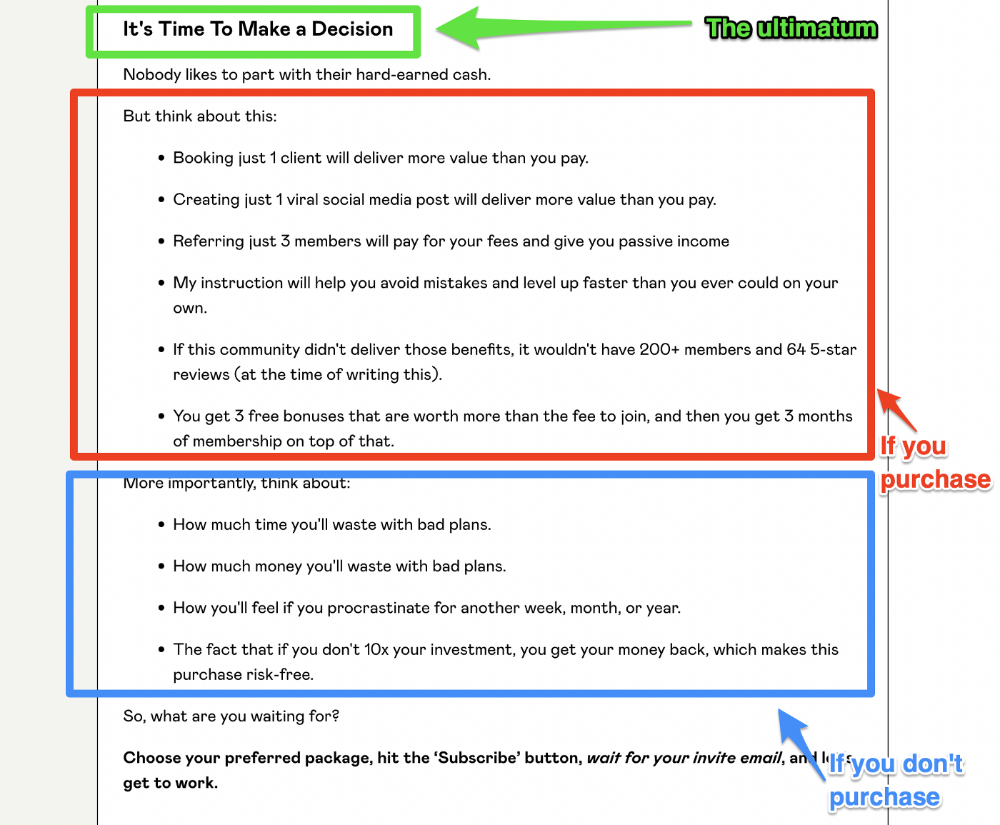
An ultimatum
Offering isn't enough.
You must give your prospect an ultimatum.
They can buy your merchandise from you.
They may exit the webpage.
That’s it.
It's crucial to show what happens if the reader does either. Stress the consequences of not buying (again, a little consequence amplification). Remind them of the benefits of buying.
I appreciate Charles Miller's product offer ending:
The top online creators use a 7-part landing page structure:
Offer the service
Describe the problem
Amplify the consequences
Tell the transformational story
Include testimonials and social proof.
Reveal the offer (with any bonuses if applicable)
Finally, give the reader a deadline to encourage them to take action.
Sequence these sections to develop a landing page that (essentially) prints money.

Entreprogrammer
3 years ago
The Steve Jobs Formula: A Guide to Everything
A must-read for everyone
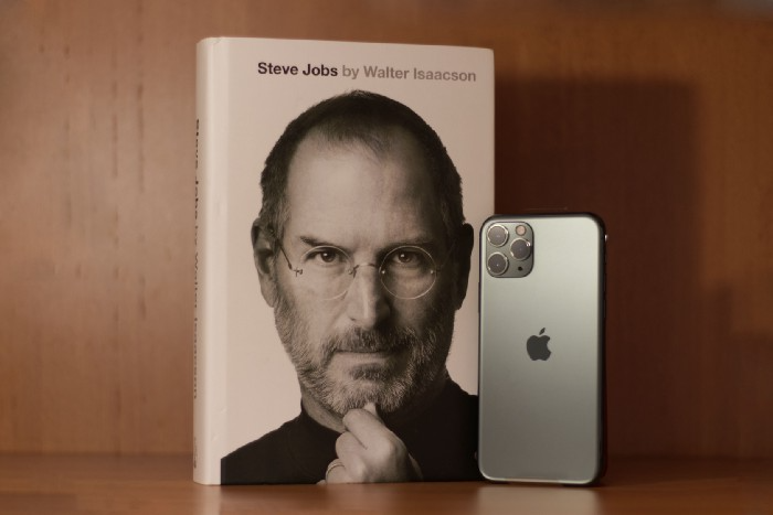
Jobs is well-known. You probably know the tall, thin guy who wore the same clothing every day. His influence is unavoidable. In fewer than 40 years, Jobs' innovations have impacted computers, movies, cellphones, music, and communication.
Steve Jobs may be more imaginative than the typical person, but if we can use some of his ingenuity, ambition, and good traits, we'll be successful. This essay explains how to follow his guidance and success secrets.
1. Repetition is necessary for success.
Be patient and diligent to master something. Practice makes perfect. This is why older workers are often more skilled.
When should you repeat a task? When you're confident and excited to share your product. It's when to stop tweaking and repeating.
Jobs stated he'd make the crowd sh** their pants with an iChat demo.
Use this in your daily life.
Start with the end in mind. You can put it in writing and be as detailed as you like with your plan's schedule and metrics. For instance, you have a goal of selling three coffee makers in a week.
Break it down, break the goal down into particular tasks you must complete, and then repeat those tasks. To sell your coffee maker, you might need to make 50 phone calls.
Be mindful of the amount of work necessary to produce the desired results. Continue doing this until you are happy with your product.
2. Acquire the ability to add and subtract.
How did Picasso invent cubism? Pablo Picasso was influenced by stylised, non-naturalistic African masks that depict a human figure.
Artists create. Constantly seeking inspiration. They think creatively about random objects. Jobs said creativity is linking things. Creative people feel terrible when asked how they achieved something unique because they didn't do it all. They saw innovation. They had mastered connecting and synthesizing experiences.
Use this in your daily life.
On your phone, there is a note-taking app. Ideas for what you desire to learn should be written down. It may be learning a new language, calligraphy, or anything else that inspires or intrigues you.
Note any ideas you have, quotations, or any information that strikes you as important.
Spend time with smart individuals, that is the most important thing. Jim Rohn, a well-known motivational speaker, has observed that we are the average of the five people with whom we spend the most time.
Learning alone won't get you very far. You need to put what you've learnt into practice. If you don't use your knowledge and skills, they are useless.
3. Develop the ability to refuse.
Steve Jobs deleted thousands of items when he created Apple's design ethic. Saying no to distractions meant upsetting customers and partners.
John Sculley, the former CEO of Apple, said something like this. According to Sculley, Steve’s methodology differs from others as he always believed that the most critical decisions are things you choose not to do.
Use this in your daily life.
Never be afraid to say "no," "I won't," or "I don't want to." Keep it simple. This method works well in some situations.
Give a different option. For instance, X might be interested even if I won't be able to achieve it.
Control your top priority. Before saying yes to anything, make sure your work schedule and priority list are up to date.
4. Follow your passion
“Follow your passion” is the worst advice people can give you. Steve Jobs didn't start Apple because he suddenly loved computers. He wanted to help others attain their maximum potential.
Great things take a lot of work, so quitting makes sense if you're not passionate. Jobs learned from history that successful people were passionate about their work and persisted through challenges.
Use this in your daily life.
Stay away from your passion. Allow it to develop daily. Keep working at your 9-5-hour job while carefully gauging your level of desire and endurance. Less risk exists.
The truth is that if you decide to work on a project by yourself rather than in a group, it will take you years to complete it instead of a week. Instead, network with others who have interests in common.
Prepare a fallback strategy in case things go wrong.
Success, this small two-syllable word eventually gives your life meaning, a perspective. What is success? For most, it's achieving their ambitions. However, there's a catch. Successful people aren't always happy.
Furthermore, where do people’s goals and achievements end? It’s a never-ending process. Success is a journey, not a destination. We wish you not to lose your way on this journey.